How to write a UX research report
Learn how to transform raw UX research data into clear, engaging, and actionable reports that effectively communicate insights to different stakeholders and drive informed decision-making.
UX research guide
Key takeaways
A UX research report transforms raw data into actionable insights by structuring findings in a clear, concise, and engaging format that helps stakeholders make informed decisions.
Different types of UX research reports serve different purposes – executive summaries provide high-level takeaways, while comprehensive reports, usability testing reports, and survey analysis reports offer deeper insights tailored to various teams.
A great UX research report is clear, structured, and actionable – it holds attention, presents credible data, provides concrete recommendations, and is tailored to the audience’s needs.
Choosing the right format and presentation style ensures your insights drive impact – written reports are ideal for in-depth reference, while presentations engage stakeholders through storytelling and discussion.
Writing a UX research report can feel overwhelming – how do you condense hours of research into a clear, compelling document that actually influences decisions? Many researchers struggle with making reports engaging, actionable, and digestible for different stakeholders.
The good news? It doesn’t have to be difficult.
This guide will walk you through how to write a UX research report step by step, with practical tips, examples, and templates to streamline the process.
You’ll learn:
What to include in a UX research report.
How to tailor it for different audiences.
Best practices for structuring and presenting your findings.
By the end, you’ll have the tools to craft concise, impactful UX research reports that don’t just document findings but actually drive user-centered decisions. Let’s get to it …
Turn research into results
Struggling to make sense of user data? Try Lyssna free today and collect high-quality insights that transform smoothly into impactful research reports.

UX research reports: What they are and what they aren’t
A UX research report isn’t just a data dump or a lengthy academic paper – it’s a structured summary that transforms raw research into actionable insights for stakeholders. The goal is to bridge the gap between research findings and business decisions. A well-crafted report ensures that your UX research analysis is clear, compelling, and directly tied to business objectives.
What a UX research report IS | What a UX research report ISN’T |
|---|---|
A clear, concise summary of research goals, methods, key findings, and recommendations. | A long, dense document filled with raw data and technical jargon. |
Tailored to non-researchers – easy to understand and focused on impact. | A research diary that details every step of the process without synthesis. |
A tool that connects user insights to business objectives, helping teams make informed decisions. | A one-size-fits-all report – your format and content should adapt to your audience. |
The best UX research reports don’t just summarize data – they translate findings into meaningful insights that inform design decisions and business strategies. For practical inspiration, explore these ux insights examples.
Why create a UX research report? The benefits
A UX research report is more than just a summary of your findings – it’s a powerful tool that turns research into action. Without a clear, well-structured report, valuable insights can get lost, misinterpreted, or ignored. By documenting the research process in a format that resonates with different stakeholders, you ensure your findings drive real improvements in user experience, product design, and business strategy.
Key benefits of a UX research report:
Turning raw data into actionable insights: A report distills large amounts of information into key takeaways, helping teams quickly grasp user needs, behaviors, and challenges.
Aligning teams around user needs and pain points: It makes sure everyone – from designers to executives – shares a common understanding of user challenges, eliminating guesswork.
Improving stakeholder buy-in with evidence-based findings: Research-backed insights presented clearly help secure support for UX improvements.
Enhancing design decisions with structured feedback: Teams gain direct user feedback, usability insights, and pain points to inform user-centered design choices.
Documenting research for future reference and iteration: Reports serve as a valuable reference, helping teams track progress, validate assumptions, and refine their approach over time.
What to include in a UX research report
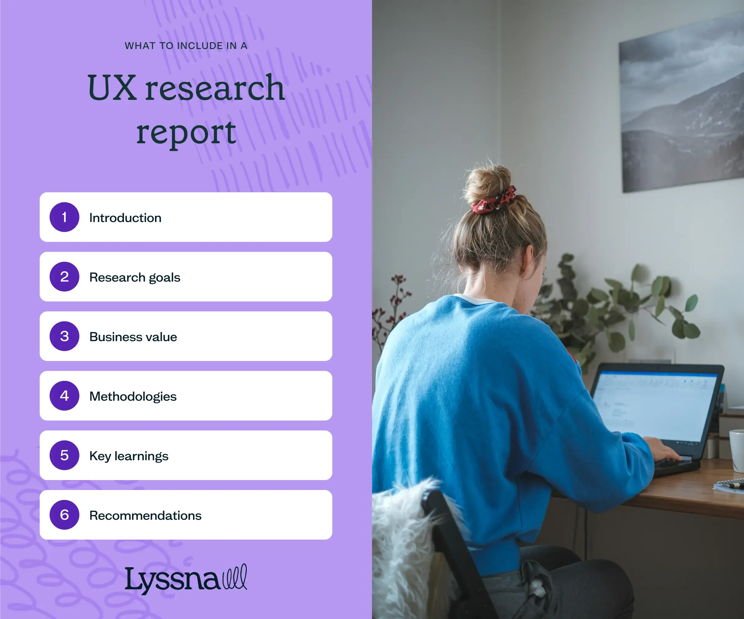
Not all UX research reports look the same – what you include depends on your audience, goals, and research scope. However, every strong report is built on a well-defined UX research strategy, ensuring insights are structured in a way that drives informed decision-making.
A well-crafted report typically includes the following essential components.
Introduction
The introduction of your report sets the stage for the rest of the document. Here, you lay out the problem you’re addressing and provide context for your research. A succinct yet impactful introduction is essential to capture the reader’s attention.
This section should outline the scope of your research, its relevance, and its potential impact on the business.
Research goals
This section is where you outline your research objectives and the questions that guided your study. As a continuation of your UX research plan, this section of the report succinctly summarizes your hypotheses, expectations, and research inquiries. These goals act as anchors so that your stakeholders can understand the core objectives of your study.
Business value
In this section, the focus shifts to clarifying the “why” behind your research. It’s a place to explain how your research findings contribute to tangible business metrics and growth objectives.
It’s important to tailor the information to your stakeholders. For example, if your report is being shared with your executive team, you might explain how your research aligns with strategic business goals. If you’re presenting to the wider UX team, you might highlight how your insights can enhance the UI design.
Methodology
In the methodology section, you’ll need to succinctly describe your research approach, the methods you used, and an overview of participant demographics in a way that non-researchers can easily understand.
Jargon-free language is crucial here. Make your methods transparent and, if necessary, provide explanations for any technical terms you use.
Key learnings
This is the most substantial part of your report. Aim for a balance between depth and clarity, making sure that your insights are presented without overwhelming your audience with data.
Choose and present key findings only, emphasizing recurring themes and trends.
You can support any insights like common experiences and pain points with things like quotes or audio and video clips. Contextualizing these findings can help your stakeholders empathize and make sense of the data.
Recommendations
Your report should conclude with actionable recommendations you’ve gained from your insights. These recommendations should echo your key takeaways and provide a clear pathway for addressing pain points or making improvements to your product or service.
Link these suggestions back to your research goals and present them as concrete next steps, whether they involve product design changes, future research studies, or recommendations for business decisions.
How to write a UX research report
A well-crafted UX research report isn’t just about documenting findings – it’s about making insights clear, compelling, and actionable. To ensure your report resonates with stakeholders, follow these key principles.
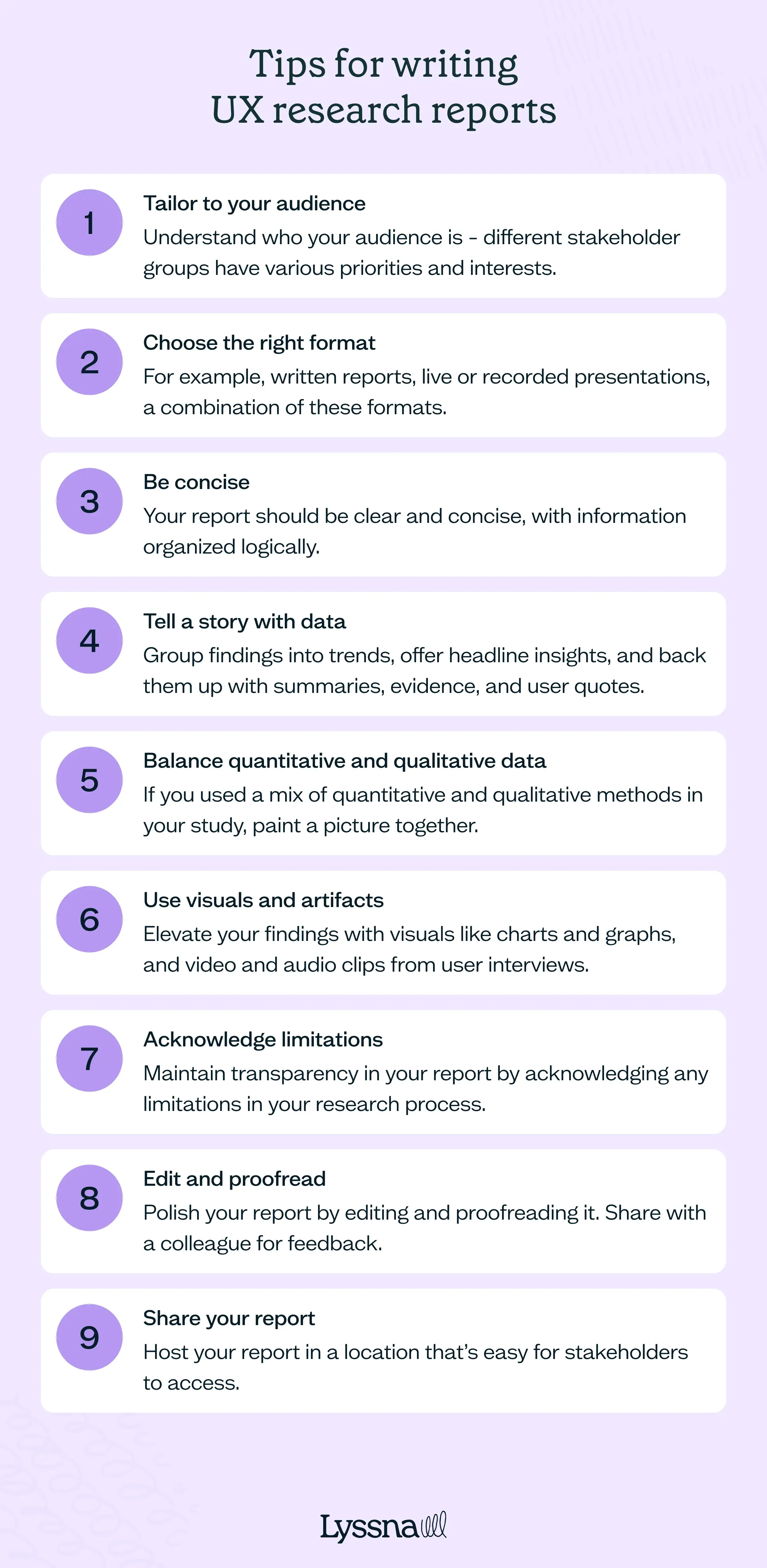
Tailor to your audience
Different stakeholders have different priorities. Adjust your content, tone, and format accordingly:
For executives: Focus on ROI and business impact, such as:
Increased customer retention.
Reduced acquisition costs.
Higher engagement and conversions.
For UX and product teams: Dive into methodologies, usability issues, and design implications to inform product decisions.
For developers: Provide technical insights related to implementation feasibility and constraints.
Remember to also adapt the length, terminology, and complexity of your report to suit your audience.
Choose the right format
Your report format should align with the needs of your audience:
Live or recorded presentations: Ideal for large groups and executives.
Written reports (PDFs, shared documents): Best for in-depth analysis and long-term reference.
Workshops: Combine a report overview with interactive discussions for engagement.
Multi-format approach: Consider blending different formats (e.g. a live presentation with a PDF for deeper insights).
Be concise
Keep your report clear and to the point.
Organize information logically – each section should flow naturally into the next.
Focus on the what, why, and how in a succinct manner.
Tell a story with data
Structure your findings in a narrative format rather than just listing raw data.
Highlight trends and recurring themes to make insights easier to digest.
Support findings with summaries, key quotes, and real-world examples to add context.
Balance quantitative and qualitative data
Use a mix of quantitative and qualitative data to create a well-rounded report:
Quantitative: Charts, graphs, and statistics from usability tests and surveys. For inspiration on how to present this kind of data effectively, check out these quantitative research examples.
Qualitative: User quotes, pain points, and behavioral observations if you’re exploring different approaches, check out these common types of qualitative research methods.
Example: Instead of stating "60% of users struggled to find the checkout button," include a direct user quote like, "I kept looking for the checkout, but it wasn’t where I expected."
Use visuals and artifacts
Don’t be afraid to get creative. Enhance engagement with:
Charts and graphs: Showcase usability test results, survey responses, and trends.
Video and audio clips: Add real user feedback for deeper impact.
Personas, journey maps, and wireframes: Help stakeholders visualize user behavior.
Acknowledge limitations
Maintain transparency by addressing any research constraints:
Limited participant diversity: If your sample size isn’t fully representative.
Time/resource limitations: If certain areas couldn’t be explored in depth.
Potential biases: If factors like leading questions or testing conditions may have influenced results.
Example: "Due to time constraints, this study focused on desktop users, so mobile experiences require further research."
Edit and proofread
A polished report ensures credibility and clarity:
Edit for structure and flow: Make sure your narrative makes sense.
Proofread for grammar, spelling, and formatting errors: Tools like Grammarly or ProWritingAid can help.
Get a second opinion: Have a colleague review your report for clarity and objectivity.
Share your report
Make sure your insights reach the right people:
Host it in an accessible location: Use shared folders, ux research repository, or project management tools.
Share it on internal communication channels: Post highlights in Slack, Microsoft Teams, or other internal communications channels.
Create a summary for quick reference: Offer a one-page overview with key takeaways for executives and time-strapped stakeholders.
There are plenty of free UX research report templates available online. Here are a few good picks from the UX community:
UX research report/case study template from Aadil, shared in the Figma community
UX research report template from Furquan Ahmad, shared in the Figma community
UX research report template from Hrvoje Grubišić, shared on Pitch
UX research report template, from Pitch
UX research report template from Femke
UX research report types: When to use each
Not all UX research reports serve the same purpose – different formats are suited to different audiences and goals. Choosing the right type of report ensures stakeholders get enough detail to make informed decisions. Below are common UX research report types and their best use cases.
Report type | Best for |
|---|---|
Executive summary reports | Leadership teams needing quick, high-level takeaways without deep data analysis. |
Comprehensive research reports | UX and product teams requiring detailed analysis, methodology breakdowns, and insights for decision-making. |
Usability testing reports | Evaluating how users interact with a product or feature, identifying task-based friction points and usability issues. |
Survey analysis reports | Summarizing quantitative and qualitative insights from user surveys, helping teams understand patterns and user preferences. |
Comparative analysis reports | Benchmarking UX against competitors or previous versions of a product to highlight areas of improvement. |
Heuristic evaluation reports | Expert evaluations that identify usability and design flaws based on UX best practices and heuristics |
Tips for presenting your UX research report
If you’re presenting your UX research report in person or asynchronously via video, mastering the art of presenting will help you feel confident.
Here are some valuable tips to make sure your presentation captivates your audience and your insights are delivered with clarity and impact.
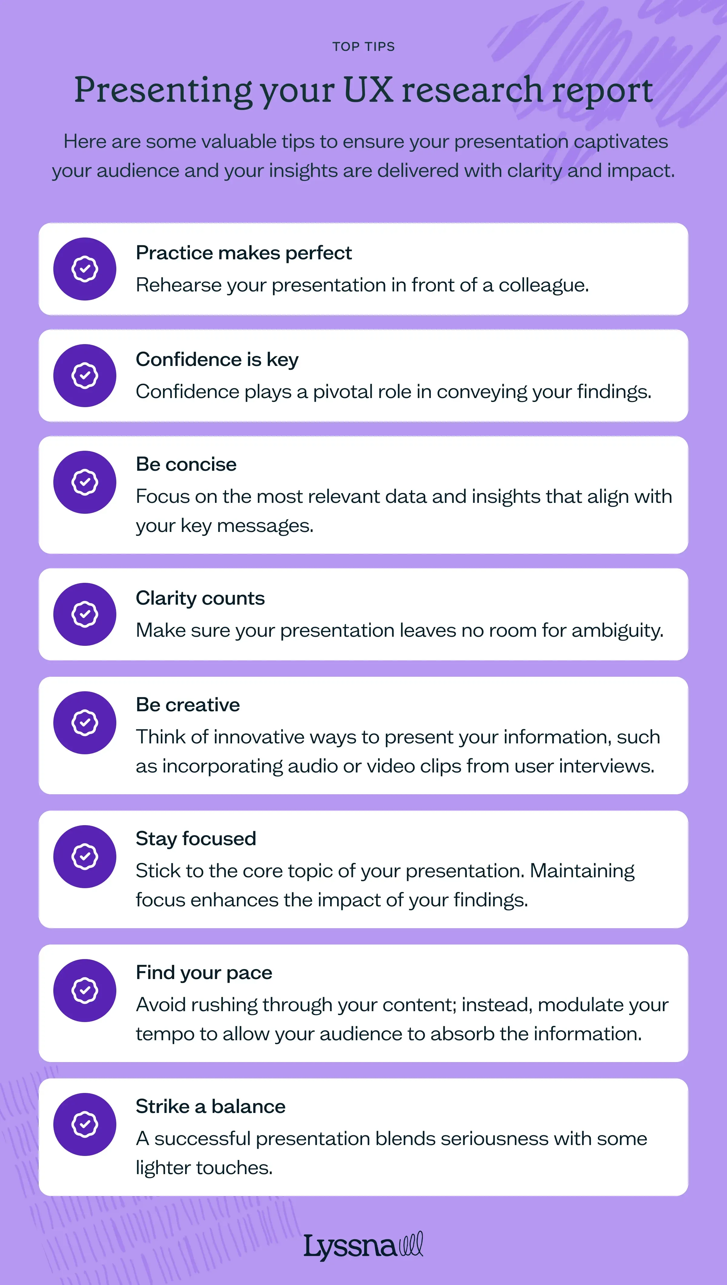
Practice makes perfect
Beyond practicing alone, rehearse your presentation in front of a colleague who isn’t part of the research process. This practice round helps you refine your content, identify any unfamiliar terms or lengthy sections, and build confidence. Constructive feedback from an outsider’s perspective can be invaluable in fine-tuning your presentation.
Confidence is key
Confidence plays a pivotal role in conveying your research effectively. Projecting your voice and maintaining eye contact with your audience (even on a video recording) establishes you as a credible and trustworthy presenter.
Try to avoid filler words like “uhs” and “ums” to maintain a smooth flow. Remember, your audience is more likely to be engaged if they sense your belief in the significance of your findings.
Be concise
Just like the report itself, conciseness matters. Keep in mind that time is limited – you usually have around half an hour to communicate your insights.
Focus on the most relevant data and insights that align with your key messages. Overloading your presentation with raw data can overwhelm your audience. Curate your content so that it strikes a balance between depth and brevity.
Clarity counts
Opt for precise and action-oriented language, removing any potential for misinterpretation.
For example, instead of “Several users had difficulty locating the search bar,” try “Improvements are needed to enhance the visibility of the search bar.” The clearer your delivery, the more effectively your audience will grasp your insights.
Be creative
Infuse creativity into your presentation to make it memorable. Think of innovative ways to present your information, such as incorporating audio or video clips from user interviews. These multimedia elements can lend an engaging and immersive quality to your presentation.
Stay focused
Stick to the core topic of your presentation. Avoid tangents that could divert your audience’s attention from the main message. Maintaining focus enhances the impact of your insights.
Find your pace
Balancing the pace of your presentation is crucial. Avoid rushing through your content; instead, modulate your tempo to allow your audience to absorb the information. This is where practicing can help you gauge when to slow down and when to pause for emphasis.
Strike a balance
A successful presentation blends seriousness with some lighter touches. Striking the right balance is important, so tailor your approach to what suits your audience and the nature of your research.
Reporting vs presenting
When sharing UX research findings, you can choose between a written report or a presentation – each serves a different purpose.
Written reports provide a detailed, structured record of research findings that stakeholders can revisit over time.
Presentations are ideal for delivering insights in a concise, engaging format, especially for decision-makers who prefer high-level takeaways.
Choosing between the two depends on your audience, research complexity, and the level of interaction required. Often, a combination of both works best.
It’s worth checking in with your stakeholders at the start of the project to make sure everyone is on the same page about the research deliverables.
Comparison: Reporting vs presenting
Aspect | Written report | Presentation |
|---|---|---|
Depth | Detailed and comprehensive | High-level and concise |
Format | Structured document (PDF, shared file) | Slide deck or live talk |
Best for | In-depth analysis, long-term reference | Engaging stakeholders, quick decision-making |
Interaction | Minimal (read at convenience) | High (discussions, Q&A) |
Ideal audience | Researchers, product teams, developers | Executives, design teams, cross-functional groups |
Written reports formats
A written UX research report can be presented in various formats depending on its purpose and audience:
Traditional reports (PDFs, Word docs, Google Docs): Structured documents with detailed findings, methodology, and recommendations.
Dashboards and data repositories: Centralized hubs where findings can be stored, referenced, and updated over time.
Case studies: Narrative-style reports focusing on specific research projects and their impact.
One-pagers or executive summaries: Condensed versions highlighting key takeaways and action items for quick reference.
Emails: Summarized research findings, key takeaways, and next steps for quick stakeholder alignment.
Presentations report formats
Presentations are ideal for engaging stakeholders and driving discussions. They can take different formats, including:
Slide decks (Figma Slides, PowerPoint, Google Slides, Keynote): A structured visual presentation for meetings or async sharing.
Live presentations: Interactive sessions where you present findings and facilitate discussions.
Recorded video walkthroughs: Pre-recorded overviews that allow stakeholders to consume insights on their own time.
Workshops: Hands-on sessions where you present research findings alongside collaborative exercises.
What is a good user research report?
A good user research report does more than just document findings – it delivers insights in a way that engages stakeholders, drives action, and informs decision-making. Here are the key characteristics to include in yours.
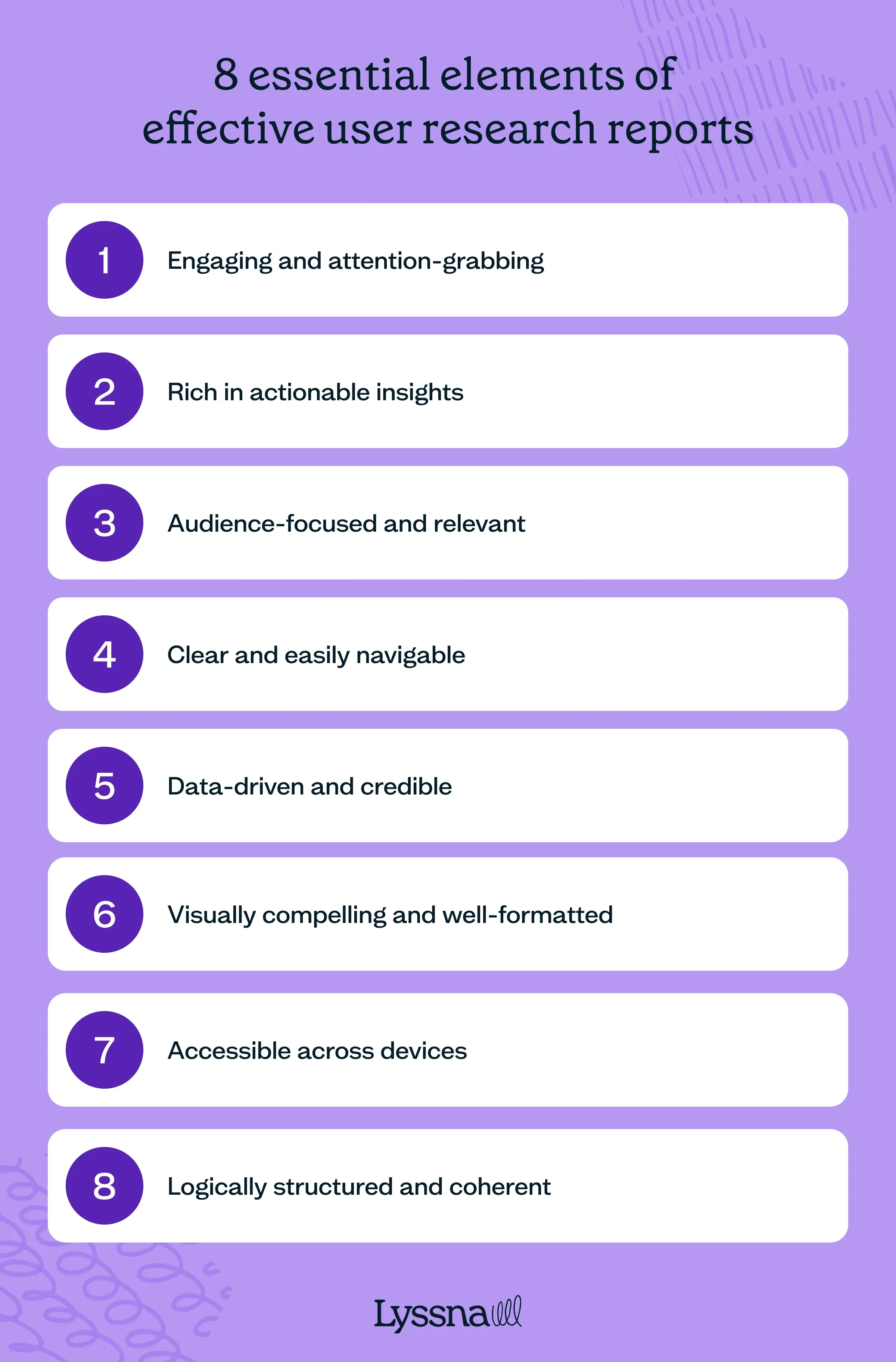
Engaging and attention-grabbing
A strong research report captures the reader’s interest from the start. It avoids dry, overly technical language and instead presents findings in a compelling and engaging manner.
Effective storytelling, real user quotes, and well-structured insights help keep the audience engaged.
Vadym Syliava, design partner and mentor, also recommends incorporating “examples and analogies to make complex concepts more relatable and easier to grasp.”
To maintain attention, reports should use varied formatting, such as summaries, bullet points, and bolded key points. (Skim back up this article and notice how we’ve tried to apply these very principles!)
Rather than overwhelming readers with dense paragraphs, a good report keeps information digestible and engaging.
Rich in actionable insights
A research report is only valuable if it leads to clear, informed recommendations. Instead of just presenting data, a strong report translates findings into practical next steps.
Each insight should include:
A clear takeaway explaining what the data means.
Implications for product, design, or business strategy.
Concrete next steps that teams can act on.
Audience-focused and relevant
A well-structured research report is customized to its audience. Different stakeholders have varying levels of expertise and interests – executives may need high-level takeaways, while design and development teams may require deeper insights.
Key ways to tailor your report:
Use familiar terminology suited to the readers’ knowledge level.
Focus on what’s relevant to each stakeholder group.
Provide different levels of detail (e.g. a one-page summary plus a detailed breakdown).
By aligning the content with the reader’s needs, the report becomes more impactful and engaging.
Clear and easily navigable
A cluttered, disorganized report makes it difficult for readers to find the most important insights. The best research reports use a logical structure, clear headings, and visual breaks to enhance readability.
Best practices for structure:
Use concise, jargon-free language.
Follow a consistent format (introduction, methodology, findings, recommendations).
Include summaries at the beginning of each section.
Use numbered lists or bullet points for clarity.
Data-driven and credible
An effective report builds trust through credibility. Every insight should be supported by solid research methods, reliable data, and transparency.
Ways to ensure credibility:
Clearly state sample sizes, demographics, and research methodologies, including how you recruited participants for your study.
Use both qualitative and quantitative data to strengthen insights.
Avoid speculation – let the data drive the conclusions.
Acknowledge any limitations or biases that may have impacted the findings.
Visually compelling and well-formatted
A visually well-designed report enhances readability and engagement. Instead of large text blocks, strong reports use visual hierarchy, white space, and multimedia elements to present findings clearly.
Key visual elements to include:
Graphs and charts to present numerical data.
Icons and color coding to highlight key points.
User journey maps or personas to illustrate findings.
Screenshots or video clips to provide real user context.
We love this tip from Octet Design Studio, too: “Photos are a great way to add a layer of detail and personality to your UX research report. You can use them to illustrate concepts or show how people use products in real life.”
A thoughtful layout makes the report not only easier to read but also more persuasive.
Accessible across different devices
A good research report is easy to access and share – that way, stakeholders can engage with it regardless of their location or preferred device.
Best practices for accessibility:
Provide multiple formats (PDF, online dashboards, interactive reports).
Ensure reports are mobile-friendly for on-the-go access.
Use clear, legible fonts and high-contrast visuals.
Avoid large file sizes that may hinder downloads or sharing.
Making reports easily accessible ensures that research findings reach the right people at the right time.
Logically structured and coherent
An effective UX research report guides the reader effortlessly from introduction to conclusion. Findings should be presented in a logical order that builds understanding step by step.
To create a strong flow:
Start with context before diving into findings.
Group related insights into coherent sections.
Use headings and subheadings to structure the content.
End with clear, prioritized recommendations.
A well-organized report ensures stakeholders absorb the key takeaways and can act on them immediately.
Create reports that drive action
Ready to craft more influential UX research reports? Start with better data. Try Lyssna free and gather the insights that make your recommendations impossible to ignore.

Crafting impactful UX research reports
A well-crafted UX research report doesn’t just document findings – it drives action. Whether you're presenting insights to executives, guiding product teams, or shaping design decisions, your report should make it easy for stakeholders to understand, engage with, and act on your research.
Now that you know how to create an effective UX research report, it’s time to put it into practice.
Start by selecting the right report type, structuring your insights clearly, and tailoring your content to your audience.