9 UX research examples
Great UX research helps turn a product people use into one they love. In this chapter, we explore real-world examples of UX research in action, from card sorting studies to user interviews. We show you how companies have used these methods to solve real problems.
UX research guide
UX research offers a variety of methods to gain a deeper understanding of how target users interact with products, from simple surveys to complex interviews. In this section, we'll explore real-world examples of how organizations have used different types of UX research to improve user experiences and drive better design decisions.
Card sorting
RSPCA UK
The RSPCA faced challenges in creating an intuitive intranet navigation.
"We started using Lyssna because we wanted to know what people thought of things. We needed insights and facts to go back to our stakeholders and say, 'Actually, we think this is a better approach,'" shares UX designer Eden Sinclair.
Conducting a card sort using Lyssna allowed the RSPCA team to organize content in a way that felt natural to their users.
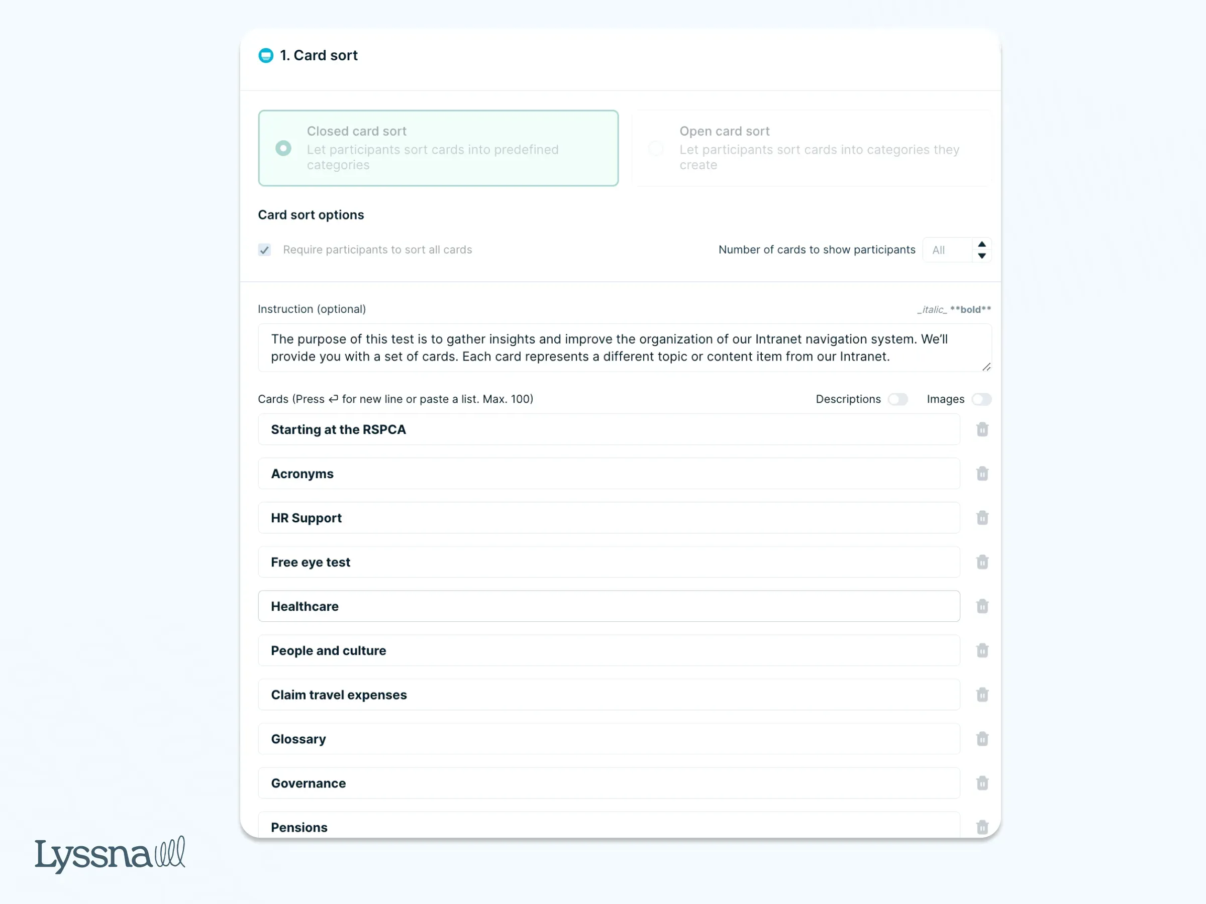
Eden adds, “After conducting a card sort, I realized I had designed the navigation completely wrong. The feedback from Lyssna helped us correct it, leading to a more intuitive user experience. It was an easy win for us.”
monday.com
To make sure their new feature name hit the mark with a global audience, monday.com used Lyssna to conduct a card sorting study.
“One of the bigger challenges is ensuring we can provide a consistently great customer experience across such a wide audience," said Nadav Hachamov, UX Researcher at monday.com. "There are demographic nuances such as language, location, industry, and job roles that need to be considered to ensure an optimal experience for that specific target audience.”
They asked participants from the UK, US, and Australia to categorize potential names into three groups: “I understand & not appealing,” “I understand & this is appealing,” and “I don't understand.” This approach helped the team choose a name that both resonated with customers and clearly conveyed the feature’s purpose.
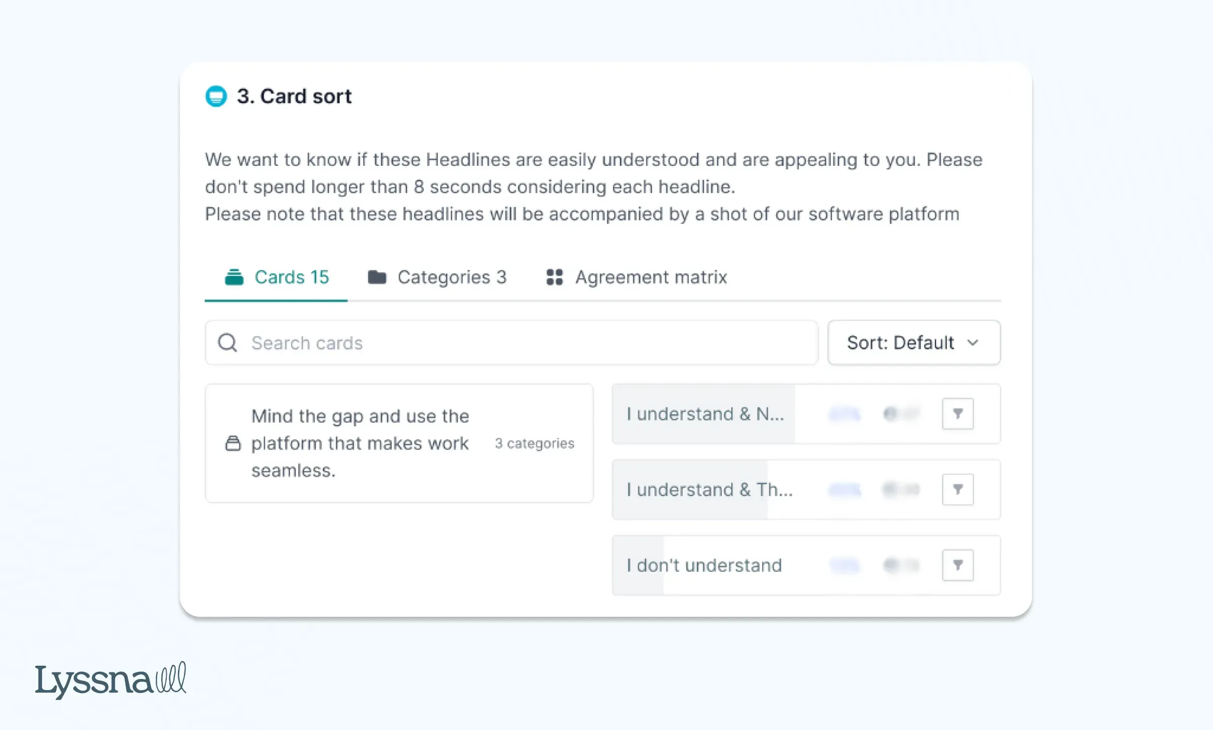
By gathering user feedback early on, monday.com made sure their new feature was relevant and appealing across multiple markets.
Surveys
RSPCA UK
The RSPCA also ran a survey using Lyssna to understand how sensitive images of animals displayed on their website affected users' emotions.
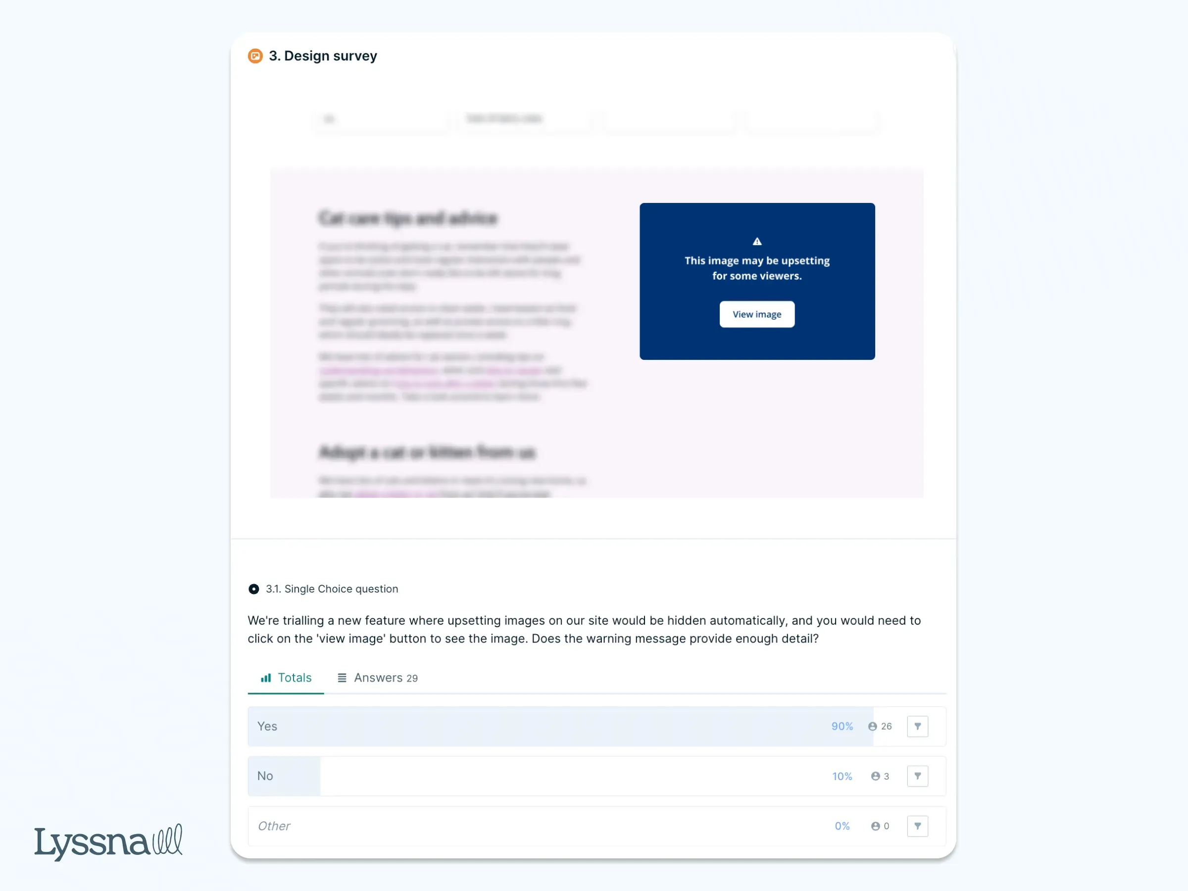
The team was concerned that these images might upset their supporters. But after testing with 30 participants, they found that the images didn’t have a significant negative impact. However, to give users more control, they introduced a "sensitive image" filter, allowing visitors to choose whether to view or hide the content.
This thoughtful approach aligned with the charity’s mission of promoting empathy while respecting user preferences.
STAYERY
Faced with a critical decision about access control systems for their expanding serviced apartment buildings, STAYERY used Lyssna to run a preference survey.
This survey tested guest preferences for electronic locks, including options like pin codes, key cards, and mobile apps. The stakes were high, as installing the wrong system could cost the company millions. A single electronic lock costs around €1,000, and scaling this decision across multiple properties would significantly impact their budget.
“For me, it was always obvious that we have to do user testing before we commit to big ticket building projects. Especially now that our biggest challenge is that we want to grow,” said Eveline Moczko, Head of Product at STAYERY.
By running the test with their guests, they gathered valuable feedback that ultimately saved them from a costly mistake.
LabXchange
As an edtech platform, LabXchange needed to make sure its navigation and user experience aligned with its target demographic of high school STEM teachers.
Using Lyssna, the team ran a quick design survey to decide whether to label a key navigation item as "Learn." Within two hours, feedback revealed that users interpreted "Learn" as a link to learn more about the organization, rather than a path to student learning materials.
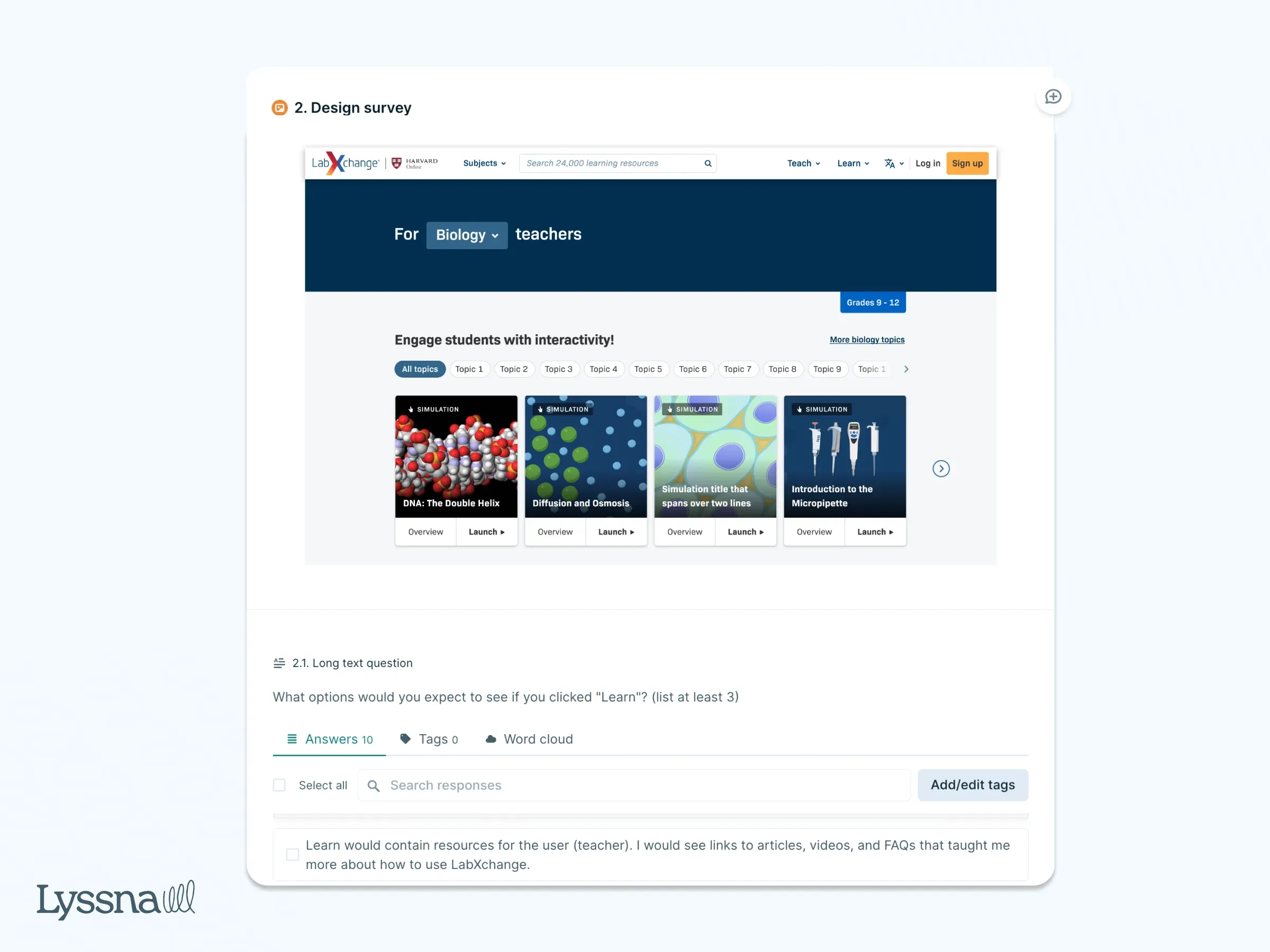
This prompted a swift redesign, saving the team time and resources by avoiding user confusion early on.
"That simple test saved us a lot of heartache!" shared Tess Gadd, Product Design Lead at LabXchange.
This approach to short, iterative testing has allowed LabXchange to make quicker, data-driven design improvements, fueling continuous innovation.
Klarna
To standardize its payment terminology globally, Klarna used Lyssna to survey how people perceive different payment terms. “We conducted a survey to comprehend user expectations and perceptions of payment terminology across Klarna's offerings," shared Sonal Malhotra, User Research Lead at Klarna. "This effort enabled us to fine-tune the naming of various concepts and products company-wide, leading to standardized naming conventions and improved brand coherence."
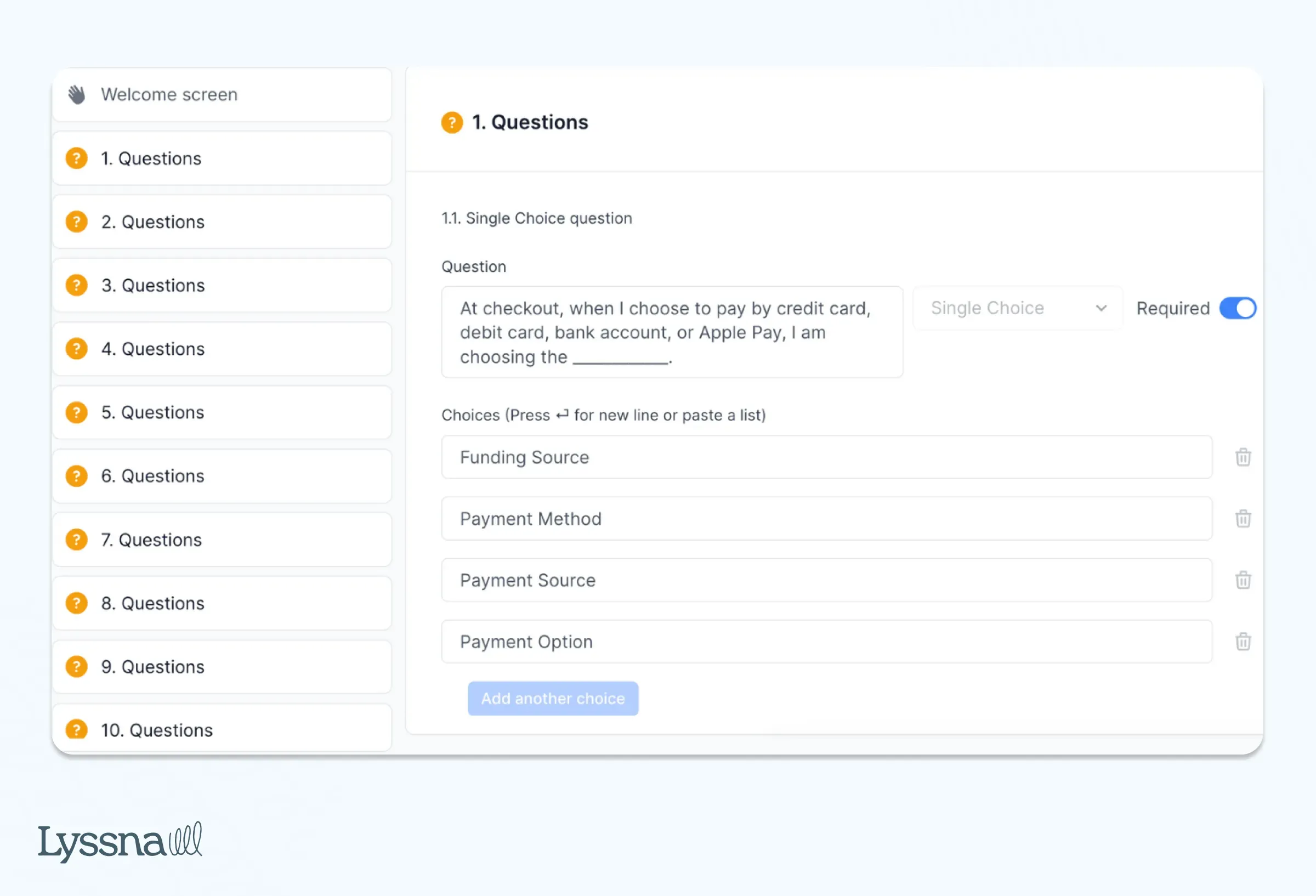
Klarna also used Lyssna to evaluate its value propositions, analyzing which unique selling points (USPs) resonated most with users. This led them to highlight the top three USPs at its merchant checkouts.
Sonal also shares: “I constantly receive responses on the same day or the following day, greatly aiding my interaction with various stakeholders.”
User interviews
Milo
Expanding their financial solutions to Latin America, Milo used Lyssna’s Interviews feature to conduct user interviews for scenario-based research.
Scott Weinreb, Senior Product Manager, conducted two rounds of interviews with participants from countries like Chile, Colombia, and Mexico. The goal was to understand cultural nuances in saving habits, which revealed key differences: while people in Colombia and Mexico used savings accounts much like checking accounts in the US, Chileans had a savings culture more aligned with Milo’s product.
This insight helped Milo refine their market entry strategy, focusing on Chile first, where user habits closely matched their product offering.
“For this particular scenario, we're creating a new product in countries that we really have no connection with. So being able to recruit from the Lyssna panel was super helpful,” said Scott.
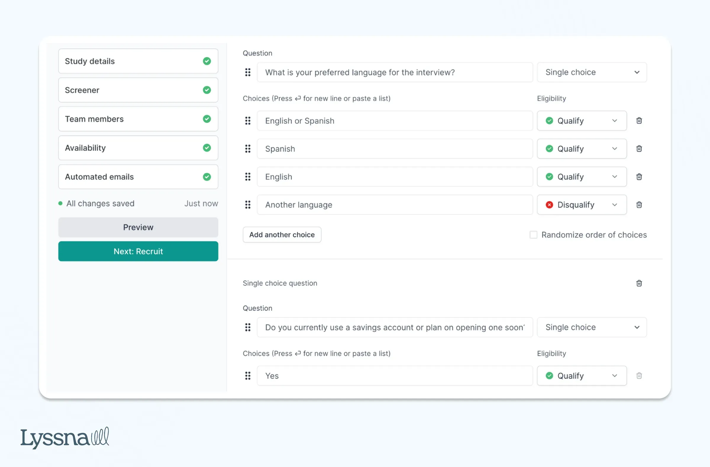
By recruiting and filtering participants through Lyssna, Scott was able to have the targeted conversations that shaped the company’s product development strategy and expansion plans.
Nav
Nav specializes in credit and financial wellbeing for small businesses. To refine their research targeting, they used a screener survey to focus on specific segments within their small business audience.
"We needed a solution that would allow us to gain quantitative insights through online research to understand, monitor, and improve our customer experiences,” shares Jenn Wolf, Senior Director of Customer Experience (CX).
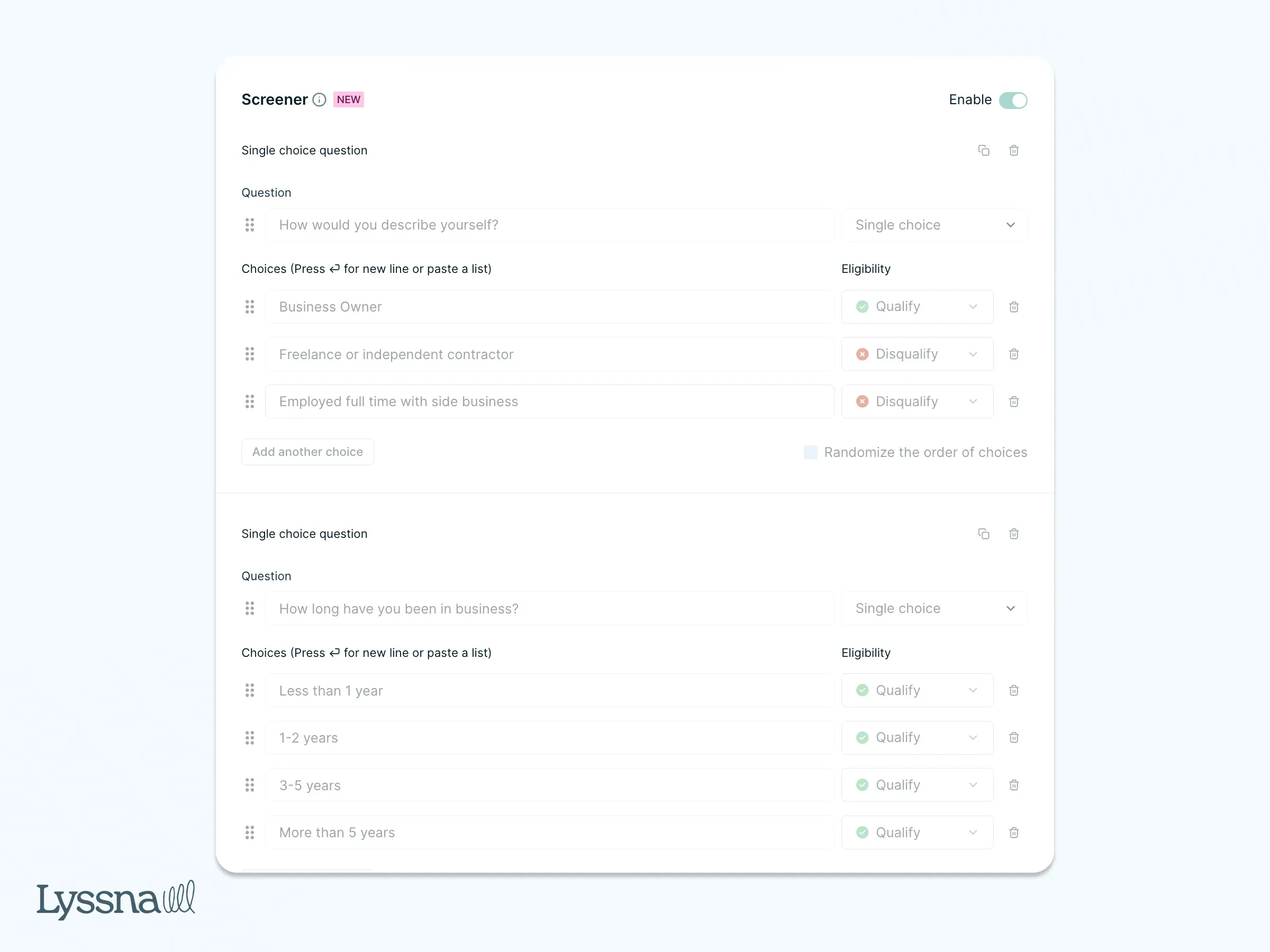
By customizing their audience at a granular level, Nav was able to collect valuable feedback from high-quality candidates, helping them optimize products and services for small business owners. This feature, combined with regular interviews and surveys, has made their research more cost-effective and efficient, allowing them to conduct impactful tests with a small team.
TrueCar
To gain deeper understanding of the behaviors and preferences of electric vehicle (EV) shoppers, TrueCar conducted user interviews using Lyssna.
Justin Nowlen, Senior Director of Product Design, led interviews to pinpoint key moments when potential buyers interacted with the platform. He was especially interested to know whether they’d consider EVs alongside traditional gas vehicles.
With Lyssna, Justin’s team quickly recruited participants and set up interviews within days. During the sessions, they asked participants to share their screen and navigate the design. This allowed them to observe real-time user behavior, including how users engaged with high-contrast banners and navigated vehicle options on TrueCar.
“What we need is something that allows us to get up and running very fast, have direct conversations over a trusted tool; a trusted interface that allows us to gain insights and take actions in the same week. Neither competitive product allowed us to do that as swiftly as Lyssna,” said Justin.
The interviews Justin conducted uncovered valuable feedback, like how users often skip additional information to focus on specific vehicles, which helped the team enhance the car-buying experience for TrueCar’s diverse audience.
Conduct UX research with Lyssna
Lyssna offers a comprehensive and user-friendly platform for conducting UX research, helping teams gather actionable insights at every stage of the product development process. Whether you're working with moderated or unmoderated ux study, user research interviews, or in-depth interviews, Lyssna provides tools to seamlessly integrate these methods into your workflow.
Integrations with Zoom, Microsoft Outlook, Microsoft Teams, and Google Calendar allow you to organize and schedule interviews easily, while screeners help you recruit participants with precision, ensuring you’re speaking to the right audience. This makes Lyssna an invaluable resource for UX teams looking to validate ideas, understand user behavior, and fine-tune design decisions with real-time data.
What sets Lyssna apart is the speed and ease with which you can set up studies and gather feedback. From first-click tests to card sorting, Lyssna enables you to engage with over 690,000 participants worldwide, ensuring your research is both cost-effective and scalable. This versatility allows teams to optimize user experience across a variety of touchpoints, helping brands build products that truly resonate with their audience.
If you’re looking to enhance your UX research process, Lyssna can help you streamline everything from recruitment to ux research analysis, allowing your team to move faster and more efficiently toward user-centered design.
And finally, if you wish to explore your options, see our extensive list of the best UX research tools on the market.