Usability testing examples
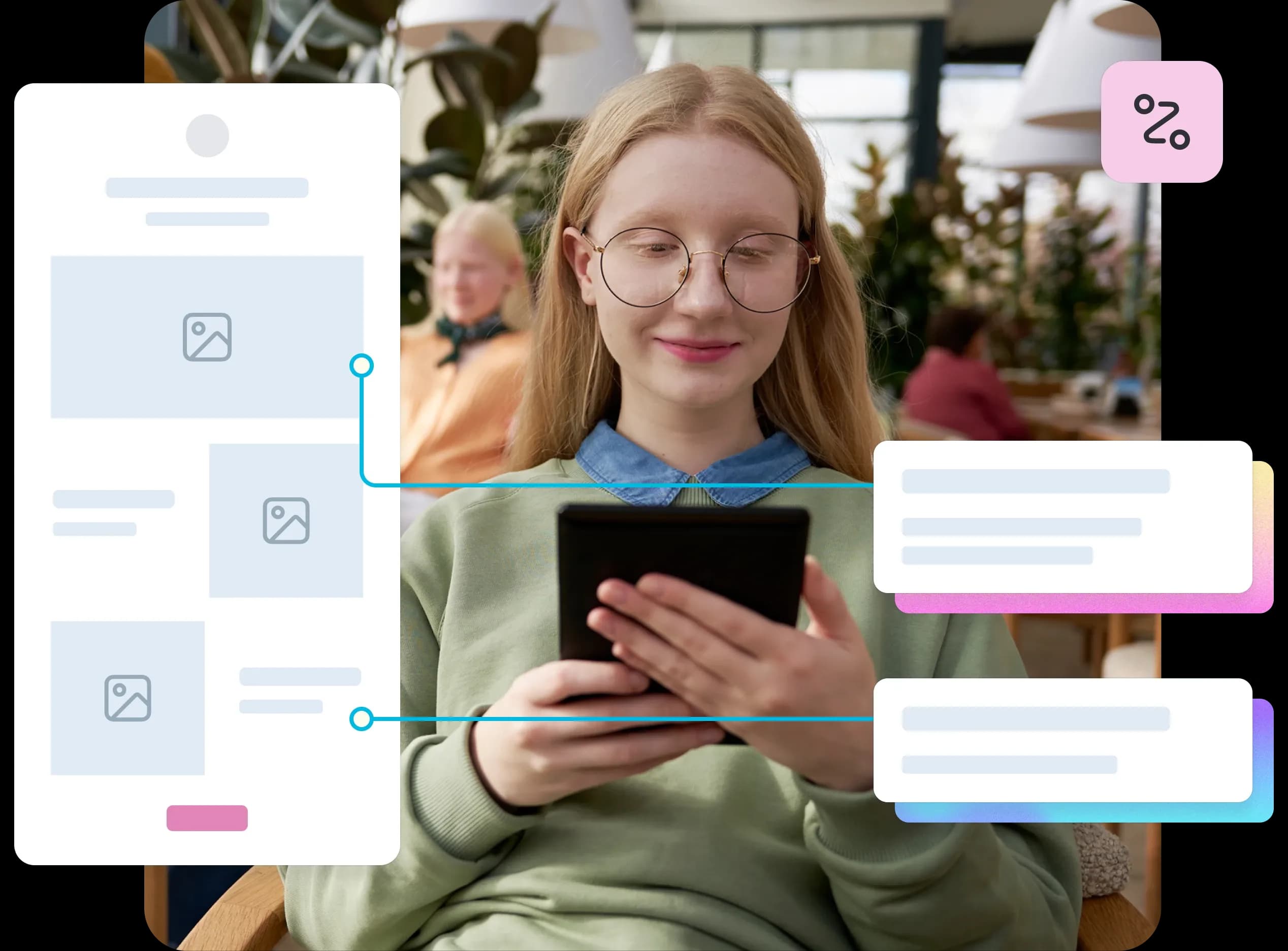
Learn how to analyze usability test results and create reports that drive action. Discover a 9-step analysis framework, report structure, examples, and tips with Lyssna.
Usability testing guide
Real-world examples of usability testing can transform your approach to user experience design. While theory is important, seeing different testing methods in action provides the clarity and confidence needed to implement these techniques effectively.
The importance of intuitive navigation has been consistently proven through research. The foundational Bailey and Wolfson study found that users who make the correct first click have an 87% success rate, compared to just 46% when the first click is incorrect.
This principle, consistently validated in subsequent studies, extends across all usability testing methods: understanding how users interact with our designs helps us create truly intuitive experiences.
This guide explores four essential usability testing examples, each revealing unique insights about user behavior. From navigation patterns to first impressions, we'll examine real-world scenarios, practical benefits, and optimal timing for each method – giving you the knowledge to choose the right testing approach for your needs.
Try these methods yourself
Explore Lyssna's testing templates for first click, prototype, preference, and five second tests. Start testing free today.
First click testing
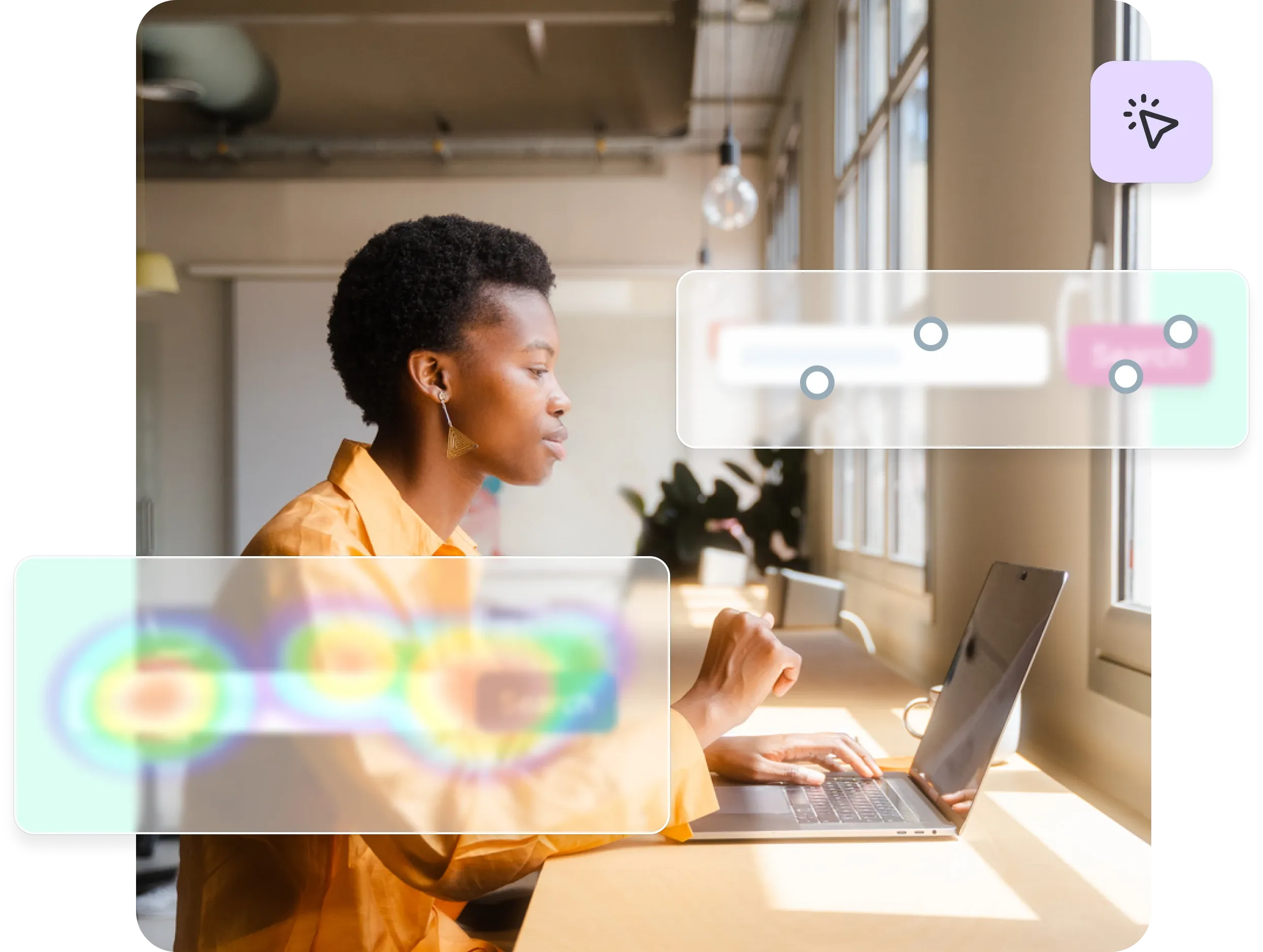
First click testing reveals whether users can intuitively find their way through your interface by tracking where they click first when attempting to complete a task. This method provides critical insights into navigation clarity and user expectations.
What it is
First click testing is a usability testing method that evaluates whether navigation and UI elements are intuitive by tracking users' initial clicks when attempting to complete specific tasks. The test measures whether users can correctly identify the right starting point for their journey through your interface.
During a first click test, participants receive a task instruction and then interact with your interface – whether it's a live website, prototype, or static design.
The testing platform records exactly where each user clicks first, creating a visual heatmap that shows click distribution across your interface.
How it works in practice: Example scenarios
Test whether users can start purchasing by asking them to "add this item to your cart”. You'll quickly discover if they click "Add to Cart," get confused by "Buy Now," or click somewhere unexpected entirely.
Philips Lighting discovered through click testing that fewer than half of users were clicking the navigation tabs on their "Choose a Bulb" page. This insight led them to redesign the page layout for better usability.
Joom marketplace used first click tests on their product catalog to identify where users clicked when searching for specific categories. The tests revealed problem areas, allowing them to make targeted improvements.
Key benefits
Reveals navigation clarity: First click testing immediately shows whether your navigation structure matches user mental models. When users consistently click the wrong elements, it indicates that your labeling, placement, or visual hierarchy needs adjustment.
Identifies misleading labels or button placement: The test exposes when interface elements don't communicate their function clearly. If users expect a "Contact" link to lead to a contact form but it opens a phone number instead, first click testing will reveal this disconnect.
Provides quantitative validation: Unlike subjective feedback, first click testing gives you concrete data about user behavior. You can see exactly what percentage of users click correctly versus incorrectly, making it easier to prioritize design changes.

When to use it
First click testing works best during early wireframes, prototypes, or live site optimizations when you need to validate navigation decisions quickly. It's particularly valuable when:
Testing new navigation structures or menu designs
Validating the placement of key conversion elements
Optimizing complex interfaces with multiple pathways
Confirming that visual hierarchy guides users correctly
The method integrates seamlessly into design sprints and iterative development cycles, providing rapid feedback that can inform immediate design decisions.
Check out Lyssna’s first click testing templates to get started.
Prototype testing
Prototype testing allows teams to validate design concepts and user flows before investing in development, catching usability issues when they're still easy and inexpensive to fix.
What it is
Prototype testing involves evaluating clickable prototypes to validate flows and interactions before development begins. This method uses interactive mockups created in tools like Figma, InVision, or Adobe XD to simulate the final user experience without requiring actual code.
During prototype testing, users navigate through realistic representations of your product, completing tasks and providing feedback on the overall experience. The testing reveals whether your proposed design solutions actually work for real users in practice.
How it works in practice: Example scenarios
Test your sign-up flow by asking users to "Create an account" in your prototype. You'll quickly spot confusing steps or unclear instructions.The test would reveal whether users understand each step, where they hesitate or become confused, and whether the overall process feels logical and efficient.
Bower Collective, a UK-based startup committed to reducing plastic waste, turned to Lyssna to better understand their potential customers and improve both their onboarding and product development. Using Figma prototype testing and card sorting, they gathered crucial feedback on everything from product design and pricing to customer motivations.
Key benefits
Saves development costs: By identifying usability problems before coding begins, prototype testing prevents expensive revisions during or after development. It's significantly cheaper to modify a prototype than to rebuild functional code.
Finds usability issues before coding: The testing reveals navigation problems, confusing workflows, and missing functionality while changes are still easy to implement. Teams can iterate rapidly on prototypes without technical constraints.
Validates design assumptions: Prototype testing confirms whether your design solutions actually solve user problems. It provides evidence-based validation for design decisions, reducing the risk of building features that users don't understand or need.

When to use it
Prototype testing is most valuable during design sprints or pre-development validation phases. Use this method when:
Validating new feature concepts or user flows
Testing complex interactions or multi-step processes
Exploring different design approaches for the same functionality
Gathering stakeholder buy-in with user-validated designs
Check out Lyssna’s prototype testing templates to get started.
Preference testing
Preference testing helps teams understand user design preferences by presenting multiple design options and gathering feedback on which versions users prefer and why.
What it is
Preference testing asks users which design version they prefer between two or more options, such as comparing layout A versus layout B. This method goes beyond simple preference by exploring the reasoning behind user choices, providing insights into what visual and functional elements resonate most with your audience.
During preference testing, users are presented with side-by-side design options. They’re asked to select their preference, followed by questions about what influenced their decision. This combination of quantitative choice data and qualitative reasoning creates a comprehensive understanding of user preferences.
How it works in practice: Example scenarios
Test different design approaches by showing users two versions side-by-side. For example, compare a features-focused landing page against one highlighting customer testimonials. Users choose their preference and explain why, revealing what truly resonates with your audience.
Stayery, a serviced apartments company, used preference testing before investing in property technology. They tested different electronic lock options (keycards vs. mobile apps vs. PIN codes) with their target guests. Since each lock costs €1,000 and a single property needs 100+ locks, this simple €200 test potentially saved them millions by identifying the right solution before committing to the purchase.
Key benefits
Provides quick directional feedback: Preference testing delivers fast insights about which design direction to pursue, helping teams make confident decisions without extensive research timelines.
Validates visual and branding choices: The method confirms whether your visual design choices align with user expectations and preferences, reducing the risk of launching designs that don't resonate with your audience.
Supports data-driven design decisions: Rather than relying on internal opinions or assumptions, preference testing provides user-validated evidence for design choices, making it easier to gain stakeholder alignment.

When to use it
Preference testing works best during early design exploration or marketing material reviews when you need to choose between viable design alternatives. It's particularly effective for:
Comparing different visual design approaches
Testing marketing campaign concepts or messaging
Validating branding decisions or color schemes
Choosing between layout options for key pages
Busuu, a leading language learning platform, uses Lyssna to validate creative concepts and key messaging through preference testing and five second tests. This helps their creative team quickly understand how users respond to ads and messaging, especially for out-of-home (OOH) campaigns.
“I like the ease of setup, the quick turnaround, the way we can segment through the answers.”
Tina Vifor
Head of Creative Communication
Check out Lyssna’s preference testing templates to get started.
Five second testing
Five second testing measures users' first impressions by showing them a design for just five seconds, then asking what they remember or understood about what they saw.
What it is
Five second testing shows users a design for exactly five seconds, then asks what they remember or understood from their brief exposure. This method tests whether your design communicates its core message and purpose effectively within the critical first moments of user attention.
During five second testing, users answer questions about what they saw, what they think the page or product is for, and what elements stood out most. The responses reveal whether your visual hierarchy, messaging, and overall design successfully communicate your intended message.
How it works in practice: Example scenarios
Testing whether users grasp a SaaS homepage's value proposition provides a perfect example of five second testing in action. You might show users your homepage for five seconds, then ask "What do you think this company does?" and "What would you do next if you were interested in this service?"
Philips Lighting used a five second test on one of its microsite home pages to see if users could quickly grasp its purpose at a glance. The results showed that a large percentage of people did not correctly understand what the website was about, allowing them to make quick changes to improve this.
Key benefits
Measures first impressions: Five second testing captures users' immediate, instinctive reactions to your design before they have time to analyze or rationalize their response. This reveals whether your design creates the right first impression.
Tests clarity of messaging and visual hierarchy: The method shows whether your most important messages are prominent enough to register within seconds. If users can't identify your core value proposition or primary call-to-action, the test will reveal this immediately.
Validates communication effectiveness: Beyond visual design, five second testing confirms whether your messaging is clear and compelling enough to make an impact in the brief window when users decide whether to stay or leave your site.

When to use it
Five second testing is ideal for marketing sites, onboarding flows, or feature announcements where first impressions are critical. Use this method when:
Testing new homepage designs or landing pages
Validating marketing campaign materials
Optimizing onboarding screens or app store listings
Confirming that key messages are immediately clear
Check out Lyssna’s five second testing templates to get started.
From testing to results: How usability testing shapes better products
The true value of usability testing lies not just in gathering data, but in transforming those insights into tangible product improvements that create better user experiences.
Turning findings into action
Usability test data only matters when it drives real improvements. Successful teams analyze patterns, prioritize high-impact issues, and create specific solutions backed by data—not opinions.
WongDoody used first click testing to make the Royal Automobile Club of Victoria's (RACV) website more accessible and user-friendly. Initial tests showed users took 19.6 seconds on average. After several rounds of testing and design iterations, they cut this to just 4.9 seconds—a 75% improvement.
"Testing was for the audience and ourselves so we could base decisions on fact, not opinion. We couldn't afford mistakes and had to make sure the outcome was right the first time.”
James Noble
Chief Design Officer
Building products users love
Usability testing reduces friction and builds trust by ensuring that products work the way users expect them to. When interfaces are intuitive and tasks flow smoothly, users develop confidence in the product and are more likely to continue using it.
The cumulative effect of addressing usability issues creates products that feel effortless to use. Users may not consciously notice good usability, but they definitely feel its absence. By systematically testing and improving based on user feedback, teams create experiences that users genuinely enjoy.
Canstar used first click testing to refine smaller, more impactful design elements so users could easily navigate complex financial data. One key test focused on the placement of an arrow, which, after a few minor adjustments, increased user engagement by 30%.
Practitioner insight
“Having the ability to create concepts in Figma and with minimal effort bring them straight into a testing platform like Lyssna has been a game changer for us.”
- Chris Taylor, Lead Experience Designer at Canstar
Iterative testing cycle
The best products evolve through continuous testing cycles, not one-time validation. Test early concepts, refine based on feedback, then test again.
Ooma commits to this rhythm by running at least one test every two-week sprint. This regular cadence catches issues before they become expensive problems.
YNAB learned this lesson the hard way: "You'd end up waiting until you felt you had something more polished... By waiting, you've gone that much further without actually getting valuable feedback." Now they test multiple variants at each stage—internally, with new users, and with existing customers—comparing results to find the best solution.
Pro tip: Make testing so quick and easy that it becomes automatic. When testing takes days instead of weeks, teams naturally test more often, creating better products through rapid iteration.
Modern usability testing platforms like Lyssna make this iterative approach practical by providing rapid testing capabilities, reliable participant recruitment, and streamlined analysis tools.
Whether you're conducting first click tests, prototype validation, preference testing, or five second tests, the key is establishing a consistent testing rhythm that informs design decisions throughout your product development process.
Start your testing rhythm
Launch first click, prototype, preference, or five second tests in minutes. Try Lyssna and recruit from our 690k+ participant panel.