Icon testing guide
Learn how to test icons for clarity and usability. Discover methods, best practices, and tips for designing icons that users understand and engage with.
Icon testing guide
Icons may be small, but their impact is substantial. They're the visual shortcuts we rely on every day. Take for granted, even. Right up until they fail.
When users can't understand what an icon means or where it leads, the entire user experience breaks down. A confusing shopping cart icon can kill conversions. An unclear navigation symbol can leave users lost. A misunderstood action button can frustrate users into abandoning your product entirely.
The good news? Effective icons don't happen by chance. They're thoughtfully designed, rigorously tested through design validation, and carefully refined to ensure clarity and usability.
This comprehensive guide will show you how to test your icons, validate your design decisions with real users, and create iconography that truly clicks with your audience.
Whether you're designing your first icon set or optimizing an existing interface, we'll walk you through proven testing methods, practical implementation strategies, and the insights you need to make data-driven icon decisions.
Key takeaways
Icons must be recognizable, consistent, and accessible. Test for clarity at different sizes, ensure visual consistency across your product, and validate that icons work with assistive technologies.
Test icons both in isolation and within their interface context. Out-of-context testing reveals pure recognition, while in-context testing shows real-world performance.
Multiple testing methods reveal different feedback. Use preference testing to compare designs, first-click testing to measure findability, and A/B testing to validate performance.
Cultural differences affect icon interpretation. What seems universal in one region may be meaningless or confusing in another, so test with your specific audience.
Iterate based on data, not assumptions. Test early and often, measure specific outcomes like task completion rates, and refine designs based on evidence rather than intuition.
Test your icons with real users
Validate your icon designs with preference tests, first click tests, and usability testing in Lyssna.
What is an icon?
Before diving into testing methodologies, let's establish what we mean when we talk about icons in digital design and why they play such a crucial role in user experience.
Definition
Icons are simplified visual symbols that represent actions, objects, or concepts in an interface. They serve as visual shorthand, communicating meaning through recognizable imagery rather than text. In digital products, icons can represent everything from basic functions (like a magnifying glass for search) to complex concepts (like a shield for security settings).
The most effective icons share several characteristics:
Simplicity: They distill complex ideas into clean, minimal visuals
Recognition: Users can quickly identify what they represent
Scalability: They remain clear at different sizes
Consistency: They follow established visual patterns and conventions
Think of icons as a universal language for digital interfaces. Just as road signs use symbols to communicate quickly to drivers regardless of their native language, interface icons help users navigate and interact with products efficiently.
Role in UI/UX
Icons guide users, reduce text clutter, and make interfaces more intuitive. They serve multiple critical functions in user experience design:
Navigation aids: Icons help users understand where they are and where they can go. A house icon universally signals "home," while arrows indicate direction and movement.
Action triggers: Icons communicate what will happen when users interact with them. A trash can suggests deletion, a pencil indicates editing, and a plus sign means adding something new.
Status indicators: Icons provide immediate feedback about system states. A green checkmark shows success, a red X indicates an error, and a loading spinner communicates that something is processing.
Space efficiency: Icons allow designers to pack more functionality into limited screen real estate, especially important on mobile devices where every pixel counts.
Cognitive load reduction: Well-designed icons reduce the mental effort required to process information, helping users complete tasks more efficiently.
However, icons only fulfill these roles when users understand them correctly. This is where testing becomes essential – ensuring your visual symbols actually communicate what you intend them to communicate.

Why use icons: 5 reasons
Understanding the benefits of iconography helps justify the investment in proper icon testing. Here are the five key reasons why icons are essential in modern interface design.
Enhance visual communication
Icons quickly convey meaning without words. While text requires reading and processing, icons can communicate instantly through visual recognition. This speed advantage becomes crucial in fast-paced digital environments where users scan rather than read.
Consider how quickly you recognize a heart icon as "favorite" or a bell as "notifications." This immediate recognition happens because icons tap into our visual processing system, which operates much faster than our text processing abilities.
Research shows that the human brain processes visual information approximately 60,000 times faster than text. This means a well-designed icon can communicate its meaning in milliseconds, while text requires conscious reading and interpretation.
For global products, icons provide a communication method that transcends language barriers, making your interface more accessible to diverse user bases.
Save space
Replace text-heavy interfaces with clean, minimal visuals. In an era where screen real estate is precious – especially on mobile devices – icons offer an elegant solution to space constraints.
A single icon can replace multiple words while maintaining clarity. Instead of a button labeled "Add to Shopping Cart," a simple cart icon with a plus sign communicates the same action in a fraction of the space.
This space efficiency allows designers to:
Include more functionality in limited areas
Create cleaner, less cluttered interfaces
Improve visual hierarchy by reducing text noise
Maintain usability across different screen sizes
The key is ensuring that space savings don't come at the expense of clarity – which is exactly what icon testing helps validate.
Universal understanding
Well-designed icons cross language barriers. Unlike text, which requires translation for international audiences, effective icons can communicate universally. A magnifying glass means "search" whether your users speak English, Mandarin, or Arabic.
This universality makes icons particularly valuable for:
Global products serving diverse markets
Applications used by speakers of multiple languages
Interfaces where text translation isn't feasible
Emergency or safety-critical applications
However, it's important to note that not all symbols are truly universal. Cultural differences can affect icon interpretation, which is why testing with your specific audience is crucial.
Improve recognition and speed
Users process icons faster than text. Once users learn what an icon represents, they can identify and act on it almost instantaneously. This speed improvement becomes more pronounced as users become familiar with your interface.
The recognition advantage of icons stems from several factors:
Pattern recognition: Humans excel at recognizing visual patterns and shapes
Muscle memory: Users develop automatic responses to familiar icons
Reduced cognitive load: Icons require less mental processing than reading text
Peripheral vision: Users can often identify icons in their peripheral vision
This speed advantage translates to improved user efficiency and satisfaction, particularly for frequently used functions.
Strengthen branding
Consistent icon styles reinforce brand identity. Icons aren't just functional elements – they're brand touchpoints that contribute to your overall design language and user perception.
A cohesive icon system can:
Reinforce brand personality (playful, professional, minimal, etc.)
Create visual consistency across different platforms and products
Differentiate your product from competitors
Build user familiarity and trust
Think about how Apple's icon style immediately identifies their products, or how Google's Material Design icons create a recognizable visual language across their ecosystem.
The challenge is creating icons that are both functionally effective and brand-appropriate – a balance that testing helps you achieve.
Understanding icon usability
Creating usable icons requires understanding the fundamental principles that make visual symbols effective. Let's explore the key factors that determine whether an icon will succeed or fail in real-world usage.
Clarity
Icons should be easily recognizable. Clarity is the foundation of icon usability – if users can't quickly understand what an icon represents, it fails its primary purpose.
Clear icons share several characteristics:
Distinct shapes: The overall silhouette should be immediately recognizable
Appropriate level of detail: Enough detail to convey meaning, but not so much that it becomes cluttered
Strong contrast: Clear distinction between the icon and its background
Scalable design: Maintains clarity at different sizes
As you design and test your icons, keep this question in mind: is it clear what this icon means – without any extra help?
Testing icons within their interface can highlight potential misinterpretations. Say you're designing an app with a heart icon. On its own, it's clear and recognizable as a symbol for 'like' or 'favorite.' But now, place it next to a thumbs-up and a star icon in your interface. Suddenly, users might wonder: 'What's the difference between these actions? Am I liking, favoriting, or rating something?'. Not good.
Testing the icon in context helps reveal if users understand its function or are in danger of misinterpreting it based on its neighbors.
Consistency
Maintain style and meaning across the product. Consistency operates on multiple levels in icon design:
Visual consistency: All icons should share similar design characteristics like line weight, corner radius, and overall style. Mixing outlined icons with filled icons, or combining different artistic styles, creates visual chaos.
Semantic consistency: Similar concepts should be represented similarly throughout your interface. If you use a gear icon for settings in one area, don't switch to a different symbol elsewhere.
Behavioral consistency: Icons representing similar actions should behave similarly. If tapping one icon opens a menu, users will expect other similar icons to behave the same way.
Inconsistency forces users to relearn your interface repeatedly, increasing cognitive load and reducing efficiency.
Familiarity
Users expect common icons (e.g. trash can = delete). Leveraging established conventions helps users understand your interface immediately without learning new visual languages.
Some near-universal icon conventions include:
Magnifying glass: Search functionality
Trash can: Delete or remove
Pencil: Edit or compose
Gear/cog: Settings or preferences
House: Home or main page
Envelope: Email or messages
While it's tempting to create unique icons that stand out, deviating from established conventions can confuse users and slow down task completion.
The key is balancing familiarity with your brand identity. You can maintain recognizable shapes while adapting the style to match your design language.
Accessibility
Icons must work with assistive technologies and color contrast. Accessible icon design ensures your interface works for users with various abilities and needs.
Key accessibility considerations include:
Color independence: Icons shouldn't rely solely on color to convey meaning. Users with color vision deficiencies should be able to understand the icon's purpose through shape and context alone.
Sufficient contrast: Icons need adequate contrast against their backgrounds to be visible to users with low vision.
Screen reader compatibility: Icons should include appropriate alt text or labels that screen readers can announce to users who can't see them.
Touch target size: Interactive icons need sufficient size and spacing for users with motor impairments to activate them accurately.
Keyboard navigation: Users should be able to navigate to and activate icons using keyboard controls.
Remember that accessibility isn't just about compliance – it's about creating inclusive experiences that work for everyone.

What to watch out for when designing icons
Even experienced designers can fall into common icon design traps. Understanding these pitfalls helps you avoid them and creates more effective testing scenarios.
Ambiguous meaning
Icons that are too abstract confuse users. While minimalism is generally good in icon design, taking simplification too far can render icons meaningless.
Common ambiguity problems include:
Over-abstraction: Reducing an icon to such basic shapes that it could represent multiple concepts
Cultural assumptions: Using symbols that only make sense within specific cultural contexts, influenced by cognitive biases that affect interpretation
Industry jargon: Creating icons based on internal terminology that users don't understand
Multiple interpretations: Designing icons that could reasonably represent several different actions
For example, three horizontal lines could represent a menu, a list, text formatting, or even a hamburger (hence the "hamburger menu" nickname). Without context, the meaning becomes ambiguous.
Cultural differences
Some symbols mean different things across regions. What seems like a universal symbol in one culture may be meaningless or even offensive in another.
Examples of culturally variable symbols include:
Hand gestures: A thumbs-up is positive in Western cultures but can be offensive elsewhere
Religious symbols: Stars, crescents, and other shapes carry different meanings across cultures
Animals: Owls represent wisdom in some cultures but bad luck in others
Colors: Red means danger in some contexts but good fortune in others
If your product serves global audiences, test your icons with representative users from different cultural backgrounds.
Over-complexity
Too much detail reduces recognition at small sizes. Icons need to work across various contexts and sizes, from large desktop displays to tiny mobile screens.
Over-complex icons suffer from several problems:
Poor scalability: Fine details disappear when icons are reduced in size
Slow recognition: Too many elements make it harder for users to quickly identify the icon's meaning
Inconsistent appearance: Complex icons may look different at various sizes due to pixel alignment issues
Increased file sizes: More detail means larger files, potentially affecting performance
The best icons maintain their clarity and meaning even when displayed at 16x16 pixels or smaller.
Lack of labels
Icons without supporting text may confuse first-time users. While experienced users might recognize your icons quickly, new users often need additional context to understand unfamiliar symbols.
Consider providing labels in these situations:
First-time use: When users encounter your interface for the first time
Complex functions: For actions that aren't represented by established conventions
Critical actions: For important functions where misunderstanding could cause problems
Accessibility: For users who rely on screen readers or have cognitive impairments
The decision to include labels should be based on user testing rather than assumptions about icon clarity.

What to focus on when icon testing
Effective icon testing requires focusing on the right metrics and user behaviors. Here are the key aspects you should prioritize during your testing process.
Recognition
Can users identify the icon's meaning quickly? Recognition testing reveals whether users understand what your icons represent without additional context.
Here are five key aspects you should focus on during testing:
Findability: Find out if users can easily and quickly locate the icon when needed. Does the icon stand out in size, color, or placement? Is it visually distinct enough to draw attention without overwhelming the design?
Recognizability: Test idea – show the icon out of context and ask, 'What does this mean?'.
Comprehensibility: Validation tip: Ask users to describe the icon's function in their own words.
Aesthetic appeal: While functionality is primary, visual appeal affects user perception and willingness to engage with your interface.
Contextual fit: Example user question: 'Does this icon feel cohesive with the rest of the interface?'
Recognition testing typically involves showing icons to users and asking them to identify what they think each icon represents. This can be done through:
Free association: Show the icon and ask "What does this represent?"
Multiple choice: Provide several options and ask users to select the most likely meaning
Task-based scenarios: Present a goal and ask users to identify which icon would help them achieve it
Strong recognition scores indicate that your icons successfully communicate their intended meaning.
Recall
Do users remember what the icon means later? Recognition is important, but recall – the ability to remember what an icon means after initial exposure – is equally crucial for long-term usability.
Recall testing involves:
Delayed testing: Show users icons, then test their memory after a time delay
Repeated exposure: Test whether users remember icons better after seeing them multiple times
Context switching: See if users remember icon meanings when they encounter them in different contexts
Icons with good recall reduce the learning curve for repeat users and contribute to more efficient interactions over time.
Contextual fit
Does the icon make sense within the product flow? Icons don't exist in isolation – they're part of larger user interfaces and workflows. Contextual fit testing evaluates how well icons work within their intended environment.
Consider testing:
Workflow integration: Do icons make sense within the sequence of actions users take?
Visual hierarchy: Do icons support or compete with other interface elements?
Surrounding content: How do icons interact with nearby text, images, or other icons?
Device contexts: Do icons work equally well on desktop, tablet, and mobile interfaces?
Consistency with expectations
Does it align with user mental models? Users approach your interface with existing expectations based on their experience with other products and established conventions.
Testing for consistency involves:
Convention adherence: Do your icons follow established patterns users expect?
Internal consistency: Are similar functions represented consistently throughout your product?
Platform conventions: Do your icons align with the design patterns of their target platforms (iOS, Android, web)?
The right testing approach helps you understand what works, what doesn't, and how to improve. Here's a breakdown of the most effective icon testing methods and how to use them within your broader UX research methods toolkit.
Icon testing methods
Different testing methods reveal different aspects of icon usability. Understanding when and how to use each approach from the broader set of usability testing methods helps you gather comprehensive insights about your iconography.
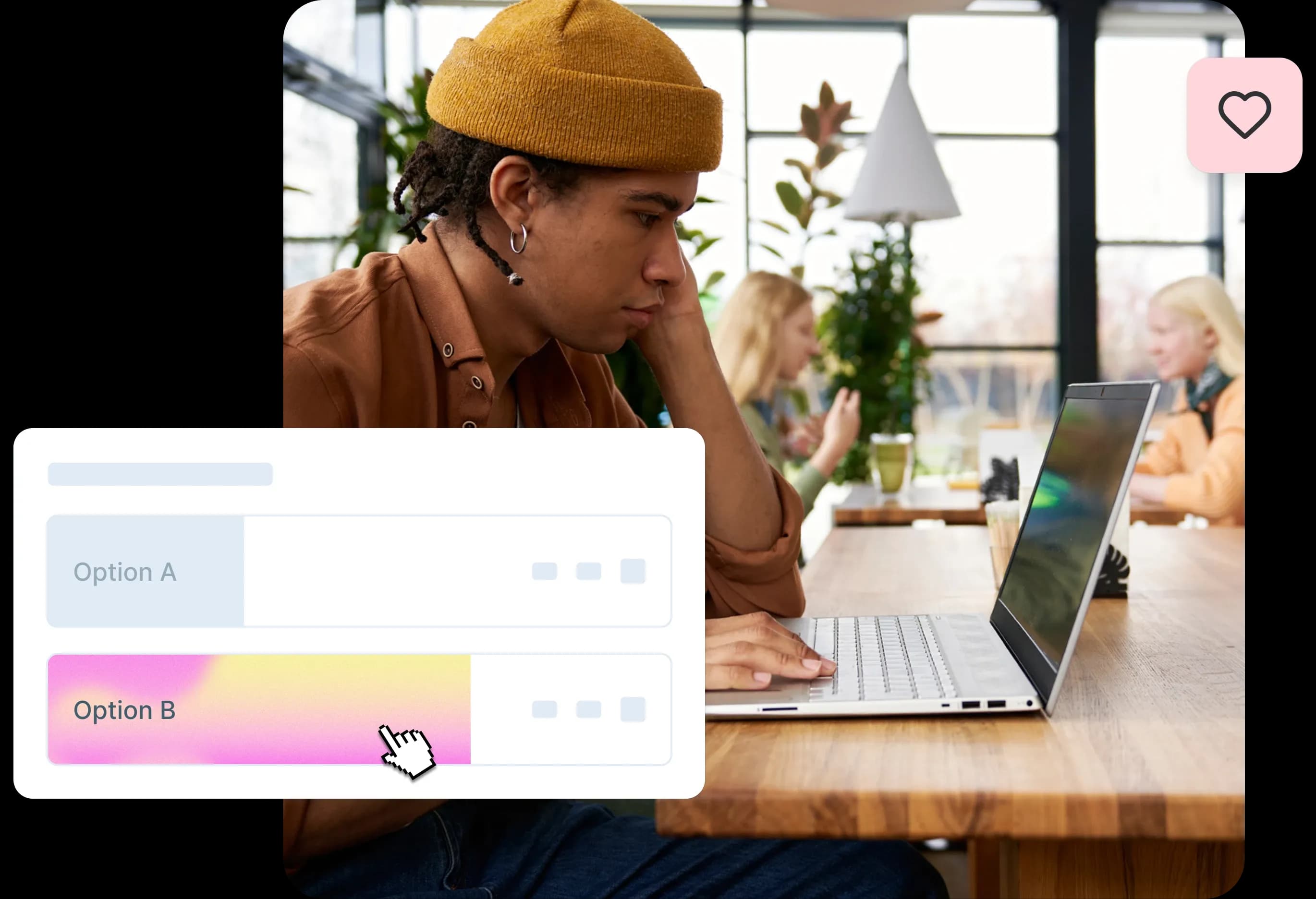
Preference testing
Ask users which icon design they prefer. Preference testing helps you choose between different icon variations by gathering user opinions about visual appeal, clarity, and appropriateness.
When to use preference testing:
Comparing multiple design directions for the same icon
Evaluating different styles (outlined vs. filled, simple vs. detailed)
Testing icon variations across different user segments
Making final decisions between equally functional options
How to conduct preference testing:
Create 2-4 variations of your icon design
Present them to users simultaneously or in sequence
Ask users to select their preferred option
Follow up with questions about why they made their choice
Look for patterns in preferences across different user groups
What preference testing reveals:
Which designs users find most appealing
Reasons behind user preferences
Differences in preference across user segments
Potential concerns or confusion about specific designs
A/B testing
Compare performance of icons in live environments. A/B testing measures how different icons perform in real-world usage by comparing user behavior metrics.
When to use A/B testing:
Testing icons in production environments
Measuring impact on conversion rates or task completion
Comparing established icons with new designs
Validating icon changes with actual usage data
Key metrics to track:
Click-through rates on icon-based buttons
Task completion rates for icon-driven workflows
Time to complete tasks involving the icons
Error rates or confusion indicators
A/B testing considerations:
Requires sufficient traffic for statistical significance
Best for testing functional rather than aesthetic differences
Should run long enough to account for user learning curves
May need to segment results by user experience level
First click testing
Measure whether users click the correct icon for a task. First click testing reveals whether users can successfully identify and select the right icon to begin a task.
When to use first click testing:
Testing navigation icons and menu systems
Validating icon placement and prominence
Measuring icon findability in complex interfaces
Comparing icon performance across different layouts
How to conduct first click testing:
Present users with a realistic interface mockup
Give them a specific task to complete
Track where they click first
Analyze whether first clicks lead to successful task completion
Identify patterns in incorrect first clicks
What first-click testing reveals:
Whether users can find the right icon for their task
Common mistakes or confusion points
How icon placement affects user behavior
The effectiveness of icon grouping and categorization
Five second testing
Show icons briefly and ask users what they recall. Five second testing evaluates immediate icon recognition and memorability by limiting exposure time.
When to use five second testing:
Testing icon clarity and immediate recognition
Evaluating icon distinctiveness in crowded interfaces
Measuring the memorability of new icon designs
Comparing recognition speed between different options
How to conduct five second testing:
Show users an interface or icon set for exactly five seconds
Remove the visual and ask what they remember
Ask specific questions about icon meanings or locations
Analyze which icons were most and least memorable
Look for patterns in what users notice first
What five second testing reveals:
Which icons grab attention immediately
How well icons communicate their meaning at a glance
Whether icons are distinctive enough to be memorable
How visual hierarchy affects icon recognition

Should you test icons in or out of context?
The question of context in icon testing is crucial for gathering meaningful insights. Should you test icons on their own, isolated from the interface, or see how they perform within the design? The answer isn't either/or – it's both. Each approach has unique benefits, together giving you a full picture of your icon's usability.
Out of context
Tests recognition without surrounding elements. Out-of-context testing isolates icons from their interface environment to measure pure recognition and comprehension.
Best for: early-stage design validation
Out-of-context testing works best when you're:
Developing initial icon concepts
Comparing multiple design directions
Testing fundamental recognition and meaning
Evaluating icons before interface integration
Benefits of out-of-context testing:
Pure recognition measurement: No interface elements influence user interpretation
Faster testing: Simpler setup and quicker user sessions
Broader applicability: Results may apply across different interface contexts
Clearer feedback: Users focus solely on the icon without distractions
Example methodology:
Example: Show users a trash can icon by itself and ask, 'What does this mean to you?' If responses vary widely, it's a sign your design needs work.
Start with out-of-context tests, like showing the icon alone and asking questions like: 'What does this icon represent?' 'How do you feel about this design?'
Limitations:
Doesn't account for contextual clues that aid understanding
May not reflect real-world usage scenarios
Can't measure findability or placement effectiveness
Misses interaction with surrounding interface elements
In context
Tests how icons perform within workflows and layouts. In-context testing evaluates icons within their intended interface environment, measuring real-world usability.
Best for: final product testing
In-context testing is essential when you're:
Validating icons in their final interface
Testing complete user workflows
Measuring findability and placement effectiveness
Evaluating icon performance alongside other interface elements
Benefits of in-context testing:
Realistic usage scenarios: Tests how icons actually perform in practice
Workflow validation: Ensures icons work within complete user journeys
Findability measurement: Tests whether users can locate icons when needed
Contextual understanding: Measures how surrounding elements affect icon interpretation
Example methodology:
Example: Place the same trash can icon in your app's toolbar and observe how quickly users can find and use it to delete an item. If they struggle, the issue might not be the icon itself but its placement or visibility.
Ask users to complete specific tasks that involve the icon, such as: 'Can you find and use the delete function in this toolbar?' 'Which icon would you click to save this document?'
What in-context testing reveals:
How icons perform in realistic usage scenarios
Whether placement and prominence are appropriate
How icons interact with surrounding interface elements
Whether contextual clues help or hinder understanding
During testing, focus on gathering actionable feedback. Ask open-ended questions to learn what users think and feel, and observe how they interact with the icons. Sometimes, the way users approach a task can reveal more than their direct feedback.
Putting iconography testing into practice
Testing icons doesn't have to be overwhelming – it's all about starting simple and building from there. By focusing on practical tests, you can refine your designs and ensure they perform well in real-world scenarios.
Step 1 – Define goals
What do you want to measure (recognition, preference, click rate)? Clear goals guide your testing methodology and help you gather actionable insights.
Common icon testing goals:
Recognition goals: Measure whether users understand what icons represent
Can users identify the icon's meaning without context?
How quickly do users recognize the icon's purpose?
Do users interpret the icon consistently?
Performance goals: Evaluate how icons affect user behavior
Do users successfully complete tasks using the icons?
How do icons impact conversion rates or engagement?
Which icon variations perform better in real usage?
Preference goals: Understand user opinions and attitudes
Which icon designs do users prefer and why?
How do different user segments respond to icon variations?
Do icons align with user expectations and brand perception?
Usability goals: Test practical icon implementation
Can users find icons when they need them?
Do icons work effectively across different devices and contexts?
How do icons perform within complete user workflows?
Step 2 – Create variations
Prepare multiple icon designs to compare. Even the best designers don't land on the perfect icon the first time – that's where variations come in. Creating a few quick versions of your design gives you options to test and refine.
Types of variations to consider:
Style variations: Test different visual approaches
Outlined vs. filled versions
Simple vs. detailed designs
Different line weights or corner treatments
Various levels of abstraction
Conceptual variations: Explore different ways to represent the same concept
Different metaphors for the same action
Alternative visual representations
Various levels of literalness vs. abstraction
Contextual variations: Test how icons work in different situations
Different sizes and placements
Various color treatments
Different surrounding contexts
Best practices for creating variations:
Limit yourself to 3-4 variations to avoid overwhelming users
Ensure each variation is genuinely different, not just minor tweaks
Consider both aesthetic and functional differences
Document the reasoning behind each variation for later analysis
Step 3 – Recruit participants
Target the right audience for your product. The effectiveness of your icon testing depends heavily on recruiting participants who represent your actual users.
Participant recruitment considerations:
Demographics: Match your target user demographics
Age ranges that align with your user base
Geographic distribution if cultural differences matter
Professional backgrounds relevant to your product
Technical expertise levels appropriate for your interface
Experience levels: Include users with varying familiarity
First-time users who haven't learned your icon conventions
Experienced users who understand your existing patterns
Users familiar with competitor products
Domain experts who understand industry conventions
Sample sizes: Plan for adequate representation
5-8 participants for qualitative insights and usability issues
30+ participants for quantitative preference data
100+ participants for statistical significance in A/B tests
Consider multiple rounds of testing with smaller groups
Step 4 – Run the test
Choose the appropriate method (preference, A/B, click test). The testing method you choose should align with your goals and the stage of your design process.
Testing execution best practices:
Create realistic scenarios: Present icons in contexts that match real usage
Use actual interface mockups rather than isolated icons
Provide realistic tasks that users would actually perform
Include appropriate surrounding content and interface elements
Ask the right questions: Focus on actionable insights
Open-ended questions: "What do you think this icon means?"
Comparative questions: "Which of these icons would you click to save your work?"
Behavioral questions: "Walk me through how you would complete this task"
Observe user behavior: Pay attention to actions, not just words
Note hesitation or confusion before clicking
Watch for scanning patterns and where users look first
Observe how users interact with icons in sequence
Document everything: Capture both quantitative and qualitative data
Record click patterns and success rates
Note user comments and explanations
Track time to completion and error rates
Save screenshots or recordings for later analysis
Step 5 – Analyze & apply insights
Turn findings into actionable design improvements. The value of icon testing lies not in the data collection, but in how you interpret and apply the insights to improve your designs.
Analysis framework:
Quantitative analysis: Look for patterns in the numbers
Calculate success rates for different icon variations
Measure average time to recognition or task completion
Compare performance across different user segments
Identify statistically significant differences between options
Qualitative analysis: Understand the why behind user behavior
Categorize user feedback themes
Identify common points of confusion or delight
Note unexpected interpretations or use cases
Look for insights that numbers alone can't provide
Synthesis and prioritization: Turn insights into action items
Identify the most critical usability issues to address
Prioritize changes based on impact and effort required
Consider both immediate fixes and longer-term improvements
Plan follow-up testing to validate design changes
Implementation guidelines: Apply insights systematically
Update design specifications based on testing results
Create guidelines for consistent icon usage across your product
Share insights with broader design and development teams
Establish processes for ongoing icon testing and refinement

Testing icon design variations
When evaluating different versions of an icon, systematic comparison helps you understand which design elements contribute to usability and user preference.
Compare minimal vs detailed versions
The balance between simplicity and detail is crucial in icon design. Testing different levels of detail helps you find the sweet spot for your specific context and user needs.
Minimal versions excel when:
Icons need to work at very small sizes
Interface aesthetics favor clean, simple designs
Users are experienced and familiar with conventions
Screen real estate is extremely limited
Detailed versions work better when:
Icons represent complex or unfamiliar concepts
Users need additional visual cues for understanding
Larger display sizes allow for more detail
Brand identity benefits from more distinctive styling
Testing approach:
Create versions of the same icon with varying levels of detail, from very simple geometric shapes to more elaborate representations. Test these across different sizes and contexts to see where each version performs best.
Test color, size, and line thickness
Visual properties significantly impact icon recognition and usability. Systematic testing of these variables helps optimize icon performance across different contexts.
Color considerations:
Test icons in both color and monochrome versions
Evaluate performance with different background colors
Consider accessibility requirements for color contrast
Test how color affects meaning interpretation
Size variations:
Test at the smallest size icons will be used
Evaluate scalability across different screen densities
Consider how size affects recognition speed
Test readability at various viewing distances
Line thickness testing:
Compare thin, medium, and thick line weights
Evaluate how line weight affects clarity at small sizes
Test consistency with overall design system
Consider how line weight impacts brand perception
Ensure style consistency with the overall UI
Icons don't exist in isolation – they're part of a broader design system. Testing how icons fit within your overall interface helps ensure cohesive user experiences.
Consistency factors to test:
Visual harmony with other interface elements
Alignment with established design patterns
Consistency with typography and spacing systems
Integration with color palettes and brand guidelines
Testing methodology:
Present icons within realistic interface contexts rather than in isolation. Ask users about overall visual coherence and whether icons feel like they belong in the interface.
Comparing icon testing results
Understanding how to interpret testing outcomes helps you make informed decisions about icon design and implementation.
Quantitative results
Quantitative usability testing metrics like click rates, success rates, and time to recognition provide measurable insights into icon performance.
Key metrics to track:
Success rates: Percentage of users who correctly identify or use icons
Target: 80%+ success rate for critical functions
Compare rates across different icon variations
Track improvement over multiple testing rounds
Segment results by user experience level
Click-through rates: Percentage of users who interact with icons
Measure engagement with icon-based buttons or links
Compare performance of different icon designs
Track changes over time as users become familiar
Consider context and placement effects
Time to recognition: How quickly users understand icon meaning
Measure from icon exposure to correct identification
Compare speed across different design variations
Look for patterns in faster vs. slower recognition
Consider the impact of user experience and familiarity
Error rates: Frequency of incorrect icon interpretation or usage
Track misclicks and wrong interpretations
Identify common confusion patterns
Measure improvement after design iterations
Focus on errors that lead to significant user problems
Qualitative feedback
User explanations of what they thought the icon meant provide crucial context for quantitative results.
Types of qualitative insights:
Mental models: How users conceptualize icon meanings
What associations users make with icon shapes
How personal experience influences interpretation
Whether icons align with user expectations
Cultural or demographic differences in understanding
Emotional responses: How icons make users feel
Confidence or uncertainty when using icons
Frustration with unclear or confusing designs
Delight with particularly clever or clear representations
Trust and credibility associations
Contextual feedback: How icons work within broader workflows
Whether icons support or hinder task completion
How icons interact with surrounding interface elements
User suggestions for improvement or alternative approaches
Insights about icon placement and prominence
Language and terminology: How users describe icon functions
The words users naturally use to describe icon actions
Whether icon meanings align with user vocabulary
Opportunities to better match user mental models
Cultural or regional differences in terminology
Benchmarking
Compare results across different user segments to understand how icon performance varies among your audience.
Segmentation approaches:
Experience level: Compare novice vs. expert users
New users may need more explicit icons and labels
Experienced users might prefer efficient, minimal designs
Consider onboarding strategies for different experience levels
Track how icon understanding evolves with familiarity
Demographics: Analyze performance across age, location, and background
Age-related differences in icon recognition and preference
Cultural variations in symbol interpretation
Professional background effects on understanding
Geographic differences in design conventions
Device and context: Compare performance across usage scenarios
Mobile vs. desktop icon performance
Different screen sizes and resolutions
Various lighting conditions and environments
Touch vs. mouse interaction differences
Benchmarking best practices:
Establish baseline performance metrics for comparison
Track improvements over time and across design iterations
Compare your icons' performance to industry standards
Use benchmarking data to prioritize design improvements

Testing your icons in context
Effective icons don't happen by chance. They're thoughtfully designed, rigorously tested, and carefully refined to ensure clarity and usability. But here's the crucial part: icons must be tested in the actual context where users will encounter them, not in isolation.
Why contextual testing is crucial before implementation
Testing icons in context reveals how they perform in their natural environment, surrounded by other interface elements, competing for attention, and serving specific user goals. This approach uncovers usability issues that isolated testing simply can't detect.
Say you're designing an app with a heart icon. On its own, it's clear and recognizable as a symbol for 'like' or 'favorite.' But now, place it next to a thumbs-up and a star icon in your interface. Suddenly, users might wonder: 'What's the difference between these actions? Am I liking, favoriting, or rating something?'. Not good.
Testing the icon in context helps reveal if users understand its function or are in danger of misinterpreting it based on its neighbors. This contextual validation is essential because users don't encounter icons in a vacuum—they see them as part of a complete interface where every element influences interpretation.
Validate that icons work in navigation, CTAs, and task flows
Icons serve different purposes across your interface, and each context requires specific validation approaches. Here's how to test icons effectively in their primary use cases:
Navigation icons:
Test whether users can predict where each navigation icon will take them
Validate that icons maintain their meaning across different sections of your product
Ensure icons work effectively in both expanded and collapsed navigation states
Check that icon meanings remain clear when used in breadcrumbs or secondary navigation
Call-to-action (CTA) icons:
Verify that action icons clearly communicate what will happen when clicked
Test whether icons motivate the intended user behavior
Validate that CTA icons stand out appropriately without overwhelming the interface
Ensure icons work effectively with or without accompanying text
Task flow icons:
Test icons within complete user workflows to identify confusion points
Validate that icons support rather than hinder task completion
Check that icon meanings remain consistent throughout multi-step processes
Ensure icons provide appropriate feedback for user actions
As you design and test your icons, keep this question in mind: is it clear what this icon means – without any extra help?
Check whether supporting labels improve or are unnecessary
The relationship between icons and text labels is nuanced. While some icons are universally understood, others benefit significantly from textual support. Testing helps you determine the optimal approach for each icon in your interface.
When to test icons with labels:
New or innovative interface patterns that users haven't encountered before
Abstract concepts that don't have established visual representations
Actions that could be interpreted multiple ways
Icons targeting diverse international audiences
When to test icons without labels:
Well-established symbols like search, home, or settings
Space-constrained interfaces where every pixel matters
Icons that are part of a consistent system users have already learned
Situations where visual clarity is the primary goal
The answer isn't either/or – it's both. Each approach has unique benefits, together giving you a full picture of your icon's usability. Out-of-context testing helps you refine the icon's design; in-context testing ensures it integrates smoothly with the overall interface.
Start with out-of-context tests, like showing the icon alone and asking questions like: 'What does this icon represent?' 'How do you feel about this design?' Then move to contextual testing where users encounter the icon during realistic task scenarios.
Test across devices (mobile vs desktop)
Icon usability can vary dramatically across different devices and screen sizes. What works perfectly on desktop might become illegible on mobile, while touch-friendly mobile icons might feel oversized on desktop interfaces.
Mobile-specific considerations:
Touch target size: Ensure icons meet minimum touch target requirements
Screen real estate: Test whether icons remain recognizable when scaled down for smaller screens
Thumb reach: Validate that frequently-used icons are positioned within comfortable thumb zones
Context switching: Check that icons work effectively when users switch between portrait and landscape orientations
Desktop-specific considerations:
Hover states: Test whether hover interactions provide helpful feedback without being distracting
Cursor precision: Ensure icons work well with precise mouse interactions
Keyboard navigation: Validate that icons are accessible via keyboard navigation
Multi-monitor setups: Check that icons remain visible and functional across different display configurations
Cross-device consistency:
Test whether users can transfer their understanding of icons from one device to another
Validate that icon meanings remain consistent across your responsive design breakpoints
Ensure that device-specific adaptations don't compromise the core icon meaning
Check that icons work effectively in hybrid environments (like tablet apps used with external keyboards)
Take the classic piggy bank – in many places, it's a universal nod to saving money. But what if your audience doesn't associate pigs with finances? Suddenly, that icon goes from 'obvious' to 'Why is there a cartoon animal on my banking page?!'
This is why cross-device testing must also consider cultural context. An icon that works perfectly for your primary market might confuse users in different regions or with different cultural backgrounds.
Creating icons that click with users
Successful icon design isn't about creating the most visually striking symbol – it's about creating clear, functional communication that serves your users' needs. The best icons feel invisible because they work so intuitively that users don't have to think about them.
Keep icons simple and recognizable
Simplicity in icon design isn't about minimalism for its own sake – it's about removing any visual elements that don't contribute to immediate recognition and understanding. Here are five key aspects you should focus on during testing:
1. Findability
Can users locate the icon quickly when they need it? Test whether your icon stands out appropriately in its context without overwhelming other interface elements. Show the icon out of context and ask, 'What does this mean?'
2. Recognizability
Do users immediately understand what the icon represents? This goes beyond aesthetic appeal to functional clarity. Test whether users can identify the icon's purpose within 2-3 seconds of seeing it.
3. Comprehensibility
Can users predict what will happen when they interact with the icon? Ask users to describe the icon's function in their own words. This reveals whether your visual metaphor successfully communicates the intended action or concept.
4. Aesthetic appeal
Does the icon fit harmoniously within your overall design system? While not the primary concern, visual consistency and polish do affect user trust and perceived quality.
5. Contextual fit
Does the icon work effectively within its specific use case and surrounding interface elements? This is where contextual testing becomes crucial—an icon that works beautifully in isolation might fail when placed next to similar symbols.
Always validate assumptions with user testing
Icon designers and product teams often fall into the trap of assuming their visual metaphors are universally understood. What seems obvious to someone who's been working on a product for months might be completely unclear to a first-time user.
Common assumptions that need testing:
"Everyone knows what this symbol means"
"The metaphor is obvious once you think about it"
"Users will learn what it means after using it once"
"It's similar to icons other apps use"
"The context makes the meaning clear"
Effective testing approaches:
Unmoderated usability testing: Let users encounter icons naturally during task completion
First click testing: See where users click when trying to accomplish specific goals
Card sorting: Understand how users categorize and group different icons
Preference testing: Compare different icon options to see which resonates most with your audience
Interviews: Gather qualitative feedback about icon meanings and user mental models
The key is testing with people who match your actual user base, not just colleagues or design-savvy friends. Your target audience's cultural background, technical expertise, and familiarity with your product category all influence how they interpret visual symbols.
Iterate based on data, not intuition
Icon testing often reveals surprising results that challenge design team assumptions. The most successful teams embrace these insights and iterate based on evidence rather than personal preferences or design trends.
Data-driven iteration principles:
Test early and often: Don't wait until icons are finalized to start testing
Measure specific outcomes: Track task completion rates, error rates, and time-to-completion
Look for patterns: Individual user feedback is valuable, but patterns across multiple users reveal systemic issues
Consider context: An icon that tests poorly in isolation might work perfectly in its intended context, and vice versa
Balance quantitative and qualitative data: Numbers tell you what's happening, but user feedback explains why
Common iteration scenarios:
High error rates: Users consistently click the wrong icon or can't find what they need
Slow task completion: Users hesitate or spend too much time interpreting icon meanings
Negative feedback: Users express frustration or confusion about specific icons
Inconsistent interpretation: Different users understand the same icon to mean different things
Cultural misalignment: Icons that work for one user group fail for another
Remember that iteration doesn't always mean starting over. Sometimes small adjustments – like adding a subtle visual cue, adjusting the icon's position, or providing better contextual support – can dramatically improve usability.
The most effective icon testing combines multiple research methods to get a complete picture. Lyssna's platform makes it easy to run unmoderated usability tests, first-click tests, and preference tests to validate your icon choices quickly and efficiently. You can test icons in realistic contexts, gather feedback from your target audience, and iterate based on solid data rather than assumptions.
Start testing your icons today
Ready to ensure your icons click with users? Sign up for a free Lyssna plan and run your first icon test in minutes.

FAQs about icon testing