Five second testing guide
Discover what five second testing is and how it helps measure first impressions of a design. Learn steps, examples, and pros and cons of this usability test.
Five second testing guide: Definition & key considerations
Users form initial impressions of websites within 50 milliseconds – faster than the blink of an eye. This rapid assessment determines whether they'll stay or leave, making first impressions critical for any digital product.
Five second testing helps you understand what users notice and remember in those crucial first moments.
By capturing these immediate reactions, you can validate whether your designs communicate the right message, identify confusing elements, and optimize for better engagement before full development.
This method is essential for UX researchers, product designers, and marketers who need quick, actionable feedback on visual designs.
Whether you're testing a home page layout, evaluating ad creatives, or validating a mobile app interface, five second testing reveals how users perceive your designs at first glance.
Key takeaways
Five second testing captures users' immediate, unfiltered reactions to designs before they have time to overthink.
The method reveals whether your design clearly communicates its purpose, value proposition, and intended actions.
You can test any visual design – websites, app interfaces, prototypes, advertisements, or marketing materials.
Testing takes minutes to complete, making it perfect for rapid iteration and quick validation.
Five to ten participants typically provide enough data to identify major patterns and issues.
Test your designs in seconds
See how users really perceive your designs. Run your first five second test today.
What is five second testing?
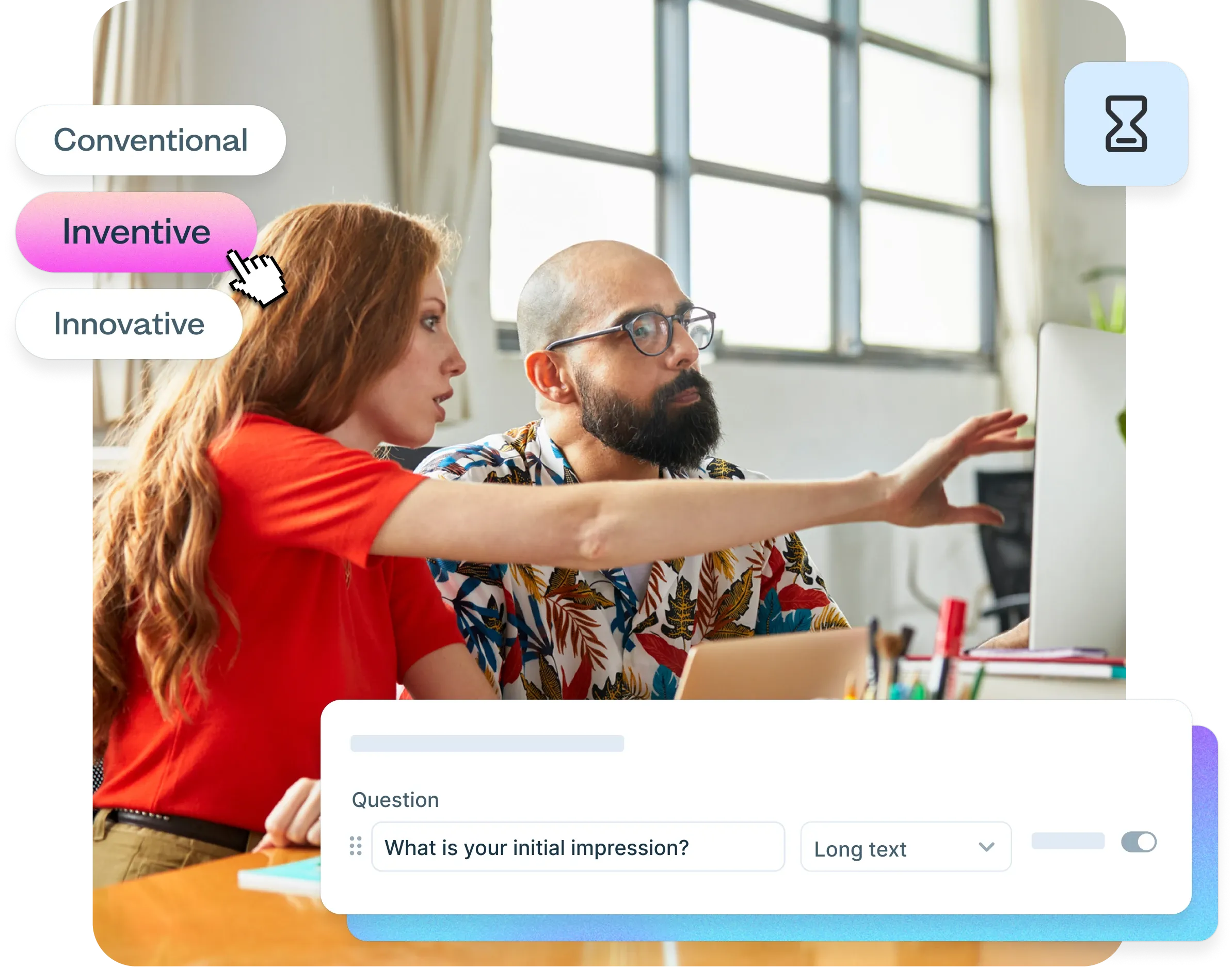
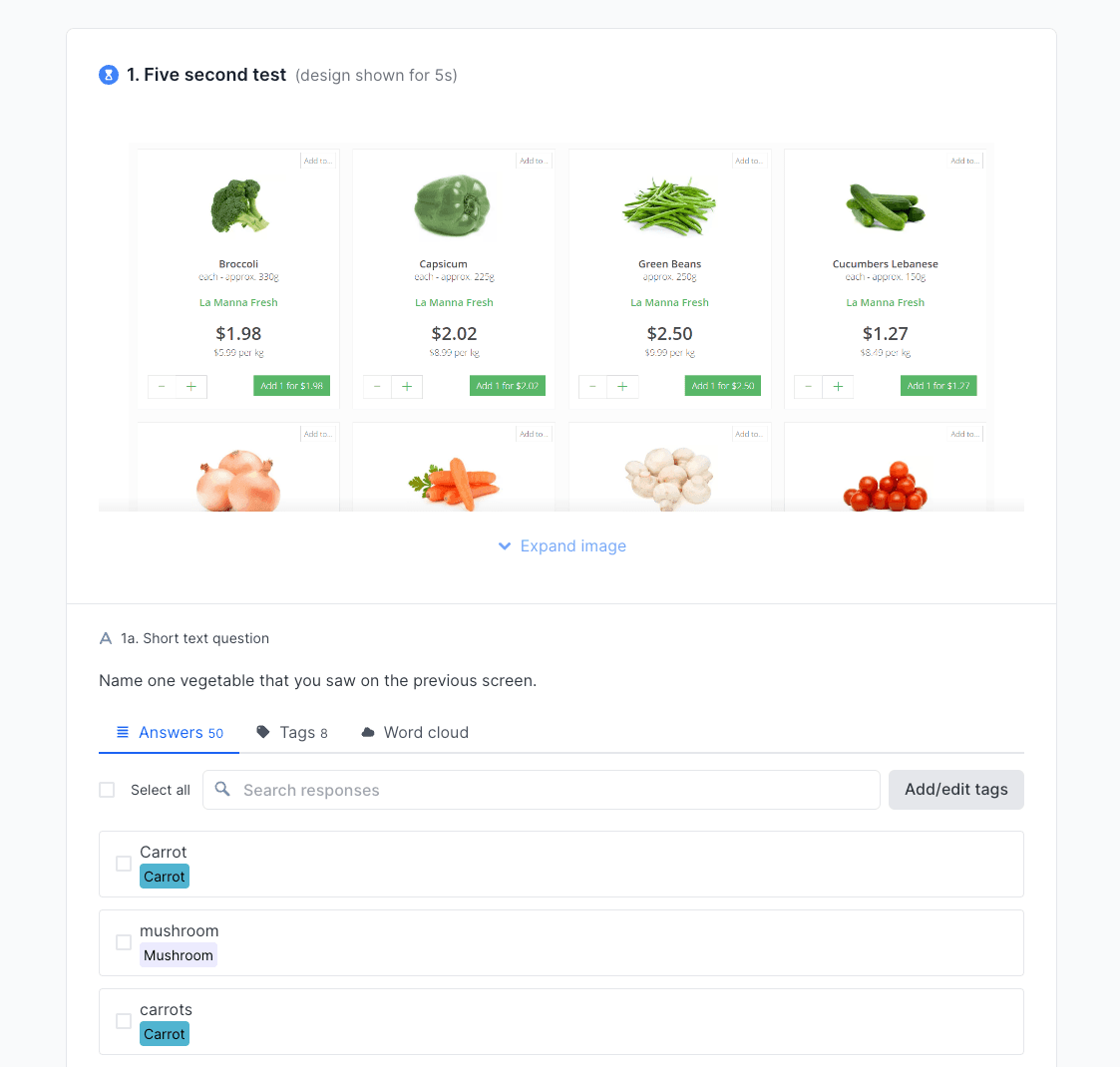
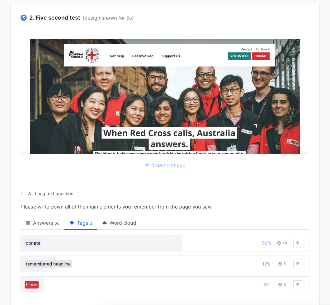
Five second testing is a usability testing method where participants view a design for five seconds (although you can set this to up to 20 seconds in Lyssna), then answer questions about what they remember and understand from that brief exposure. This method captures users' immediate, unfiltered reactions to visual designs before they have time to analyze or overthink their responses.
How it works
Step | What happens |
|---|---|
1. Show | Participants view a design (webpage, app screen, advertisement, etc.) for five seconds |
2. Hide | The design is removed from view |
3. Ask | Participants answer questions about what they remember |
4. Analyze | You identify patterns in how users perceive and understand your design |
The five second timeframe is deliberate – it mirrors how quickly users form initial impressions in real-world scenarios. When users have more than five seconds, they start analyzing designs like a designer would, noticing details they'd normally overlook.
What five second testing reveals
Five second testing serves three primary purposes:
Measure clarity: Does your design clearly communicate its purpose and value proposition?
Assess message recognition: Do users understand what you're offering and who it's for?
Capture first impressions: What immediate reactions and emotions does your design evoke?
You can test any visual design that needs to communicate quickly – websites, app interfaces, prototypes, wireframes, advertisements, or marketing materials.
Why use five second testing?
Five second testing addresses one of the most critical challenges in digital design: capturing and keeping user attention in a competitive online environment. Here's why this method has become essential for design and research teams.
Key benefits at a glance
Benefit | What it means for your team |
|---|---|
Genuine first impressions | Captures users' immediate reactions before they overthink or analyze like a designer would |
Message clarity | Validates whether your value proposition, target audience, and key actions are immediately clear |
Real-world behavior | Mirrors how users actually browse – scanning quickly rather than studying carefully |
Rapid feedback | Completes in minutes instead of days, enabling faster iteration cycles |
Cost-effective | Requires only a design image and simple questions – accessible for any budget |
Captures genuine first impressions
First impressions form almost instantaneously and significantly influence user behavior. This matters because first impressions are difficult to change once formed.
If users immediately perceive your product as confusing, unprofessional, or irrelevant, they're unlikely to explore further – regardless of how good your actual product might be.
Evaluates message clarity and value proposition
Your home page, landing page, or app interface needs to communicate your value proposition clearly and quickly. Five second testing reveals whether users can identify:
What your product or service does
Who it's designed for
What makes it valuable or different
What action they should take next
If users can't answer these questions after five seconds, your design likely needs refinement to improve clarity and focus.

Optimizes for real-world browsing behavior
Five-second testing mirrors how people actually browse the web. Users don't carefully study every element – they scan quickly, looking for relevant information and clear next steps. This method validates whether your design works within these natural browsing patterns.
Provides rapid feedback for iterative design
Unlike comprehensive usability testing, five second testing can be completed in minutes to gather quick design feedback.
This speed makes it perfect for rapid iteration cycles, allowing teams to test multiple design variations quickly and make data-driven decisions about which direction to pursue.
"A full-blown research project can take a lot of time and energy, but you can have meaningful early results from Lyssna in a single day. I think that's one of the best benefits I've seen: faster and better iteration."
Alan Dennis
Product Design Manager at YNAB
Cost-effective validation method
Five second testing requires minimal resources – just a design image and a few simple questions. This makes it accessible for teams with limited budgets or tight timelines who still need user feedback to guide their design decisions.

When to use a five second test
Five second testing is most effective in specific scenarios where immediate visual impact and message clarity are critical. Understanding when to use this method helps teams get maximum value from their research efforts.
Scenario | What to test | Why it works |
|---|---|---|
Early-stage design | Wireframes, mockups, core concepts | Validates messaging before detailed design work begins |
Home page & landing pages | Value proposition, CTAs, brand impression | Tests the first point of contact with your product |
Marketing creative | Ads, hero sections, email headers, social graphics | Evaluates materials designed for quick attention |
Comparative testing | Multiple design options, A/B variants | Provides clear data on which version communicates better |
Mobile interfaces | Screen layouts, navigation, CTAs | Validates clarity on smaller screens with shorter attention spans |
Early-stage design validation
Use five second testing during the early phases of design development to validate core concepts and messaging before investing in detailed design work. This helps teams:
Test initial wireframes or mockups to ensure the basic layout communicates effectively
Validate that key messages are prominent and understandable
Identify major usability issues before they become expensive to fix
Compare different design directions to choose the most effective approach
Home page and landing page optimization
Home pages and landing pages are prime candidates for five second testing because they often serve as the first point of contact between users and your product. Test these pages to ensure:
Your value proposition is immediately clear
Users understand what you offer and who it's for
Key calls-to-action are noticeable and compelling
The overall design creates the right first impression for your brand
Marketing creative evaluation
Five second testing works exceptionally well for evaluating marketing materials that need to capture attention quickly:
Advertisement creatives: Test whether ads communicate their message effectively in the brief moment users see them, similar to how you'd evaluate landing page first impressions
Hero sections: Validate that the top portion of your webpage makes the right impression
Email headers: Ensure email designs grab attention in crowded inboxes
Social media graphics: Test whether visual content communicates effectively in social feeds
Comparative design testing
When you have multiple design options and need to choose the most effective one, five second testing provides clear data about which version communicates better. This is particularly useful for:
A/B testing different home page layouts
Comparing various call-to-action button designs
Evaluating different color schemes or visual hierarchies
Testing alternative messaging approaches
Mobile interface validation
Mobile interfaces require especially clear communication due to smaller screen sizes and shorter attention spans. Five second testing helps validate:
Whether key information is visible and readable on mobile devices
If navigation elements are immediately recognizable
Whether calls-to-action stand out effectively on smaller screens

When not to use five second testing
Five second testing isn't suitable for every situation. Consider other methods when you need to:
If you need to... | Use this instead |
|---|---|
Test pages that require careful reading | Design survey |
Predict user behavior and navigation paths | First click test or prototype test |
Ask complex questions about functionality | Design survey or usability test |
How to run a five second test (step by step)
Running an effective five second test requires careful planning and execution to ensure you gather meaningful, actionable insights. Here's a detailed walkthrough of the process – and check out the interactive demo below for a step-by-step using Lyssna.
Step 1: Choose the design to test
Start by selecting the specific design element you want to evaluate. The key is choosing something that needs to communicate effectively within a brief viewing period.
What you can test
Design type | Examples |
|---|---|
Landing pages | Homepage designs, product pages, campaign-specific landing pages |
App screens | Onboarding flows, dashboard layouts, key feature interfaces |
Marketing materials | Advertisement creatives, email headers, social media graphics |
Prototypes | Early-stage design concepts, wireframes |
Print materials | Brochures, flyers, poster designs |
Design preparation tips:
Use high-resolution images that display clearly on different devices
Ensure the design represents the actual user experience with realistic content, not placeholder text
Test designs at the size and format users will actually encounter them
Consider testing both desktop and mobile versions if your design is responsive
Pro tip: Take a screenshot or export your design as a static image. Avoid showing interactive prototypes or live websites, as these can distract from the first impression test.
Step 2: Recruit participants
The quality of your participants directly impacts the value of your insights. While you don't need large sample sizes for five second testing, you do need to recruit the right people.
Participant guidelines
Consideration | Recommendation |
|---|---|
Target audience | Recruit people who match your actual user demographics for the most relevant feedback |
Sample size | 5-10 participants typically provide sufficient data to identify major patterns |
Screening criteria | Consider basic demographics, experience level, or product familiarity based on your testing goals |
General users | For broad first-impression testing, general internet users can provide valuable insights |
Recruitment options:
Internal recruitment: Use your existing customer base or email list for highly relevant feedback
Research panels: Platforms like Lyssna's research panel provide access to diverse, pre-screened participants
Social networks: Recruit through professional networks or social media for quick, informal testing
Friends and colleagues: Useful for initial validation, though less representative of your actual audience
Pro tip: For landing pages and marketing materials, recruiting from your target audience is critical. For testing general usability or visual hierarchy, broader audiences work well.
Step 3: Show the design for 5 seconds
Precise timing control is essential for valid results. The five second exposure must be consistent across all participants to ensure comparable data.
Technical setup
Use testing platforms: Tools like Lyssna automatically control exposure time and transition to questions during unmoderated tests
Manual timing: If conducting in-person moderated tests, use a stopwatch and practice the timing beforehand
Clear instructions: Tell participants they'll see a design briefly and should pay attention to their immediate impressions
Best practices for the exposure phase:
Ensure participants are focused and ready before showing the design
Use a neutral lead-in (avoid priming participants with hints about what to look for)
Display the design at appropriate size and resolution for the intended viewing context
Transition immediately to questions without allowing additional viewing time
Pro tip: Don't tell participants what questions you'll ask after the five seconds. This ensures you capture genuine first impressions rather than directed attention.
Step 4: Ask recall questions
The questions you ask determine the insights you'll gain. Focus on open-ended questions that reveal what users naturally noticed and remembered.
Essential question types
Question category | Examples |
|---|---|
Core comprehension | "What was this page about?" "What product or service was being offered?" "Who do you think this is designed for?" |
Visual hierarchy | "What elements stood out most?" "What did you notice first?" "What colors, images, or text do you remember?" |
Clarity and confusion | "Was anything unclear or confusing?" "What questions would you have after seeing this?" |
Emotional response | "What was your overall impression?" "How did this design make you feel?" "Would you be interested in learning more?" |
Question design best practices:
Keep questions simple and focused on one concept each
Use neutral language that doesn't lead participants toward specific answers
Ask open-ended questions first, then follow up with specific clarifications if needed
Limit the total number of questions to prevent participant fatigue (5-8 questions maximum)
Pro tip: Start with the most important question first – typically "What was this page about?" or "What do you remember most?" This captures the strongest immediate impressions before participants start analyzing.
Step 5: Collect and analyze responses
The analysis phase transforms individual participant responses into actionable design insights. Look for patterns that reveal how effectively your design communicates.
What to look for in your analysis
Analysis focus | What to examine |
|---|---|
Consistency in recall | What elements did most participants remember? Which messages came through clearly? |
Unclear elements | What did participants misunderstand or misinterpret? Which design elements caused confusion? |
Pattern recognition | Do participants who "missed the point" converge on similar misinterpretations? |
Success benchmark | Did more than 80% of participants understand the main message? |
Interpreting your results
If more than around 80% of participants understand your main message, you've got a successful design. If this number is much lower, some changes are likely necessary.
Sometimes, participants who missed the point will converge on similar ideas or themes. This is a clear indication that there's a red herring in your design throwing people off. These patterns often reveal specific design elements that need adjustment or removal.
Documentation and next steps:
Summarize key findings and patterns in your responses
Identify specific design elements that need improvement
Prioritize changes based on frequency and severity of issues
Plan follow-up testing to validate design improvements
Pro tip: Use Lyssna's word cloud feature to visualize common themes in open-ended responses. This helps you quickly spot what participants remember most and identify unexpected patterns.
Learn more: Analyzing test results in Lyssna
Five second test examples
Real-world examples help illustrate how five second testing works in practice and the types of insights it can reveal. Here are three scenarios using Lyssna's testing templates:
Example 1: Testing a home page design
Scenario: A SaaS company wants to ensure their home page captures attention and communicates their value proposition within the first five seconds.
Test setup:
Element | Details |
|---|---|
Design tested | Homepage hero section with headline, key benefits, and CTA button |
Participants | 8 small business owners from Lyssna's research panel |
Template used | Home page design test template |
Key questions | What does this company offer? Who is this product for? What stood out most? |
Results and insights:
6 out of 8 participants correctly identified the product category
3 participants mentioned "team collaboration" without prompting
2 participants were unclear about pricing structure
All participants noticed the call-to-action button
Action taken: The team clarified pricing information in the hero section and strengthened language around team collaboration benefits.
"The speed and the size of the panel are impressive. To do research studies in under 24 hours is pretty remarkable."
Pavel Semenov
Head of Research
Example 2: Evaluating marketing campaign creatives
Scenario: An ecommerce brand needs to choose between two ad designs for their holiday campaign before investing in paid media.
Test setup:
Element | Details |
|---|---|
Design A | Product image with "50% Off Holiday Sale" text overlay |
Design B | Lifestyle image showing product in use with "Holiday Savings Inside" text |
Participants | 10 target customers matching their demographic |
Template used | Marketing campaign concept test template |
Key questions | What is being advertised? What would you expect if you clicked? How did this make you feel? |
Results and insights:
Design A: 9/10 participants correctly identified the discount offer and had specific expectations about savings
Design B: 6/10 participants mentioned the product, but only 3 understood there was a sale
Design B created more emotional connection but less clarity about the offer
Participants recalled the "50%" number from Design A more than any element from Design B
Action taken: The team chose Design A for the promotion to maximize conversion potential, but incorporated lifestyle elements from Design B in future brand campaigns.
Example 3: Gathering quick design feedback
Scenario: A fitness app team wants to test whether their onboarding screen's call-to-action is noticeable and the key benefits are clear.
Test setup:
Element | Details |
|---|---|
Design tested | App onboarding screen with workout images, app benefits, and "Start Your Journey" button |
Participants | Fitness enthusiasts who regularly use mobile apps |
Template used | Gather quick design feedback test template |
Key questions | What would you do next on this screen? What design elements stood out? What do you remember? |
Results and insights:
5 participants immediately mentioned the call-to-action button
4 participants correctly identified this as a fitness/workout app
2 participants were distracted by background images and missed the button entirely
Most participants found the "Start Your Journey" language motivating and clear
Action taken: The team simplified the background imagery to reduce visual competition and make the CTA more prominent, while keeping the motivational language that tested well.
"The ease and flexibility of Lyssna has enabled us to run some pretty complex testing campaigns and it's handled it all brilliantly. There's very little that we haven't been able to do."
Chris Taylor
Lead Experience Designer
Pros and cons of five second testing
Like any research method, five second testing has specific strengths and limitations. Understanding these helps teams use the method appropriately and set realistic expectations for results.
Pros | Cons |
|---|---|
Quick and efficient – Results in minutes, not days | Limited depth – Doesn't reveal why users react certain ways |
Low cost – Minimal resources required to run tests | No task completion data – Can't measure actual usability |
Captures genuine reactions – Users can't overthink responses | Surface-level insights – May miss complex interaction patterns |
Scalable online – Easy to test with remote participants | Context limitations – Doesn't account for real browsing context |
Comparative testing – Great for A/B testing design options | Recall bias – Users may not remember everything they noticed |
Advantages in detail
Speed and efficiency: Five second testing can be completed in under an hour from setup to results. This rapid turnaround makes it perfect for fast-paced development cycles where teams need quick validation before moving forward.
Authentic user reactions: Because participants can't study the design extensively, their responses reflect genuine first impressions rather than analytical feedback. This authenticity is valuable for understanding real-world user behavior.
Cost-effective validation: The method requires minimal investment in time, tools, or participant incentives, making it accessible for teams with limited research budgets.
Flexible implementation: Five-second testing works well for both moderated and unmoderated testing scenarios, and can be conducted in-person or remotely.
Limitations to consider
Shallow insights: While five second testing reveals what users notice, it doesn't explain the underlying reasons for their reactions or how they might behave in real-world scenarios.
No behavioral data: The method can't measure task completion rates, error rates, or other usability metrics that require interaction with the design.
Limited context: Participants view designs in isolation, without the context of how they arrived at the page or what they're trying to accomplish.
Recall limitations: Users may not remember everything they noticed during the five second exposure, potentially missing important but subtle design elements.
Best used alongside other methods
Five second testing works best as part of a comprehensive research strategy. Combine it with:
Usability testing to understand how users interact with your design over time
User interviews to explore the reasoning behind user reactions
Card sorting to validate information architecture decisions
Analytics data to understand real-world user behavior patterns
Pro tip: Use five second testing early in your design process to validate first impressions, then follow up with usability testing or prototype testing to evaluate actual interaction and task completion.
Best practices for five second testing
Following established best practices ensures your five second testing provides reliable, actionable insights that can guide design decisions effectively.
Keep questions simple and focused
Design questions that are easy to understand and answer quickly. Participants have just seen a design for five seconds, so complex or multi-part questions will frustrate them and reduce response quality.
Effective question characteristics:
Single concept focus: Ask about one thing at a time
Clear language: Use simple, everyday words rather than technical jargon
Open-ended format: Allow participants to respond in their own words
Logical sequence: Start with broad impressions, then get more specific
Example of good vs poor questions
✅ Good | ❌ Poor |
|---|---|
"What was this page about?" | "What was this page about and how did the visual hierarchy guide your attention to the primary value proposition?" |
"What stood out most to you?" | "Did the hero image, headline, and call-to-action button work together to create a cohesive visual narrative?" |
Pro tip: If you find yourself using "and" in a question, split it into two separate questions instead.
Use neutral phrasing to avoid bias
The way you phrase questions can significantly influence participant responses. Neutral language ensures you capture genuine user perceptions rather than responses shaped by leading questions and your expectations.
Bias-free question techniques:
Avoid suggesting specific answers or outcomes
Don't use your company's internal language or terminology
Ask what participants noticed rather than whether they noticed specific elements
Let participants describe their experience in their own words
Example of neutral vs leading questions
✅ Neutral | ❌ Leading |
|---|---|
"What elements stood out to you?" | "Did you notice our prominent call-to-action button?" |
"What was your impression of the design?" | "Did you find the design modern and professional?" |
"What do you remember about the colors?" | "Wasn't the blue color scheme eye-catching?" |
Run multiple tests for consistency
Single tests can be influenced by participant variability, technical issues, or other factors. Running multiple rounds of testing helps validate your findings and builds confidence in your results.
Testing iteration strategies:
Test the same design with different participant groups to confirm patterns
Make incremental design changes and retest to measure improvement
Test at different times of day or week to account for participant state variations
Compare results across different demographic segments if relevant
Pro tip: If you're seeing inconsistent results across participant groups, it may indicate that your design communicates differently to different audiences – a valuable insight in itself.
Combine with complementary research methods
Five second testing provides valuable but limited insights. Enhance your understanding by pairing it with complementary research methods.
Effective method combinations
Combination | What you learn |
|---|---|
Five second test + Preference test | First validate that designs communicate clearly, then test which version users prefer |
Five second test + Usability test | Understand first impressions, then observe how users actually interact with the design |
Five second test + User interviews | Capture immediate reactions, then explore the reasoning behind user responses |
Five second test + First click test | Confirm message clarity, then validate that users know where to click next |
Document and share findings effectively
Transform your test results into actionable recommendations that design and development teams can implement.
Create clear documentation:
Summarize key patterns rather than individual responses
Highlight specific design elements that need attention
Provide clear next steps based on your findings
Include participant quotes that illustrate important points
Create visual summaries that stakeholders can quickly understand
Sample findings structure:
Section | What to include |
|---|---|
Executive summary | Top 3-5 key findings in one sentence each |
Success metrics | Percentage of participants who understood main message |
Problem areas | Specific design elements causing confusion with examples |
Participant quotes | 2-3 memorable quotes that capture key insights |
Recommendations | Prioritized list of changes with rationale |
Pro tip: Share results within 24 hours of completing your test while insights are fresh. Quick turnaround keeps momentum going and helps teams act on feedback faster.
Ready to get started?
Check out this step-by-step video guide to running a five second test in Lyssna.
FAQs about five second testing
Ready to capture first impressions?
Start testing with Lyssna's five second test feature. Sign up for free and validate your designs with real users in minutes.