First click testing guide
Learn what first click testing is, how to run it, and why it matters for UX. See examples, pros and cons, and best practices for navigation usability testing.
Share on:


First click testing guide
First click testing evaluates whether users know where to click first to complete a task – and predicts overall task success. This simple yet powerful usability method reveals critical insights about navigation clarity, information architecture, and user behavior that can make or break your product's user experience.
One of the most influential studies in usability research, conducted by Bob Bailey and Cari Wolfson, demonstrated the profound impact of that initial click. Their findings showed that when users get their first click right, they have an 87% chance of completing their task successfully, compared to just 46% when the first click is wrong.
This dramatic difference underscores why first click testing has become an essential tool for UX researchers, product designers, and anyone responsible for creating intuitive digital experiences.
Whether you're validating a new navigation structure, testing icon clarity, or optimizing conversion funnels, first click testing provides the rapid, actionable insights needed to create experiences that work the way users expect.
This guide covers everything you need to know about first click testing: what it is, when to use it, how to run effective tests, real-world examples, pros and cons to consider, and best practices for reliable results.
Key takeaways
First click testing reveals whether users instinctively know where to click to complete a task.
The method works at any stage, from early wireframes to live websites, making it ideal for rapid validation and iteration.
Testing can be completed quickly, with 15-30 participants typically providing reliable feedback about navigation effectiveness.
Results pinpoint specific usability issues like confusing labels, visual hierarchy problems, and mismatched information architecture.
First click optimization directly impacts business metrics, from conversion rates to support ticket reduction

What is first click testing?
First click testing is a usability method that measures where users first click when trying to complete a specific task.
Unlike comprehensive usability testing that tracks entire user journeys, first click testing focuses specifically on that crucial initial interaction – the moment when users decide where to begin their task.
The method works by presenting users with a specific goal or task, then tracking exactly where they click first on an interface. This could be a website homepage, mobile app screen, prototype, or even a simple wireframe. The key lies in understanding whether users' instinctive first choice aligns with the optimal path to task completion.
Web analytics packages can tell you where users clicked, but not what they were trying to achieve. First click testing allows you to ask users to carry out a specific task, letting you isolate and investigate user behavior around each different scenario separately.
Our demo video below goes into more detail about what first click testing is and how you can run a test in Lyssna.
The first click principle
The fundamental principle behind first click testing is remarkably straightforward: the first click strongly predicts success rate and user confidence. When users make the correct first click, they're significantly more likely to complete their task successfully. Conversely, an incorrect first click often leads to confusion, frustration, and task abandonment.
This principle holds true because the first click represents users' mental model of how information should be organized. When their expectations align with your interface design, they feel confident and continue with purpose. When expectations don't match reality, users begin second-guessing themselves and may never recover their initial momentum.
The psychological impact extends beyond mere task completion. Users who struggle with their first click often experience cognitive load that affects their perception of the entire product. They may perceive the interface as more complex than it actually is, leading to decreased satisfaction and increased likelihood of abandonment – even if they eventually find what they're looking for.
How first click testing compares
First click testing occupies a unique position in the usability testing landscape. While traditional usability testing observes complete task flows and five second testing measures immediate impressions, first click testing bridges these approaches by focusing on the critical decision point that determines task trajectory.
Method | Focus | Time to results | Best for | Typical sample size |
|---|---|---|---|---|
First click testing | Initial navigation decision | 1-2 hours | Validating IA and navigation | 15-30 users |
Five-second testing | First impressions | 30 minutes | Brand and message clarity | 20-50 users |
Full usability testing | Complete user journey | 2-3 days | End-to-end flow optimization | 5-8 users |
A/B testing | Conversion metrics | 1-2 weeks | Data-driven iterations | 100+ users |
Tree testing | Information architecture | 2-4 hours | Menu structure validation | 30-50 users |
First click accuracy determines user success
First click accuracy often determines whether users succeed or fail at their intended tasks. When users can immediately identify the correct starting point for their journey, they approach subsequent steps with confidence and clarity. This positive momentum carries through the entire experience, leading to higher completion rates and user satisfaction.
Consider an ecommerce scenario: If users trying to track an order can immediately spot "Order Status" in your navigation, they're likely to complete their task successfully.
The confidence gained from that correct first click creates a positive feedback loop – users trust the interface and continue navigating with purpose.
However, if they first click on "My Account" because the tracking option isn't clearly visible, they may become frustrated navigating through account pages, second-guessing their choices at each step, and ultimately abandoning their search.
Research consistently shows this pattern across different types of interfaces and user tasks. Users who start on the right path maintain their momentum, while those who begin incorrectly often never recover – even when the correct option is just one click away.
Identifying confusing layouts and terminology
First click testing excels at revealing specific usability issues that other methods might miss. By observing where users click first when attempting to complete a task, you can pinpoint exactly which elements are misleading or overlooked.
The table below outlines the five most common problems uncovered through first click testing:
Usability issue | Description and example |
|---|---|
Ambiguous navigation labels | Terms clear to your team may confuse users lacking insider knowledge. Example: "Resources" could mean documentation, downloads, support articles, or company information depending on context. |
Visual hierarchy problems | Important elements lacking visual prominence often go unnoticed, even when technically visible. Users naturally gravitate toward elements with stronger visual weight, regardless of actual importance. |
Icon confusion | Symbols that seem universal to designers may be incomprehensible to users. Example: The hamburger menu still confuses many users despite widespread adoption. |
Information architecture mismatches | When site structure doesn't align with user mental models, even clearly labeled navigation becomes problematic. Example: Users might look for "Pricing" under "Products" while you've placed it under "Solutions." |
Competing visual elements | When multiple elements compete for attention, users become paralyzed by choice or click on visually dominant but incorrect options. |
Among these issues, visual hierarchy problems are particularly subtle because they create "functionally invisible" elements – buttons or links that are technically present but go completely unnoticed by users. Similarly, information architecture mismatches can persist even after you've improved your labeling, since the underlying structure doesn't match how users think about your product or service.
The good news? Ambiguous navigation labels and icon confusion are typically the quickest wins, often requiring nothing more than clearer wording or supplementary text labels.
Business impact of first click optimization
The business implications of first click optimization extend well beyond user experience metrics. When users can quickly find what they're looking for, conversion rates improve, support tickets decrease, and customer satisfaction scores rise.
For SaaS products, clear first click paths reduce onboarding friction and increase feature adoption. New users who can immediately find core features are more likely to experience the product's value and convert from trial to paid accounts. Existing users who can easily navigate to advanced features increase their engagement and reduce churn.
For ecommerce sites, intuitive navigation directly impacts sales conversion. Every incorrect first click represents potential revenue lost to frustration. Website builder BaseKit increased conversions by 25% after redesigning its plans and pricing page to be clearer and more intuitive. Meanwhile, Walmart Canada's responsive redesign resulted in mobile orders increasing by 98% and overall conversions across all devices increasing by 20%.
For content sites, easy navigation keeps users engaged and reduces bounce rates. Publishers who optimize their first click paths see increased page views per session and longer time on site, which are key metrics for advertising revenue.
For support costs, better navigation means fewer confused users contacting support. Buffer recorded a 26% reduction in ticket submissions just 5 months after redesigning their help center with improved navigation. Similarly, companies implementing comprehensive knowledge base improvements typically see 25-40% reductions in support tickets within six months.

When to use first click testing
First click testing proves most valuable at specific points in the design and product development process where navigation decisions have the greatest impact on user experience and business outcomes.
Early design stage validation
First click tests can be run using screenshots, sketches, wireframes, prototypes, and mock-ups, giving you the freedom to test from very early on in the design process, all the way through to the final designs and live interfaces.
During the early design stage, first click testing helps validate information architecture decisions before significant development resources are invested. Testing wireframes and prototypes allows teams to identify navigation issues when changes are still relatively inexpensive to implement.
As Ross S. from a design team notes: "The ability to launch and get results for preference tests, first click tests, or simple design surveys by EOD has been amazing not only in assisting our design team, but it promotes buy-in for research in general."
Key use cases for early-stage first click testing
Use case | What to test | Why it matters |
|---|---|---|
Information architecture validation | Whether users can find key content categories | Prevents costly restructuring later in development by validating navigation structure early |
Navigation menu optimization | Different organizational approaches (e.g., Should "Billing" live under "Account" or as a top-level item?) | Identifies which structure best matches user mental models before committing to development |
Landing page effectiveness | Whether key entry points guide users correctly from the start | A landing page that fails the first click test will struggle to convert visitors regardless of content quality |
Mobile navigation patterns | Touch-friendly navigation on smaller screens | Mobile users have even less patience for navigation confusion than desktop users |
By catching these issues at the wireframe stage, teams can iterate quickly and avoid expensive redesigns after launch. The key is testing early and testing often. Each round of feedback makes your final product more intuitive.
Pre-launch optimization
Before launching new navigation menus or information architectures, first click testing provides crucial validation that your design decisions will work in practice. This is especially important for major redesigns or new product launches where user familiarity can't be assumed.
Pre-launch testing scenarios
Scenario | What to test | Why it matters |
|---|---|---|
Website redesigns | Whether new organization makes sense to both existing and new users | When navigation structures change significantly, even returning users become newcomers |
New product features | Whether users can discover and access new functionality | The best features fail if users can't find them |
Mobile app launches | Touch interactions and gesture-based navigation feel natural | Mobile users expect immediate, intuitive interaction with no learning curve |
International expansion | Navigation with users from different cultural backgrounds | Navigation conventions and mental models vary significantly across regions |
Post-launch optimization
Post-launch first click testing helps optimize existing flows like checkout, signup, and onboarding processes. This ongoing optimization approach allows teams to continuously improve user experience based on real user behavior and changing expectations.
Post-launch optimization focus areas
Focus area | What to identify | Business impact |
|---|---|---|
Conversion funnel improvements | Where users get stuck in critical flows | A confusing first click in checkout can tank conversion rates |
Feature adoption | Why users aren't discovering or using key functionality | Features often fail not because they're poorly designed but because they're poorly positioned |
Support ticket reduction | Most common navigation confusion points driving support contacts | Every improved first click means fewer frustrated users seeking help |
Seasonal optimization | How to adapt navigation for changing user needs throughout the year | Holiday shoppers have different navigation needs than back-to-school browsers |
When running first click tests on a new design, it's essential to also test the original design. This not only gives you an idea of which elements you could improve but also gives you a benchmark so you can measure and verify improvements in the new design.
Pro tip: Always test your current design alongside new versions. You might discover your "improvement" actually performs worse than what you already have. A 60% success rate might seem low until you realize your current design only achieves 40%.

How to run a first click test (Step by step)
Running an effective first click test requires careful planning and execution across five key steps. Each step builds on the previous one to ensure you gather meaningful, actionable insights about user behavior and navigation effectiveness.
Step | Action | Key deliverable | Time required | Pro tip |
|---|---|---|---|---|
1. Define task | Create realistic user goal | Clear task scenario | 15-30 min | Test internally first – if your team struggles to understand it, users will too |
2. Choose interface | Select test asset | Wireframe to live site | 5-15 min | Start low-fidelity to test IA without visual bias |
3. Recruit users | Find 15-30 participants | Target audience mix | 1-3 days | Include both new and experienced users for complete insights |
4. Observe clicks | Record interaction data | Click coordinates and time | 1-2 hours | Watch for "rage clicks" – rapid clicking reveals frustration |
5. Analyze results | Create heatmaps and metrics | Success rates and patterns | 2-4 hours | Compare against competitors for benchmarking insight |
Step 1: Define the task
The foundation of successful first click testing lies in crafting clear, realistic tasks that reflect genuine user goals. Your task definition should be specific enough to have a clear correct answer, yet natural enough to mirror how users actually think about their objectives.
Effective task characteristics:
Goal-oriented: Focus on what users want to accomplish, not how.
Realistic: Reflect actual user scenarios and motivations.
Specific: Clear enough that success can be objectively measured.
Unbiased: Avoid language that hints at the correct answer.
Example task: "Find shipping information for your order"
This task works well because it represents a common user goal, uses natural language that users would recognize, and has a clear correct answer without revealing the solution path.
Tasks to avoid:
"Click on the shipping link" (too leading)
"Find information" (too vague)
"Navigate to the order tracking section" (uses interface language)
Pro tip: Write 3-5 variations of each task and test them internally. If team members interpret them differently, refine until meaning is consistent.
Step 2: Choose the prototype or interface
First click testing's flexibility allows you to test various interface types, from early sketches to fully functional websites. Your choice depends on your testing goals, development stage, and available resources.
Interface options include:
Sketches and wireframes: Ideal for early concept validation when you want to test structure without visual design influence.
Interactive prototypes: Best for testing realistic user flows and interaction patterns.
Live websites: Perfect for optimizing existing experiences with real functionality.
Mobile screenshots: Essential for testing touch interactions and mobile-specific patterns.
Competitor interfaces: Useful for benchmarking and identifying industry conventions.
Selection considerations:
Fidelity level: Higher fidelity provides more realistic results but requires more development time.
Interactive elements: Ensure clickable areas match your final implementation plans.
Visual hierarchy: Even low-fidelity designs should represent relative visual importance.
Device context: Test on devices that match your target user environment.
Step 3: Recruit participants
Targeted participant recruitment is preferred for first click testing because navigation expectations vary significantly across different user groups. The participants you choose directly impact the relevance and applicability of your results.
Recruitment strategies:
User research panels: Access diverse, pre-screened participants quickly.
Customer databases: Test with existing users who understand your domain.
Social media outreach: Cost-effective for broad demographic targeting.
Professional networks: Valuable for B2B product testing.
Participant considerations:
Sample size: 15-30 participants typically provide reliable insights.
Demographics: Match your actual user base in key characteristics.
Experience level: Include both newcomers and experienced users.
Device usage: Ensure participants use devices similar to your audience.
Pro tip: Segment your results by user type. New users might need different navigation than power users, and both perspectives matter.
Step 4: Observe the first click
Recording click location and time to action provides the core data for first click analysis. Modern testing platforms make this process straightforward, but understanding what to observe ensures you capture meaningful insights.
Key observations:
Click coordinates: Exact pixel location of the first click.
Time to first click: How long users hesitate before clicking.
Click accuracy: Whether the first click leads toward task completion.
User behavior patterns: Common paths and decision-making approaches.
Confidence indicators: Speed and decisiveness of clicks.
Data collection best practices:
Screen recording: Capture the full interaction for qualitative analysis.
Think-aloud protocols: Understand reasoning behind click choices.
Multiple tasks: Test several scenarios to identify patterns.
Device tracking: Note differences between desktop and mobile.
Pro tip: The "3-second rule" – if users take more than 3 seconds to click, you have a findability problem, even if they eventually click correctly.
Step 5: Analyze results
Analyzing first click testing results involves both quantitative metrics and qualitative insights. The combination provides a complete picture of user behavior and clear direction for interface improvements.
Key metrics:
Percentage of correct first clicks: Your primary success indicator.
Average time to first click: Measures user confidence and clarity.
Click distribution: Shows where users actually click vs intended targets.
Task completion correlation: Links first click accuracy to overall success.
Analysis techniques:
Heatmap visualization: Reveals click patterns across the interface.
Success rate comparison: Compares performance across different designs.
Segmentation analysis: Identifies differences between user groups.
Qualitative coding: Categorizes user feedback and reasoning.
Actionable insights focus on:
Navigation improvements: Specific changes to labels, placement, or hierarchy.
Visual design adjustments: Making correct options more prominent.
Information architecture changes: Restructuring to match mental models.
Content strategy updates: Clearer language that matches expectations.
The interactive demo below shows these steps in more detail using Lyssna.
First click testing examples
First click testing proves invaluable across diverse scenarios, from app feature discovery to complex enterprise navigation. These examples from our templates library demonstrate how organizations use first click testing to validate critical user pathways and improve task success rates.
Travel app feature discoverability
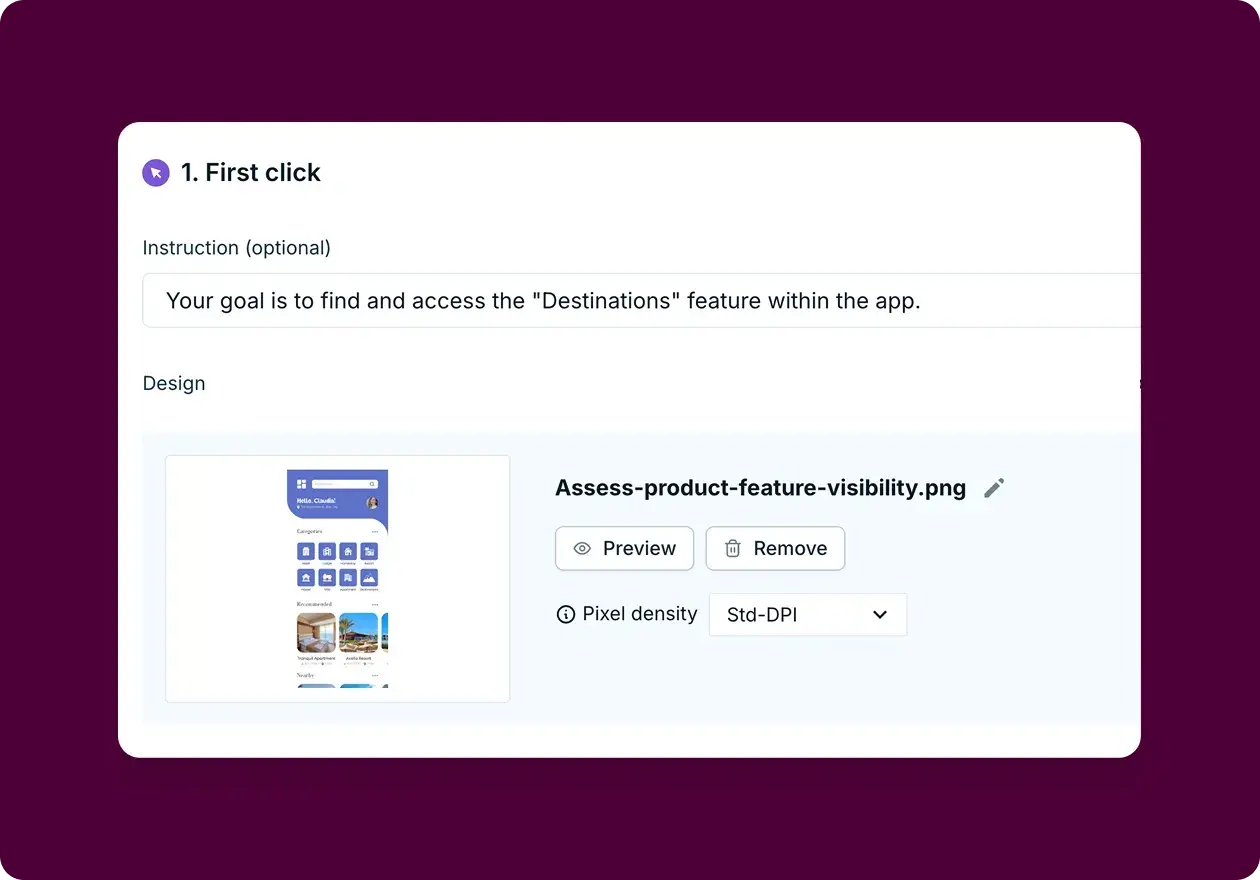
Scenario: Testing whether users can intuitively locate a key feature within a mobile app interface.
We used first click testing to assess how easily users could find the "Destinations" feature in a travel planning app. Understanding feature discoverability helps product teams identify navigation issues before they impact user adoption and engagement.
Test setup:
20 participants completed the study.
Single task: "Your goal is to find and access the 'Destinations' feature within the app."
Participants clicked on a static app interface mockup.
Follow-up questions explored task difficulty and gathered improvement suggestions.
Key findings:
The results revealed interesting challenges with the current design:
Average difficulty rating was 4.5 out of 5 (where 5 = very easy), indicating participants found the task relatively easy overall.
Click patterns showed two users clicked on multiple areas rather than heading directly to the Destinations icon.
Time to first click averaged 4.2 seconds, slightly above the optimal 3-second threshold.
Heatmap analysis revealed clicks were more scattered than expected for a "relatively easy" task.
Qualitative insights: Participant feedback highlighted that the icon was too small or not visually distinct enough from surrounding elements. Others suggested the feature's placement at the top of the screen made it easy to overlook, with one participant noting: "The icon should be separated from the other features around it since those are all types of accommodation."
Design agency home page navigation
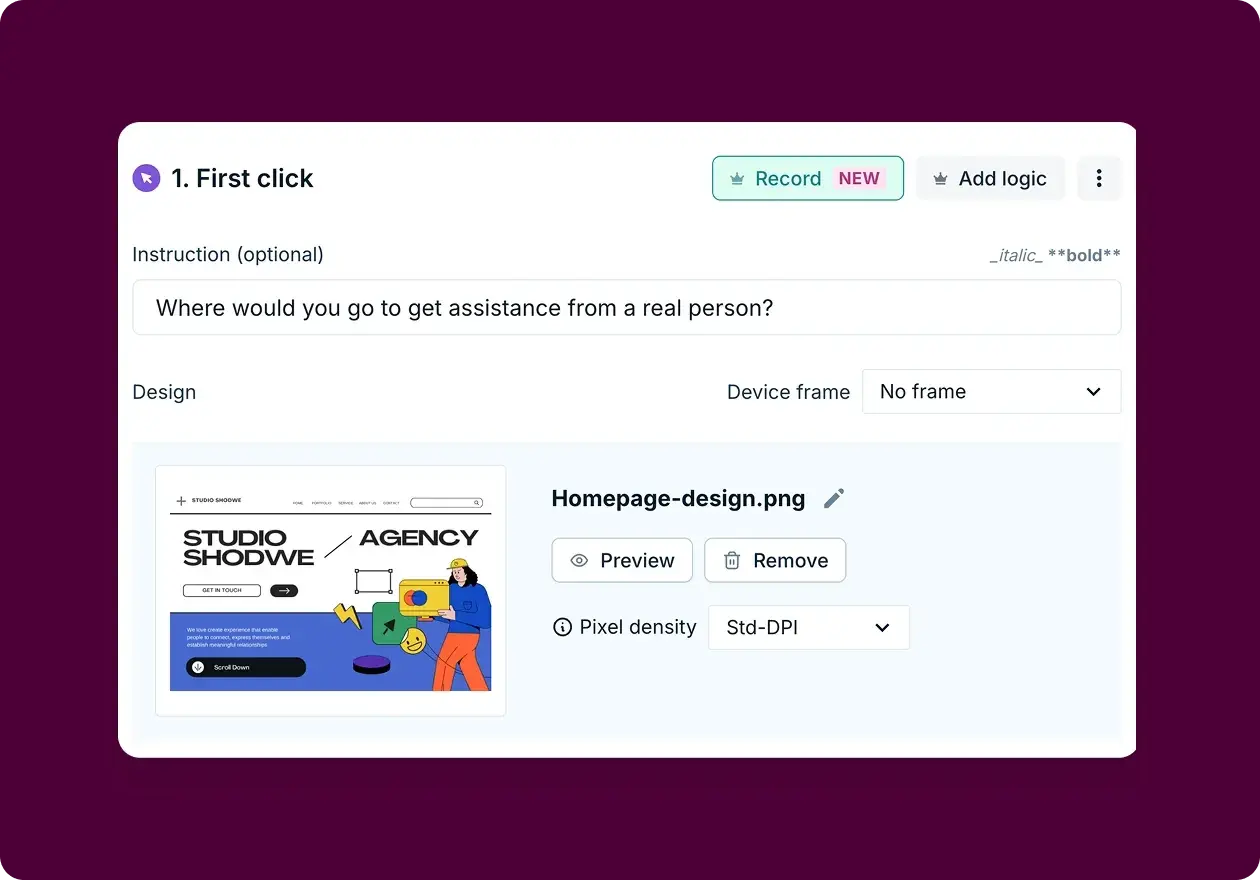
Scenario: Testing whether users can intuitively find customer support on a creative agency website.
We evaluated how easily users could locate customer support on a design agency's home page. The test asked participants: "Where would you go to get assistance from a real person?"
This simple question helps reveal whether your contact and support options are positioned where users naturally expect to find them.
Test setup:
25 participants completed the study.
Single task focused on finding human support.
Participants clicked on a home page design mockup.
Follow-up questions measured confidence and ease of discovery.
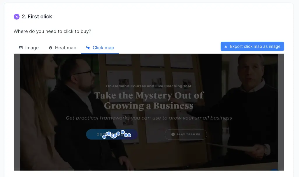
Key findings:
The heatmap revealed an interesting pattern in user behavior:
Primary clicks concentrated in the center-right area over the contact element.
Secondary clicks appeared on the upper navigation "Get in touch" CTA.
Small cluster on "Scroll down" indicator, suggesting users looked for footer links.
Confidence score averaged 3.68/5, indicating moderate certainty.
Ease rating averaged 3.80/5, showing room for improvement.
Analysis insights: The concentrated click pattern suggested the primary contact element was working for most users. However, scattered secondary clicks indicated disagreement about where customer support should be located. This split suggested different user mental models for finding help.
Pro tip: Both examples above were created using Lyssna's first click testing templates. Our template library provides pre-built test scenarios across multiple use cases, making it easy to get started with first click testing.
As Jeff W. notes: "Lyssna helps test navigation ideas and categories, as well as brand awareness tests. With templates available, they have the easiest implementation in the market.”
Get a preview of our first click testing templates:

Pros and cons of first click testing
Understanding the advantages and limitations of first click testing helps teams use this method effectively while recognizing when additional research approaches might be needed.
✅ Pros | ❌ Cons |
|---|---|
Predicts success with 87% accuracy | Only measures first interaction |
Results in hours, not weeks | No full journey insights |
Works from sketches to live sites | Requires well-crafted tasks |
Budget-friendly research method | Limited qualitative data |
Clear, quantifiable metrics | May miss contextual factors |
Easy to run and implement | Results depend on task quality |
Pros of first click testing
Predicts task success with remarkable accuracy: The strong correlation between first click accuracy and overall task completion makes this method an excellent predictor of user experience outcomes. Teams can identify potential problems early and focus optimization efforts on changes that will have the greatest impact on user success.
Easy to run and implement: First click testing requires minimal technical setup and can be conducted with basic tools. Unlike comprehensive usability testing that requires extensive moderation and analysis, first click tests can be designed, launched, and analyzed quickly by small teams.
Provides quick feedback for rapid iteration: Results are available within hours or days rather than weeks, making first click testing ideal for Agile development environments where quick validation is essential. Teams can test multiple design variations rapidly and make data-driven decisions about navigation improvements.
Works effectively with prototypes and early designs: The ability to test wireframes, sketches, and prototypes means teams can validate navigation decisions before investing in full development. This early validation prevents costly redesigns and ensures user-centered navigation from the beginning.
Cost-effective research method: Compared to comprehensive usability studies or focus groups, first click testing provides high-value insights at a fraction of the cost. Small teams and startups can gather meaningful user feedback without significant budget allocation.
Objective, quantifiable results: First click testing produces clear metrics that stakeholders can easily understand and act upon. The combination of success percentages, time measurements, and heatmap visualizations creates compelling evidence for design decisions.
Cons of first click testing
Doesn't measure full task completion: First click testing only captures the initial user decision, not whether users can successfully complete their entire task. A correct first click doesn't guarantee overall task success, and teams need additional research methods to understand complete user journeys.
Limited scope of insights: The method focuses narrowly on navigation decisions and doesn't reveal broader usability issues like content comprehension, form design problems, or emotional user responses. Teams need complementary research approaches for comprehensive UX understanding.
Results depend heavily on well-written tasks: Poorly constructed tasks can lead to misleading results that don't reflect real user behavior. Task writing requires skill and understanding of user language, and biased or unclear tasks can invalidate the entire study.
May not capture context-dependent behavior: Users in testing environments may behave differently than they would in real-world scenarios where they have different motivations, time pressures, or environmental factors affecting their decisions.
Limited qualitative insights: While first click testing provides clear quantitative data, it offers limited understanding of user reasoning, emotions, or the "why" behind user behavior. Teams often need follow-up interviews or think-aloud protocols to understand user motivations.
Potential for false confidence: High first click success rates might create overconfidence in design decisions when other usability problems exist. Teams should use first click testing as part of a broader research strategy rather than relying on it exclusively.

Best practices for first click testing
Implementing first click testing effectively requires attention to several key practices that ensure reliable, actionable results. These best practices help teams avoid common pitfalls and maximize the value of their testing efforts.
Keep tasks realistic and goal-oriented
Effective first click testing tasks mirror genuine user motivations and use natural language that reflects how people actually think about their goals. Rather than focusing on interface mechanics, tasks should emphasize user outcomes and real-world scenarios.
Task writing principles:
Use user language, not interface language: Say "find your order status" instead of "access the order tracking system."
Focus on goals, not methods: Describe what users want to accomplish, not how.
Include realistic context: Provide background that mirrors real situations.
Avoid technical jargon: Use terms your actual users would recognize.
Example of realistic task progression:
❌ Poor: "Click on the navigation menu to access account settings."
✅ Better: "Change your email address."
✅ Best: "You're moving next month and need to update your email address so you don't miss important account notifications."
Avoid leading language
Leading language in task descriptions can bias user behavior and produce results that don't reflect natural user decision-making. Careful task construction ensures that users rely on their own mental models rather than hints embedded in the task description.
Common leading language mistakes:
Using exact interface labels in task descriptions.
Providing step-by-step instructions instead of goals.
Including location hints that guide users to specific areas.
Using terminology that only appears in one interface location.
Neutral language techniques:
Synonym usage: Use different words than those in your interface.
Goal-focused framing: Emphasize outcomes rather than processes.
Natural context: Embed tasks in realistic user scenarios.
Multiple variations: Test the same concept with different wording.
Run multiple tasks for broader insights
Single-task testing can produce misleading results that don't represent overall navigation effectiveness. Running multiple tasks reveals patterns in user behavior and provides more comprehensive insights into interface usability.
Multi-task strategy benefits:
Pattern identification: Consistent problems across tasks indicate systematic issues.
Comprehensive coverage: Different tasks test various interface areas.
Reliability validation: Multiple tasks confirm results aren't task-specific.
Priority setting: Comparing task performance helps focus improvements.
Task selection approach:
Primary user goals first.
Known problem areas second.
New feature validation third.
Edge cases for completeness.
Pro tip: Include one "impossible" task to identify if users are just clicking randomly versus genuinely trying to complete tasks. This helps validate the quality of your participant responses.
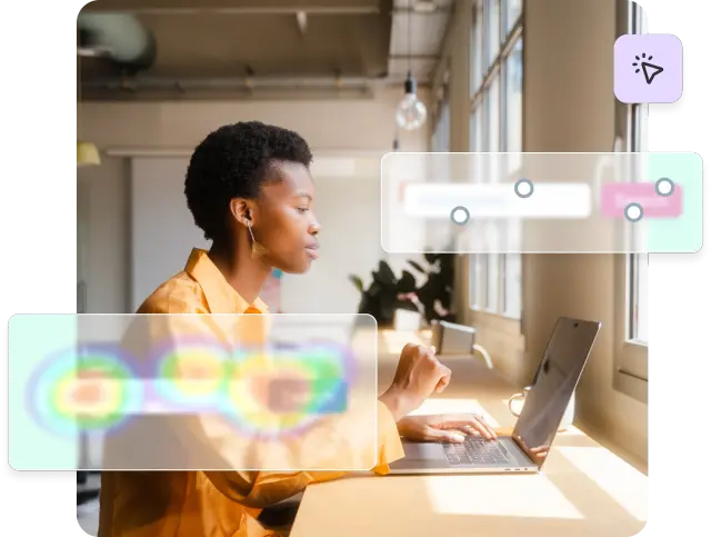
Use visual heatmaps to analyze first clicks
Visual heatmaps transform click data into intuitive representations that reveal user behavior patterns and guide design decisions. These visualizations make it easy to identify problem areas and communicate findings to stakeholders.
Heatmap analysis techniques:
Click concentration: High-density areas indicate strong user expectations.
Scatter patterns: Widely distributed clicks suggest confusion.
Unexpected hotspots: Clicks on non-interactive elements reveal mismatched mental models.
Dead zones: Important areas with few clicks need visual prominence.
Advanced heatmap insights:
Overlay comparisons: Compare heatmaps across user segments.
Time-based analysis: See how patterns change with hesitation.
Device-specific patterns: Identify mobile vs desktop differences.
Success correlation: Distinguish successful vs unsuccessful click patterns
Pro tip: Overlay heatmaps from different user segments to spot audience-specific confusion points. New users and experienced users often have completely different click patterns.
Test competitors and industry standards
Understanding how your navigation compares to competitors and industry conventions helps identify opportunities for both differentiation and alignment with user expectations.
Competitive testing benefits:
Identify industry navigation conventions users expect
Discover innovative approaches that work well
Benchmark your performance against alternatives
Understand where to follow vs. break conventions
Pro tip: Run the same test on your competitors' sites. This benchmarking reveals industry conventions users expect and helps identify opportunities for differentiation.