How the RSPCA UK engages their supporter base to improve UX
We speak with Eden Sinclair and Michelle Loa Kum Cheung, UX designers and researchers at RSPCA UK.
Summary
Find out how the RSPCA UK’s digital team uses Lyssna to validate design decisions quickly, improve navigation, and improve accessibility.
The RSPCA (Royal Society for the Prevention of Cruelty to Animals) UK is a charitable organization with the mission to prevent cruelty, promote kindness to and alleviate suffering of all animals.
The RSPCA has expanded its digital presence in recent years to connect with its extensive supporter base. This has seen the digital experience team grow and focus on understanding users better and enhancing their digital interactions.
Eden Sinclair and Michelle Loa Kum Cheung, both UX designers and UX researchers, work on the charity's digital products, including its websites and other digital platforms. They are focused on making sure that the digital presence of the RSPCA remains impactful, true to brand, accessible and user-friendly. To achieve all this, they need reliable user insights.
Challenge
At first, the RSPCA faced significant challenges gathering user feedback, and decisions were often based on assumptions and behavioral psychology rather than concrete data.
This led the digital design lead, Tim Rackham, making UX research a top priority when Eden joined the team in 2021.
"When I joined, we weren't doing any kind of user research. Tim tasked us to start attaining insights from real people and talking to our supporters, but we didn't have a way to do that," shares Eden.
Michelle adds, "We have a huge supporter base who we can send tests to for free, but we needed a tool to collect data in a digestible form – metrics, stats, percentages – that we could present to our stakeholders."
The RSPCA’s diverse audience, ranging from children to retirees, presented another layer of complexity.
"When testing designs, our aim is to foster an emotional connection with users, aligning with the RSPCA's charitable mission, while ensuring intuitive designs.”
Michelle Loa Kum Cheung
UX designer

They needed a way to make sure that their digital experiences resonated with all user segments.
Test prototypes with real users
Discover how easy it is to validate your designs with Lyssna. Get feedback on Figma prototypes and user flows instantly.
Solution
After doing a lot of research, the team chose Lyssna for its user-friendly interface and integration with Figma. It was an ideal fit for their needs.
"We started using Lyssna because we wanted to know what people thought of things. We needed insights and facts to go back to our stakeholders and say, 'Actually, we think this is a better approach.'"
Eden Sinclair
UX designer

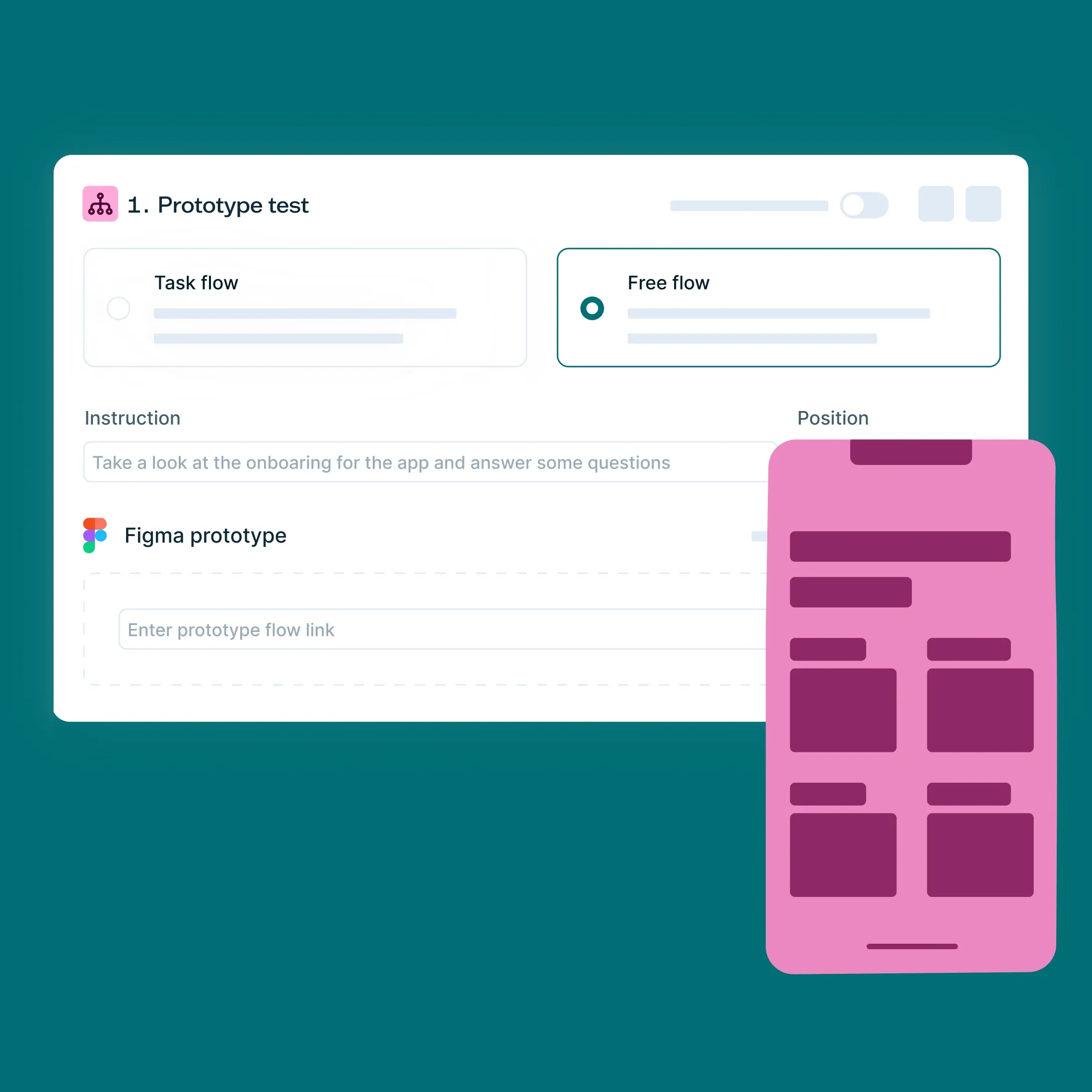
The team now conducts various user tests, including card sorting and navigation testing. They frequently send out designs to test user preferences or to evaluate working prototypes.
"Prototype testing is probably the one I use the most. And within any kind of questions we ask, the conditional questioning feature has been extremely useful,” shares Michelle.
“It allows us to ask follow-up questions based on previous responses, then depending on what they choose, you can lead them on a different journey and ask them different questions based around what they've chosen."
“You can integrate Figma really easily, which is super important for us because we use Figma for all our designs, and then all we have to do is just paste in the link, and then it's there.”
Eden Sinclair
UX designer
Additionally, Lyssna’s flexible recruitment options allow the team to send tests to their extensive list of members, known as ‘micro volunteers,’ while also having access to an external research panel.
Another benefit has been the tools’ ease of use, not only for the digital experience team but also those taking part in tests. “It's easy for our users as well. Some of our user base, they're not the most technically savvy people, but we haven't had any issues with people using Lyssna,” shares Eden.
“A little thing, but something that's really, really useful is when it tells you how long the task is going to take to complete. Because then we can put that in our recruitment messaging when we send it out.”
“It's a tool to get people's opinions, talk to them, find out what they really think.”
Eden Sinclair
UX designer
Results
Since adopting Lyssna, the RSPCA digital experience team has significantly improved their ability to gather user insights and validate design decisions quickly, leading to several impactful changes and innovations.
1. Validating design decisions quickly
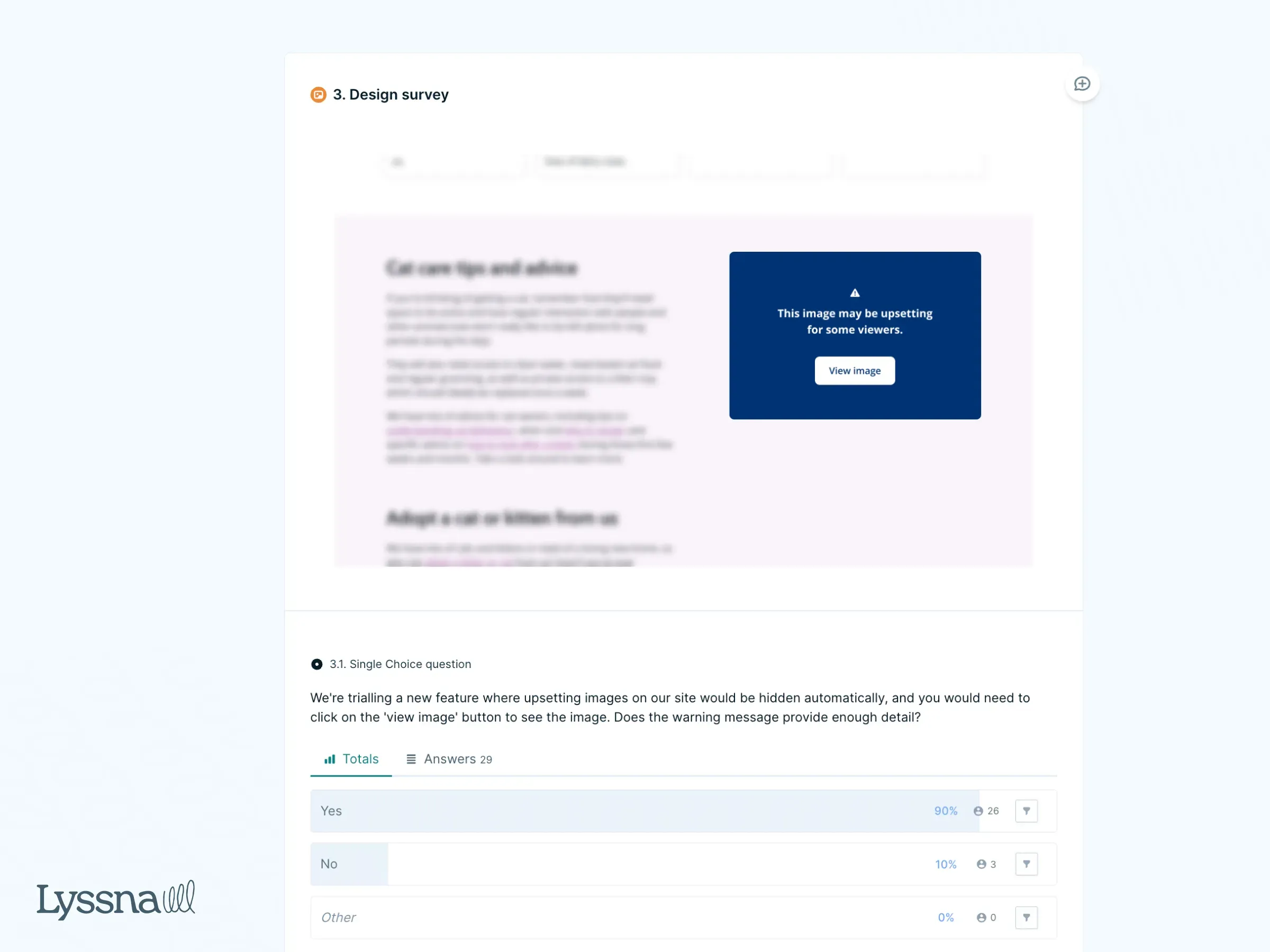
One of the biggest benefits has been the ability to quickly validate design decisions. For instance, the team faced a challenge about using graphic images.
Eden shares, “We wanted to find out if using graphic images would negatively impact our supporters, so we decided to conduct a quick Lyssna test with about 30 participants.”
From the results received, “We introduced a sensitive image filter that allows users to unhide the image if they want. This change led to more people viewing these sensitive pages, which is really good.”
2. Improved navigation and user experience
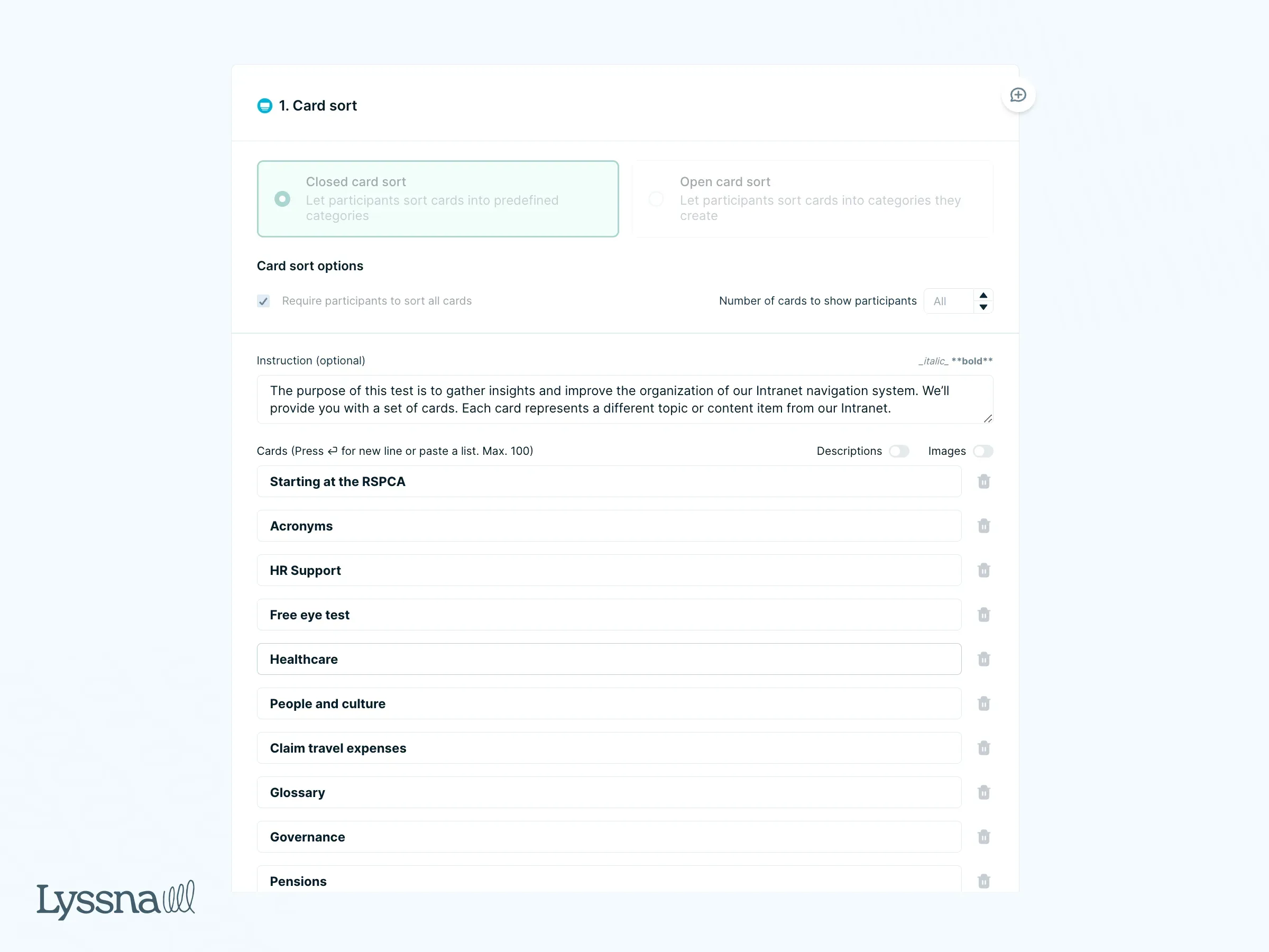
Another notable result involved redesigning their intranet’s navigation. The team used card sorting to test the new navigation and make sure it was more intuitive for users.
Eden adds, “After conducting a card sort, I realized I had designed the navigation completely wrong. The feedback from Lyssna helped us correct it, leading to a more intuitive user experience. It was an easy win for us.”
3. Improving accessibility
“After our rebrand, we wanted to make sure that all of our designs were accessible, and worked for all of our users.”
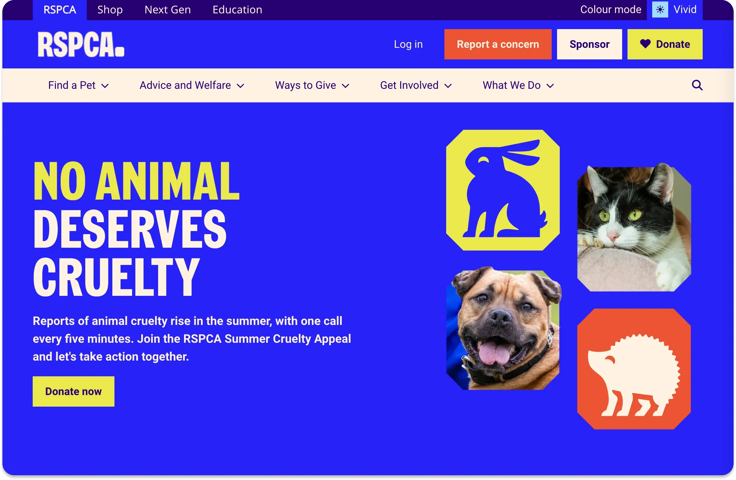
“Now, we've added a new filter on our website that dims the colors. So you click it and it reduces the colors. It's called calm mode. We've had a really positive reaction from that. People have been saying that it's great for neurodivergence and better for their eyes.”
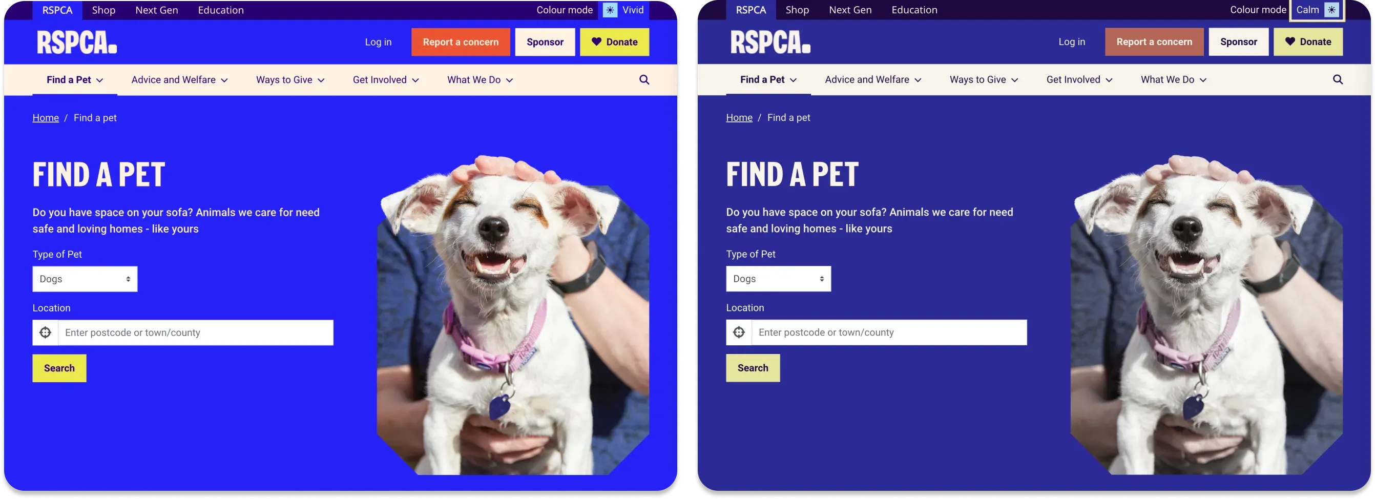
By using Lyssna, the RSPCA's digital experience team has significantly improved their ability to make data-driven decisions, cater to a wide audience, and quickly respond to feedback. This transformation has not only improved the usability and accessibility of their digital products but also strengthened their connection with supporters.


Try for free today
Join over 320,000+ marketers, designers, researchers, and product leaders who use Lyssna to make data-driven decisions.
No credit card required
