08 Dec 2023
|8 min
UX best practices for ecommerce
We spoke with the Director for CRO and UX Strategy from The Good, who shared some actionable tips to elevate your CRO. From analyzing user traffic to targeting high-conversion audiences, apply these UX tips for immediate impact.

Having an ecommerce website that attracts traffic is certainly something to be happy about. But what happens once visitors land on your website? Are they treated to an experience that sparks their interest in your products and converts them into becoming customers, or do they bounce?
The success of a customer’s journey depends on not only on offering them a positive user experience, but in making it easy to follow through on those all-important points of conversion.
Natalie Thomas, Director for CRO and UX Strategy at digital agency The Good, knows first-hand how important UX and CRO are for online retailers. We recently had a great conversation with Natalie on the topic of ecommerce UX CRO. Here, she shares her experience of working with clients and what it takes to bump up those conversions.
What changes can ecommerce companies implement today to improve CRO UX design?
The avenues that people take to land on your website can tell us a lot about who they are and the likelihood of them converting. Natalie stresses that by identifying traffic sources, UX and CRO efforts can be put towards those key landing pages and giving visitors what they need at those specific points in order to convert.
“I think one of the most foundational things that I see get missed when it comes to optimizing for ecommerce websites is just simply understanding where users are coming from.”
Focus efforts on where people are landing
Natalie has observed that many companies tend to overdo it in terms of the efforts they put into their home pages. She remarks that, “Generally, when we get a new website, we look at the data and find that many users never even visit a home page.”
It makes sense that you’d would put a lot of work into your home page, assuming that this is the main point of entry. But Natalie stresses the importance of paying attention to metrics and to customers who land on product pages. She says, “Someone who is coming to your website on mobile from a Google shopping ad for a product keyword is really different than someone who has arrived through an unrelated keyword or stumbled upon your website on social.” She also adds that, “A larger portion of traffic lands on product pages than you might expect.”

Natalie also mentions that customers who move beyond product pages and actively add items to their carts have moved to the next level of the purchasing journey, and diverge from those who are browsing. She says, “It’s important to keep in mind that those who are actually engaging with the cart are a very different audience. They’re often high intent, so this is an area where you can do thing like cross-selling, upselling, and making sure that the checkout experience aligns with your brand and user experience.”
Doing things like reiterating free shipping, or communicating other important incentives, can also boost sales conversions.
Target those most likely to convert
“Understanding not only where traffic comes from, but what traffic might have a tendency to convert later, will help you understand where to focus your efforts.”
It’s not uncommon to come across a company that puts all of its SEO eggs into the one basket – its blog. Natalie notes that, “When we look at folks who land on blog pages, they generally convert lower. They’re not necessarily there to purchase. They’re coming because they want information.”
This ties back to the importance of understanding users and their intentions. Putting SEO efforts into pages that attract visitors who are ready to make a purchase will yield better results.
Elevate your research practice
Join over 320,000+ marketers, designers, researchers, and product leaders who use Lyssna to make data-driven decisions.
Best practices that can help ensure the success of your ecommerce UX CRO strategy
Do ongoing research and testing
It isn’t enough to do user research and usability testing at the beginning of the development process. The wants and needs of users, as well as the ecommerce space overall, are always changing. Natalie recommends doing continual research with people who haven’t spent much time using your website or app.
“Don’t get complacent, make sure that you’re re-upping on the cadence of your research regularly. Unearth the challenges that your users have, and make sure that you’re open to fresh ideas and perspectives,” she shares.
People that haven’t used your website can help provide fresh insights and feedback. Natalie recommends running evaluative processes like heuristic analyses, usability testing, and A/B testing.

Natalie shares this story: “We worked with a company that had a lot of SKUs that were organized on the website in the same way that they were in the shipping warehouse. This made sense to them, as this was how they’ve been looking at these products for years. But when we did a card sorting test, we found that users didn’t bucket these products into the same categories at all.”
This is a great example of how fresh eyes can reveal insights that would otherwise go unnoticed. Whether you’re recruiting users from your own network, or externally from a research panel like the one from Lyssna, it’s essential to stay on top of problems or issues that may be preventing conversions.
Looking to run a card sorting test to improve the information architecuture of your ecommerce site? We've got a template that can help.
Do rapid validation
A/B testing is important, but it can be lengthy. Rapid validation is an alternative that offers a stripped-down process for testing and collecting information.
For more information on what rapid validation means – and how it’s different from A/B testing – check out this article from Natalie.
Just like A/B testing, rapid validation is considered evaluative research that makes it possible to validate hypotheses through data. In her article, Natalie remarks that, “evaluative research is how we move from data-informed to data-backed.”
Rapid validation generally involves rapid prototyping and running tests on these bare-bones product representations. Where A/B testing can be an expansive pursuit to “test everything,” rapid validation makes it possible to focus only on specific parts of a user’s journey.
This makes it possible to collect information in a short time frame, and you can then use this information to improve your website’s CRO UX design. Task completion analysis and sentiment analysis are the two pillars of rapid validation, allowing for a quick turnaround.
Task completion analysis
Task completion analysis helps you evaluate how users are interacting and engaging. Methods like first click testing and prototype testing focus on user actions, and can show whether users have easy paths to conversions or are running into difficulties.

Sentiment analysis
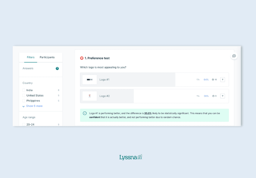
Sentiment analysis involves methods like five second tests, preference tests, or design surveys to help you understand how people feel about their experiences.

Create a knowledge center
Ecommerce owners and product managers understand users best, but if you’re having trouble leading conversations about what changes to implement to improve CRO, building a dashboard that has all of your previous research and results makes communication and collaboration easier.
Implement tools to inform your UX and CRO strategies
Predicting what different visitors require at specific moments in their user journey lies at the center of ecommerce UX CRO.
How customers arrive on your site, and what they’re looking for, are big factors in determining what messaging, calls-to-action, and features to add to ensure they take the steps you want them to take.
Conducting usability testing and user research is essential in understanding your users and identifying what they need. Tools like Lysnna can help you come up with UX CRO strategies to help improve the chances of conversions.
Your go-to user research platform
The best teams use Lyssna so they can deeply understand their audience and move in the right direction — faster.
--
Jeff Cardello is a freelance writer who loves all things tech and design. Outside of being a word nerd, he enjoys playing bass guitar, riding his bike long distances, and recently started learning about data science and how to code with Python.
You may also like these articles


Try for free today
Join over 320,000+ marketers, designers, researchers, and product leaders who use Lyssna to make data-driven decisions.
No credit card required


