11 Sep 2025
|14 min
System Usability Scale (SUS)
Find out how to run a System Usability Scale survey and calculate and understand your SUS score.

You've built something great, but how do you know if users actually find it usable?
Whether you're a UX designer validating a new design or a product manager making data-driven decisions, you need a reliable way to measure usability fast.
This is where the System Usability Scale (SUS) comes in. Keep reading to learn more about it. We've also created a free SUS calculator template that automates the scoring process.
Key takeaways
Bottom line: SUS provides a quick, reliable benchmark for your product's usability, but treat it as your starting point, not your destination.
It's not a percentage: A SUS score of 68 is average (50th percentile), not "good" - aim for 80+ to truly delight users.
Less is more for accuracy: You only need 5-12 participants for reliable results, and the 10 original questions work better than custom versions.
Combine with diagnostics: SUS tells you if there's a problem; use methods like first click testing and tree testing to discover what and where.
Context matters: Compare your scores against industry benchmarks – a 70 might be excellent for complex enterprise software but concerning for a consumer app.
Speed meets depth: Users complete SUS in 2 minutes, giving you statistically valid data that executives understand and act on.
Start testing today
Ready to benchmark your product's usability? Run SUS surveys with automated scoring in Lyssna – free plan, no setup required.

What is the System Usability Scale?
The System Usability Scale (SUS) is a 10-question survey that measures usability on a 0-100 scale. With an average score of 68, it's the industry standard for quantifying user experience across websites, apps, and digital products. As a technology-independent tool, it measures how usable people perceive your product to be.
Created by John Brooke in 1986 as a "quick and dirty" usability measure, the SUS has since become the gold standard, referenced in over 600 publications and used by teams at companies from startups to Fortune 500s.
Unlike other metrics that focus on specific features or tasks, SUS provides a global measure of system satisfaction based on three key dimensions defined by ISO 9241-11:
Effectiveness: Can users successfully achieve their goals?
Efficiency: How much effort does it take?
Satisfaction: Was the experience pleasant?
As UX researcher Andrew Smyk notes, "SUS is practical and reliable for measuring perceived ease of use across digital products and services."
This versatility means you can use the same scale to evaluate everything from mobile apps to voice interfaces to enterprise software.
The beauty of SUS? It takes users just 2 minutes to complete, yet provides statistically valid data you can benchmark against thousands of other products. After nearly 40 years of use, it remains the industry standard because it still works.

When to use SUS vs other methods
Different usability evaluation methods serve different purposes. Choosing the right one depends on your research goals, timeline, and the type of insights you need to drive design decisions.
Use SUS when you need
Quick benchmarking after unmoderated usability testing sessions
Comparison data between design iterations (A/B testing)
Executive-friendly metrics that translate to business decisions
Industry-standard scores to compare against competitors
Choose other methods when you need
Diagnostic information about specific usability issues (combine SUS with qualitative methods)
Real-time feedback during the design process
Deep insights into user emotions or motivations
Think of SUS as your usability thermometer. It tells you if there's a problem, but not what's causing it.

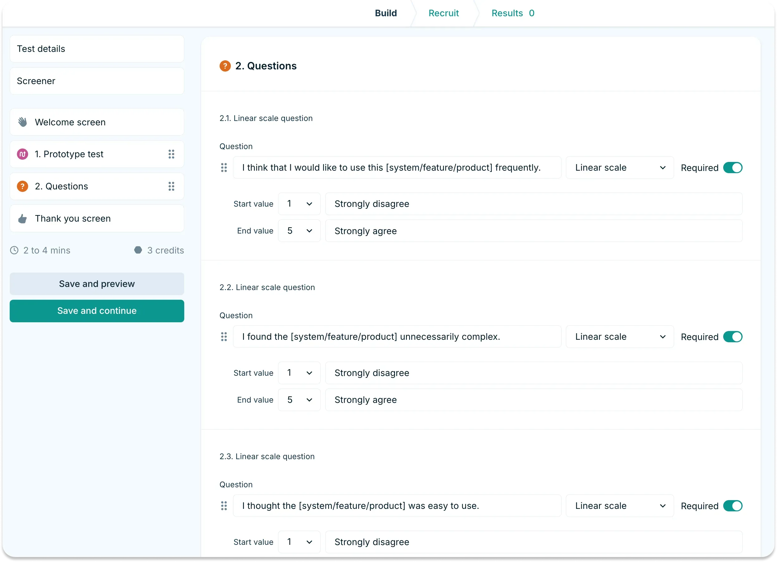
System Usability Scale SUS questionnaire
Here are the 10 SUS questions users answer on a scale of 1 (strongly disagree) to 5 (strongly agree):
I think that I would like to use this system frequently.
I found the system unnecessarily complex.
I thought the system was easy to use.
I think that I would need the support of a technical person to be able to use this system.
I found the various functions in this system were well integrated.
I thought there was too much inconsistency in this system.
I would imagine that most people would learn to use this system very quickly.
I found the system very cumbersome to use.
I felt very confident using the system.
I needed to learn a lot of things before I could get going with this system.
Notice the alternating pattern of positive and negative statements?
This prevents users from mindlessly selecting the same response down the entire survey. It's clever psychology that ensures more thoughtful responses.
Administering your SUS survey
Getting reliable SUS data isn't just about asking the questions. You need to ask them at the right time, to the right people, in the right way too.
Critical requirements for valid results
Minimum sample size: You need at least 5 users for basic reliability, though 12-15 participants provide better statistical confidence. The good news? Unlike other research methods, SUS maintains reliability even with small samples.
Timing is everything: Users must complete meaningful tasks with your system before taking the survey. This could mean:
Finishing a complete user flow (like making a purchase)
Completing specific usability test tasks
Using the product for a minimum time period
When you run unmoderated usability tests, participants interact naturally with your product without researcher bias, then complete the SUS immediately after – capturing their genuine first impressions.
As Andrew Smyk emphasizes: "Give users 1-2 minutes to complete the questionnaire. Make sure that no other feedback is collected, only the ranking scores, to ensure the questionnaire's integrity."
Common mistakes product teams make
Even experienced teams stumble with SUS implementation. Here are the pitfalls we see most often:
Testing too early: Without meaningful task completion, scores are meaningless. If someone's only clicked two buttons, they can't evaluate system complexity.
Modifying the questions: You might think "cumbersome" sounds outdated, but changing it breaks comparability with decades of benchmark data. Stick to the original wording.
Miscoding the data: According to researcher Katie Godwin, "11% of SUS datasets are miscoded by researchers and 13% contain mistakes from users." The alternating positive-negative pattern trips up even careful teams. That's why we recommend using automated scoring tools.
Treating it as diagnostic: SUS only indicates problems exist. You'll need additional testing to locate them.

System Usability Scale scoring: Step-by-step calculation
Let's walk through scoring with a real example. Say a user provides these responses:
Question | Response | Score Type | Calculation |
|---|---|---|---|
Q1 | 4 (Agree) | Odd | 4 - 1 = 3 |
Q2 | 2 (Disagree) | Even | 5 - 2 = 3 |
Q3 | 5 (Strongly Agree) | Odd | 5 - 1 = 4 |
Q4 | 2 (Disagree) | Even | 5 - 2 = 3 |
Q5 | 4 (Agree) | Odd | 4 - 1 = 3 |
Q6 | 1 (Strongly Disagree) | Even | 5 - 1 = 4 |
Q7 | 4 (Agree) | Odd | 4 - 1 = 3 |
Q8 | 2 (Disagree) | Even | 5 - 2 = 3 |
Q9 | 4 (Agree) | Odd | 4 - 1 = 3 |
Q10 | 1 (Strongly Disagree) | Even | 5 - 1 = 4 |
Total: 33 × 2.5 = 82.5 SUS score
Here's the formula breakdown:
For odd questions (1, 3, 5, 7, 9): Subtract 1 from the response
For even questions (2, 4, 6, 8, 10): Subtract the response from 5
Sum all adjusted scores and multiply by 2.5
Skip the manual math – use our Google Sheets template. Just import your CSV from Lyssna and watch the scores being calculated automatically.
Understanding scores
Here's a critical point that trips up even experienced professionals: SUS scores are not percentages.
A score of 70 out of 100 might seem like 70%, which sounds pretty good. However, as usability expert Jeff Sauro explains, SUS scores need to be converted to percentiles for accurate interpretation. A score of 70 actually falls at the 50th percentile, making it average rather than above average.
This confusion leads teams to celebrate mediocre scores or panic over decent ones. A score of 68 is average and it means your usability is exactly in the middle of all tested systems. You need to hit 80+ to truly impress users.
The two dimensions of SUS
While most teams treat SUS as a single score, advanced practitioners know there's more beneath the surface. UX researcher George Melissourgos discovered that SUS actually measures two distinct dimensions:
Usability dimension (Questions 1, 2, 3, 5, 6, 7, 8, 9): The core usability measure, essentially equivalent to the overall SUS score.
Learnability dimension (Questions 4 & 10): How easily new users can get started with your system.
To calculate learnability separately:
Add the adjusted scores for questions 4 and 10
Multiply by 12.5
Results range from 0-100
Example: If Q4 scored 3 and Q10 scored 4 (after adjustment), learnability = (3+4) × 12.5 = 87.5
Note: Recent research shows this two-factor structure appears primarily in certain contexts, so use it as supplementary insight rather than a primary metric.

System Usability Scale survey
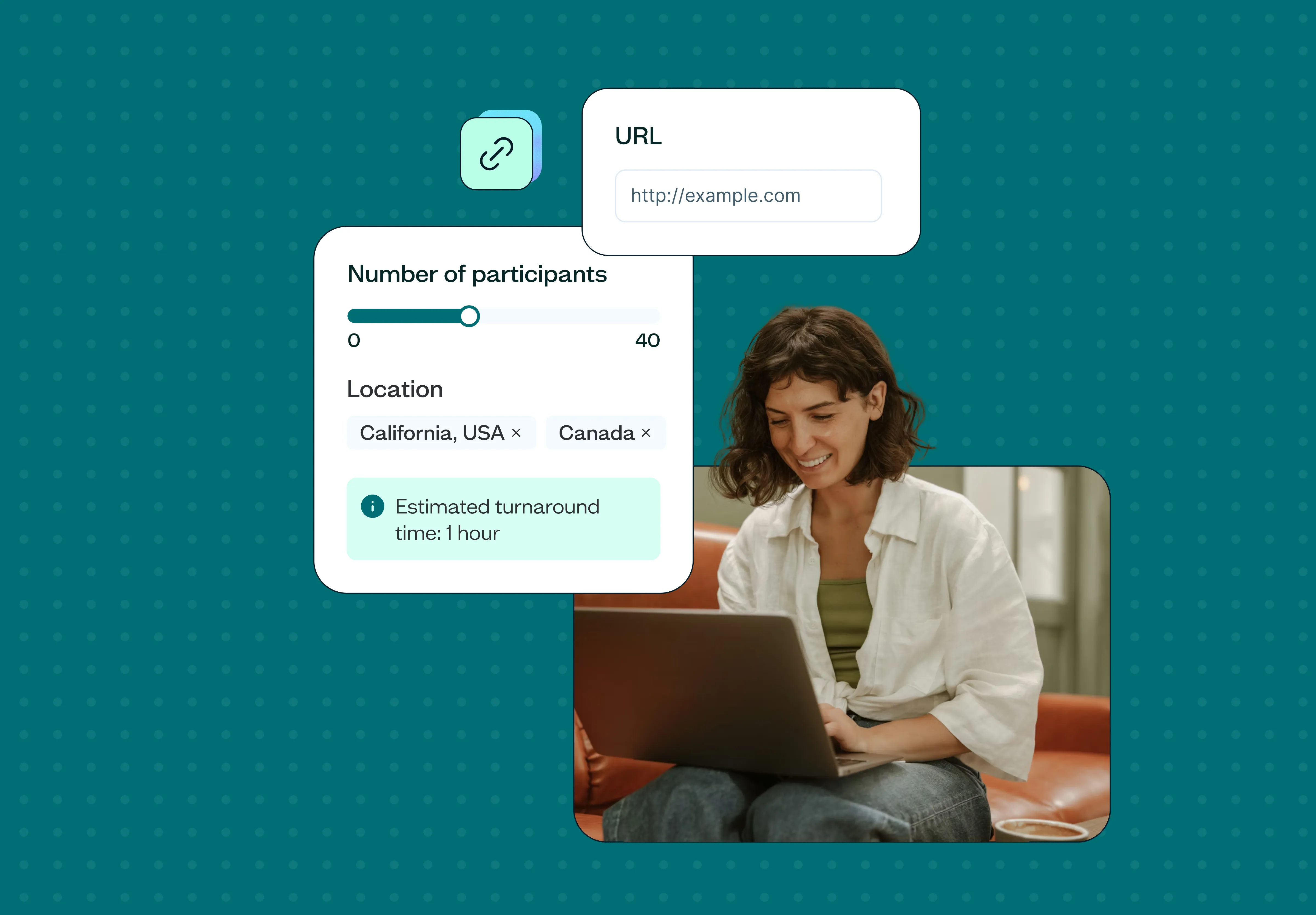
Effective SUS surveys require a seamless workflow that transforms user testing data into actionable insights quickly and accurately.
The optimal SUS workflow
Follow this proven five-step process to go from testing to insights efficiently.
Step | Action | Key details |
|---|---|---|
1. Set up your test | Create an unmoderated usability test | Include 3-5 key tasks that represent typical user goals |
2. Configure triggering | Add SUS questionnaire | Appears automatically after task completion |
3. Collect responses | Let participants complete naturally | Users complete tasks, then rate their experience |
4. Export and analyze | Download results as CSV | Drop into scoring template for instant calculations |
5. Take action | Run targeted follow-up tests | Diagnose specific issues based on scores |
Important note: Meaningful interaction is essential for valid scores. Users need substantial interaction to form valid opinions. In a mobile app redesign case study, the redesigned JagLine Shuttle app achieved a SUS score of 79.5 – indicating good usability – but only after participants completed full user flows and meaningful tasks with the application.
Timing considerations:
Immediate administration: Capture fresh impressions before memory fades
Post-task, not mid-task: Never interrupt users during activities
Consistent context: All participants should complete similar tasks for comparable scores
Digital survey tools
Running SUS surveys digitally streamlines data collection and eliminates calculation errors. Here's how to implement an efficient digital workflow.
Lyssna's integrated approach
Step | What happens | Benefit |
|---|---|---|
1. Run test | Unmoderated usability test with real users | Authentic task completion |
2. Auto-trigger | SUS questions appear after test | No manual intervention needed |
3. Export | Download responses as CSV with one click | Clean, structured data |
4. Import | Drop into scoring template | Instant calculations |
5. Analyze | Get scores, averages, and percentiles | Automated insights |
Alternative: The positive SUS version
If your participants struggle with the alternating positive-negative questions, consider the all-positive version validated by Sauro and Lewis. Katie Godwin's research found this reduces scoring errors by 11-13% while maintaining reliability.
Positive SUS uses reworded statements like:
"I found the system to be simple" (instead of "unnecessarily complex")
"I thought there was a lot of consistency" (instead of "too much inconsistency")
The simplified scoring (just add responses and multiply by 2.5) makes it ideal for quick iterations or less technical teams.

Interpreting SUS scores
Your SUS score is calculated, but what does it actually mean? Here's your quick reference guide.
SUS score | Letter grade | Percentile rank | What it means | User behavior |
|---|---|---|---|---|
84.1-100 | A+ | 96-100 | Exceptional | Users love it and actively recommend |
80.3-84 | A | 90-95 | Excellent | High satisfaction, word-of-mouth growth |
74-80.2 | B | 70-89 | Good | Above average, minor improvements needed |
68-73.9 | C | 50-69 | Average | Acceptable but has clear room to improve |
51-67.9 | D | 15-49 | Poor | Significant usability problems |
0-50.9 | F | 0-14 | Awful | Critical issues, users likely abandon |
Industry context matters. Different types of software and applications score differently on SUS, and understanding these benchmarks helps you set realistic goals for your product.
Real-world benchmarks to compare against (source):
Microsoft Excel: 56.5 (complex but powerful)
Microsoft Word: 76.2 (familiar and functional)
Amazon: 81.8 (optimized for conversion)
Google Search: 92.7 (the gold standard)
These ratings, collected by Kortum and Bangor (2013) and cited in Lewis and Sauro (2018), show the wide range of SUS scores even among successful products. Excel's lower score reflects its complexity – users may find it less immediately usable but still value its capabilities.
Remember: 68 is average, not good. According to Jeff Sauro's analysis of over 500 studies, a score above 68 is considered above average, while anything below is below average. If you're celebrating a 70, it's essentially at a C grade. Aim for 80+ to create products users genuinely enjoy – this is the threshold where users are more likely to recommend your product to others.
Taking action on low scores
So your SUS score came back below 68. Don't panic! Now you know there's a problem, and you can fix it systematically.
For scores below 51 (critical issues)
These products are frustrating users so badly they're likely abandoning them. UX researcher Andrew Smyk provides this diagnostic checklist:
Navigation problems? Users can't find what they need.
Run first click testing in Lyssna to see if users click the right place initially. If first clicks are wrong, your information architecture needs work.
Information architecture issues? Content is poorly organized.
Use tree testing to evaluate your category structure without visual design interference. It identifies if users can find items in your proposed navigation.
Mental model mismatches? Your organization doesn't match user expectations.
Conduct card sorting to understand how users naturally group content. It reveals the categorization that makes sense to your audience.
For scores 51-68 (poor but fixable)
Focus on the highest-impact user flows first
Run targeted usability tests on problem areas
Iterate and retest – even 5-point improvements matter
For scores 68-80 (room for improvement)
You're not in crisis mode, but don't get comfortable
Look at subscale scores – is learnability dragging you down?
Benchmark against direct competitors

SUS limitations and complementary methods
While SUS provides valuable benchmarking data, combining it with diagnostic methods creates a complete picture of your product's usability.
What SUS won't tell you
SUS is powerful, but understanding its limitations helps you use it more effectively as part of a comprehensive testing strategy.
SUS is a thermometer, not an X-ray. It tells you there's a problem but not where it lives.
A low score could mean:
Confusing navigation
Slow performance
Ugly visual design
Complex user flows
All of the above
Modest correlation with actual performance
According to MeasuringU's analysis, SUS correlates with task completion at only r=.24, meaning just 6% of SUS scores are explained by what happens in the usability test.
Users might successfully complete tasks but still rate the experience poorly – or struggle through tasks yet give high satisfaction scores.
This same level of correlation is found with other post-test questionnaires, suggesting it's a common characteristic of subjective usability measurements rather than a unique limitation of SUS.
A system might score well in testing but fail in the real world due to factors SUS doesn't measure things like pricing, competition, marketing, or changing user needs.

Complete testing strategy
Smart teams combine SUS with diagnostic tools for comprehensive insights.
The diagnostic cascade approach
1. Benchmark: Run unmoderated tests with SUS to establish your baseline score.
2. Diagnose (if SUS < 68): Deploy specific diagnostic tools to pinpoint exact problems.
First click testing: Are users starting in the right place? Wrong first clicks predict task failure 80% of the time.
Tree testing: Can users find items in your navigation structure? Tests information architecture without visual design.
Card sorting: Does your content organization match user mental models?
3. Fix and retest: Make targeted improvements based on diagnostic findings, then run SUS again to measure impact.
4. Track over time: Monitor scores continuously – if they plateau, you need fresh insights.
Example scenario: Consider how diagnostic tools complement SUS. An ecommerce site with a SUS score of 62 might use first click testing to discover users can't find the search bar in an unconventional footer placement. Moving it to the expected header location could boost scores to 74 – a significant improvement from one targeted fix guided by diagnostic data.

Getting started with SUS
Ready to measure your product's usability? We've assembled everything you need to run SUS effectively:
Essential tools
Lyssna's SUS Calculator Template: Our free template that automatically calculates scores from your data
Google Sheets Scoring Template: Make a copy of the Google Sheet and import your CSV results for instant calculations
Complete workflow:
Set up your usability test in Lyssna
Add SUS questions to appear post-test
Export responses as CSV
Drop into our Google Sheets Scoring template for instant scores
Compare against industry benchmarks
Remember: SUS provides the benchmark, diagnostic tools provide the specifics. Combine it with Lyssna's diagnostic tools like first click testing and tree testing to pinpoint specific issues. Then iterate, retest, and watch your scores climb.
Get started free
Ready to run your first SUS study? Test with real users and benchmark your product's usability on Lyssna – start free today.
FAQs about System Usability Scale

Kai Tomboc
Technical writer
Kai has been creating content for healthcare, design, and SaaS brands for over a decade. She also manages content (like a digital librarian of sorts). Hiking in nature, lap swimming, books, tea, and cats are some of her favorite things. Check out her digital nook or connect with her on LinkedIn.
You may also like these articles


Try for free today
Join over 320,000+ marketers, designers, researchers, and product leaders who use Lyssna to make data-driven decisions.
No credit card required