04 Oct 2023
|12 min
Screener surveys
Learn how to design an effective screener survey for user research. Includes tips on question types, branching logic, bias, and how to recruit the right participants for your study.

Creating an effective screener survey is one of the most important steps in the research process. Done well, it helps you recruit participants who will provide valuable, actionable feedback. Done poorly, and you'll end up with flawed data that leads to misguided decisions.
This article focuses on creating participant recruitment screeners for individual moderated and unmoderated studies, not for phone screening.
To help you create the best possible screener for your research needs, we created a Google Doc checklist – you can copy it to your Google Drive and have it on hand the next time you're designing a screener survey.
Key takeaways
A screener survey's job is to screen the right people in and the wrong people out — poor screening leads to flawed data and misguided decisions.
Before writing your screener, establish your research objectives and define your criteria for screening in, screening out, and which criteria you're willing to relax if recruiting gets difficult.
Keep questions neutral and unbiased, offer non-applicable answer options, and use a variety of question types to reduce survey fatigue.
Branching, piping, and skip logic can create a more efficient and personalized screening experience — worth exploring if your platform supports it.
Always pilot your screener before launch to test for clarity, flow, and timing.
What is a screener survey?
The primary purpose of a screener survey is to recruit the right participants for your research study. The goal is to screen the right people “in” and the wrong people “out”. Curating this sample is key to generating quality results for both quantitative and qualitative studies, including various types of quantitative research and to make sure that you're gathering input from the people best suited to provide it now or over time via a participant pool.
If you don’t screen well, you’ll gather flawed feedback, and then make poor decisions based on tainted evidence. This is no bueno. So it pays to be clever about how you approach this effort!
Before starting your screener survey, always establish the objectives and information required from the study, then make sure the questions and responses gather actionable feedback and reliable data.

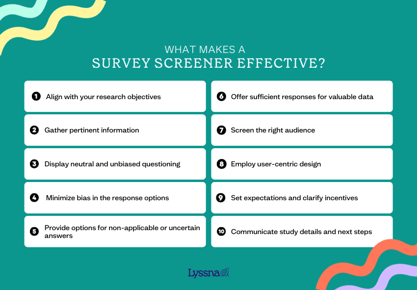
What makes a screener survey effective?
Successful screener surveys should:
Align with your research objectives:
Does the screener align with the objectives of your research plan?
Have the research objectives been clearly defined and validated beforehand?
Gather pertinent information:
Which information is most valuable and pertinent for the research?
Are the questions designed to demonstrate that the respondent’s time is valued?
Display neutral and unbiased questioning:
Are the questions posed in a neutral and unbiased manner?
Minimize bias in the response options:
Do the response options cover a comprehensive range of possibilities?
Have measures been taken to minimize bias in the response options?
Provide options for non-applicable or uncertain answers:
Are there options for respondents to indicate when a question doesn't apply or if they're unsure of the answer?
Offer enough responses for valuable data:
How many responses are needed to obtain sufficient and valuable information?
What is the target number of respondents to ensure meaningful data?
Screen the right audience:
Has the predetermined criteria for participant selection been clearly identified?
Are efforts made to screen out individuals who don't qualify for further research?
Employ user-centric design:
Does the screener provide a clear understanding of the study's context upfront?
Is the survey designed to offer a positive user experience with clear, logical, and concise language?
Set expectations and clarify incentives:
Do respondents know what to expect after completing the screener?
Are the incentives offered to selected participants clearly communicated?
Communicate study details and next steps:
When screening for a future study, are the specific details (dates, format, platform, duration) clearly stated?
Have you provided information about the next steps and the follow-up timeframe?

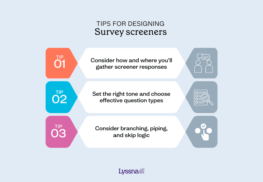
Tips for designing screener surveys
1. Consider how and where you’ll gather screener responses
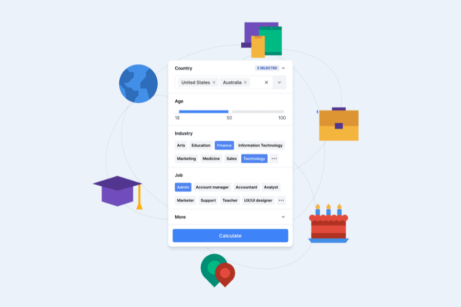
In some instances,you’ll be screening within the platform where a moderated usability testing or unmoderated ux study will take place. Platforms like Lyssna offer a research panel, where remote participants for unmoderated studies are screened before they’re allowed to begin a test. Lyssna also supports screener logic, so you can add branching rules that route participants based on their answers — and if you're recruiting from your own network, you can customize your screener introduction, screened-in, and screened-out messages to reflect your brand voice.

Other times, screening will be a distinct and separate phase of the research process and you’ll review the screener responses individually before inviting people to participate in a study, such as a user interview at a future time.
Both embedded and standalone survey platforms vary in sophistication. Consider your study’s needs and the functionality of the platform you’re using. For example:
Do you need to capture geolocation?
Will respondents be asked to provide a signature or upload any documents?
Is piping and/or branching helpful for this recruiting effort?
Will you be reviewing the responses before inviting participants to the study? Or will your screener survey immediately redirect them to schedule a session time if they pass the criteria?
Pro tip: I try to keep my screeners to 10 or fewer questions. Remember, the primary goal is to identify the best participants.
2. Set the right tone and choose effective question types
Take first impressions into account. The screener is often the first touchpoint with potential participants and prospective customers, so make sure your solicitation (the survey welcome), and all of the content within the screener, are professional and set the right tone.
Many people think designing questions and response options are easy tasks. They aren’t. In fact, this is both an art and a science that's difficult to master – 95% of the surveys I see contain fatal flaws!
Consider using a variety of question types to reduce survey fatigue. Understand the pros and cons of different question types and when to use them.
Below are examples of question types to consider.
Single select:
Radio button (binary): Yes/No
Dropdown menu (multiple choice): Usually a longer list than radio button options
Select image (logos, icons, layouts)
Multi-select:
A list of responses where respondents may select more than one option
You can specify 'Select all that apply' or restrict it to a minimum or maximum of questions
Open text fields, which are often used for:
Contact forms
Text boxes – short and long
Dates (pickers)
Email addresses
Percentages
Phone numbers (character validation)
Signatures (sign using a cursor, capture image, via touch)
Grids and rating scales:
Radio button grids (provide a single select per row) are used to ask multiple but similar questions, and are condensed and consolidated in presentation for respondents and for efficient reporting (each row is essentially one data point).
Rating/Likert Scales are horizontal layouts of radio button responses. Make sure you're consistent in regards to left to right anchors, and customize the left and right verbiage.
Slider bars allow respondents to drag across a scale to produce a numeric value. Add labels on the left and right anchors and be consistent with the number of points on the scales used in your survey.
There are several other question types including drag and drop, grouping/card sorting, and more.
Pro tip: I strive to gather some “smoke signals” to reveal more about the respondents, to hypothesize, and collect data to inform the subsequent research (e.g. discussion guides, activities, segmentation, etc).
3. Consider branching, piping, and skip logic
Evaluate whether branching, piping, or skip logic will be helpful for your screener. These advanced features aren’t available on all platforms, but are incredibly powerful. They allow you to change what questions or pages are displayed to a respondent and tailor questions based on previous answers, which will:
Result in a custom pathway through the survey based on rules.
Reduce the time it takes for respondents to complete the screener.
Right-size the data collected.
Eliminate the need for multiple links or survey variations.
Provide a better user experience.
Here are some considerations to evaluate whether to explore branching, piping, or skip logic. Ask yourself:
Is there significant overlap in questions and responses for multiple segments or phases of the study?
Are you recruiting from the same place and in the same way?
Will you be able to apply learnings from, or to a sequential survey?
Will all of the survey content be ready at the same time?
Do you have access to a more sophisticated survey platform that offers these options?
Are you prepared for the added complication?
Tips for writing screener surveys
Solicitations are invitations to take a screener survey. When using a standalone platform, they’re typically sent via email and include a link to the screener. On an embedded platform, the solicitation appears first upon login.
The content of this invitation will vary depending on the survey topic and goals.
Pro tip: When using a standalone platform, make sure to duplicate the email solicitation content, or a version of it, into the beginning of the survey too. Why? Because oftentimes, the original email recipient will forward the survey link to someone else without the email solicitation, so you want to make sure that second recipient has the context as well.
Here are some things to consider when writing solicitations and screeners:
Set expectations upfront about the topic at a high level (but don’t give it all away!). Include the time to complete and the incentive details.
Organize your questions into categories (e.g. about you, your car, your insurance, your driving habits).
Pro tip: I often map out my screener surveys visually to “see” the piping, skip logic, and branching flows and pathways.
Identify the criteria to screen in: key behaviors, contexts, motivations and/or attitudes representing the type of people you're designing for and seek feedback from.
Confirm the criteria to screen out: You may want to remove conflicts of interest, extreme or power users, those who have completed a study for your organization in the past 3–6 months, etc. You’ll need to screen out people who don’t meet the study criteria, don't qualify for your products or service, etc.
Pro tip: Sometimes, I include made up response options to gauge the authenticity of participants. For example, I may ask “Which of the following have you consumed in the past month? Select all that apply.” The response options will include an answer that doesn't exist.
Discuss the criteria to relax: Before you launch your screener, agree on which criteria you and your stakeholders are willing to release if you run into a difficult recruiting situation. This will save precious time and reduce stress!
Pay attention to the details:
Consider the title. Don’t give away the focus of your study in the title as this may sway responses.
Revisit the survey questions and response options multiple times during development to make sure they produce the right outcomes.
Triple check all spelling, grammar, and punctuation are correct.
Piloting your screener is key. Pilot to test for question clarity, flow, links, pathways, stimuli, length of time, technology, and outputs. After piloting with your team, you might also run your screener through User Interviews' screener grading tool for an additional perspective on question clarity and potential bias.
Genuinely thank respondents for their time.
Pro tip: Always pilot your screener on desktop, mobile, and tablet platforms before launching. Why? Because the experience across devices differs tremendously!
Remember, not everyone you solicit to take your screener survey will qualify, be interested, or be available to participate in your study, so plan accordingly! Think of the solicitation and screening process as a funnel. You may need to keep “feeding your funnel” or relax your recruiting criteria.
Pro tip: When recruiting with a standalone platform for a future moderated study, recruit and schedule 30% more participants than you actually need. This safety measure will help you accommodate for no-shows and people who may have passed your screener but weren’t actually qualified.
You can access all of the above tips as a handy checklist – save a copy to your Google Drive and have it on hand the next time you're designing a screener survey.
Remember, if you don’t screen properly, you'll be gathering input from people who aren't best suited to providing it. This will result in flawed data, and then you and your stakeholders will be acting on tainted information. Proper screening is key to making sure you're gathering feedback from the right people at the right time. This is especially important when you're conducting studies that rely on nuanced, exploratory insights. Different types of qualitative research methods like interviews, usability testing, or contextual inquiries require participants who genuinely reflect your target audience’s behaviors, attitudes, or environments.
Elevate your research practice
Join over 320,000+ marketers, designers, researchers, and product leaders who use Lyssna to make data-driven decisions.
FAQs about screener surveys
You may also like these articles


Try for free today
Join over 320,000+ marketers, designers, researchers, and product leaders who use Lyssna to make data-driven decisions.
No credit card required


