04 Oct 2023
|10 min
Mobile first design
Learn about the importance of mobile first design in creating user-friendly digital products. Discover best practices, principles, and benefits.

Today, more people are using mobile devices to access the internet than any other device. A report by Broadband Search shows that about 55% of global web traffic is from mobile device users. Another report by GSMA states that 5.3 billion people had subscribed to mobile services by the end of 2021. This number represents 67% of the world's population.
The GSMA’s report cited above further states that:
“Over the period to 2025, there will be an additional 400 million new mobile subscribers, most of them from Asia Pacific and Sub-Saharan Africa, taking the total number of subscribers to 5.7 billion (70% of the global population).”
Looking at these predictions, designers will need to prioritize the mobile experience when creating digital products. And one way to do this is by adopting a mobile first design.
This article looks into what the mobile first approach is and why it’s important. We'll also outline some of the best practices you can adopt to create mobile-friendly designs.
Mobile first design definition
Mobile first design is the process of planning and developing digital products for mobile use before designing for other devices. This design process lets you build products that are compatible with mobile devices, especially in the first phase of design.
Once you have a mobile-friendly design, you can then expand your designs to larger screens (desktop and tablet). In this phase, you can include features that aren't in the mobile version.
For a long time, designing for computer users took the front seat. This was because more people accessed the internet on computers. This method of designing for computers is called desktop-first design.
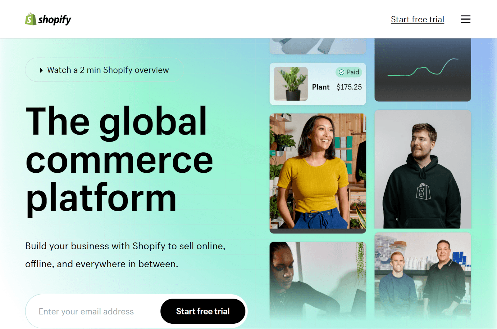
Source: Shopify
But today, there’s more emphasis on creating digital products that perform well seamlessly on mobile screens.
Mobile first design importance
Mobile first design is essential because users today want responsive digital products. They want products they can access on any device – whether it's a mobile phone, tablet, or a PC.
But that’s not all. Below are some other reasons mobile first design is important.
Cater to a large user base
By designing mobile-friendly products, you’re catering to a large user base. This is because there has been a significant shift in how people access the internet.
As of January 2022, smartphone users make up 55% of the market share while desktop users take up 42%. This shows that the majority of people access the internet with their phones.
Better UX
Using the mobile first design process ensures you include only core features and content. This makes it easy for users to navigate and find what they are looking for on time. A strong focus on what is user experience design helps guide these decisions, ensuring smartphone users have a smooth and intuitive experience.
It’s easier to build for larger screens
Once you have a lean version, it's easier to add more features to the desktop version.
For instance, if you’re designing an e-commerce store, you’ll start by building a simple version for mobile. You can then include extra features to the desktop and tablet versions.
Search engines love mobile-friendly websites
Major search engines like Google rank websites that are easily accessible on mobile in search results. This helps them serve their mobile users with sites that are mobile-friendly and optimized for mobile screens.
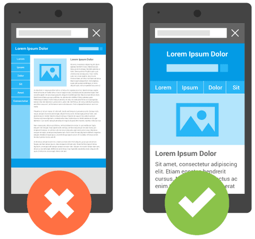
Source: Google Search Central
In 2015, Google rolled out its mobile-friendly update. With this update, Google states:
"We're boosting the ranking of mobile-friendly pages on mobile search results. Now searchers can more easily find high-quality and relevant results where text is readable without tapping or zooming, tap targets are spaced appropriately, and the page avoids unplayable content or horizontal scrolling."
What are the differences between mobile first design vs. responsive design?
Responsive design involves creating websites that can render on different devices.
As a web designer, using this design process enables you to build a site that lets end users have a smooth user experience, regardless of the device they use. Whether you’re using a tablet, PC, or smartphone, the website should adapt to fit the device screen.
While a responsive website can adapt to any device, it doesn’t focus on the mobile user experience. In fact, responsive web pages might not perform well in a mobile environment.
On the other hand, mobile first design ensures that mobile UX is at the forefront. This design process allows you to create products that perform seamlessly in the mobile environment.
The below table outlines the main differences between responsive designs and mobile first designs.
Responsive design | Mobile first design |
|---|---|
Aims to create designs that can adapt to different screen sizes and resolutions | Prioritizes designing for mobile devices |
You start by designing for desktop screens and then adapt your designs to mobile | You design for mobile screens first and expand your designs to large screens |
Designs involve using flexible grids, images, and CSS to adjust the layout and website content based on the user's device and screen size | Designs prioritize simplicity, speed, and minimalism to give users with smaller screens the best user experience |
Provides a consistent user experience across all devices (desktop, tablet, mobile) | Optimizes the user experience for mobile users, who make up a large percentage of internet users |
What are the principles of mobile first design?
Here are the core principles to remember when designing for mobile.
Keep your designs simple
Having a minimalist design prevents you from overwhelming users with unnecessary elements. Therefore, ensure you include important content and features only. Also, make use of white space to have a clean and clutter-free layout.
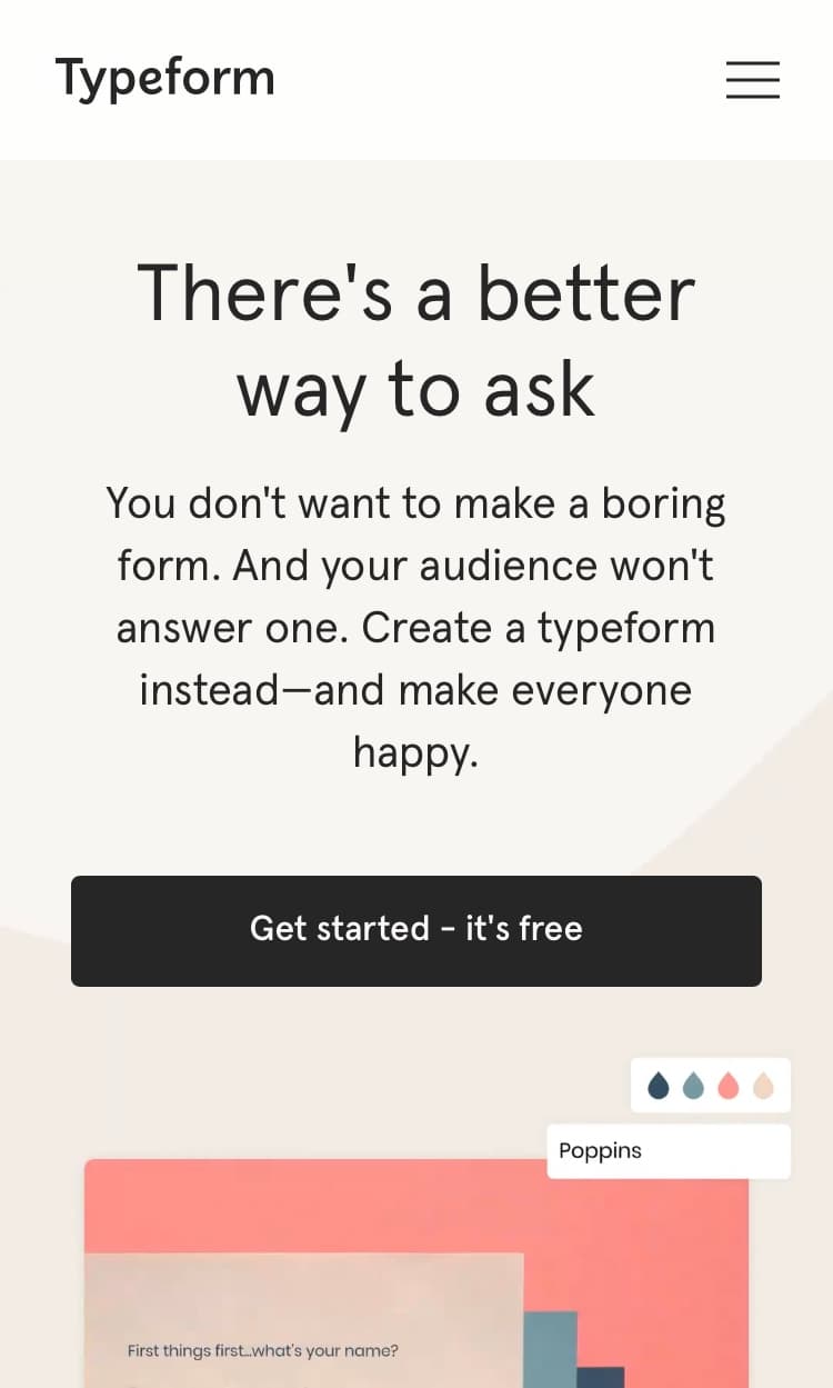
Source: Typeform
Visual hierarchy
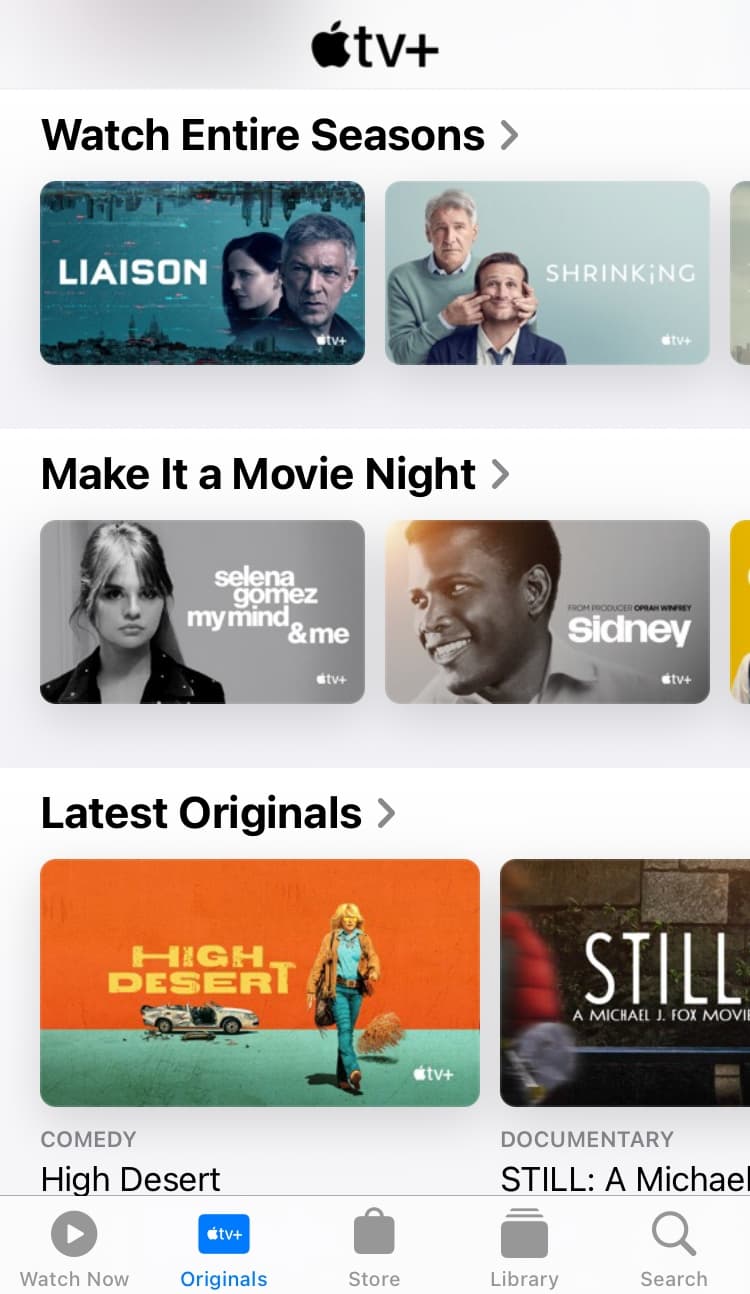
Visual hierarchy allows you to rank design elements in order of importance. It influences how end-users view your content and guides them to take a desired action.
Here are some of the visual hierarchy principles you can use to convey the most important design elements in your product:
Sizes and scales: Enlarge the size of an element so users will easily notice it.
Colors and contrast: Use bright colors or high contrast to make important elements stand out to users.
Change perspective to create an illusion of distance or separation: This can include blurring the background, adding drop shadows to highlight a design element, or even using a parallax motion effect
Source: Apple TV
Make your content scannable
Research conducted by Nielsen Norman Group showed that 79% of their test users scanned any new pages they came across. Only 16% of their test participants read the content word by word. This research shows that users are more likely to scan your content.
Since users prefer to scan, how do you display your content? You can do so by following these quick tips:
Use headings and subheadings
Use bullet points
Use short paragraphs
Use simple words and avoid jargon
Use lots of white space
If your content is scannable, users can easily identify key points on your web pages. This is a good way to increase user engagement and satisfaction.

Source: Pitchfork
Make your CTAs clear and accessible
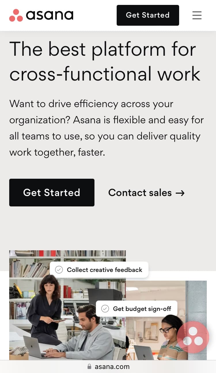
Avoid using vague CTA copy, as it can leave your audience confused. Instead, use words that are clear, consistent, and communicate value.
When designing your CTA buttons, use vibrant colors to make them more noticeable. Also, make sure you place buttons where users can find them easily. You can test your CTAs and button placement using a click tester.
Source: Asana
Mobile first design best practices
Below are some mobile first design best practices you can use when building your next digital product.
Use an intuitive navigation menu
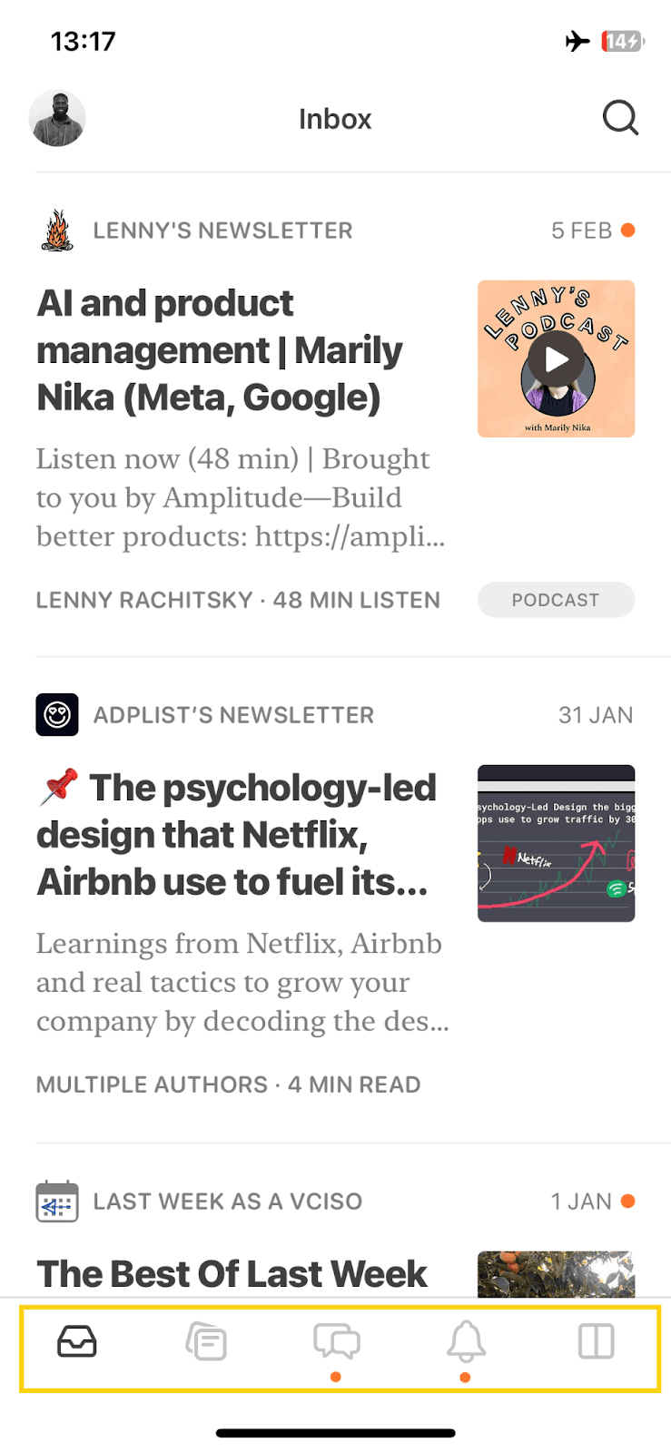
Ensure you don't crowd your navigation bar with lots of options. Instead, only include the most important features. You should also ensure you're using labels and icons that users are familiar with.
Source: Substack
An excellent example of a mobile-friendly product with an intuitive navigation bar is Substack. It uses a bottom navigation that allows users to access different options with just a quick tap. It also has a search bar allowing you to search for anything on your feed.
Avoid pop-ups or banners to advertise
When building mobile-friendly websites, it’s best to avoid using pop-ups or banners. This is because they take up a lot of valuable space on mobile screens.
Pop-ups or banners also make it very difficult for users to navigate your product. It can be disruptive and can increase your bounce rate. Search engines like Google may penalize your site for using intrusive pop-ups on mobile devices.
Test your prototypes on mobile devices
Before rolling your product out to the public, conduct user testing. Recruit participants and ask them to test your product on a real mobile device.
Prototype testing will also help you uncover underlying possibilities and issues that you might not have missed. Overall, testing your prototypes helps you improve your product and ensure that they meet the needs of your end users.
User testing + mobile first design: Creating products that users really want
Creating mobile-optimized products is one thing. Building digital products that people really want is another. Therefore, it’s important to ensure you test your designs before rolling them out to the public.
One way to do this is by conducting user testing. There are various ux testing tools available to help you understand how users interact with your product. User testing also identifies flaws in your designs so you can make improvements to create a better user experience.
User testing platforms like Lyssna give you a comprehensive suite of testing tools, including prototype testing, to uncover design issues early, preventing wasted time, effort, and user frustration. It also offers access to a participant recruitment panel so you can test your designs with real users and get feedback in minutes.
Elevate your research practice
Join over 320,000+ marketers, designers, researchers, and product leaders who use Lyssna to make data-driven decisions.
Frequently asked questions about mobile first design
--
Femi Oyelola is a B2B SaaS/Tech content marketing writer. He specializes in writing long-form content about marketing, ecommerce and product development. You can connect with him on Twitter or LinkedIn.
You may also like these articles


Try for free today
Join over 320,000+ marketers, designers, researchers, and product leaders who use Lyssna to make data-driven decisions.
No credit card required


