04 Oct 2023
|18 min
Landing page optimization
Learn how to optimize conversions on your SaaS landing page using five second tests and first click tests.

When you’re paying for traffic to a landing page in the search for new users, new customers, or both, you can’t afford to take chances with your page design. Every conversion is important, and you don’t want basic usability issues getting in the way.
In this case study, I’ll show you how to optimize the headline and call-to-action of your landing pages to capture as many potential users as possible. I’ll achieve this with some simple remote user tests run on the Lyssna research platform.
Software-as-a-Service (SaaS) landing pages are my focus in this particular case, but you can use this method to test a lot of different types of landing pages. I’ll tackle some headline optimization first, and then do some validation of the call-to-action element. My aim is to generate hard quantitative metrics as well as measuring user sentiment.
This method is effective in helping you see how your design performs before you have enough traffic to run meaningful split tests, or if you want to increase the ROI of split testing.
What are we testing?
Two critical elements of a landing page are the headline and the call-to-action (CTA). I’ll show you how to optimize these two components using a hybrid landing page/homepage as my test subject.
The page in question belongs to MessageBird. They’re a SaaS company that provides API-based communication products, like in-app VOIP, transactional SMS messaging, real-time chat support, and so on.
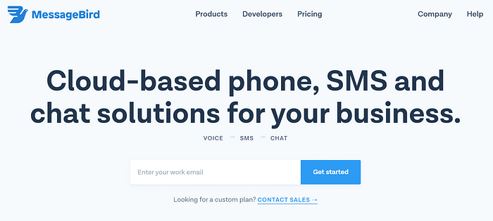
Below is the full landing page that I used to start my testing.
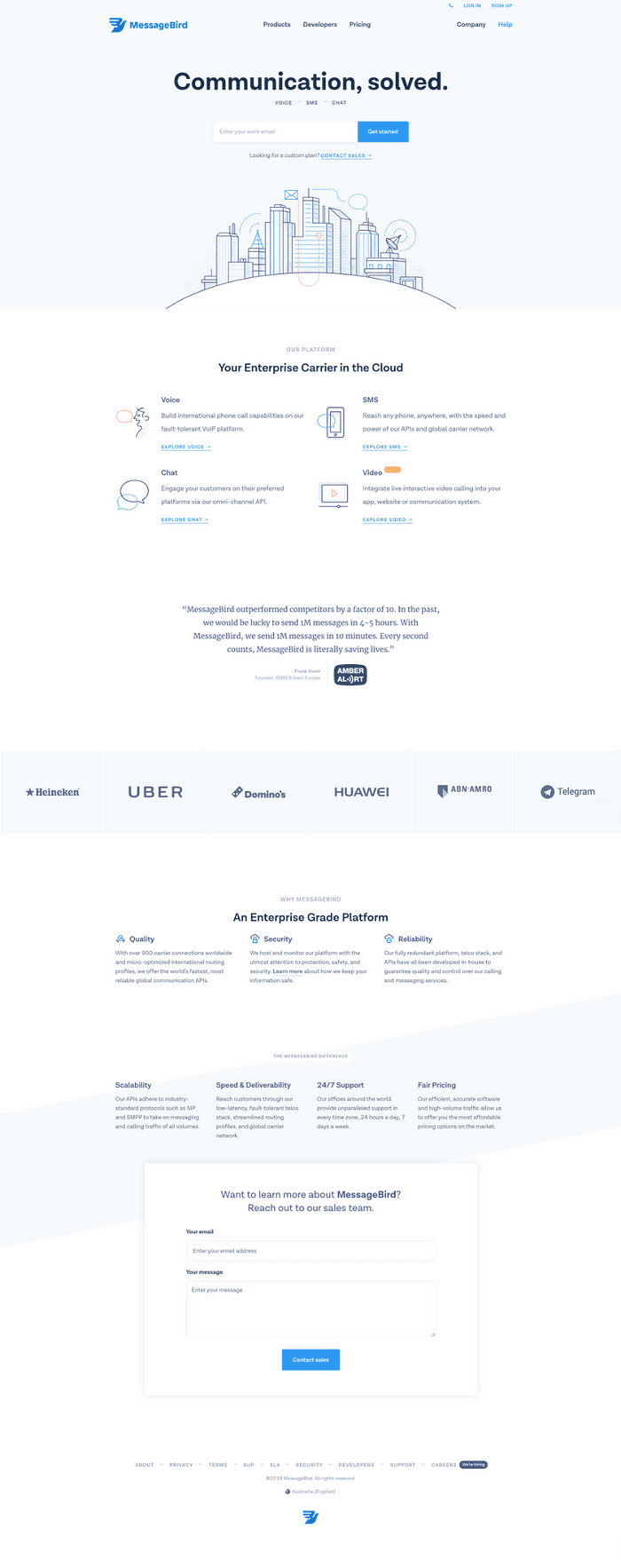
messagebird.com as at October 2018
At first glance, this is a nicely designed landing page, with a neutral visual style that communicates a modern vibe.
There’s a lot of content here, and a lot of potential targets for optimization. I’m going to focus my optimization efforts on the area that is roughly above the fold, containing the site navigation, headline, and a call-to-action.
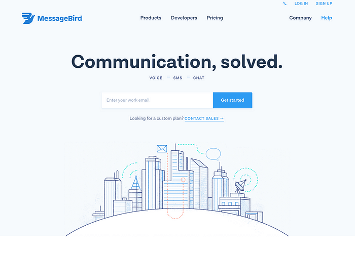
This is our starting point for optimization. Let’s get into it!
Optimizing your headline
For SaaS companies, it’s very important that a new, unfamiliar user can decipher what a page is about based on the headline alone. SaaS products are often new or innovative, so communicating their intent early is a priority when designing for this industry.
The five second test from Lyssna is an easy way to put your landing page headline through its paces on this point. In five seconds, the participant will have a chance to scan the page, take in the key headlines and images, and that’s it. After that, the participant answers a series of questions about what they remember about the design.
It’s a quick and easy method to get a ‘gut check’ on how well your landing page does in terms of describing your service or product. This is quite a mature technique in remote user testing. Ollie Gardner of Unbounce produced a very informative primer video in his ‘Landing Page Sessions’ series that holds up well.
Initial test results
Here are the results of my initial five second test with the original design. You can see that I’ve categorized the responses to show how participants interpreted the page.
When interpreting results like this, it’s important to draw a line in the sand about what you consider a ‘success’ response. I had three criteria that I looked for in a response to categorize it as accurate:
Identifying the business-focused target audience, either by directly referencing it, or using business-centric terms in the description, e.g. using the word ‘customers’.
Identifying that it was a communications tool, either by referencing specific channels like chat, SMS, or VOIP, or by using a word like ‘communication’ in their response.
Identifying that the service included cloud-based access and storage of the relevant communications data – although I was flexible on this requirement as it’s a fair assumption that a communications service is going to work like this.
When it came to categorizing responses, I read through each individual response and tried to make sense of the intent behind each comment. If the response hit at least two of the above criteria, then I’d mark it as ‘accurate or pretty close’. If it was in the right area, talking about the correct themes, then I marked it as ‘in the ballpark’. If the response demonstrated no or little comprehension, I categorized it as ‘not in the ballpark’.
Here’s a quick snippet of what the output from this process looks like.

A ‘successful’ response that covers criteria 1 & 2.
You could argue that the third ‘not in ballpark’ response is technically correct, but there is clearly no comprehension of the specific job or business function that MessageBird carries out, which is the focus of the page.
This kind of categorization forms the basis of my analysis. To that end, I used my criteria as consistently as I could – but I definitely tried to read the intent behind the response rather than the exact wording.
I also added in some descriptive tags based on the terms that surfaced in the data, which helped me see if there was ‘parroting’ of the exact headline terms in the responses. This illustrates themes in the data, past the simple check of ‘did this person get it?’ that the accuracy categorization gives us.
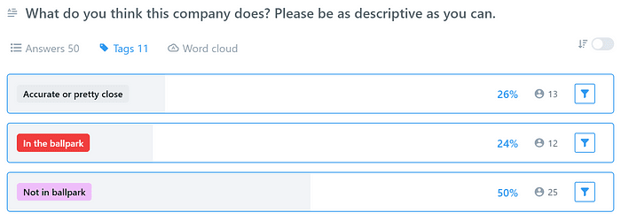
Here’s the summary of what the responses to the initial five second test looked like.
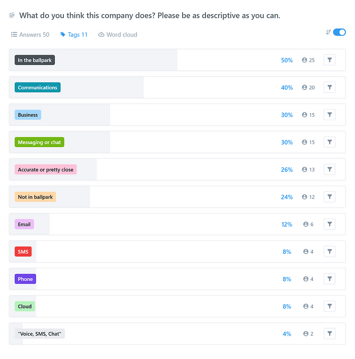
This view of the data gives you a sense that there were lots of responses that were around the right themes, but that hitting the nail on the head was hard. The good news is that ‘Communications’, ‘Business,’ and ‘Messaging’ were all popular themes in the responses. With some small tweaks, this design can achieve much better results.
Here’s a look at a filtered view of the results, showing only the comprehension-related tags.
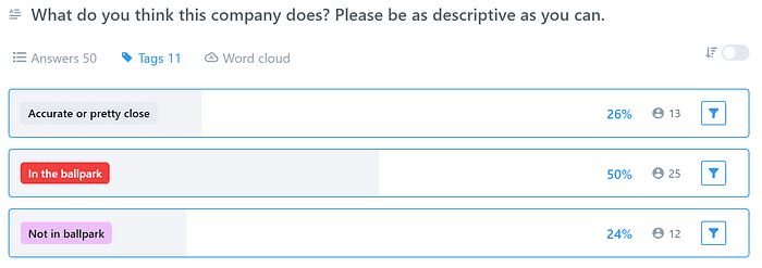
These results demonstrate an opportunity for improvement, so let’s try testing a new headline.
Enter the first challenger
Five second tests are very quick to set up and run, so whipping up a new design variation and running an alternative test is straightforward. I used a variation set to ensure a unique set of participants saw each design variation that I tested.
By swapping the headline of the page with another used further down the page, which is a little more descriptive, I can test to see if the headline copy from the original version is having a negative effect on comprehension of this page. Here’s the top of our second test design.
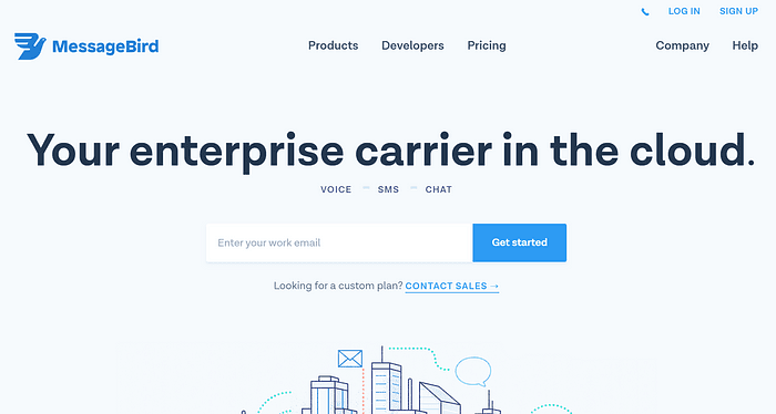
A quickly hacked alternative headline for the landing page
… and here’s the categorization chart, taken from the second test results page.
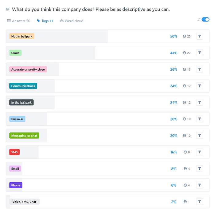
I’ve moved backward with this variation! It seems that the themes have shifted to follow the change in the headline, but this has had a negative effect on comprehension. Here’s the filtered view of comprehension-related tags.
This chart shows how powerful a headline can be for a SaaS business landing page. It’s difficult to comprehend what a company does from a brief look at their website at the best of times, so getting the headline right is key for SaaS landing pages.
I’m not taking this failure to heart though. The good thing about this kind of test is that it only took a couple of minutes to set up and run, which allows us to check options and ideas quickly. I’ve gathered some data and learned that I have to try something else to move these metrics in the right direction.
Trying an alternative headline
Let’s try a version with much plainer language.
The third version of the headline
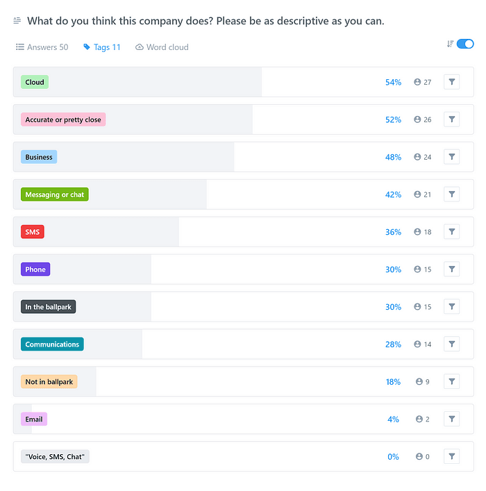
Much better! The themes in the responses for this third test reflect the terms and phrases used in the new headline, but looking at the responses, it’s clear that there is a higher level of comprehension.
Let’s see what filtering down to the accuracy tags looks like.
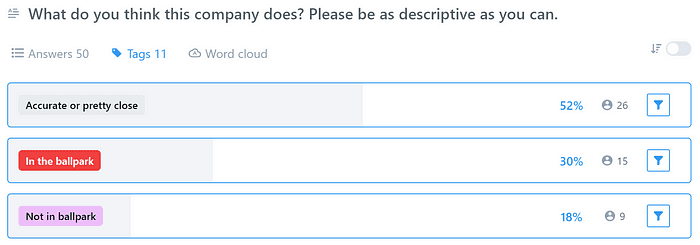
I’m excited to see a comparison of these results together, so I quickly copied the key results over into a Google Sheet, and made a chart.
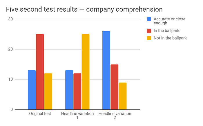
It’s night and day with this new headline. The shape of the columns on the right is exactly what we’re hoping to see in a five second comprehension test.
What did we learn?
When designing for a technology-focused SaaS product like this, it’s hard to resist putting broad, catch-all phrases in the headlines to keep pages feeling simple and accessible.
While that might be nice for the branding of the service, the data here shows that it has a negative effect on new-user comprehension of the landing page for MessageBird.
Changing the headlines around to be more descriptive and less sparse or filled with buzzwords showed an improvement in the first-glance comprehension.
You might be reading this thinking, “Of course the more descriptive headline is better at explaining what a company does!”, and that’s a fair opinion. But opinions only get you so far in a business environment. It’s risky to put your trust in opinions.
This kind of user testing data is the ammunition that you need to enact change in environments where sticky stakeholders or stern branding guardians are having too much influence on the design and copy of a landing page. In enterprises that are particularly risk-averse, real user data goes a long way when you’re trying to get a change to a customer-facing property approved.
The purpose of this page is to generate conversions and leads, and everything else should take a back seat. Everyone has an opinion on elements like headlines, but it’s very difficult to argue with user data.
You can continue this optimization process until you’ve found a perfect headline, but I’ve made some good progress towards finding a headline that communicates better than the original. For the sake of brevity, I’ll move along to the next critical part of the landing page – the call-to-action.
Optimizing your call-to-actions
If your landing page has a call-to-action on it, like a form or button that triggers a product trial, then a click test gives you an unbiased view of the performance of your design.
Checking the basic usability of your landing page design like this can help you pick up those precious extra conversions. Although it might seem like nitpicking, especially when your call-to-action seems obvious, there’s still value in testing your call-to-action – even if you find that things are performing well, and no change is necessary.
Let’s keep looking at the MessageBird example, and turn our focus to the ‘Get started’ form and button interaction underneath the headline.
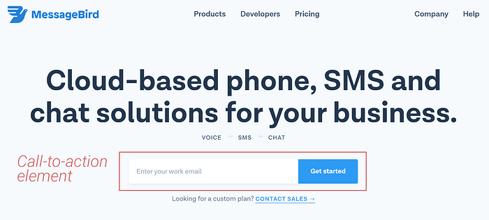
Setup for this test is basic. I loaded up the best performing concept from the headline five second tests and used that as a baseline in these click tests. I also added a Customer Effort Score question, which we’ll explore after looking at the task results.
The task in this test asks participants to ‘find a way to try the product’. This is a good baseline task for landing pages because it provides the participant with a clear, unambiguous goal that matches up with what the business wants new visitors to do.
Your go-to user research platform
The best teams use Lyssna so they can deeply understand their audience and move in the right direction — faster.
Analyzing results from the baseline first click test
Here are the baseline test results, with the successful clicks highlighted by Areas 1–3. Area 1 is the primary email input and button, and Areas 2 & 3 are secondary actions – the small Sign Up link in the header, and the CTAs at the bottom of the page. I counted these as successful responses. Any clicks in the ‘Other’ area were categorized as unsuccessful.
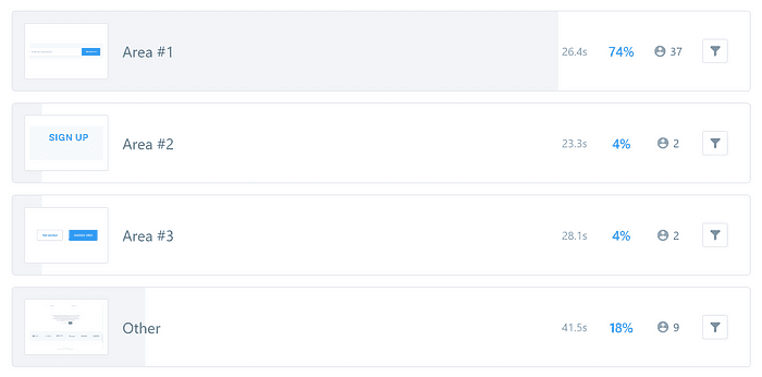
A visualization of the click test results, showing the number of clicks on each highlightedaArea
If we combine the clicks in these three areas to find the total number of successful clicks, the result is 41 participants – 82%. This is a good performance for this landing page, a comfortable pass mark for the baseline test.
The design is straightforward, although there are distractions from the primary call-to-action, including navigation elements, descriptive content, and images. You could live with an 82% result, but could this be better?
And could we improve the performance of the primary CTA, instead of relying on secondary ones throughout the page?
Iterating with a new test
Check out a new variation that I whipped up with Chrome DevTools.
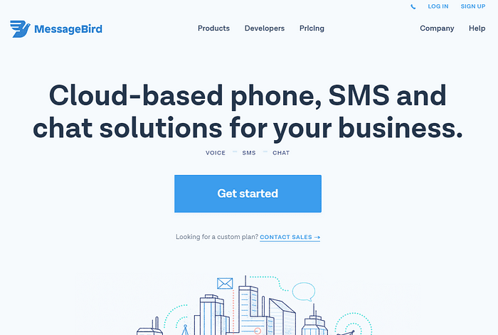
The whole page is used in these tests – this is just a snippet of it to show the changes.
With some basic changes to the layout of the ‘Get started’ button, including resizing it to be bigger, and removing the email address form field to cut down on distractions, we’re ready to go with our next test.
When performing these tests, speed is the key. Use whatever tools you are familiar with to get rolling. It doesn’t matter if you’re a few pixels off. You can go a long way into the optimization process with a browser tool like the Chrome DevTools to generate variations.
Using a variation set, this test took about 30 seconds to set up. I duplicated the baseline test, updated the test image with the new concept, previewed it to make sure everything is as it should be, and then recruited 50 new participants.
Here are the key results for the test of the new, simplified variation.

The success rate for this design is 96%, a stellar performance. 48 of 50 participants clicked on the bigger, simpler call-to-action, with nobody opting for the smaller buttons at the bottom or in the header. This is an exceptional result for a design.
Check out the animated heatmap comparison below to see the different performances overlaid on the test images. Hot zones in the heatmap are areas that were most commonly clicked.
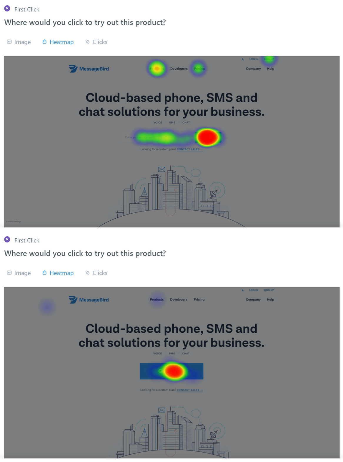
Results from the original CTA design are a stark contrast to the CTA variation design.
Looking at these results, the CTA variation design results are much more focused, with hardly any clicks on other elements. I’m calling this a win.
But what about the email address?
Yes, I’ve removed the email address input on this page. In this example, when a user clicks the CTA, they’re taken to a signup form which duplicates the email address field anyway. I’ve traded one input off on this initial screen, for no extra inputs on the second.
All data generated via remote user testing should be balanced against your production statistics and real customer behavior. There may be a very good reason to start with the email address on this first page that I don’t know about. All I can say is that the design does its job better without the email address input.
Measuring sentiment with a Customer Effort Score
In the two click tests above, I included a Customer Effort Score (CES) question to measure how much perceived effort my test participants expended in completing the task.
It may be personal bias, but I love the feedback that the CES scale provides, and how easy it is to interpret. As an interaction designer and user researcher, it gives me a window into the true sentiment a participant has about the functionality of the design in question.
Here’s what the CES results look like on Lyssna, using a mandatory multiple choice question after the baseline click test:
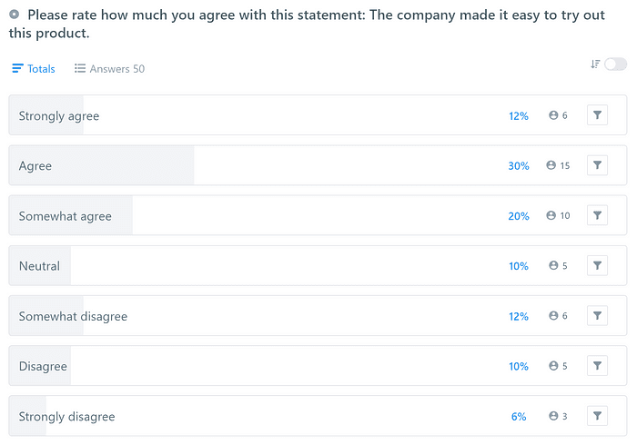
CES results from the baseline click test
Straight away, you can see from the shape of this graph that this wasn’t a good performance by the baseline design. After combining the responses, the CES for this test is 4.66 out of 7. For a page like this, a good CES to aim for is around 5–5.5 out of 7.
This landing page has one primary job to do – generate conversions and leads – and you’d definitely hope to see more ‘Strongly agree’ responses and a much smaller tail of negative responses in a question like this.
This metric shows that even though a lot of clicks would have resulted in ‘success’ for this page, it’s worth experimenting with the layout to see if we can smooth out the experience for potential customers.
That’s where landing page optimization software like Lyssna come into play, helping teams iterate quickly based on real user feedback.
Comparing the baseline CES with a variation
We know that the CTA variation design performs better than the baseline at attracting clicks to the target area. Check out this improvement in the CES results.
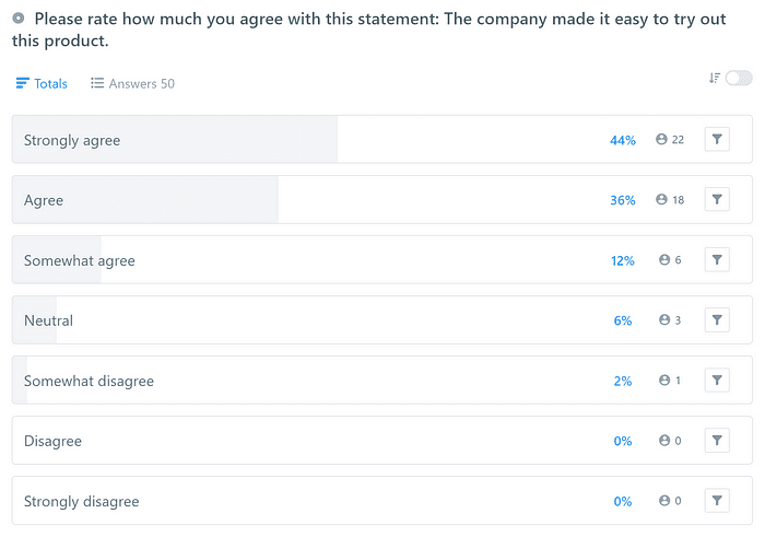
CES of the CTA variation design
The CES for this new version is 6.14, a 31.8% increase over the previous test results, with a much heavier weighting at the top of the scale. This is a great step forward for the design, and one of the best CES scores I’ve seen for a SaaS landing page design like this.
Whether you call it done at this stage or keep going with new variations is up to you, your time, and your research budget. That said, there’s definitely data here that supports changing both the headline and call to action on this landing page.
And now for the hard part!
In this case study, I’ve shown you a technique that has unearthed changes that could make a measurable impact on the performance of this SaaS landing page.
But design and layout never exist in a vacuum. People get attached to things like headlines and layouts, as it takes a large amount of effort to reach a consensus about them in the first place. I’ve run roughshod over any requirements from a branding perspective, which may not be possible in your context.
Don’t feel down by having to climb that mountain. The potential benefits of user-data-driven design are obvious to most stakeholders and managers. Taking the risk out of design optimization is something that no exec or stakeholder can argue against! Lyssna has all the tools you need to test your landing pages and CTAs.
Elevate your research practice
Join over 320,000+ marketers, designers, researchers, and product leaders who use Lyssna to make data-driven decisions.
You may also like these articles

Try for free today
Join over 320,000+ marketers, designers, researchers, and product leaders who use Lyssna to make data-driven decisions.
No credit card required


