03 Oct 2023
|19 min
Gestalt design principles
Learn the Gestalt design principles that top UX and UI designers use to create beautiful, engaging, and effective designs.

11 Gestalt design principles every UX and UI designer should know
Want to create beautiful, functional, and usable designs that keep users engaged?
Enter Gestalt design principles, the secret weapon used by top UX designers, UI designers, and others to create products that engage users by aligning closely with core ux design principles.
Ready to up your design game? Join us as we dive into the world of Gestalt principles, complete with plenty of visual examples. Don't forget to bookmark this guide and share it with a friend who's ready to level up their design skills!
What is Gestalt?
Gestalt psychology, which rose in popularity around 1912, is the foundation of the Gestalt design principles. This fascinating concept originated from the German word "unified whole". In short, it describes how things are put together to form a whole object.
Gestalt also sheds light on how our brains perceive visual elements as a seamless, cohesive whole – from recognizing patterns in images to labeling elements based on proximity and similarity.
In design, Gestalt principles are the foundation of visually appealing and effective designs. They are used to arrange elements and information in ways that our brains naturally organize and perceive them.
From mobile apps to brochures, designers use these principles to deliver visually stunning work and useful experiences.
How is Gestalt psychology applied in design?
The introduction of Gestalt psychology paved the way for the idea that what we see is shaped by our expectations, assumptions, and motivations.
You'll see Gestalt principles in action everywhere if you look closely – from infographics to mobile apps to signage. For example, the Get Vaccinated. Wear a Mask. Save Lives. Google doodle below is a fun demonstration of using closure, one of the Gestalt design principles.
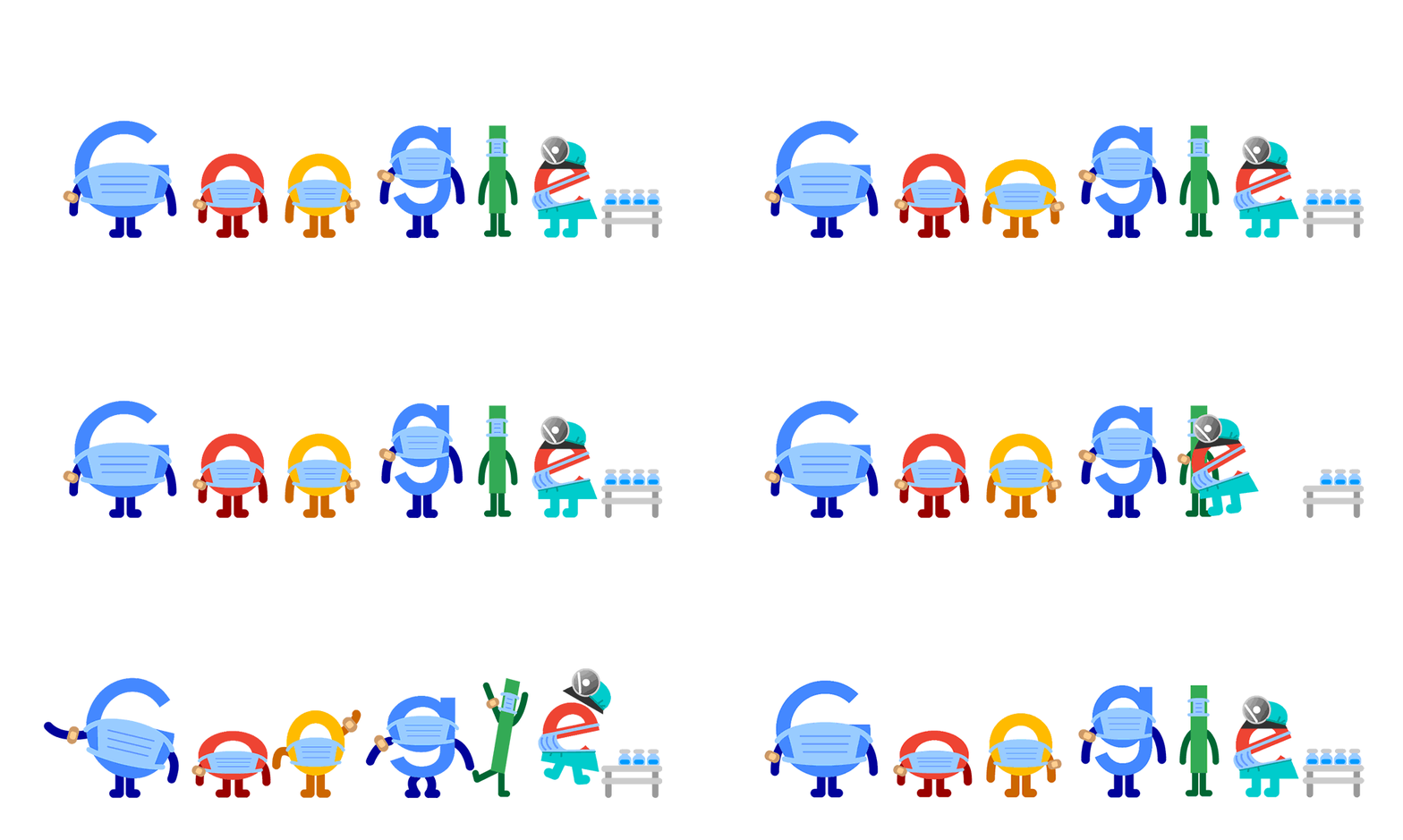
Closure refers to the ability of our minds to fill in missing information to create a whole image from incomplete visual information. In the doodle, the letters of the word "Google" are represented by Band-Aids, syringes, and masks, which are arranged in a way that isn’t immediately recognizable as the word "Google."
However, our minds are able to perceive the underlying message and fill in the gaps to complete the image. This is an example of closure in action – our brains are able to perceive the incomplete shapes and make sense of them.
Validate your designs with Lyssna
Ready to see how users perceive your Gestalt-inspired designs? Use Lyssna to conduct user research and gather quantitative data.
What are the Gestalt design principles?
The following Gestalt theory principles help ensure that your audience perceives your work as you intended:
Similarity
Continuity
Closure
Common region/Common fate
Figure/Ground (Multi-stability)
Proximity (Emergence)
Symmetry and Order (Pragnanz)
Past experience
Parallelism
Focal points
Simplicity
Let's take a closer look at each principle, with visual examples to help demonstrate what they look like in practice. As you’ll see, some of these principles overlap.
Similarity
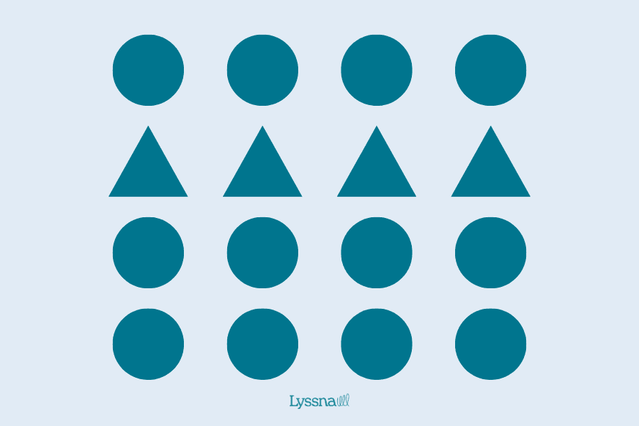
The Gestalt principle of similarity states that when objects share visual attributes such as shape, size, color, or texture, our minds perceive them as belonging to the same group or pattern. This means that we tend to group together similar objects, and distinguish them from objects that differ in their visual attributes.
Imagine a website with various buttons, some square, some round, some blue, and some green. Without the principle of similarity, this would look chaotic and confusing.
However, when you group similar buttons together – making sure that round buttons are all the same color, for example – you create a clear visual hierarchy that’s easy for users to understand and navigate. It also draws the viewer's eye to specific areas of the design and helps them understand the relationship between different elements.
Similarity in practice
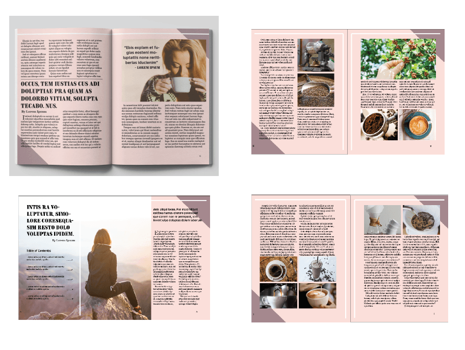
The Gestalt principle of similarity is often utilized in the layout of a magazine to create a cohesive visual experience for the reader. For example, article headlines may share the same font size and color, and be positioned in a consistent location on each page. And images within an article may have a shared border color to create a set.
These similar visual elements create visual harmony and guide the reader's eye throughout the magazine, making it easier for them to find information quickly.
Essentially, similarity is used to bring together related elements and create a unified design that’s pleasing to the eye and facilitates the reader's experience.
Source: behance.net
Quick tip: Understand how your users group elements and information together with card sorting.
Continuity
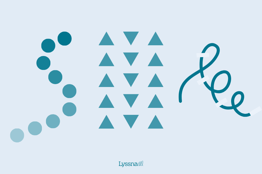
The Gestalt principle of continuity suggests that our brains perceive a connected series of elements as a single, continuous unit.
In design, this principle can be used to create a visual path that guides the viewer's eye through a composition. By using visual cues such as lines, shapes, and colors, you can connect different elements and create a sense of flow.
For example, consider a website with multiple articles, each with unique headings and images. By utilizing the principle of continuity, you can connect these disparate elements by using visual elements. This can lead the viewer's eye from one article to the next and create a smooth and continuous user experience.
Continuity in practice
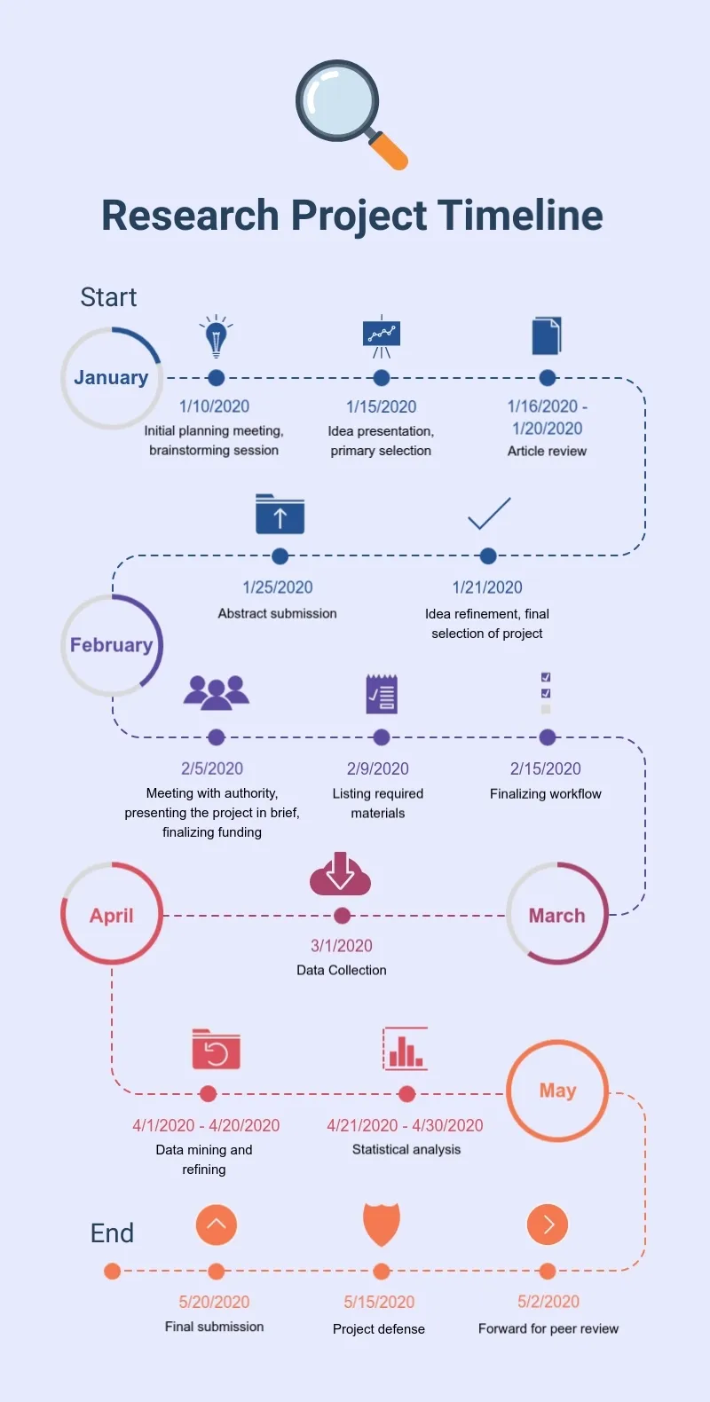
A flowchart within an infographic is a great example of the continuity principle in action. By connecting the various steps of a process with lines or arrows, it provides a visual roadmap that guides the viewer's eye through the information.
This cohesive visual experience is enhanced through consistent shapes, text placement, and fonts, which make it simple to recognize the relationships between each step and follow the flow of information.
Source: visme.co
By using the continuity principle, this infographic template creates a seamless visual experience that helps us understand the flow of information.
Closure
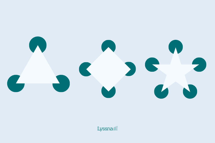
The Gestalt psychology principle of closure (sometimes known as reification) refers to a phenomenon where the brain fills in missing information or completes a picture, even when parts of it are missing.
A simple example of this is a stylized illustration of a tree with only the trunk, branches, and a few leaves. Despite the missing details, the viewer can still perceive it as a complete and recognizable tree.
Designers often use this principle to create simple yet memorable designs. By relying on the viewer's brain to fill in the missing information, the design can be made more efficient and impactful. Closure also adds an element of mystery and intrigue to the design, encouraging the viewer to engage more deeply with the visual.
Closure in practice

Source: wikimedia.org
The WWF logo is a good example of how closure works in logo design. If you look closely, you'll notice a cute panda shape created from the negative space. Although the panda isn’t a complete shape on its own, our brains fill in the missing pieces to perceive a whole panda. This clever use of closure helps the WWF convey its mission of protecting wildlife, creating a memorable and impactful logo.
Common region and common fate
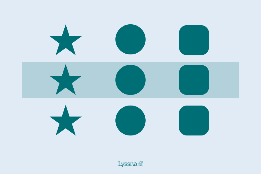
The Gestalt principle of common region and common fate describes how our brains perceive the relationship between objects. Objects that are close to each other (sharing a common region), or are moving in the same direction or at the same speed (common fate), are perceived as a group.
In design, this principle is used to create a sense of unity and organization in a composition. For example, grouping similar objects together within a common region, such as icons or images, creates a visual hierarchy. Alternatively, aligning text or objects in the same direction creates a sense of movement and flow, guiding the viewer's eye.
By using the common region/common fate principle in your designs, you can create visually pleasing and easily readable compositions.
Common region or common fate in practice
The design of the horizontal navigation bar on the Apple website illustrates the common fate principle.
By aligning the links in a straight line and having them move together as the user hovers over each link, it creates a sense of unity and direction, guiding the user's attention and making the navigation more intuitive and user-friendly, an approach that becomes even more effective when you test navigation to validate it with real users.

Meanwhile, the principle of common region is often used in newspaper or magazine layouts to group articles and images together within columns or boxes. This grouping creates a common region for each piece of content, which helps establish a visual hierarchy and makes it easier for the reader to find and understand the content. So, when you look at a newspaper or magazine, you'll see this principle in action.
Figure/Ground
Source: wikipedia.org
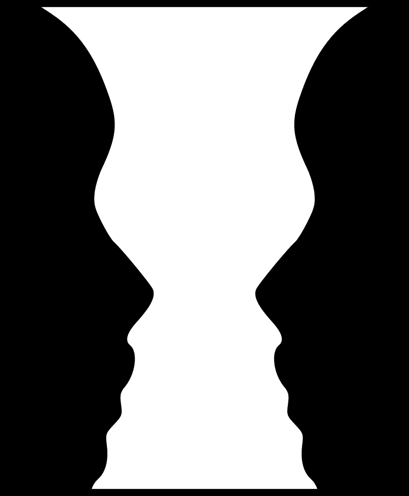
The Gestalt principle of figure/ground, also known as multi-stability, is how our brains process and perceive objects and their surroundings in the environment.
In Universal Principles of Design, figure/ground is described as the way our brains perceive elements as either objects of focus (the figure) or the background (the ground). Like closure, this Gestalt principle works through the use of positive and negative space.
This principle also creates a visual illusion known as multi-stability, where our brains switch back and forth between perceiving different elements as the figure or the ground.
Using the principle of figure/ground in design can help you create visually engaging designs and emphasize specific content. You can control which elements are perceived as the figure and the ground by using contrasting colors, shapes, sizes, and textures. This way, you direct the viewer's attention to essential parts of your design and create a sense of visual focus.
For example, on a website or poster, you can use this principle to guide the viewer's eye to critical information a key consideration when understanding what is ui. By emphasizing certain elements, such as a call-to-action button or a tagline, and using contrasting colors or shapes, you can make them stand out as the figure against the background.
Figure/Ground in practice
Source: dribbble.com
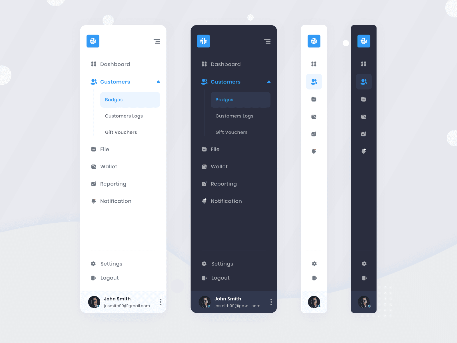
The Gestalt principle of figure/ground can be seen in the format of navigation bars.
A well-designed navigation bar should clearly distinguish between the figure (the selected or active tab) and the ground (the other tabs). By using contrasting colors, shapes, and sizes, you can create a clear visual hierarchy that makes it easy for users to navigate through the interface. This way, the figure/ground principle can help guide users and enhance their overall user experience.
Proximity
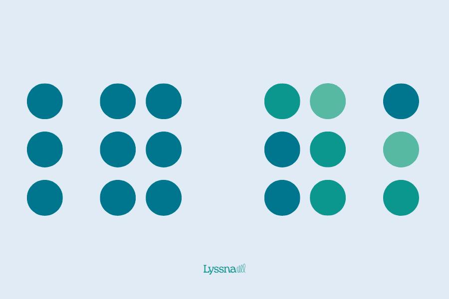
The Gestalt principle of proximity involves grouping together elements that are related. As a designer, you can use this principle to create a more organized and structured design by placing similar elements in close proximity to each other. This helps you to tell a story and draw attention to the most important parts of your design.
Imagine arranging puzzle pieces together in one place, making it easier to see the bigger picture and fit everything together. This is the essence of the principle of proximity.
Proximity in practice
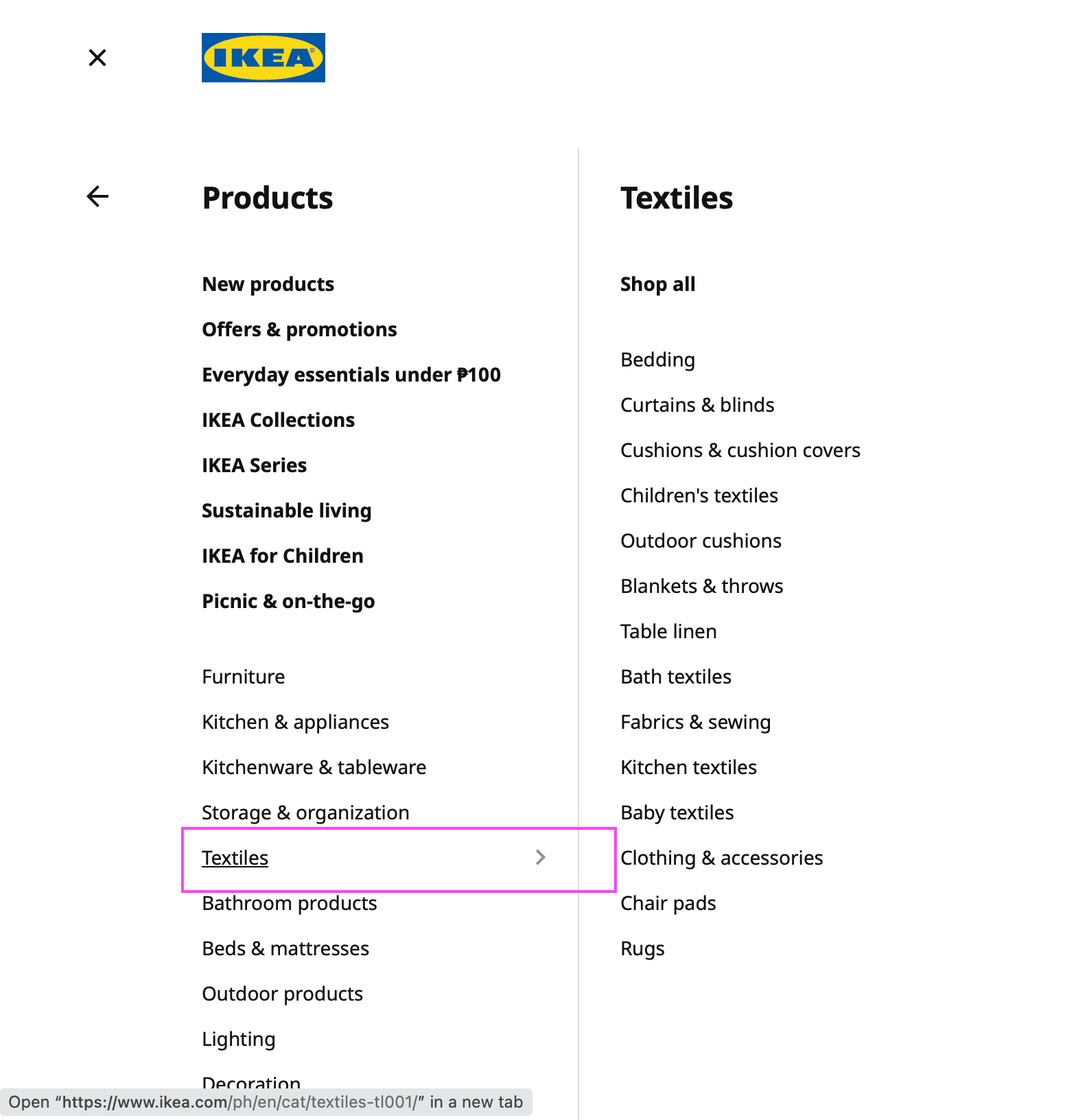
On the IKEA website, products that are related to each other are placed near one another, separated from unrelated products. This grouping of related products makes it easy for users to quickly find what they’re looking for, creating a visually appealing and user-friendly browsing experience. By utilizing the Gestalt principle of proximity, the IKEA website is able to provide a clear and organized look for users.
Quick tip: Use first click testing to gain information about how users complete a task on your website, like finding a specific product.
Symmetry and order
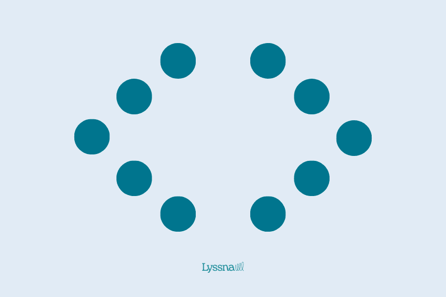
The Gestalt principle of symmetry and order is about bringing balance and structure to your designs. This helps create a visually stunning and engaging experience for your audience.
For example, think about designing a website or logo. By aligning elements in a balanced and repeated pattern, using centered text, mirrored imagery, or a grid, you can achieve symmetry that instantly makes your designs pop.
In addition, including elements that indicate order, such as clean lines, predictable patterns, and neat arrangements, can help create an organized and easily understandable visual.
Symmetry and order in practice
The Gestalt principle of symmetry and order can be clearly seen in UI design through the use of grid systems. Grids serve as a structure for arranging design elements like text, images, and buttons, ensuring symmetry and equal spacing.
Grids can also be used to organize content into columns and rows, establishing a clear visual hierarchy and making it easier for users to navigate and understand information.
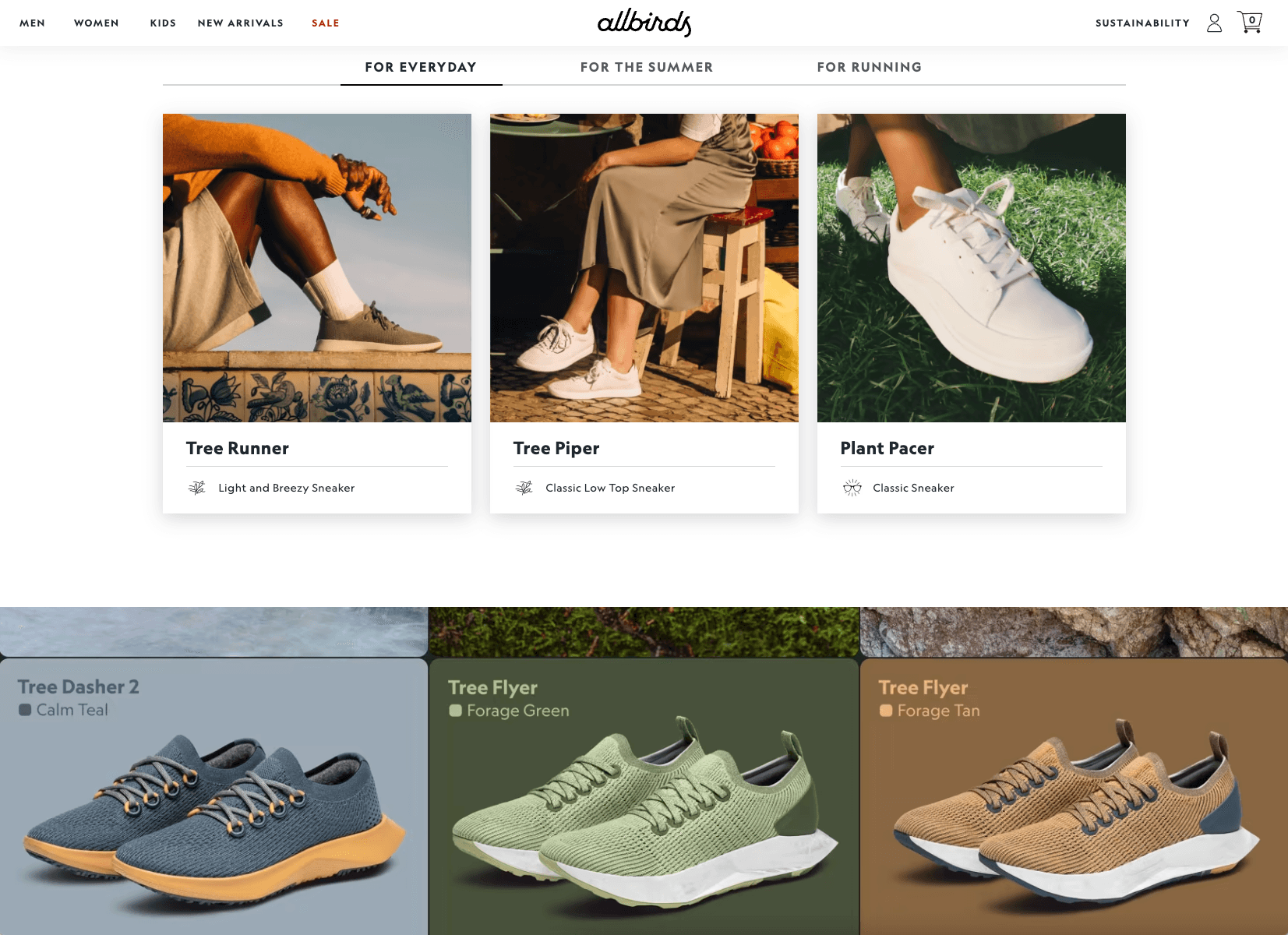
An excellent example of grid use in website design can be seen on the Allbirds website. The grid layout is used to make scanning easy, with their offerings arranged in neat rows and columns that are symmetrical and organized.
Past experience
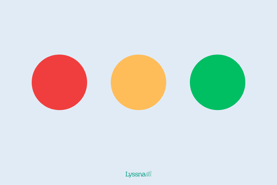
The Gestalt principle of past experience highlights how our personal experiences and cultural backgrounds shape the way we perceive visual information.
You can use this principle to create more effective designs by taking into account the experiences and cultural backgrounds of your target audience. By incorporating design elements that are familiar to your audience, you can create a more relatable and engaging user experience.
For example, if your research shows that your target audience is familiar with a particular design style, incorporating that style into your design can make it more recognizable and familiar to them. As a result, users are likely to connect more strongly with the look and feel of your design.
Past experience in practice

Source: dribbble.com
An example of this is the widely recognized "home" icon, which is commonly used to navigate back to the main screen of a website or app. Users are already familiar with this icon from their past experiences of using other websites and apps, and have developed an expectation of what it should look like and what it represents.
By using these familiar icons in your design, you can create a more intuitive and user-friendly experience for your audience.
Parallelism
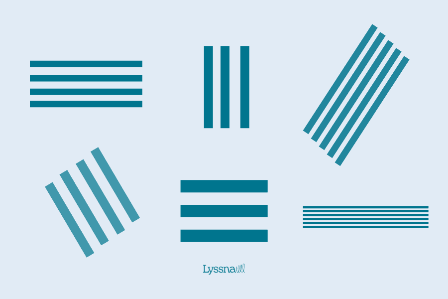
Parallelism is a design principle that suggests arranging elements in parallel lines to make them appear as a single unit. This creates a sense of unity and consistency, making the design visually appealing and easy to comprehend.
For example, in web design, aligning text, images, and other elements in parallel lines creates a sense of structure and coherence, making the information more accessible to the viewer. It also helps direct the viewer's gaze towards specific areas of the design, such as a call-to-action button.
However, parallelism isn’t just limited to lines. As Steve Bradley, the author of Design Fundamentals: Elements, Attributes, & Principles notes, you can also use curves or shapes to apply the principle of parallelism in your design.
Parallelism in practice
An example of parallelism in practice is the use of consistent margins and padding in web design. This is the white space around and between elements on a web page.
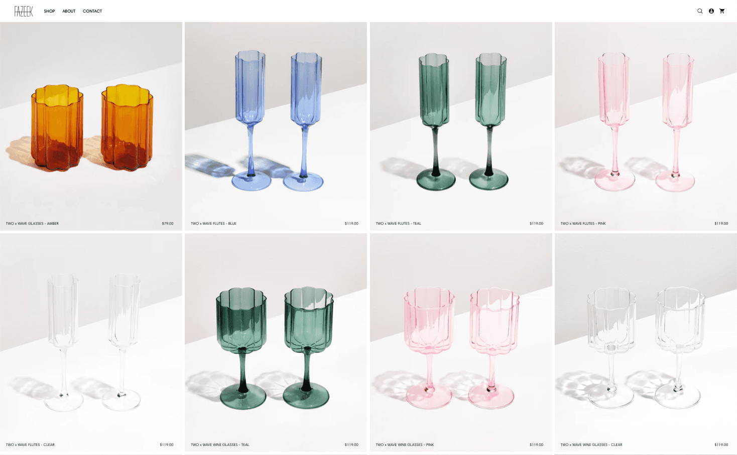
In this example from Fazeek, a designer homewares company, we can see items in the e-commerce store photographed in the same way and displayed with consistent margins and padding. This creates a sense of parallelism and alignment, and helps create a cohesive and visually appealing layout.
Focal point
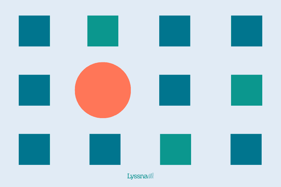
The focal point principle is all about drawing the viewer's attention to the most important part of your design. This is achieved by highlighting one element or object as the center of attention.
To create a strong focal point, you can use techniques that make the element stand out from its surroundings. This can be done through the use of contrasting colors, making the element larger or more prominent than the others, or placing it in the center of the page. The goal is to guide the viewer's eye to the most important information or element in the design, such as a headline, image, or call-to-action button.
Focal point in practice
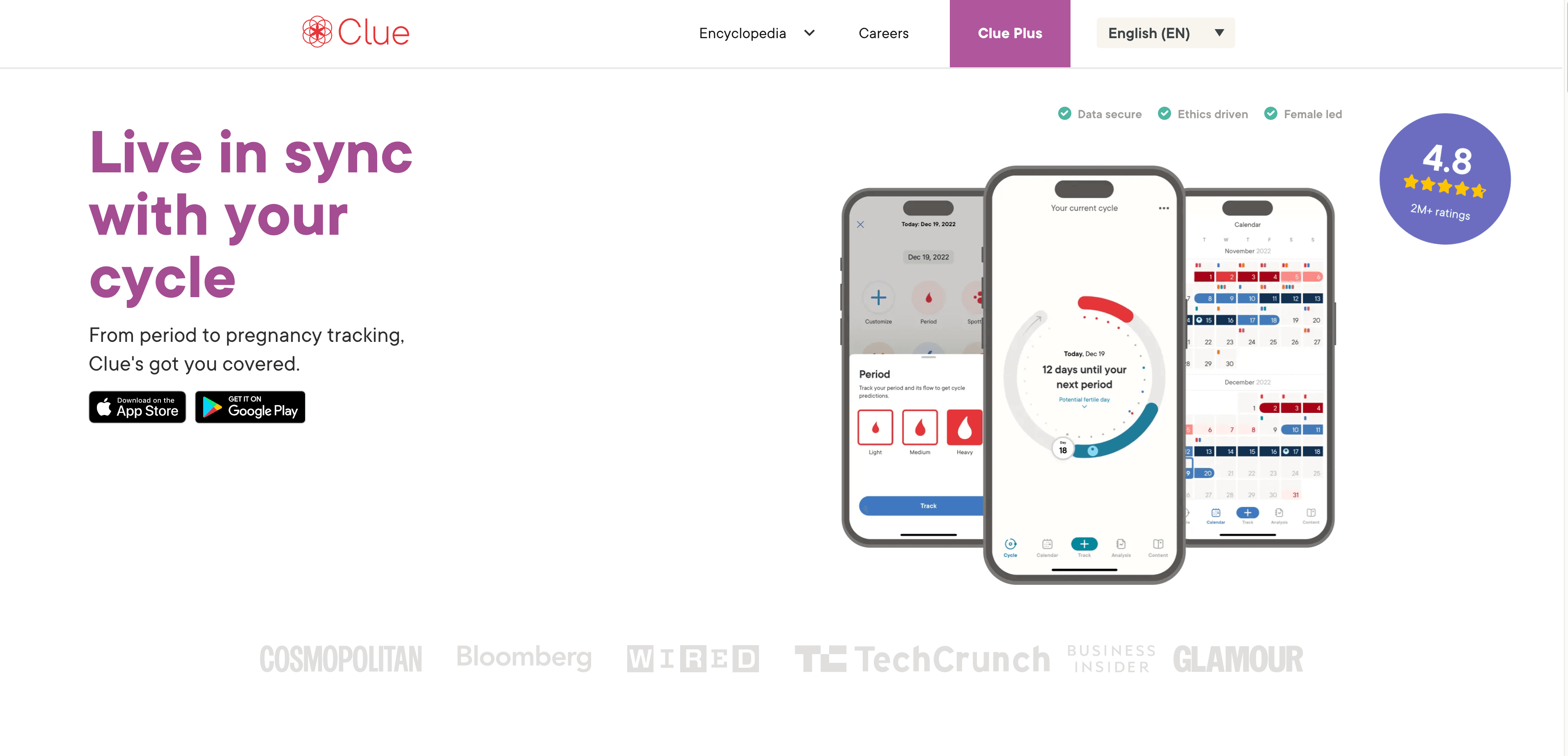
A good example of the focal point principle is a large, eye-catching hero image on a website's homepage. A hero image is often placed at the top of the page to immediately capture the viewer's attention. This hero image serves as a focal point, drawing the viewer's eye and setting the tone for the rest of the content on the page.
By including a hero image that communicates your brand's message, you create a visually appealing and impactful first impression. For instance, Clue, a menstrual cycle tracking app, uses screenshots of their app as the hero image, which quickly communicates the app’s functionality and features to the viewer.
Simplicity

The Olympic rings are an example of the Gestalt principle of simplicity
The Gestalt principle of simplicity in design focuses on using only the necessary elements to effectively communicate a message or achieve a goal. The reason behind this is that our brains tend to prefer simplicity and order, and including unnecessary elements can detract from the design.
To apply this principle, use clean and uncluttered layouts, limit the number of colors and elements used, and keep the overall design free of distractions. This approach ensures that the design remains focused and communicates its intended message clearly and effectively.
Simplicity in practice
Swiss Style design is a great example of the principle of simplicity in action. The design style is known for using minimal typography and a limited color palette to create a clean, uncluttered look. By limiting the number of design elements and sticking to a consistent, pared-down aesthetic, Swiss Style design demonstrates how simplicity can result in a visually appealing and user-friendly design.
Design better with the Gestalt design principles
Gestalt principles can help you become a better designer by giving you have a framework for:
Evoking delight and positive emotions from users.
Improving usability in your designs.
Strengthening brand perception.
Improve your UX with data-driven feedback
Apply Gestalt principles confidently. Use Lyssna to run surveys and usability tests that inform your design decisions.
Frequently asked questions about Gestalt design principles
--
Kai has been creating content for healthcare, design, and SaaS brands for over a decade. She also manages content (like a digital librarian of sorts). Hiking in nature, lap swimming, books, tea, and cats are some of her favorite things. Check out her digital nook or connect with her on LinkedIn.
You may also like these articles
Try for free today
Join over 320,000+ marketers, designers, researchers, and product leaders who use Lyssna to make data-driven decisions.
No credit card required


