09 Jul 2024
|10 min
Using Lyssna in conversion copywriting
Learn how to incorporate usability testing into your conversion copywriting workflow to make data-backed decisions.

Rolling out new copy is exhilarating. But it can strike fear in the hearts of the bravest marketers. Even if you've done it a million times, you might worry about questions like these:
Will the new messages resonate?
I love the wording – but will our audience think it's a cringe fest?
What if this new direction costs us sales – how will the business (and my career) recover?
And it's no easier for the fine folks tasked with writing the copy either. Freelancers and in-house copywriters alike struggle with perfectionism, fear of failure, and the threat of AI replacing our jobs.
Some resort to puffery. Others seek solace in LinkedIn rants about the state of copywriting. I use Lyssna.
In my role as Head of Growth & Creative for a communications consultancy agency, I'm always looking for ways to validate my copy and messaging ideas. I've found Lyssna to be a good alternative to A/B testing because it helps me reduce complexity and costs when I test and validate my copy and messaging ideas. It's super swift, affordable, and much more flexible than A/B testing. Plus, it works even if the website in question doesn't see sufficient traffic for A/B testing – and for copy that's tricky to test, such as print or customer care email templates.
First, let's get the lingo out of the way.
Elevate your research practice
Join over 320,000+ marketers, designers, researchers, and product leaders who use Lyssna to make data-driven decisions.
What is conversion copywriting?
Conversion copywriting is the evidence-informed use of language to achieve a measurable transformation, shift, or change of mind. Someone who “converts” takes action. While that action will often be a purchase, it could also be signing up for a newsletter, signing a petition, or attending a free event.
What does the conversion copywriting workflow look like?
A client presents a problem they'd like me to solve.
I research our client's business, their desired and actual audiences, and their market. I also search journals, libraries, and the internet for related scientific studies.
Together with our team of strategists, designers, and copywriters, I come up with ideas and hypotheses. Depending on the problem we're looking to solve, these might relate to positioning and branding, tone of voice, marketing strategy – or something completely different. I make plenty of notes and collect them in a dedicated, prioritized database. This also includes helpful information such as relevant frameworks from behavioral theory and examples from published research.
At this stage, I like to check in with the client to see which ideas resonate and why.
Once I have the green light, I draft copy in line with my research findings and ideas. I like collecting a few dozen options for key messages such as headlines, calls to action, or product detail descriptions, using message testing to evaluate their effectiveness. My editor and I review, cluster, and refine these ideas and settle on a small number of potential winners.
Now it's time to validate! I run and analyze several tests to see which ideas work best, and which tweaks could make the copy perform better.
Whenever possible, I mock up the copy I want to test so it looks like it's a real website or email. In theory, you could work with a screenshot of a Word document, but I've found that a lot of participants get distracted with the lack of design. Response quality improves if the copy is well-presented.
Based on the Lyssna results, I make the appropriate changes to our copy and present it to the client. Most of the time, there's more than one idea that yields great results. Then, it's up to the client to decide which one they prefer – and if they’re in a position to A/B test these options.I also keep a log of our tests and findings for future reference, so we don't lose sight of ideas we've tried before.
In multilingual projects, we work through the same steps for each target language to make sure it's a true fit for the audience and not just a translation.
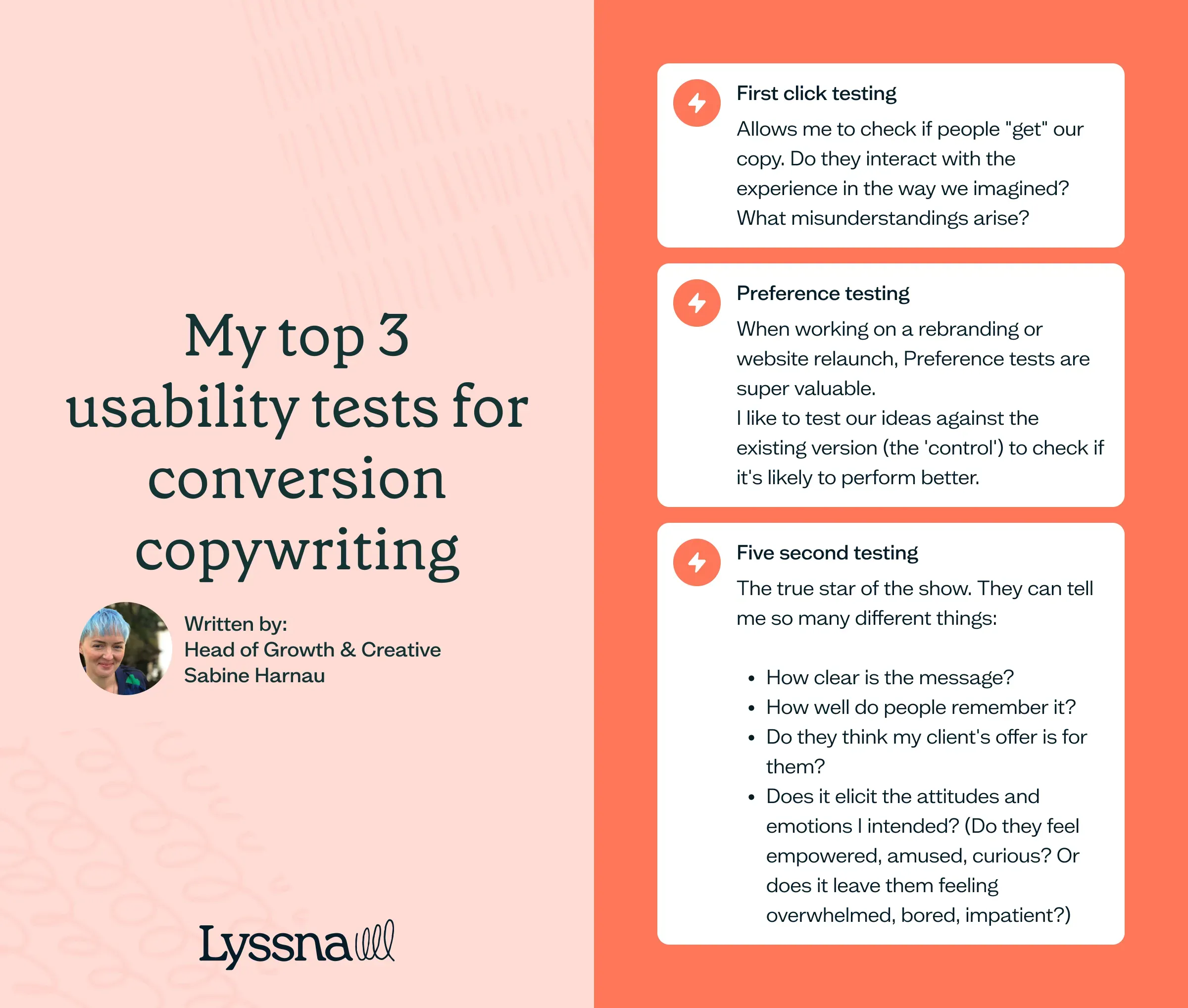
My top 3 usability tests for conversion copywriting
Depending on the project, all Lyssna features come in handy. But my most-used test types are five second tests, first click tests, and preference tests.
Combine these test types with the fact that the Lyssna panel comprises well over half a million people, and we can get a pretty good handle on which wording will work before it ever goes live.
Screeners and targeting options also help me make sure the responses are relevant, and sometimes I even filter responses demographically for even more granular insights.
First click testing
UX plays a huge role in conversion copywriting. For example, we often write new user flows, rename menu items for website relaunches, and optimize calls to action. Understanding the differences between copywriting vs UX writing is crucial in these contexts, as each requires a unique approach to messaging and user engagement.
First click testing allows me to check if people "get" our copy. Do they interact with the experience in the way we imagined? What misunderstandings arise? Since testers participate voluntarily, we need to worry less about privacy. And because they're in their natural environment, results translate to real life much better than those from tests taken in a lab setting.
Preference testing
When working on a rebranding or website relaunch, preference tests are super valuable. I like to test our ideas against the existing version (the 'control') to check if it's likely to perform better.
Open-ended questions help me figure out what's working in each version, so I have a better handle on future improvements.
Five second testing
But five second tests are the true star of the show. They're like the Swiss pocket knife in my tool stack because they can tell me so many different things:
How clear is the message?
How well do people remember it?
Do they think my client's offer is for them?
Does it elicit the attitudes and emotions I intended? (Do they feel empowered, amused, curious? Or does it leave them feeling overwhelmed, bored, impatient?)
Check out our template library to get started with first click testing, preference testing, and five second testing.
Conversion copywriting case study: Exazyme
We tested the following four versions of a new home page for our start-up client, Exazyme. We wanted to find out:
Would the more evocative headline perform better?
Or would the option naming the target audience perform better?
Or the one emphasizing the benefits?
Or would none of them beat the control?
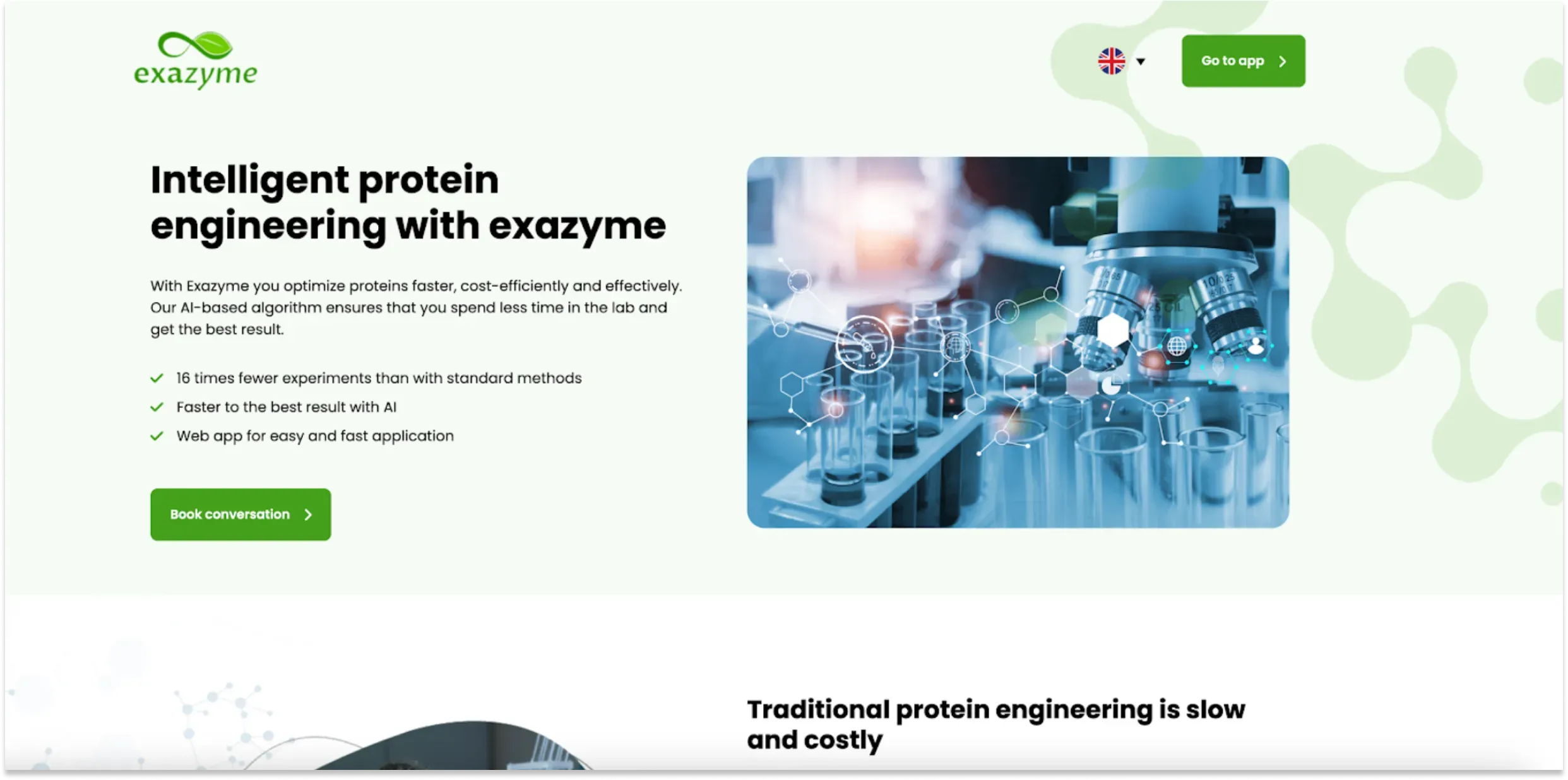
The control is the hero section that was live when the Exazyme team first approached us for conversion rate optimization. In our first round of testing, this option performed best.
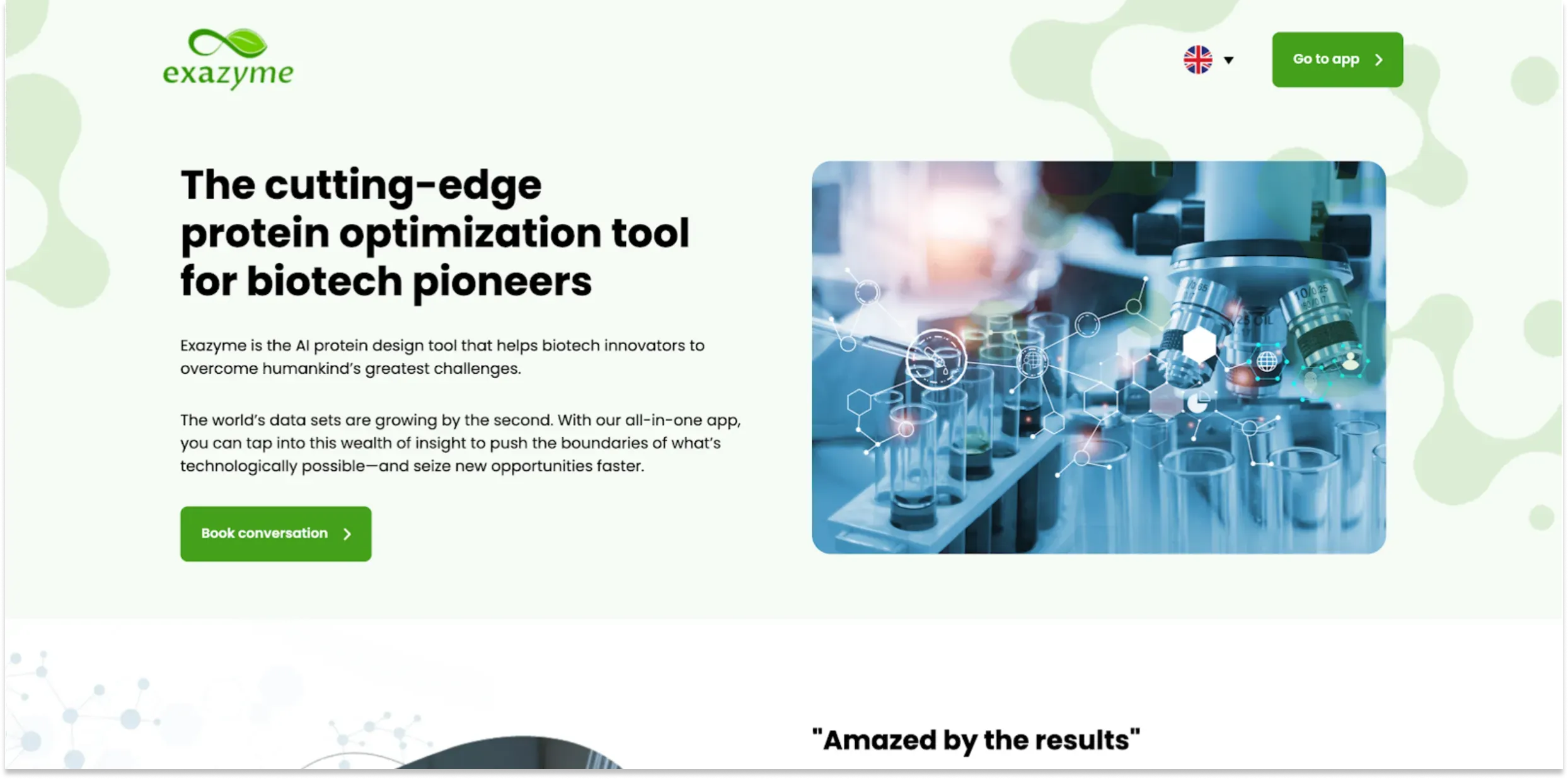
Above is what we tested with the target audience. Based on our research, the ideal client of this innovative startup was an early adopter – a "pioneer", to quote voice-of-the-customer data. But this version performed the worst.
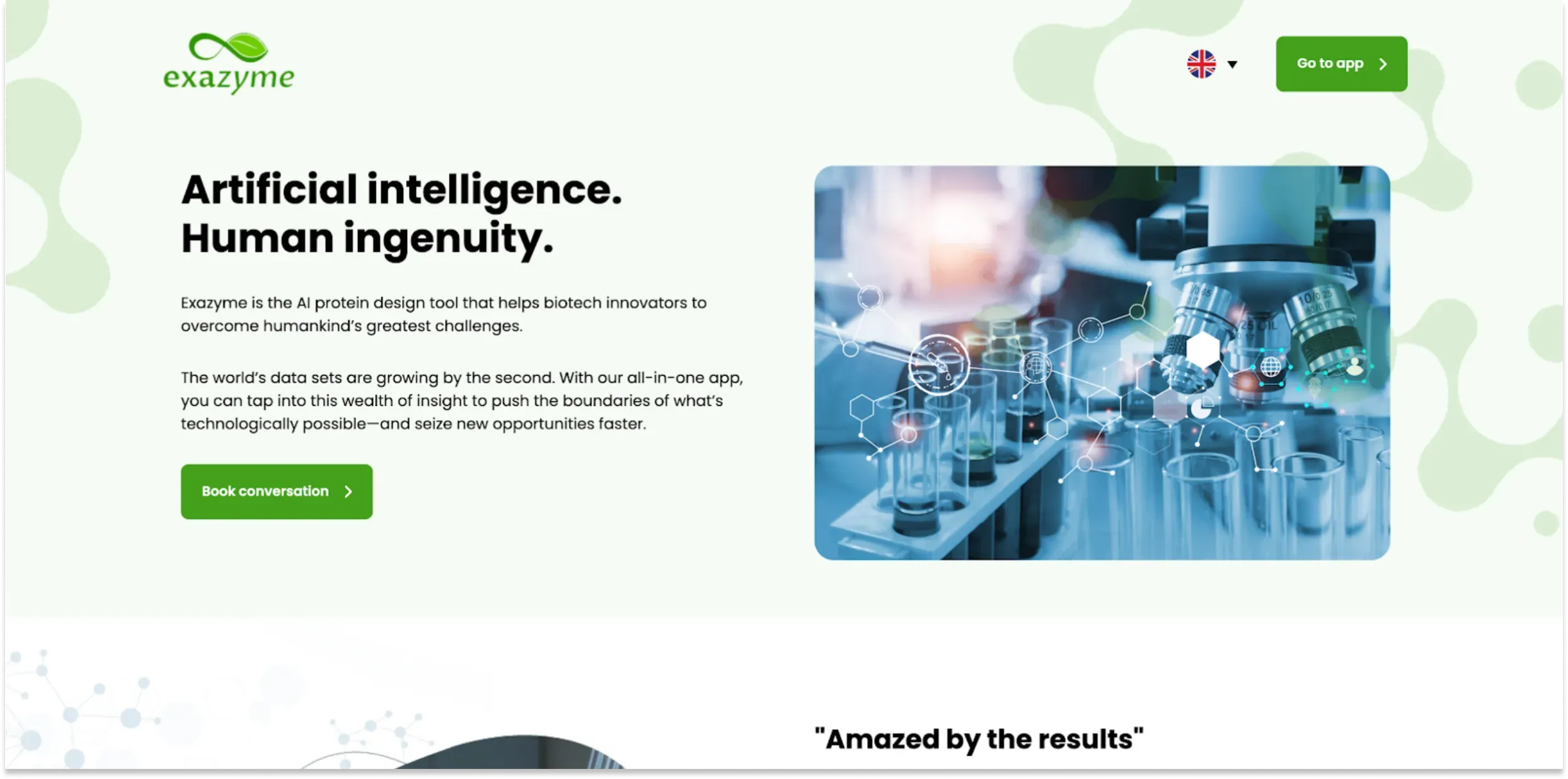
Above is the evocative option. We knew from our user interviews that our client's audience perceived a huge gap between the capabilities of AI and human researchers. Tapping into these feelings worked well: this hero section made it to second place in the tests.
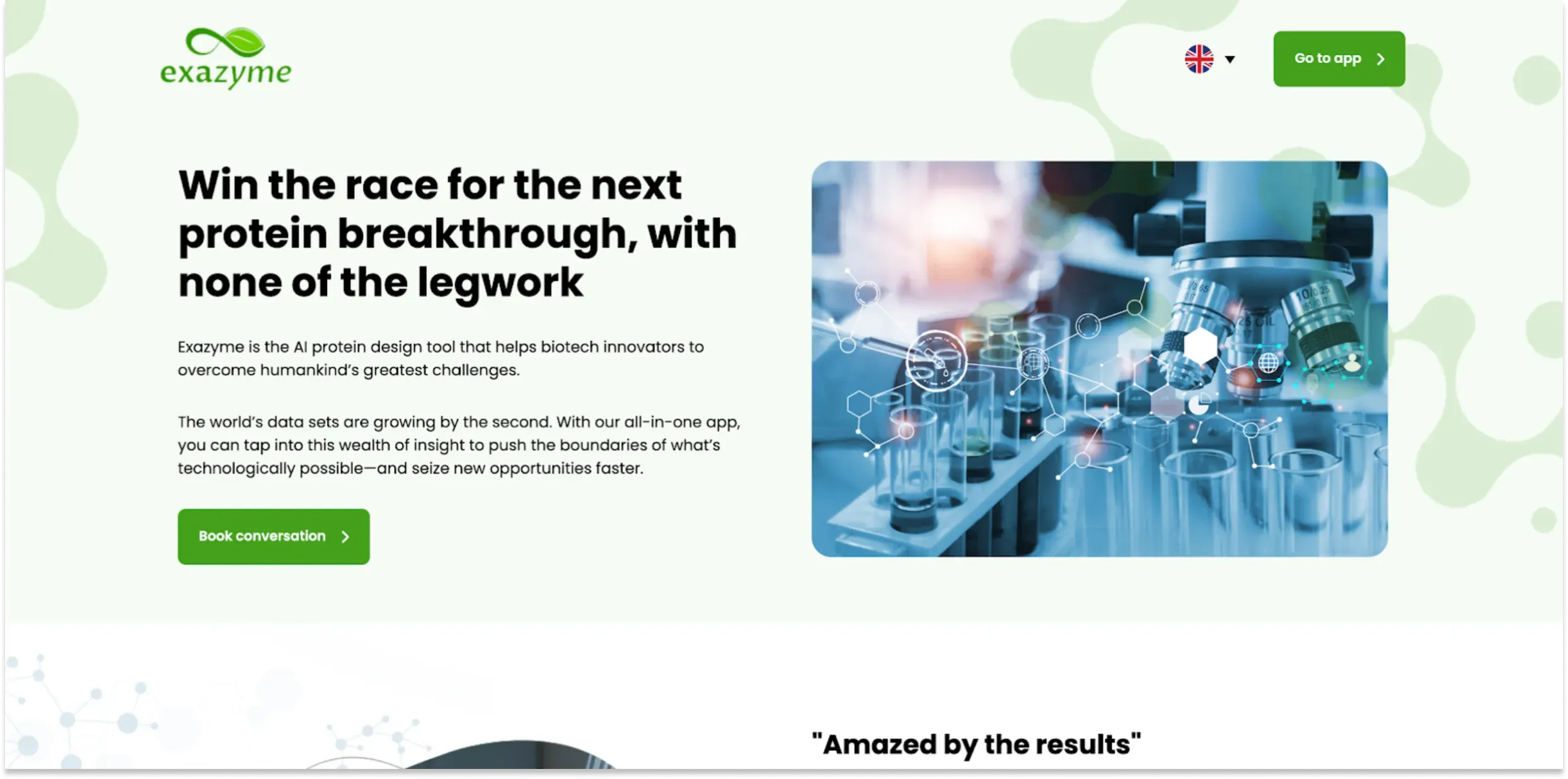
And above is the playful benefits-focused headline. We tested this version to see if metaphors and puns would resonate with this audience – especially when talking about the outcomes of using this software.
But it was the open-ended questions that held the true answers. People said they preferred the control because it had three bullet points – not because the wording did so much for them. So, we updated the mock-ups and copy to include three bullet points in each version.
And hey presto:
The control came out last.
Most participants preferred the evocative option, closely followed by the one mentioning the target audience.
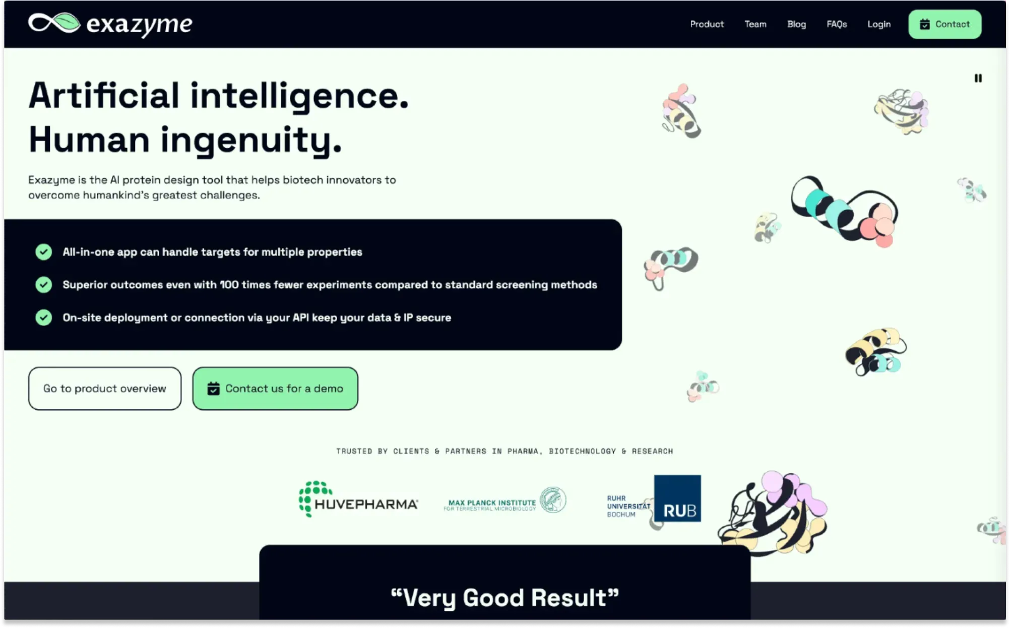
Take a peek below at the hero section of the website we wrote and designed for Exazyme based on these tests (and others).
Analyzing usability test results to make better copywriting decisions
Lyssna’s built-in functionality makes results analysis simple.
I usually tag responses and calculate what percentage of panelists gave the desired response. Depending on complexity, I might visualize the results in a chart.
For open-ended questions, I also like the word cloud option – it really helps clients grasp the main takeaway at a glance.
Making sense of the results is the sophisticated part – especially if the results prove our hypothesis wrong. That's why I always refer to the research that prompted the test in the first place. Often, my notes from the literature, interviews, and user testing help me to plan my next steps.
Your go-to user research platform
The best teams use Lyssna so they can deeply understand their audience and move in the right direction — faster.
The takeaway: 5 best practices for testing copy in Lyssna
In my experience, testing copy in Lyssna works best if you follow these practices.
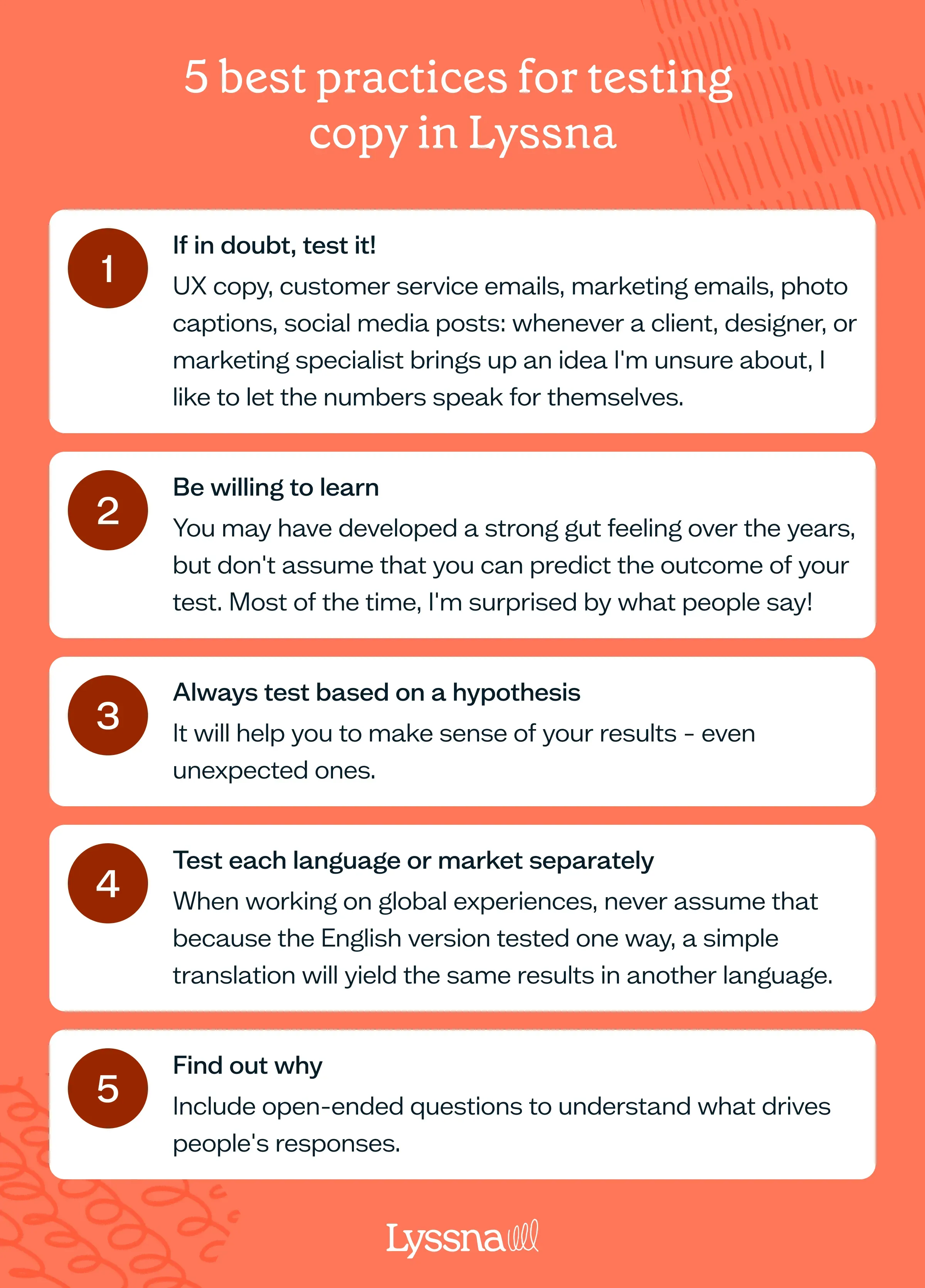
If in doubt, test it!
UX copy, customer service emails, marketing emails, photo captions, social media posts: whenever a client, designer, or marketing specialist brings up an idea I'm unsure about, I like to let the numbers speak for themselves.
Be willing to learn
You may have developed a strong gut feeling over the years, but don't assume that you can predict the outcome of your test. Most of the time, I'm surprised by what people say!
Always test based on a hypothesis
It will help you to make sense of your results – even unexpected ones.
Test each language or market separately
When working on global experiences, never assume that because the English version tested one way, a simple translation will yield the same results in another language.
Find out why
Include open-ended questions to understand what drives people's responses.
–
Sabine Harnau (she/they) is Head of Growth & Creative at From Scratch Communications – the evidence-informed communications consultancy for inclusive brands. Sabine’s work spans positioning, branding, marketing strategy, multilingual copywriting, and UX.
You may also like these articles

Try for free today
Join over 320,000+ marketers, designers, researchers, and product leaders who use Lyssna to make data-driven decisions.
No credit card required


