04 Oct 2024
|13 min
Understanding comparative usability testing
Evaluate user performance on tasks, identify strengths, and improve your designs with comparative usability testing.

Comparative usability testing is one of the most effective ways to truly understand how users interact with your product. By directly comparing different versions of a design (or even competing products), you can see what works and what doesn’t – and, more importantly, why.
Struggling to figure out which features resonate most with users? This method provides the clarity you need to make informed design decisions.
In this article, we’ll walk you through everything you need to know about comparative usability testing. You’ll learn its key benefits, why it’s crucial for product development, the methods you can use, and our top tips for getting the most out of it.
Key takeaways
Identify strengths and weaknesses: By directly comparing different options, you can see which aspects of your product work well and where improvements are needed, leading to more effective designs.
Boost user satisfaction: Testing helps you refine your product so you can make sure it’s more intuitive and enjoyable to use, which leads to increased user satisfaction and retention.
Streamline product development: With clear feedback on which elements work best, your team can focus on refining key features, speeding up development, and improving the final product.
Efficient use of resources: Comparative usability testing allows you to test multiple designs early on, reducing the risk of costly redesigns and making sure you make data-driven design decisions that maximize the impact of your efforts.
What is comparative usability testing?
Comparative usability testing is a UX research method that involves comparing two or more designs, features, or products to see which performs better from a usability perspective.
Unlike traditional usability testing – where you focus on assessing the usability of a single product – comparative usability testing helps you understand user preferences between options. It answers critical usability testing questions like: Which layout do users find more intuitive? Or, which feature is easier to use? This allows you to analyze how different elements impact user experience and provides actionable insights to refine your designs.
You can conduct comparative usability testing in various forms – from comparing different versions of a website to testing entirely different products against each other. The goal is always the same: to uncover which version performs better and why.
The importance of comparative usability testing
Comparative usability testing is a great way to understand how users interact with different designs, helping improve the user experience and make better design decisions. Here’s how.

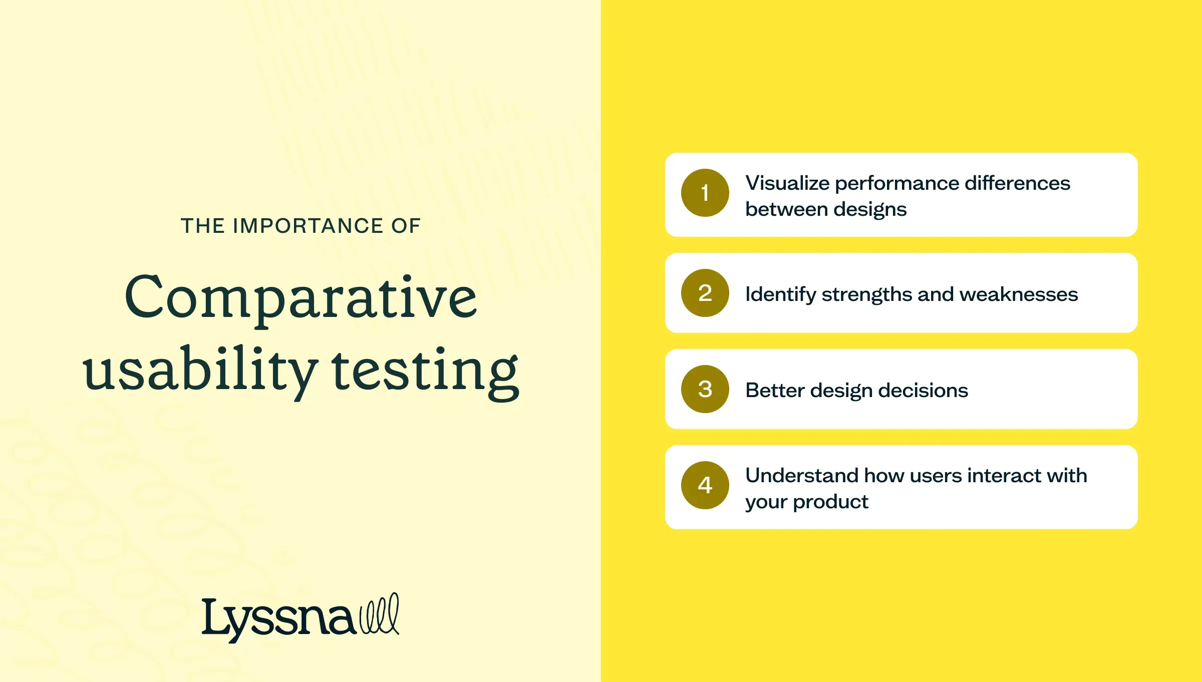
Visualize performance differences between designs
Comparative usability testing provides a clear, data-driven comparison of how users perceive and navigate different designs. This helps you understand specific areas where one design excels over another. Like the sharp click of a user finding exactly what they need versus fumbling frustration ... This allows for more precise improvements and designs optimized for real user needs.
Identify strengths and weaknesses
Comparative testing highlights the strengths of one version and the weaknesses of another, leading to more refined and user-friendly designs.
Make better design decisions
Comparative usability testing is invaluable in shaping both current and future design choices. It plays a key role in the design validation process by helping you gather performance data across different versions and pinpoint which design elements work best, and why. This method goes beyond surface-level feedback, helping you fine-tune designs based on real user behavior. For a deeper understanding of how to document and analyze your usability testing findings, check out this usability testing report to structure your insights effectively.
Understand how users interact with your product
Comparative usability testing gives you a clear view of how users engage with your product. By watching how they use different versions of your design, you can spot patterns in their behavior and decision-making. These findings help you create solutions that better fit their needs and improve overall usability.
Key benefits of comparative usability testing
Comparative usability testing offers several advantages that can greatly improve your design process and your product’s user experience.

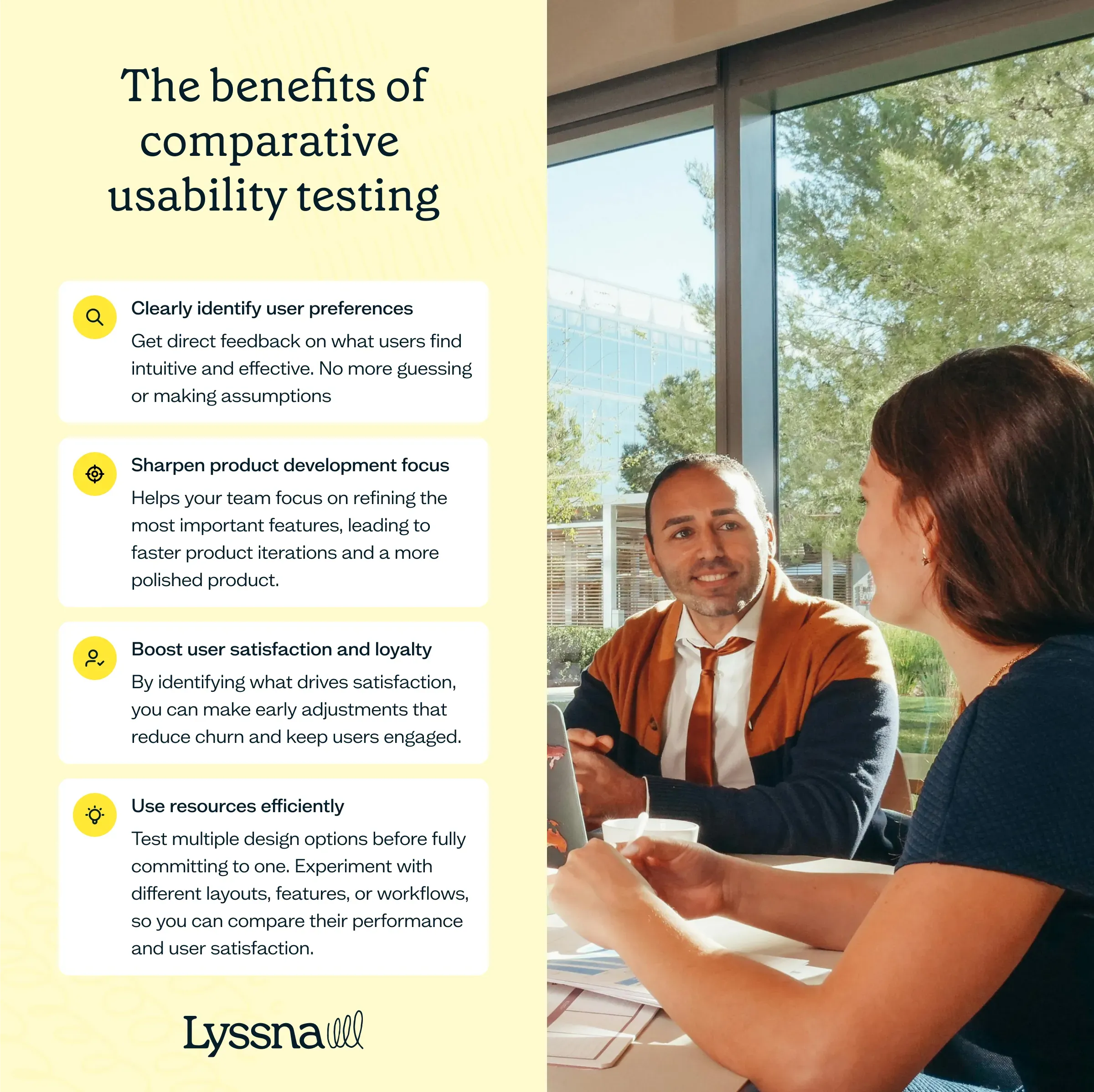
Clearly identify user preferences
Comparative testing gives you direct feedback on what users find intuitive and effective. No more guessing or making assumptions. You’ll know exactly which design elements work best, helping you focus on improvements that meet their expectations and improve their experience.
Sharpen product development focus
Comparative testing helps your team focus on refining the most important features. This leads to faster product iterations and a more polished product.
Boost user satisfaction and loyalty
Happy users are more likely to stick around and recommend your product. By identifying what drives satisfaction, you can make early adjustments that reduce churn and keep users engaged.
Use resources efficiently
Comparative usability testing allows you to test multiple design options before fully committing to one. This approach helps you experiment with different layouts, features, or workflows, so you can compare their performance and user satisfaction.
By identifying the best-performing design early, you can avoid costly mistakes and unnecessary rework. This process not only saves time and resources but also makes sure that you’re moving forward with a design that’s more likely to meet user needs.
Comparative usability testing methods
Comparative testing takes different forms, each tailored to specific parts of the user experience. Understanding which usability testing method to use – and when to use it – helps you gather the most valuable feedback to improve your product design.
The video below goes into more detail about the different usability testing methods available in Lyssna and when to use them.
Preference testing
Preference testing is a direct form of comparative usability testing. It involves presenting users with two or more designs, features, or layouts, and asking them which they prefer and why.
It allows you to:
Evaluate user reactions to different design elements.
Understand the rationale behind user preferences.
Identify which design aspects resonate most with your target audience.
Preference testing is especially useful for comparing visual design elements (like colors, letters, and pictures), layout changes, and information architecture.
Prototype testing
Prototype testing, when used comparatively, allows you to test multiple early-stage designs to see which version better solves user needs.
By testing and comparing different prototypes, you can uncover usability issues and gather feedback before moving forward with development. This makes it a valuable method for comparing concepts early in the design process.
First click testing
While first click testing typically focuses on evaluating a single design, it can be adapted for comparative usability studies.
In a comparative context, first click testing allows you to:
Analyze initial user instincts across multiple designs.
Identify which interface elements draw attention most quickly.
Compare the intuitiveness of navigation paths between designs.
By observing where users first click on different versions of a design, you can see how effective various layouts, button placements, and visual hierarchies are. This data is particularly valuable, because it reflects users’ reactions, often revealing preferences or pain points.
Five second testing
Five second testing is usually used to assess a design’s immediate impression, but it can also be adapted for comparative purposes. conducting a message test across multiple designs, you can compare which conveys the most important information or has the greatest visual impact. To better understand the process, check out what is message testing.
In a comparative context, five second testing allows you to:
Compare first impressions across different designs.
Identify which elements grab attention most quickly in each version.
Assess the clarity of purpose and the main message between designs.
This helps you understand which design communicates its purpose most clearly and how effectively each version conveys your brand identity or messaging.
Start testing now
Ready to dive in? Try our templates for preference testing, prototype testing, and first click testing. Get actionable insights faster with our user-friendly tools. Begin your comparative usability journey today!
A/B testing
While it’s not technically a usability testing method, we’d be remiss not to include A/B, or split, testing. This method involves showing two different versions (A and B) of a webpage, feature, or product to separate user groups and measuring which performs better based on key metrics such as conversion rates, click-through rates, and bounce rates.
This approach is particularly effective for testing small changes, like adjusting a call-to-action button or tweaking the layout of a form. A/B testing provides clear, quantitative data to guide your product decisions.
Benchmark testing
Benchmark testing is a valuable method in comparative usability testing that evaluates your product’s performance against industry standards, competitors, or previous versions. This helps you see where your product stands and can reveal areas for improvement.
By comparing competitor pricing pages, task completion rates, error rates, or satisfaction levels, you gain a clearer picture of how your product stacks up against the competition – and where there’s room for growth.
Our top tips for performing comparative usability testing
Here are some of our top tips to help you get the highest-quality feedback and the most meaningful results when conducting comparative testing.

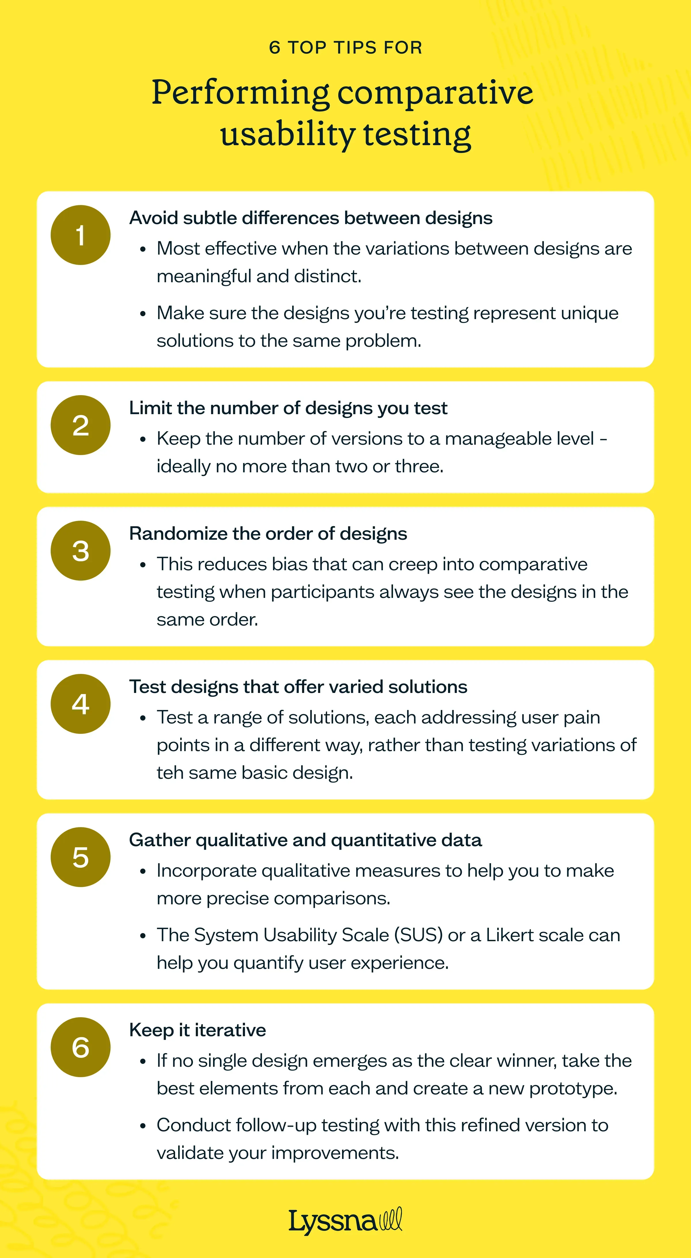
1. Avoid subtle differences between designs
Comparative usability testing is most effective when the variations between designs are meaningful and distinct. If the differences are too subtle – such as comparing two versions of a button or slightly varied color schemes – users might not even notice them.
Make sure the designs you’re testing represent unique solutions to the same problem. This allows participants to provide clearer feedback and, in turn, helps you make more decisive design choices.
2. Limit the number of designs you test
When testing multiple design solutions, keep the number of versions to a manageable level – ideally no more than two or three. Testing more than three designs can overwhelm participants, making it harder for them to recall key details and provide valuable feedback. By focusing on a smaller number of designs, you create a more focused and productive testing session.
3. Randomize the order of designs
Bias can creep into comparative usability testing when participants always see the designs in the same order. To mitigate this, randomize the order in which your participants view the designs. For example, Participant 1 might see the designs in the order A, B, C, while Participant 2 views them in the order B, C, A. This helps reduce order effects, for more reliable feedback.
4. Test designs that offer varied solutions
Make sure the designs you’re comparing offer genuinely different solutions to the problem you’re addressing. If you’re only testing variations of the same basic design, the results will be less impactful. Instead, test a range of solutions, each addressing user pain points in a different way. This helps identify which direction to pursue in your final design, and potentially combining the best elements of each option.
5. Gather qualitative and quantitative data
While user opinions are helpful in comparative usablity testing, incorporating qualitative measures can help you to make more precise comparisons. Tools like the System Usability Scale (SUS) or a simple Likert scale and understanding different quantitative research design types can help you structure your testing in a way that yields measurable, reliable insights for comparing different designs.. For example, a participant might rate one design higher even if they say they "like" another, offering a more precise comparison.
6. Keep it iterative
Comparative usability testing should be seen as an iterative process rather than a one-off event. If no single design emerges as the clear winner, take the best elements from each and create a new prototype. Conduct follow-up testing with this refined version to validate your improvements. This process ensures you’re always moving towards a solution that maximizes user satisfaction and efficiency.
These strategies will sharpen your testing, giving you the insights you need for smarter design decisions.
Making the most of comparative usability testing
Comparative usability testing is a powerful way to build a product that truly connects with your users. By comparing different designs and features, you can see which options work best.
It’s not just about which design works better, it’s about unlocking the "why" behind it.
This knowledge helps you create better user experiences, boost satisfaction, and ultimately drive business success.
Ready to let your next test shape the future of your product?
Elevate your UX research
Experience the power of Lyssna's comparative usability testing tools. Sign up for free and transform your product development process. Start making data-driven decisions today!
You may also like these articles


Try for free today
Join over 320,000+ marketers, designers, researchers, and product leaders who use Lyssna to make data-driven decisions.
No credit card required


