19 Dec 2025
|15 min
App design trends for 2026
Explore the app design trends shaping 2026, from AI-native interfaces to sustainable design. Learn how to test and validate these trends with real users.
In 2026, app design is shifting away from flashy new concepts toward the maturity of existing technologies. We're seeing AI woven naturally into interfaces, designers preparing for spatial computing, and a much stronger emphasis on ethical and sustainable design practices that users actively demand.
The trends shaping app design aren't about novelty – they're about making digital experiences more intuitive, more personalized, and more respectful of user autonomy and privacy.
Let's explore the key trends defining mobile app experiences today.
Key takeaways
AI-native interfaces adapt in real-time to user context, moving beyond chatbots to create truly predictive experiences.
Spatial design preparation is improving 2D interfaces today, even before widespread headset adoption.
Hyper-personalization balances customization with transparency, letting interfaces adapt while keeping users in control.
Gesture evolution extends familiar patterns into more nuanced interactions, with accessibility alternatives built in.
Biometric integration is spreading beyond health apps, but only when privacy-first principles guide implementation.
Micro-animations now serve a purpose, communicating state and progress rather than just adding visual polish.
Sustainable and ethical design has become a competitive advantage, with users actively rejecting dark patterns.
Collaborative features are embedded everywhere, designed for both real-time and asynchronous interaction.
Trend overview at a glance
Trend | Key benefits to users |
|---|---|
AI-native interfaces | Reduced friction through prediction |
Spatial design preparation | Clearer information hierarchy |
Hyper-personalization | Interfaces that adapt to individual needs |
Gesture evolution | Faster, more natural interactions |
Biometric integration | Seamless authentication and health tracking |
Micro-animations with purpose | Better feedback and state communication |
Sustainable and ethical design | Increased trust and efficiency |
Collaborative features | Better outcomes through shared work |
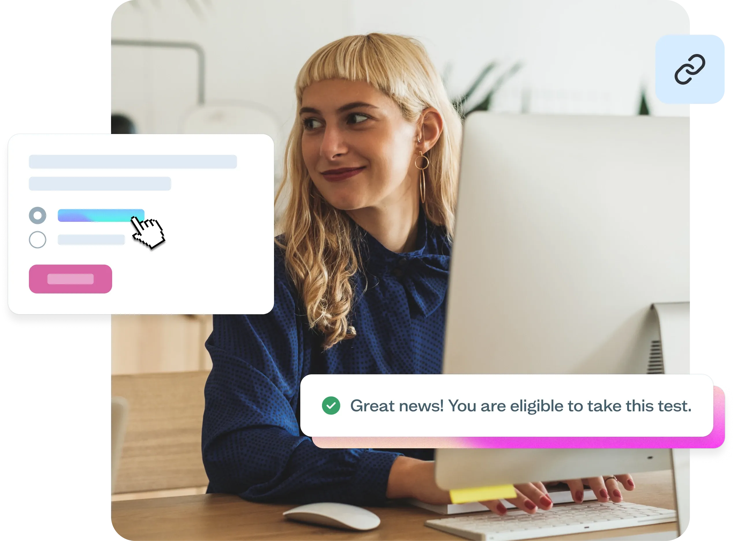
Test new design patterns with real users
Before you commit to these trends, validate them with your audience. Start testing for free with Lyssna and make confident design decisions.
1. AI-native interfaces
We've moved past the "add a chatbot" phase of AI integration. AI is now woven into the fabric of app experiences in ways that feel natural rather than tacked on.
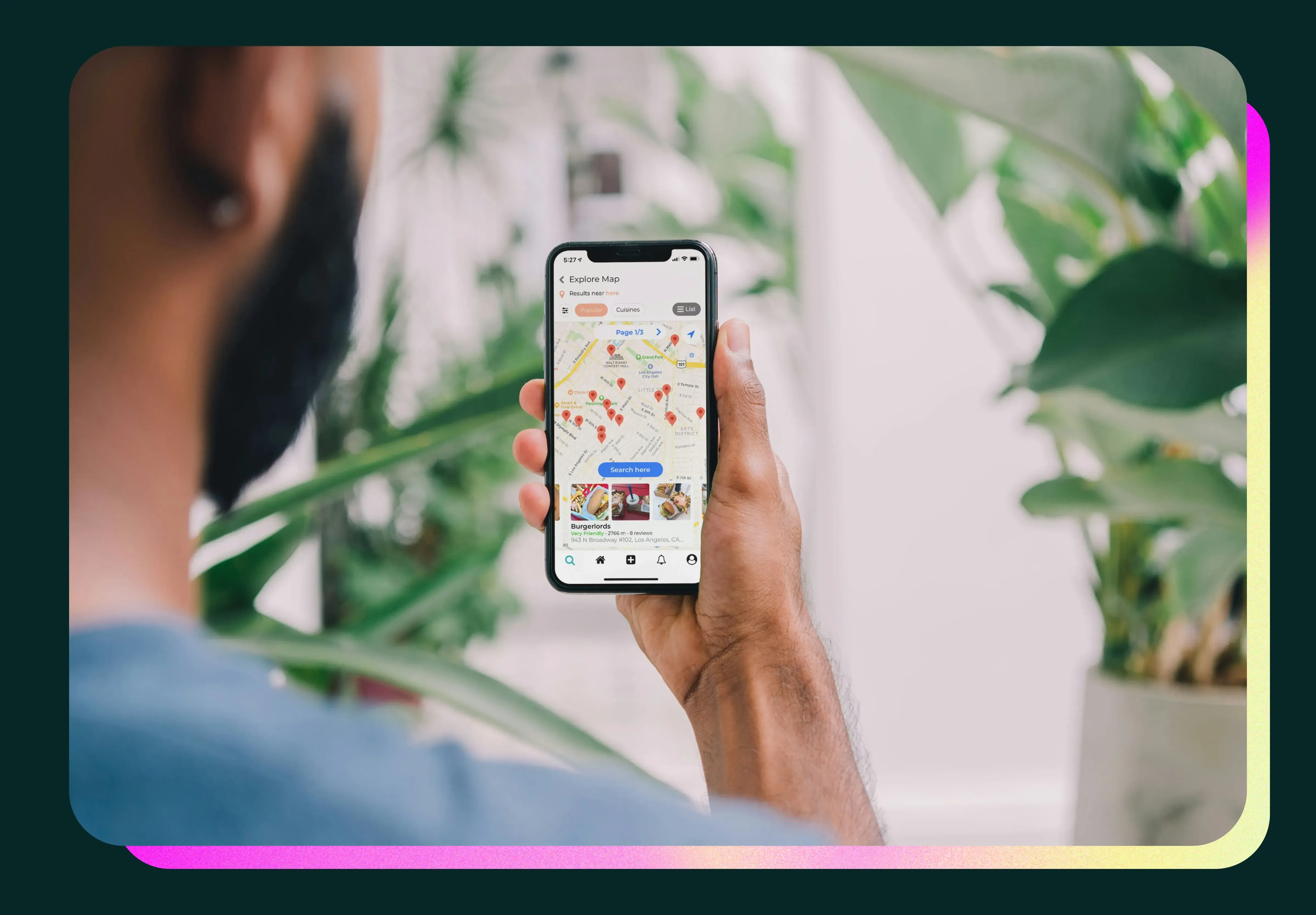
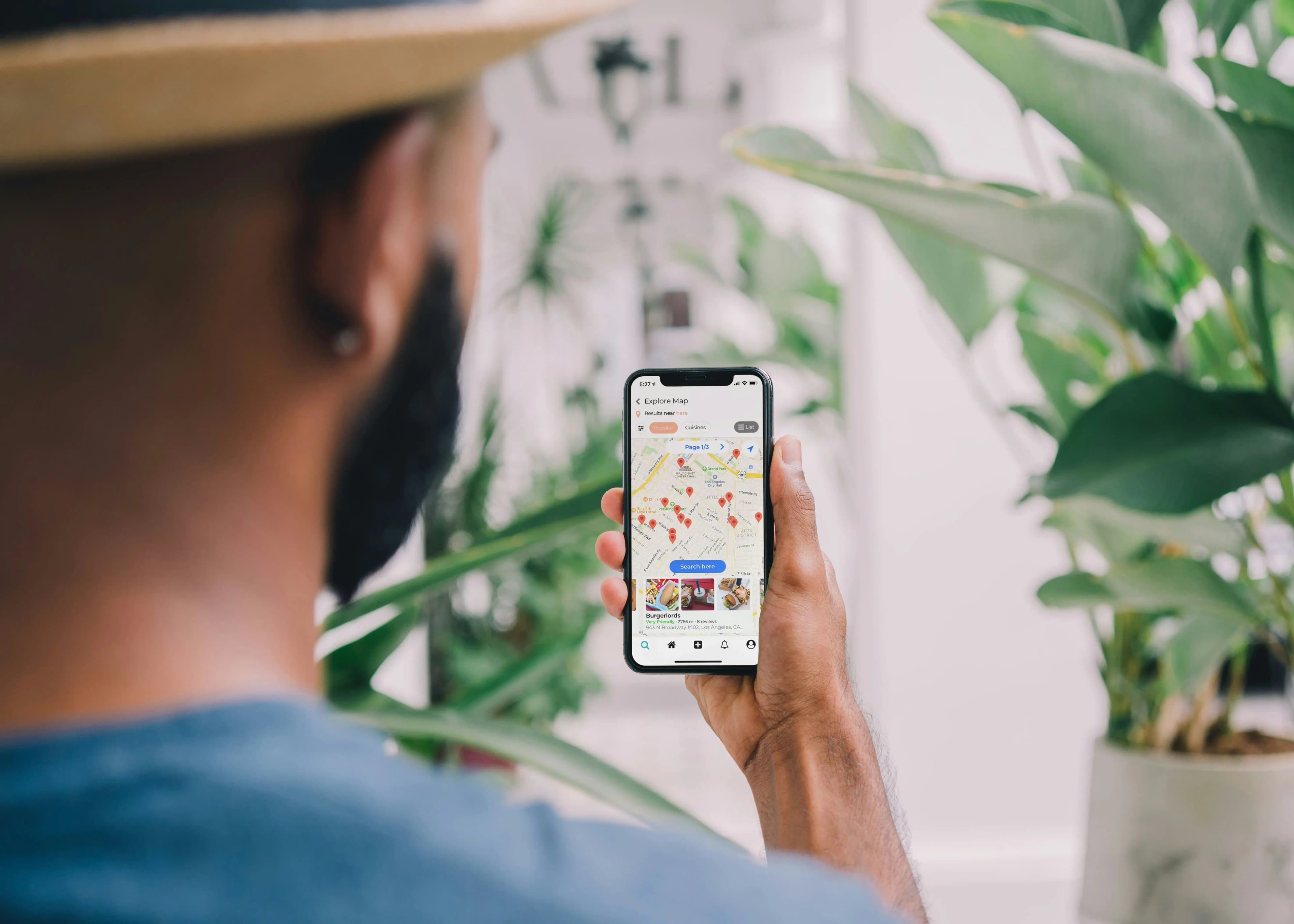
Think about it – instead of opening an app and searching for what you need, AI-native interfaces predict what you're looking for based on your context. Google Maps now predicts destinations based on your routine and calendar. Spotify's AI DJ feature adapts music selections based on your listening patterns and time of day. Amazon's app suggests reorders for items you purchase regularly before you run out.
This shift is fundamental. We're designing interfaces that adapt in real-time, focusing not on what the user might do, but on understanding what they're trying to accomplish and removing friction from that path.
What makes an interface AI-native? Here's what we're seeing:
Natural language as a primary interaction method, not just a feature.
Predictive surfaces that change based on time, location, and behavior patterns.
Adaptive layouts that reorganize themselves based on what you use most.
Contextual actions that appear exactly when you need them.
The challenge? Testing these personalized experiences requires thinking differently about research. You can't just test one version of an interface anymore – you need to validate how the AI adapts across different user patterns and contexts.
2. Spatial design preparation
Yes, Vision Pro adoption has been slower than expected. But that hasn't stopped designers from preparing for the inevitable shift to spatial computing.
Even if users aren't wearing headsets yet, designers are building systems that can scale from flat screens to spatial interfaces. This means thinking about depth, layering, and the z-axis in ways that actually improve traditional 2D experiences too.
Thinking about information hierarchy in three dimensions forces designers to be more intentional about what matters most. We're not designing for spatial computing because everyone has a headset – we're designing spatial-ready systems because it makes our current interfaces better.
What does spatial preparation look like in practice?
Design systems that account for depth and layering.
Component libraries built with z-axis positioning in mind.
Information architecture that works in both 2D and 3D contexts.
Gesture interactions that translate across interfaces.
Visual hierarchy that considers not just size and color, but spatial relationships.
Even if your users aren't in a spatial environment yet, these principles create clearer, more focused interfaces today.
3. Hyper-personalization and adaptive UIs
Remember when dark mode felt revolutionary? That was just the beginning. Apps are now offering personalization that goes far beyond a simple toggle.
We're seeing interfaces that change based on individual usage patterns. Instagram and TikTok prioritize content in your feed based on what you engage with most. Gmail's Smart Compose predicts your writing style and suggests completions. Netflix reorganizes its entire home page to surface genres and shows aligned with your viewing history.
This isn't about overwhelming users with endless customization options. It's about intelligent adaptation that happens automatically, with clear controls to override when needed.
The trick is balancing personalization with consistency. Users need to feel like they're in control, not like the app is making decisions for them. Every adaptation should be explainable and reversible.
What makes adaptive UIs work well:
Starting with sensible defaults for new users.
Gradually adapting based on clear behavioral signals.
Providing visibility into why the interface looks the way it does.
Making it easy to reset or customize manually.
Being transparent about what data drives personalization.
The ethical dimension matters here. Users are increasingly aware of their data, and they want to know how it's being used. Apps that succeed with personalization are those that put privacy controls front and center.
When testing adaptive interfaces, think about validating not just the end state, but the journey. How does the interface evolve? When do users notice changes? Do they feel helpful or intrusive?

4. Gesture evolution
We've been swiping and tapping for over a decade now. Gestures are evolving beyond these basics into more nuanced, multi-finger interactions that feel natural once you learn them – kind of like keyboard shortcuts for your fingers.
The apps leading this trend aren't inventing gestures randomly. They're building on patterns users already understand and extending them in intuitive ways.
Apps like Procreate support three-finger tap to redo and four-finger tap for full screen. Apple's native apps use pinch gestures consistently across Photos, Safari, and Maps to zoom in and out. The Kindle app also lets you adjust font size by pinching anywhere on the screen, not just in a menu. These aren't reinventions – they're smart evolutions of gestures we already know.
The best gestures are the ones you can stumble upon naturally. If a gesture requires reading a tutorial, it's probably too complex. But if it feels like a natural extension of something you already do, it sticks.
What's working in gesture design:
Building on established patterns rather than inventing new ones.
Using haptic feedback to confirm gestures and teach users.
Providing visual hints that encourage gesture discovery.
Making sure gestures work for different hand sizes and abilities.
Always offering alternative ways to accomplish the same action.
Accessibility is crucial here. Not everyone can perform complex gestures, so gesture-heavy designs need to include equally efficient alternatives. Think of gestures as shortcuts, not requirements. For more on accessible mobile design, consider how different users interact with touch interfaces.
5. Biometric integration
Your phone knows your face. Your watch knows your heart rate. Apps are now using this biometric data to create experiences that adapt to your physical and emotional state.
This goes beyond unlocking your phone with your face, though. Health and fitness apps have been the early leaders – apps like Whoop use heart rate variability to provide recovery recommendations, while Oura Ring tracks sleep patterns and readiness scores based on biometric data. Apple Health integrates various biometric inputs to give users a comprehensive view of their health metrics.
But we're seeing this spread beyond dedicated health apps. Meditation apps like Calm and Headspace integrate with Apple Watch to track heart rate during mindfulness sessions. Fitness platforms like Peloton adjust workout recommendations based on your performance metrics and heart rate zones.
Biometric data is incredibly personal. When apps use it well, they can provide genuinely helpful experiences. But there's a fine line between helpful and intrusive. Users need to understand exactly what's being measured, how it's used, and have the power to opt out completely.
The privacy-first approach means:
Clear explanations of what biometric data is collected.
Transparency about how the data is processed and stored.
Simple controls to turn biometric features off entirely.
Never sharing biometric data without explicit consent.
Processing data on-device whenever possible.
When you're testing biometric features, recruit diverse participants. Different people have different comfort levels with this technology, and their feedback will help you find the right balance between innovation and privacy.

6. Micro-animations with purpose
Micro-animations aren't new – but they've matured significantly. The difference now is that animations are expected to provide information, not just delight.
Users have become sophisticated in their understanding of interface feedback. They can tell the difference between an animation that's showing them progress and one that's just filling time. Purposeful micro-animations win while purely decorative ones feel outdated.
Dennis Lenard, CEO and Co-Founder of Creative Navy, explains why this matters:
"Clear feedback helps users understand what's happening within an interface. For example, highlighting fields requiring attention during form submission preserves cognitive resources and simplifies navigation. Feedback mechanisms like error messages or visual cues (e.g. shaking for invalid input) help users spot and fix issues, making the experience smoother and less frustrating. Subtle feedback and animations encourage users to explore features, making the app feel dynamic and engaging."
Every animation should answer a question. Where did that item go? Is this processing? Did my action succeed? If an animation doesn't communicate something useful, it's just slowing the user down.
What makes micro-animations purposeful:
They communicate state changes clearly.
They show relationships between elements.
They provide feedback on user actions.
They guide attention to what matters.
They respect user preferences for reduced motion.
Performance should be considered too. It doesn’t matter how beautiful an animation is if it slows down interactions or drains your battery. Users are increasingly conscious of their device's battery life, and apps that respect that constraint earn loyalty.
When testing animated interfaces, pay attention to whether users understand what the animations are communicating. If they can't explain what an animation means, it's probably not working.
7. Sustainable and ethical design
This might be the most important trend on this list. Sustainable and ethical design has moved from a nice-to-have to a competitive advantage.
Users are increasingly aware of and resistant to dark patterns – those design tricks that manipulate you into doing things you don't want to do. Apps that respect user autonomy are winning trust, while those that rely on tricks are facing backlash.
But sustainability goes beyond avoiding dark patterns. It's about the technical choices designers make. Optimizing images to reduce data transfer. Writing efficient code that doesn't drain batteries. Using dark mode not just because it looks cool, but because it genuinely saves power on OLED screens.
Sustainability isn't separate from good UX – it is good UX. When you design efficiently, apps load faster and batteries last longer. When you're transparent about data usage, users trust you more. These things are connected.
What sustainable design looks like in practice:
Optimized assets that load quickly and use less data.
Efficient code that doesn't waste processing power.
Clear, honest communication about features and data usage.
Respect for user time and attention.
Dark patterns actively avoided, not just absent.
The regulatory environment is pushing this forward too. With privacy regulations tightening globally, apps that build with transparency from the start will have an easier time adapting to new requirements.
When you're conducting research, include questions about trust and transparency. Users might not articulate "this feels like a dark pattern," but they'll tell you when something feels off or manipulative.

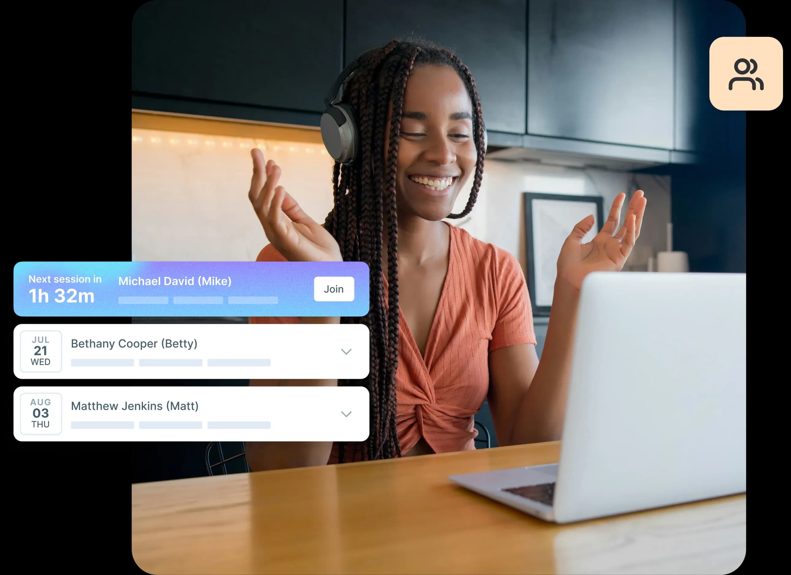
8. Collaborative features embedded everywhere
Real-time collaboration used to be the domain of productivity apps. Now, it's showing up everywhere.
Pinterest lets you create shared boards where multiple people can save ideas together. Strava includes clubs and challenges where friends encourage each other's fitness goals. Splitwise helps roommates and partners manage shared expenses collaboratively. The pattern is clear: any task that's better with other people is getting collaborative features.
But how is this different from just slapping on a share button? These features are designed for both synchronous and asynchronous collaboration. Not everyone can be online at the same time, so the best collaborative features work whether you're together or not.
The challenge isn't the technology – it's the human dynamics. How do you show someone's presence without making it feel like surveillance? How do you handle conflicts when two people make changes? How do you make collaboration feel optional, not mandatory?
What makes embedded collaboration work:
Clear presence indicators that respect privacy.
Conflict resolution that's automatic for simple cases, obvious for complex ones.
Easy controls to switch between solo and collaborative modes.
Asynchronous features that work when people aren't online together.
Privacy settings that let users control who they collaborate with.
The social dynamics matter more than you might think. Test collaborative features with real pairs or groups of people, not just individuals pretending to collaborate. The insights you get from watching actual social interaction are invaluable.
Testing and validating 2026 trends
Trends can fade as quickly as they emerge. Just because something is popular in 2026 doesn't mean it'll stick around. The only way to know if a trend works for your users is to test it.
That means going beyond asking "do you like this?" and instead observing how people actually use these new patterns. Do AI predictions save time or create confusion? Do gesture interactions feel natural or frustrating? Does personalization feel helpful or creepy?
Choosing the right testing method
What you're validating | Best testing method | What you'll learn |
|---|---|---|
Gesture discoverability | Prototype testing | Can users find and perform gestures naturally without instructions? |
AI prediction accuracy | First click testing | Do predictive elements appear where users expect them? |
Personalization preferences | Preference testing | Which level of adaptation feels helpful vs intrusive? |
Adaptive UI changes | A/B testing, usability testing | Do interface changes improve or confuse the experience? |
Collaborative workflows | Usability testing with pairs/groups | How do people actually work together in the interface? |
Spatial design hierarchy | Prototype testing | Is information prioritized correctly? |
Micro-animation effectiveness | Preference testing | Do animations communicate state clearly? |
Trust and transparency | User surveys, interviews | Do users understand and trust how their data is used? |
When you're testing emerging design trends, consider these approaches:
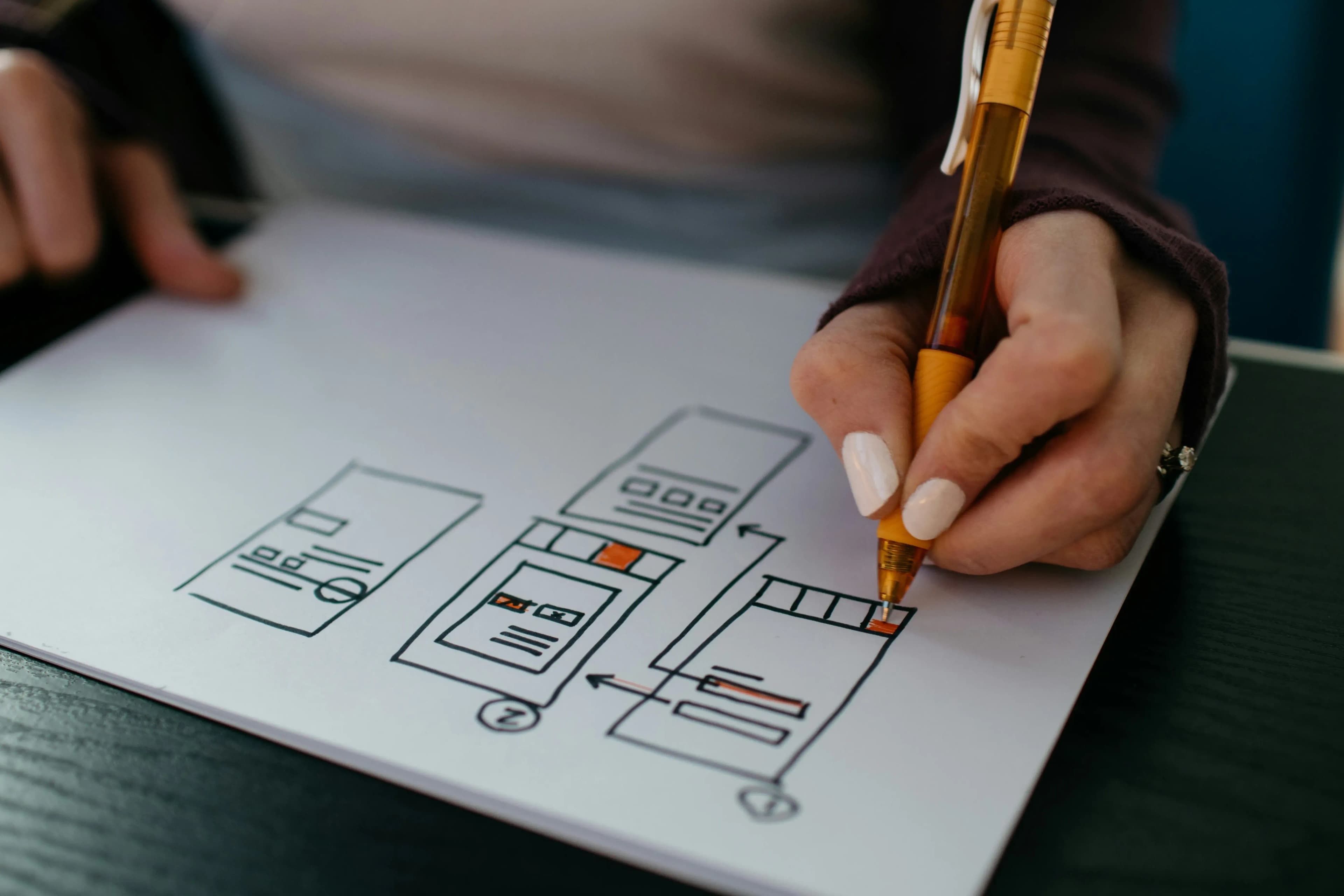
Prototype testing: Build lightweight prototypes of new interaction patterns and watch how people use them. This works especially well for gesture interactions and spatial design concepts.
Preference testing: When you're exploring different approaches to personalization or adaptation, show people options and understand what resonates. This helps you calibrate how much adaptation feels right.
First click testing: For AI-native interfaces that change based on context, validate that predictive elements appear where users expect them.
Live website testing: If you're implementing these trends in a live product, test with real users in real contexts to see how the patterns perform in the wild.
The key is testing early and often. These trends represent significant shifts in how people interact with apps, and that means there's genuine risk in implementing them without validation.
Whether you recruit from Lyssna's research panel or test with your own users, make sure you're validating these patterns before committing to major design changes.
Don't assume that because something is trending, it'll automatically work for your users. Test it, learn from it, iterate on it.
Validate trends before you build
Don't guess which trends will work for your users. Test designs, prototypes, and live experiences with Lyssna's research platform. Start free today.
FAQs about app design trends for 2026

Diane Leyman
Senior Content Marketing Manager
Diane Leyman is the Senior Content Marketing Manager at Lyssna. She brings extensive experience in content strategy and management within the SaaS industry, along with editorial and content roles in publishing and the not-for-profit sector
You may also like these articles


Try for free today
Join over 320,000+ marketers, designers, researchers, and product leaders who use Lyssna to make data-driven decisions.
No credit card required