03 Oct 2023
|15 min
Accessibility in UX design
Discover the importance of accessibility in UX design and its impact on businesses. Learn about disabilities to consider, best practices, and resources to enhance inclusivity.

An estimated 1.3 billion people – or 1 in 6 people worldwide – experience disability at some point. Disabilities come in all shapes and sizes and can be temporary or permanent.
As a UX designer, moving towards inclusivity in design, such as advocating for accessibility, might be intimidating at first. However, embracing accessibility isn't only the right thing to do, but also a tremendous opportunity for business growth and impact.
This article explores what accessibility in UX design truly means, and why organizations must prioritize it. We'll also delve into the various disabilities that you should consider when crafting products and services.
You'll also learn accessibility tips and best practices tailored to user experience (UX) design. Plus, keep an eye out for a comprehensive resource list that you can use to improve your accessibility chops in UX.
The role of accessibility in UX design
Accessibility in UX design is the practice of designing products and services for users of various abilities. Accessible products and services make all users feel included and understood, regardless of their abilities, context, or situation.
Accessibility also aims to level the playing field. It's not just about making sure that people with disabilities can use a website or app; it's about making sure that they have the same level of access to information and services as everyone else.
As Hugo Bernier, Principal Program Manager at Microsoft, shares: "Designing with accessibility in mind makes a difference because it gives everyone the same opportunities."
Accessibility vs usability
You might wonder about the differences between accessibility and usability.
Usability is the practice of creating products that are easy to use. A usable interface is intuitive, efficient, and enjoyable—fundamentals that are deeply rooted in effective user interface development. Its goal is to make tasks as easy as possible for users, so they can get what they need quickly and easily.
Meanwhile, accessibility makes sure everyone can use a product, regardless of their abilities. It aims to break down barriers and make products accessible to people with disabilities.
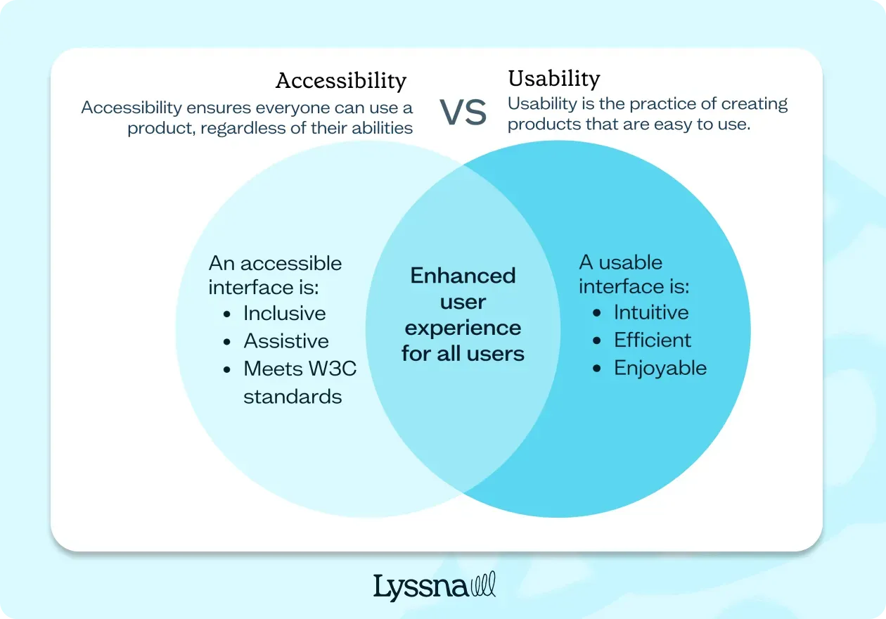
Usability and accessibility are two sides of the same coin. When usability and accessibility are done well, they create a seamless user experience that everyone can enjoy.
Here are some examples of how usability and accessibility can work together:
An internal tool used in your organization that has clear and concise text that’s easy for everyone to read, including those with a vision impairment.
An app that uses colorblind friendly colors so that it’s easy for users with color blindness to navigate.
A website that allows users to navigate with a keyboard so that it’s accessible to people with limited mobility.
Learn more about the distinctions and overlaps between accessibility and usability in Accessibility, Usability, and Inclusion by the Web Accessibility Initiative.
Disabilities to consider when designing for accessibility
When designing for accessibility, it's important to consider the wide range of disabilities that users may have. Here's what these disabilities might look like.
Disability type | Permanent considerations | Temporary considerations |
|---|---|---|
Visual impairments | Partial or total blindness, color blindness, vision issues | Temporary vision-related issues (e.g. blurred vision, light sensitivity, eye patch) due to eye strain or medical conditions |
Auditory impairments | Deafness, hearing-related issues | Temporary hearing loss due to ear infections, injury, or medical procedures |
Motor impairments | Physical disabilities, limited mobility | Temporary physical limitations due to injuries, surgeries, or recovery from medical conditions |
Cognitive impairments | Learning disabilities, attention disorders | Temporary cognitive difficulties due to medication, concussion, or recovery from illness |
Neurological impairments | Epilepsy, Parkinson's disease, neurological disorders | Migraine, dizziness, nausea |
Situational impairments | N/A | Temporary situational limitations like holding a baby, limited mobility due to injury, or a noisy environment |
Visual impairments
People with partial or total blindness, color blindness, and other vision-related issues. Users may also experience temporary vision-related issues due to eye strain, eye surgery, or other conditions. This can include blurred vision, sensitivity to light, or needing an eye patch.
Auditory impairments
People who are deaf or hard of hearing, and those with other hearing-related issues. Users may have temporary hearing loss due to ear infections, injury, or recovery from medical procedures. They may rely on captions or transcripts to understand audio content during this period.
Motor impairments
People with physical disabilities, such as those who use a wheelchair or have limited mobility in their hands. Users may have temporary physical limitations due to injuries, surgeries, or recovering from medical conditions. This can impact their ability to use a mouse or keyboard.
Cognitive impairments
People with learning disabilities, attention disorders, and other cognitive impairments that affect their ability to process information. Users may experience temporary cognitive difficulties due to medication, concussion, or recovery from an illness. During this time, they may have trouble with memory, concentration, or information processing.
Neurological impairments
People with conditions such as epilepsy, Parkinson's disease, and other neurological disorders that affect their ability to use products and services. Migraine and dizziness from a concussion can be a temporary type of neurological impairment, too.
Situational impairments
People may face temporary situational limitations, such as holding a baby, having limited mobility due to a broken arm, or being in a noisy environment. These factors can affect their ability to interact with your product.
Your go-to user research platform
The best teams use Lyssna so they can deeply understand their audience and move in the right direction — faster.
Why accessibility matters in UX design and why it’s important for businesses
Accessible design translates to better design. "When we design for disability first, you often stumble upon solutions that are better than those when we design for the norm," shares Elise Roy, a disability rights lawyer and design thinker, in her TED Talk When we design for disability, we all benefit.
Here’s why businesses should weave accessibility into their design process.
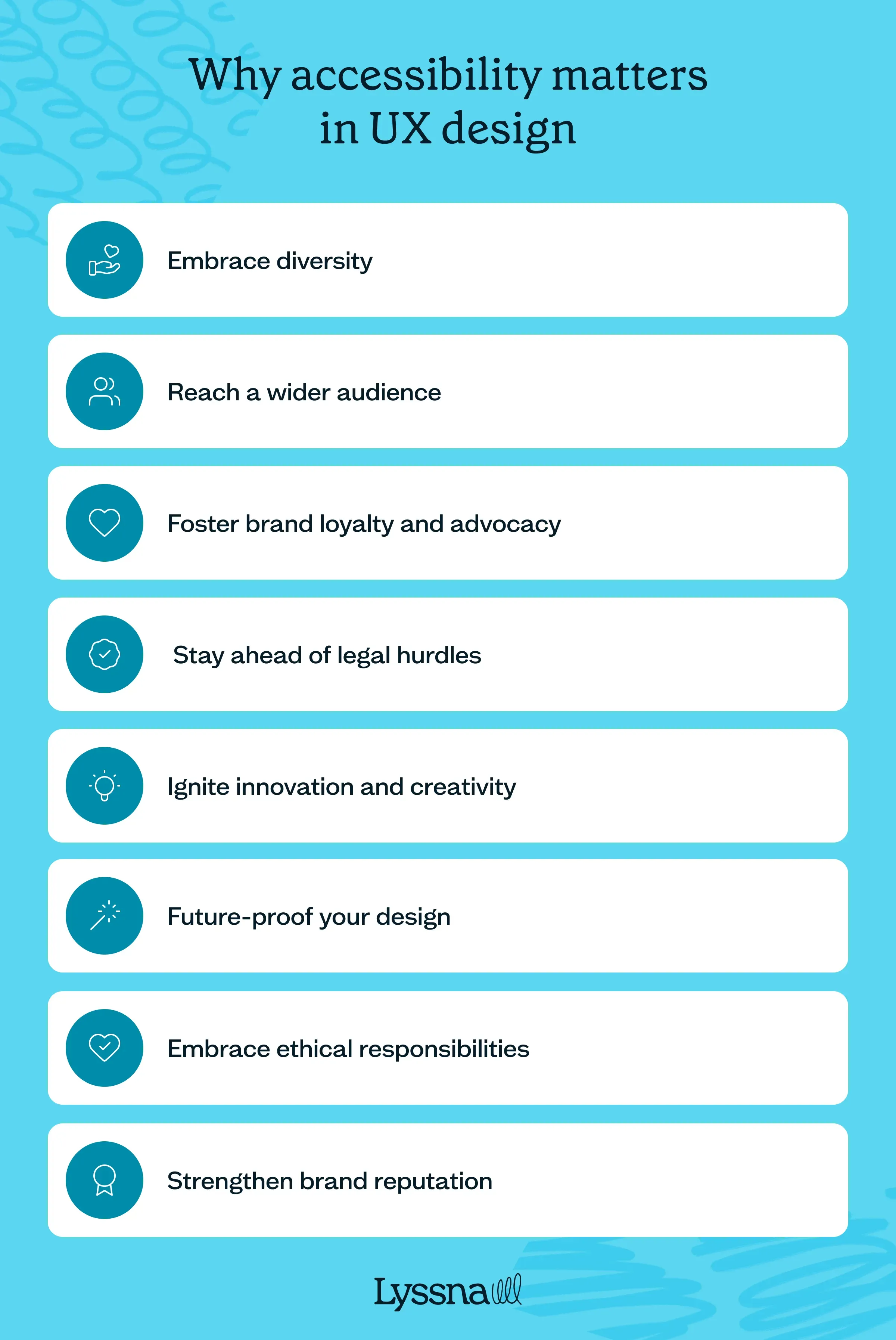
1. Embrace diversity
Accessibility transforms design into a powerful force that embraces diversity, making sure that everyone, regardless of their abilities, can fully participate and thrive using your product or service.
2. Reach a wider audience
By embracing accessibility, you unlock the doors to a vast market of potential users, tapping into the purchasing power of people with disabilities.
3. Stay ahead of legal hurdles
Staying compliant with accessibility laws and regulations safeguards your business from legal pitfalls, including the costly disruptions of legal battles or penalties.
4. Foster brand loyalty and advocacy
By valuing accessibility, you cultivate a loyal user base who appreciates your commitment to their needs, becoming passionate advocates for your brand and spreading positive word-of-mouth.
5. Strengthen brand reputation
Prioritizing accessibility signals that your brand not only cares about its users but also champions social responsibility, bolstering your reputation as an inclusive and compassionate organization.
6. Ignite innovation and creativity
Accessibility challenges designers to think creatively, leading to ingenious solutions that break barriers and push the boundaries of what's possible.
7. Future-proof your designs
Considering accessibility in your designs ensures that your products and services remain adaptable and responsive to evolving technologies and user needs.
8. Embrace ethical responsibilities
Making accessibility a priority aligns with ethical principles, demonstrating that your organization stands firmly on the side of inclusivity, equal access, and a world where everyone can thrive and succeed.
How to embed accessibility in UX design: Tips and best practices
Incorporating accessibility into your design and product development process requires some effort and resources up front, but getting it right means you'll reap the rewards (listed above) later.
Get started with accessibility using the following best practices and actionable tips.
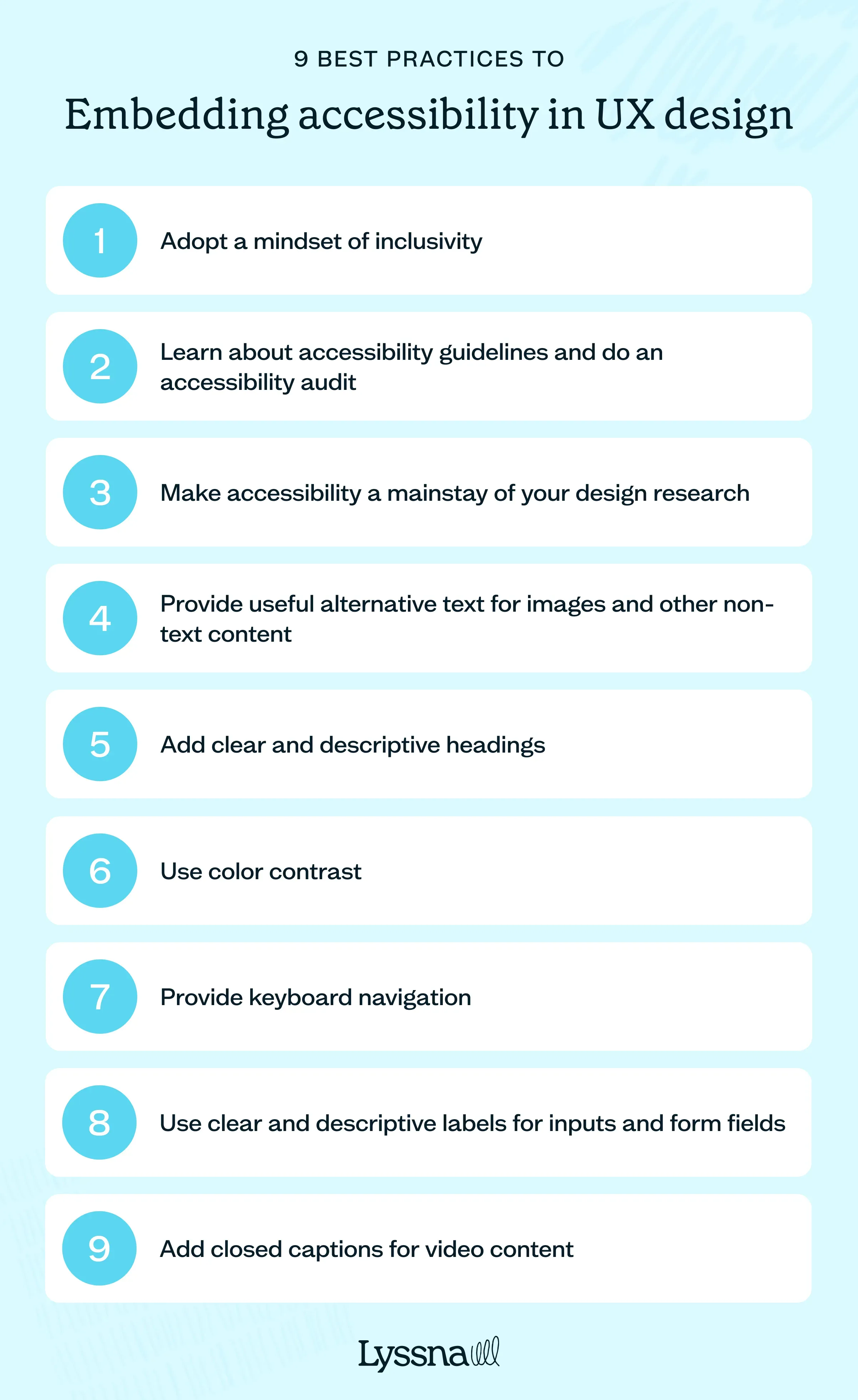
Adopt a mindset of inclusivity
Accessibility in UX design starts with an inclusive mindset.
"There’s a laundry list of practical things that designers can do, such as ensuring proper contrast ratios, legible font sizes, and optimizing for screen readers, to make products more accessible. But at a fundamental level, better solutions come from a mindset shift to be inclusive," points out Collin Cole, a veteran designer who is now a senior client lead at Lynxeye.
Morgana Ancone, Senior UI Designer & Accessibility Advocate, also suggests asking these nine questions during the design process:
Who is my target audience?
Is it possible that they are living with a disability? Perhaps they are neurodivergent.
Is the design legible and does it read properly?
Will it make sense to my demographic?
Is it too busy and overwhelming?
Will they be confused by the instructions or content?
Does it function effectively?
Can I go back, exit, or close it?
Is the design perceivable, operable, understandable, and robust?
Learn about accessibility guidelines and do an accessibility audit
There are many accessibility guidelines available (more on this below), such as the Web Content Accessibility Guidelines (WCAG). Research these guidelines and learn how to implement them in your designs.
Alternatively, hire an accessibility expert to audit and assess if your product works smoothly with assistive technologies and meets the WCAG 2.1 AA standards. You can use the audit's findings as a roadmap to fix accessibility issues and improve your product.
Make accessibility a mainstay of your design research
The best way to ensure your products are accessible is to always test them with users that have disabilities. Developing a comprehensive user experience testing will help you identify areas that need improvement.
“Include 20% user interviews to include those with disabilities. These users’ insights can be found in user interviews, contextual inquiries or ethnographic research, like journaling,” suggests David Pinedo, a UX researcher and designer at Alight Solutions.
Provide useful alternative text for images and other non-text content
Make sure that all your images have descriptive alternative text (alt text) that conveys their meaning to users who can't see them. This is helpful for people who use screen readers to "hear" rather than "read" content on the web. It's also useful for people with a slow internet connection, like in developing countries, where images may load slowly.
Pablo Stanley, designer and former design lead at Invision, shares this expert tip when writing alt text: "Try to describe what’s happening in the image, and how it matters to the story, rather than just saying something like a picture. Context is everything."
Add clear and descriptive headings
Structure your content using heading tags (h1, h2, h3, etc.) to create a logical hierarchy and facilitate navigation. It also helps to make your headings bigger, which provides a clear structure and helps users in understanding how your content is organized.
Use color contrast
Add enough contrast ratios between foreground text and background to improve readability for all users, especially those with low vision.
For example, avoid using light gray text on a white background. Instead, opt for a darker color that meets the W3C guidelines for contrast ratio.
Provide keyboard navigation
Design interfaces that can be navigated using a keyboard alone, as some users may rely on keyboard navigation due to motor disabilities.
This also means testing if users can navigate your website or app through all interactive elements, such as menus, buttons, and form fields using only the tab key, and making sure they can be accessed and operated without a mouse.
Use clear and descriptive labels for inputs and form fields
Each input field should have a concise and meaningful label that accurately describes the information expected. For example, instead of simply labeling a field as "Name," provide more context with "Full Name" or "First Name" and "Last Name" labels.
When adding placeholder text (if you really have to), avoid the default light-gray color because it has poor color contrast against most backgrounds. Make sure that it meets the color contrast requirement of at least a 4.5:1 contrast ratio or 3:1 contrast ratio if it's large (larger than 18pt or 14pt + bold).
Add closed captions for video content
Closed captions for videos make the content accessible to users who are deaf or hard of hearing. For example, if you have a product demo video on your website, provide an option for enabling closed captions, allowing users to follow along with the visual content.
These best practices serve as a starting point, and continuous testing and design feedback are essential for improving accessibility in your products.
Accessibility in UX design resources
Whether you're just starting or looking to level up your expertise in accessibility, use the list below as your go-to reference for understanding and implementing accessibility best practices.
Web Content Accessibility Guidelines (WCAG): The official guidelines published by the World Wide Web Consortium (W3C). It provides detailed recommendations for making web content accessible.
A11y Project: An open-source, community-driven resource that offers accessibility guidelines, code snippets, and best practices for web development.
Inclusive Components: A resource that provides accessible and inclusive code examples and patterns for common UI components.
WebAIM: A comprehensive resource hub for web accessibility. You'll find tutorials, articles, and tools to help designers and developers create accessible websites.
Color Contrast Checker: A tool that automatically checks all elements of a website for sufficient color contrast and crawls to finds broken elements. Besides color contrast, it can also check for 40 other accessibility issues.
Accessible Colors: A tool that allows you to test color contrast ratios and ensure that your chosen color combinations meet accessibility standards.
Accessibility for Teams: A quick-start guide by the US General Services Administration offering resources on accessibility based on your role in the product discovery and development processes.
Inclusive Design Principles by Microsoft: A set of inclusive design principles and guidelines from Microsoft that emphasizes the importance of considering diversity in design.
Accessibility for Everyone by Laura Kalbag: A book where you can learn more about disability challenges, accessibility laws and guidelines, and how to plan and test for accessible design.
A Web for Everyone: Designing Accessible User Experiences by Sarah Horton and Whitney Quesenbery: This book provides practical advice, examples, and case studies of creating websites and digital interfaces that everyone can use.
Included: The Disability Equity Podcast: A podcast from the Johns Hopkins University Disability Health Research Center that delves into the different challenges and issues about disability equity.
Accessibility shouldn't be an afterthought in UX design
When you consider accessibility at the outset of your design process, you can help make sure that users of various abilities have equal access and a great user experience. You can also gain valuable insights, leading to innovative design solutions that benefit your organization.
If you’re looking for a simple yet reliable user research tool to help you and your team design more accessible experiences, try Lyssna. This go-to user research platform for companies like Google, Amazon, and Asana allows researchers and designers to uncover user needs quickly through its comprehensive suite of user testing tools.
Elevate your research practice
Join over 320,000+ marketers, designers, researchers, and product leaders who use Lyssna to make data-driven decisions.
Frequently asked questions about accessibility in UX design
---
Kai has been creating content for healthcare, design, and SaaS brands for over a decade. She also manages content (like a digital librarian of sorts). Hiking in nature, lap swimming, books, tea, and cats are some of her favorite things. Check out her digital nook or connect with her on LinkedIn.
You may also like
Stay in the loop by signing up for our newsletter
We'll keep you updated with the latest tools & insights to elevate your research game.


