06 Mar 2026
|22 min
UI design principles
UI design principles help teams create clear, consistent, and usable interfaces. Learn essential UI guidelines, examples, and best practices for modern products.

UI design principles are the foundational guidelines that help teams create interfaces users can understand, navigate, and enjoy. Whether you're designing a mobile app, a SaaS dashboard, or an ecommerce checkout flow, these principles ensure your product communicates clearly and functions intuitively.
Great UI design reduces friction, guides users toward their goals, and creates experiences that feel effortless. When you apply UI design principles consistently, you build products that users trust, return to, and recommend to others.
This guide explores the core UI design principles every designer and product team should know, with practical examples and actionable advice for applying them in your work. We'll also cover how to validate your design decisions through user testing, so you can move forward with confidence rather than assumptions.
Key takeaways
UI design principles provide a framework for creating clear, consistent, and usable interfaces that reduce cognitive load and improve user satisfaction.
Clarity, consistency, and visual hierarchy are foundational. They help users understand what to do and where to focus their attention.
Feedback and affordance ensure users always know what's happening and how to interact with interface elements.
Accessibility isn't optional. According to the WebAIM Million project, 94.8% of the top one million home pages had detectable WCAG 2 failures. Designing for all users improves the experience for everyone.
Testing validates your decisions. Methods like preference testing, first click testing, and prototype testing help you confirm that your UI actually works for real users.
UI and UX work together. While UI focuses on how the interface looks and responds, it exists within the broader context of the overall user experience.
Start testing early with user research platforms like Lyssna. Even rough wireframes and early prototypes can reveal whether your layout, hierarchy, and navigation are working before you commit to development.
Test your UI with real users
Try Lyssna and validate your design decisions with preference tests, first click tests, and five second tests.
What are UI design principles?
UI design principles are established guidelines that inform how visual elements, interactive components, and information should be organized and presented within a digital interface. They draw from cognitive psychology, visual design theory, and decades of research into how people interact with technology.
As Don Norman, author of The Design of Everyday Things, puts it: "Design is really an act of communication, which means having a deep understanding of the person with whom the designer is communicating." UI design principles are the framework that makes this communication possible, giving designers a shared language for creating interfaces that users can understand without explanation.
Definition of UI design principles
At their core, UI design principles help designers make decisions that prioritize user needs over aesthetic preferences or technical convenience. They answer questions like: How should buttons look so users know they're clickable? How much information should appear on a single screen? What visual cues help users understand where they are in a process?
These principles aren't arbitrary rules. They're based on how human perception and cognition work. For example, the principle of visual hierarchy leverages the fact that our eyes naturally move toward larger, bolder, or more colorful elements first.
Difference between UI and UX
While UI (user interface) and UX (user experience) are closely related, they focus on different aspects of product design:
UI design | UX design |
|---|---|
Focuses on visual elements and interactions | Focuses on the overall experience and journey |
Concerned with how things look and respond | Concerned with how things feel and flow |
Deals with buttons, typography, colors, layouts | Deals with user research, information architecture, workflows |
Answers "How should this button look?" | Answers "Should this button exist at all?" |
Think of it this way: UX determines what a product should do and why, while UI determines how it should look and behave while doing it. A product can have a beautiful UI but poor UX (it looks great but is confusing to use), or excellent UX with mediocre UI (everything works well but feels dated or inconsistent).
Why principles matter for usability and product success
Imagine you're designing a fitness app. If the user interface is cluttered, with buttons in different places on every screen, users will get lost and leave. But if you apply principles like consistency and visual hierarchy, users can navigate easily from tracking workouts to logging meals without confusion.
UI design principles matter because they reduce learning curves, minimize errors, build trust, improve efficiency, and support business goals. Better usability leads to higher engagement, conversion, and retention, which is why investing in your interface design pays off across the entire product life cycle.
Why UI design principles matter
Understanding why these principles matter helps you prioritize them in your design process and advocate for them with stakeholders.
Clarity and ease of use
When interfaces are clear, users don't have to think about how to use them. They just do. Clarity means every element has a purpose, labels are understandable, and actions have obvious outcomes. This reduces the mental effort required to complete tasks, which directly impacts user satisfaction and task completion rates.
Reduced cognitive load
Cognitive load refers to the mental effort required to process information and make decisions. Every unnecessary element, confusing label, or unexpected behavior adds to this load. By applying UI design principles, you minimize cognitive load so users can focus on their actual goals rather than figuring out your interface.
Consistency across products
Consistency creates predictability. When buttons look and behave the same way throughout your product, users develop mental models that help them navigate confidently. This extends to consistency with platform conventions too. iOS users expect certain patterns, Android users expect others, and web users have their own expectations.
Accessibility and inclusivity
Designing with accessibility in mind isn't just about compliance. It's about ensuring your product works for everyone, including people with visual, motor, cognitive, or auditory differences. Many accessibility best practices overlap with general UI principles, reinforcing the importance of thoughtful, inclusive design across the entire user journey.
Improved engagement and conversion
Good UI design directly impacts your bottom line by removing barriers between users and their goals. Think about a food delivery app where the "Place Order" button is hard to find, or the payment screen glitches. Users won't wait around. They'll switch to a competitor with a faster, simpler experience.
Core UI design principles (with examples)
Let's explore the essential principles that should guide every interface design decision.
Clarity
Interfaces should be self-explanatory and easy to understand. Users shouldn't need a manual or tutorial to accomplish basic tasks.
How to achieve clarity:
Use plain, descriptive language for labels and instructions.
Ensure icons are universally recognizable or paired with text labels.
Make the purpose of each screen immediately obvious.
Avoid jargon unless your audience specifically expects it.
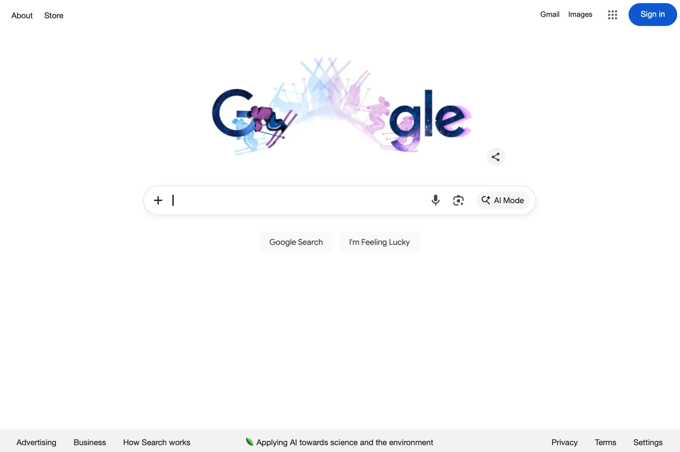
Example: A "Submit" button is clearer than "Process" or "Execute." Google's search page is a masterclass in clarity: one input field, one primary action, and zero ambiguity about what to do next. Compare that to a cluttered dashboard where users have to hunt for the action they need.
Consistency
Consistent components, patterns, and behaviors reduce friction and help users build accurate mental models of how your product works.
Types of consistency to maintain:
Visual consistency: Same colors, typography, and spacing throughout.
Functional consistency: Similar elements behave the same way everywhere.
External consistency: Following platform conventions users already know.
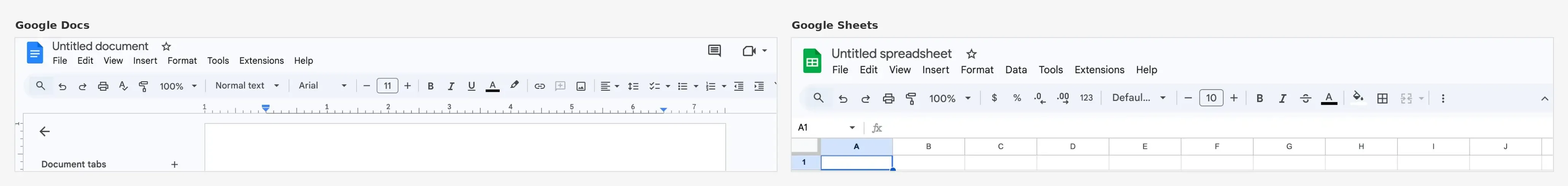
Example: Google Workspace is a strong example of consistency in action. Whether you're using Docs, Sheets, or Slides, the toolbar layout, iconography, and interaction patterns feel familiar across apps. If clicking a card expands it on one screen of your product, clicking cards should expand them everywhere.
Visual hierarchy
Use size, color, spacing, and contrast to guide attention toward what matters most. Visual hierarchy helps users understand the relative importance of elements and navigate content efficiently.
Techniques for establishing hierarchy:
Make primary actions larger and more prominent than secondary ones.
Use whitespace to separate distinct content groups.
Apply color strategically to draw attention to key elements.
Position important information where users naturally look first (typically top-left in Western cultures).
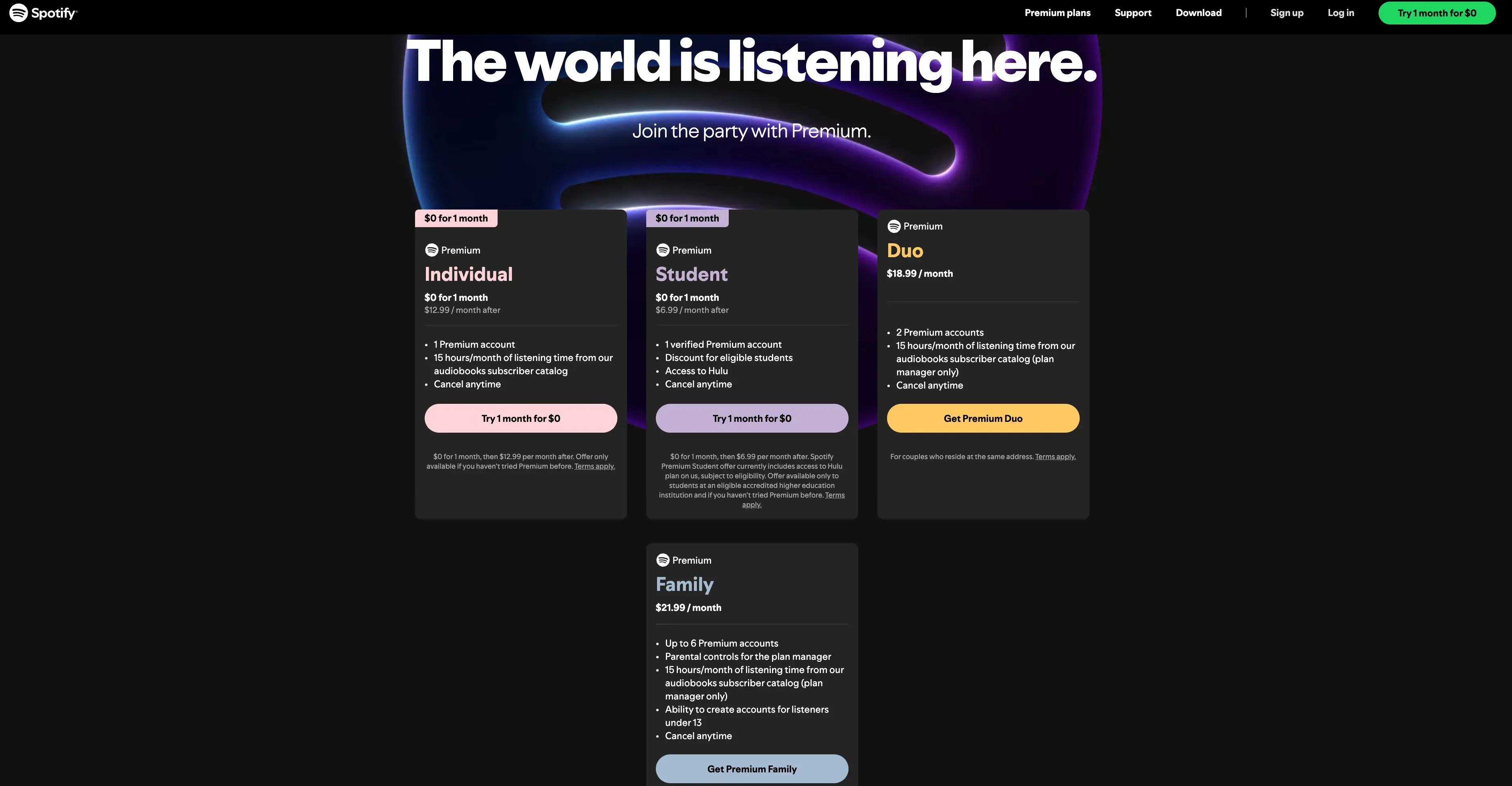
Example: On a pricing page, visual hierarchy helps users quickly compare options and identify promoted plans. Spotify's pricing page does this well, using colored promotional badges and distinct CTA button styles to draw attention to its trial offers, while keeping all plans easy to scan and compare.
Feedback
Users should always know what's happening after an action. Feedback confirms that the system received input and communicates the result.
Types of feedback to provide:
Immediate feedback: Button states change on hover and click.
Progress feedback: Loading indicators show something is happening.
Confirmation feedback: Success messages confirm completed actions.
Error feedback: Clear messages explain what went wrong and how to fix it.
Example: When a user submits a form, they should see a loading state, then either a success message or specific error messages. Never silence or ambiguity.
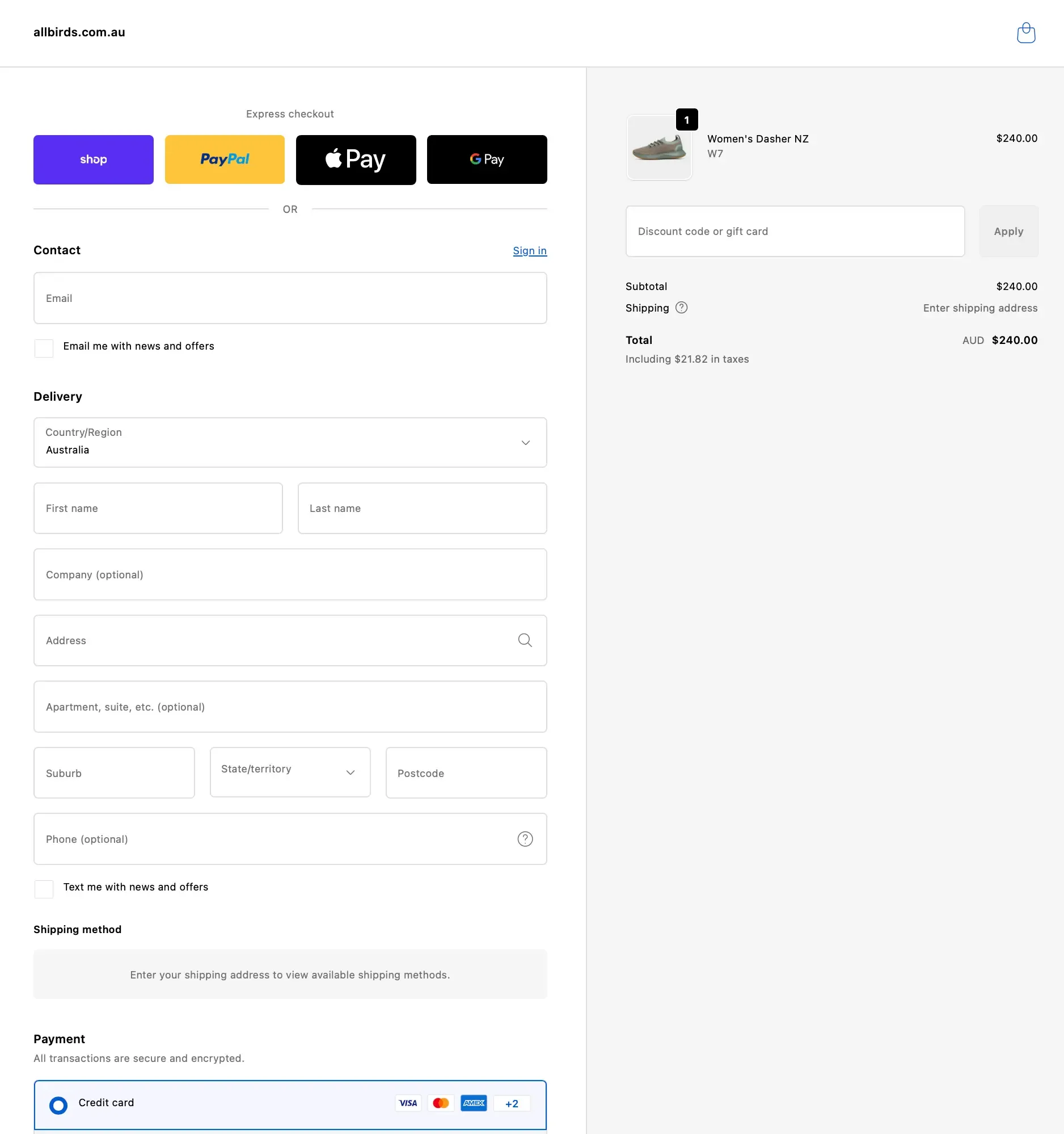
Shopify's checkout is a good example here. The one-page layout organizes the process into clearly labeled sections (contact, delivery, shipping, payment), marks optional fields so users know exactly what's required, and uses conditional content like revealing shipping methods only after an address is entered. Every element provides clarity about what's needed and what happens next.
Simplicity
Remove unnecessary elements and distractions. Every element should earn its place on the screen by serving a clear purpose.
How to simplify interfaces:
Eliminate redundant information and duplicate controls.
Use progressive disclosure to reveal complexity only when needed.
Prioritize the most common user tasks.
Resist the urge to add features "just in case."
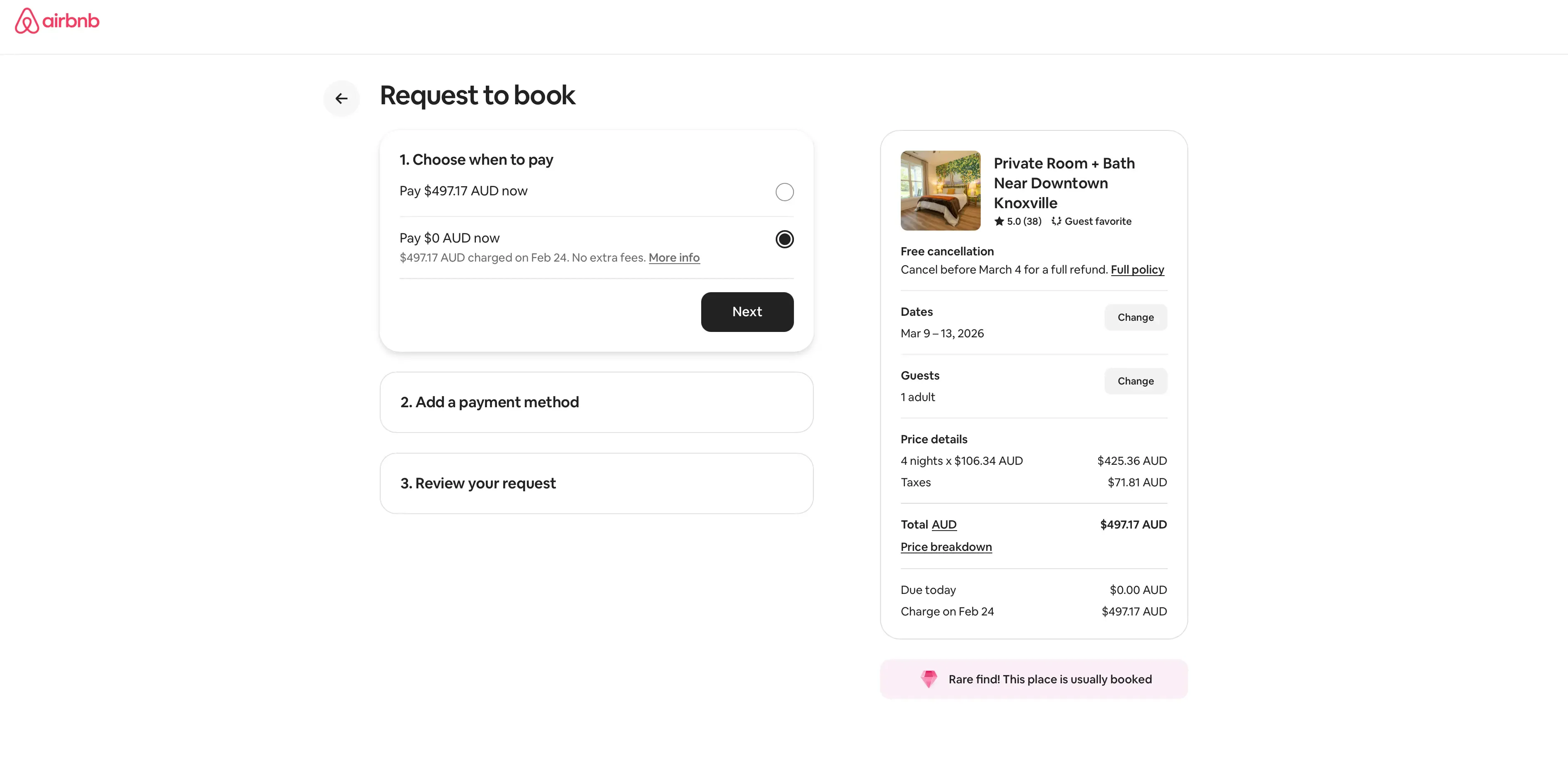
Example: Airbnb's booking flow is a good reference here. The "Request to book" page breaks the checkout into three numbered steps (payment timing, payment method, review), with a clear summary of dates, guests, and pricing always visible on the right. Each step stays collapsed until you reach it, keeping the interface focused and distraction-free.
Affordance and signifiers
Make it obvious how elements should be used. Affordance refers to what an element can do; signifiers are the visual cues that communicate this.
Common signifiers in UI design:
Buttons look raised or have clear boundaries.
Links are underlined or colored differently from body text.
Draggable elements have grab handles or textured areas.
Input fields have visible borders and placeholder text.
Example: A slider control with a visible track and draggable handle clearly communicates that users can adjust a value by dragging. A flat, unlabeled line wouldn't communicate this at all.
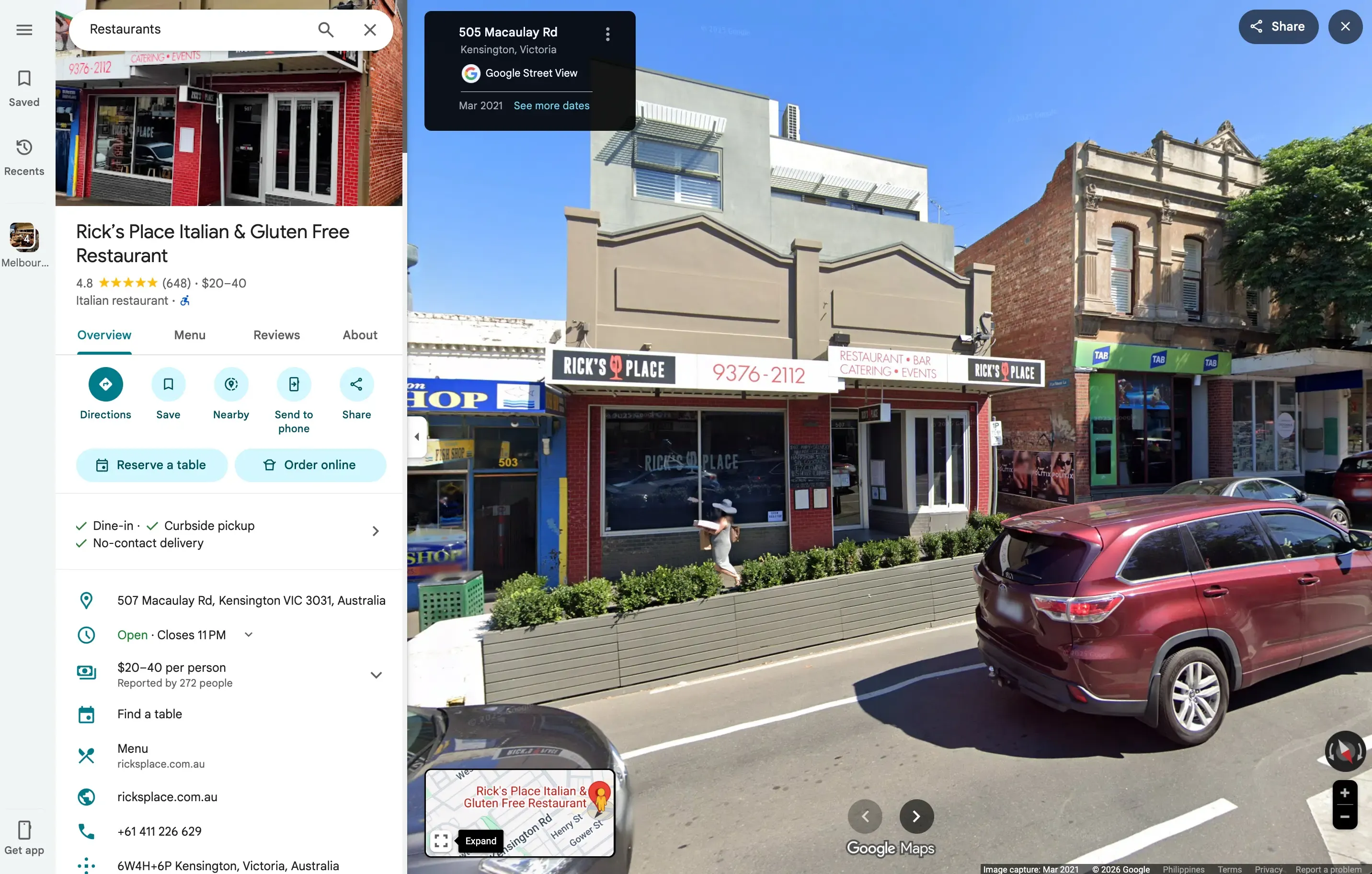
Google Maps uses strong affordances throughout its interface. Action buttons pair icons with text labels (Directions, Save, Nearby) so users never have to guess what each one does. Primary actions like "Reserve a table" and "Order online" are visually distinct from secondary options, and interactive elements like the expandable mini-map and zoom controls clearly signal how to use them.
Accessibility
Design for all users, including those who have disabilities. This means considering contrast ratios, keyboard navigation, screen reader compatibility, and more. According to the WebAIM Million project from Utah State University, 94.8% of the top one million home pages had detectable WCAG 2 failures, highlighting just how widespread these issues remain.
Key accessibility considerations:
Color contrast: Text should have sufficient contrast against backgrounds (WCAG recommends at least 4.5:1 for normal text).
Keyboard navigation: All interactive elements should be reachable and usable without a mouse.
Screen readers: Use semantic HTML and ARIA labels so assistive technologies can interpret your interface.
Touch targets: Buttons and links should be large enough to tap accurately (at least 44x44 pixels).
Example: Don't rely on color alone to communicate information. If error states are shown in red, also include an icon or text label so colorblind users understand the message. Microsoft's Fluent Design System is a strong example of accessibility built into the foundation. It includes high-contrast themes, focus indicators, and screen reader support as core features rather than afterthoughts.
Pro tip: Build accessibility into your design process from the start, not as a last-minute checklist item. Testing your UI with assistive technologies like screen readers early on helps you catch issues when they're still easy to fix.
UI design principles vs UX design principles
While UI and UX principles overlap significantly, understanding their distinct focuses helps you apply each appropriately.
UI focuses on interface and interaction
UI design principles address the visual and interactive layer of a product. They guide decisions about how elements look (colors, typography, iconography), how elements behave (animations, transitions, states), how elements are arranged (layout, spacing, alignment), and how users interact with them (clicks, taps, gestures).
UX focuses on overall experience
UX design principles address the broader experience of using a product. They guide decisions about what problems the product solves, how users flow through tasks and journeys, what information users need and when, and how the product fits into users' lives and contexts.
How both work together
The best products emerge when UI and UX work in harmony. Here's how the two disciplines compare across key areas:
Area | UI design principles | UX design principles |
|---|---|---|
Focus | How the interface looks and responds | How the overall experience feels and flows |
Key questions | "Is this button visible and clear?" | "Does the user need this button at all?" |
Deals with | Colors, typography, layout, interaction states | Research, information architecture, user journeys |
Validates through | Preference testing, first click testing, five second testing | User interviews, usability testing, journey mapping |
Goal | Make each interaction intuitive and visually clear | Make the entire experience seamless and meaningful |
In practice, the two disciplines are constantly informing each other. A UX designer might discover through user interviews that customers abandon a sign-up form because it feels overwhelming. That's a UX insight. A UI designer then responds by breaking the form into shorter steps, adding a progress indicator, and using visual hierarchy to make each step feel manageable. The principle and the experience work together.
Common UI design mistakes to avoid
Even experienced designers make these mistakes. Recognizing them helps you catch issues before they reach users.
Overloading interfaces
Trying to show everything at once overwhelms users. Instead of helping, dense interfaces paralyze users with too many choices. Use progressive disclosure to reveal information and options as they become relevant, and prioritize the actions your users need most.
Poor contrast and readability
Low-contrast text, tiny fonts, and busy backgrounds make content hard to read. This affects everyone, not just users with visual impairments. Prioritize readability by using sufficient contrast, appropriate font sizes, and adequate line spacing.
Inconsistent components
When buttons, forms, and navigation behave differently across screens, users lose confidence. They can't predict what will happen, so they proceed cautiously or abandon tasks entirely. Establish and follow a design system to maintain consistency.
Ignoring accessibility
Designing only for "typical" users excludes a significant portion of your potential audience. Beyond the ethical implications, inaccessible products face legal risks and miss business opportunities – yet only 39% of North American businesses make accessibility a formal requirement on projects. Build accessibility into your process from the start, not as an afterthought.
Relying on assumptions instead of testing
Designers often assume they know what users want or how they'll behave. These assumptions are frequently wrong. The only way to know if your UI works is to test it with real users.
Pro tip: You don't need a huge research budget to validate your designs. Even a quick preference test or five second test with a small group of participants can reveal issues you'd never spot on your own. The goal is to build a habit of testing early and often, rather than waiting until your designs are fully built.
How to apply UI design principles in real products
Principles are only valuable if you can apply them. Here's a practical approach to incorporating UI design principles into your workflow.
Understand user needs
Before designing anything, understand who you're designing for and what they're trying to accomplish. This might involve:
Reviewing existing user research and analytics
Conducting user interviews to understand goals and pain points
Creating personas that represent your target users
Mapping user journeys to identify key moments and needs
Design with principles in mind
As you create designs, use these questions as a built-in quality check:
Clarity: Can users understand what each element does?
Consistency: Do similar elements look and behave the same way?
Hierarchy: Is it clear what's most important on each screen?
Feedback: How will users know their actions succeeded or failed?
Simplicity: Can anything be removed without losing value?
Accessibility: Does the design work for users with different abilities?
Test interfaces with real users
Design decisions should be validated, not assumed. Testing reveals whether your UI actually works for the people who will use it. Even quick, informal tests can uncover significant issues before they become expensive to fix.
Iterate based on feedback
Testing isn't a one-time event. It's an ongoing practice. Each round of feedback should inform improvements, which are then tested again. This iterative approach helps you refine your UI until it truly serves user needs.
Pro tip: Don't wait for pixel-perfect designs before testing. Even rough wireframes and early prototypes can reveal whether your layout, hierarchy, and navigation are working. The earlier you test, the less costly it is to make changes.
Validate before launch
Before committing to development, validate your designs with enough confidence to move forward. This reduces the risk of building something that doesn't work and saves time and resources in the long run, unlike the 60% of companies that only test prototypes internally late in development.
Practitioner insight: The ability for us to design a quick mockup, run it on Lyssna and receive feedback within an hour has helped us reach definitive design decisions much sooner than before.
– Chris Taylor, Senior UX/UI Designer at Canstar
Testing UI design principles with users
Testing is how you move from "I think this works" to "I know this works." Different testing methods reveal different insights about your UI.
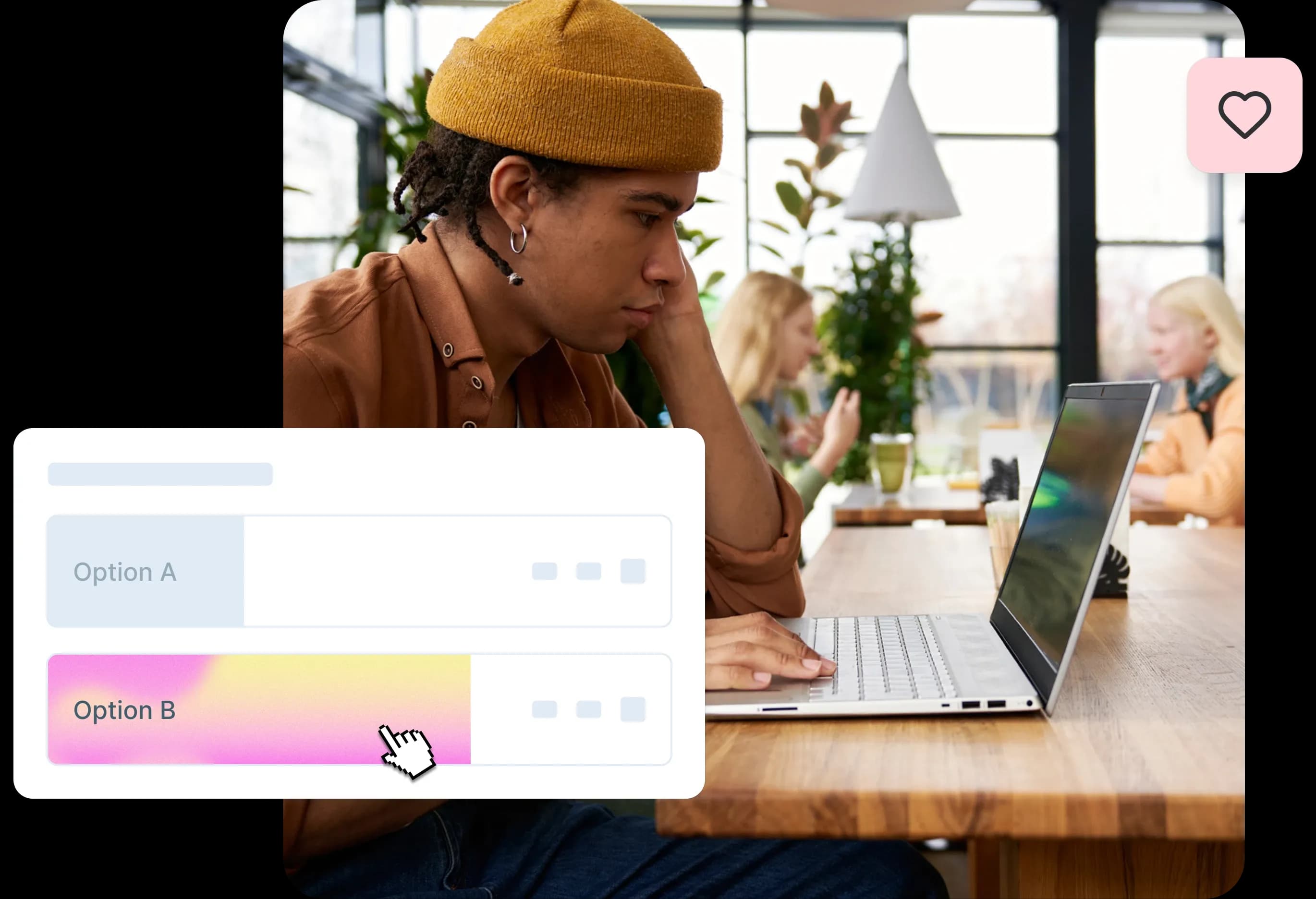
Preference testing
Preference testing helps you compare design variations to see which resonates more with users. This is valuable when you're deciding between different visual approaches, layouts, or component styles.
When to use preference testing:
Comparing color schemes or visual treatments
Evaluating different icon styles
Choosing between layout options
Testing variations of key UI elements
First click testing
First click testing reveals whether users can find what they're looking for. By seeing where users click first when given a task, you can evaluate whether your visual hierarchy and navigation are working as intended.
When to use first click testing:
Evaluating navigation clarity
Testing whether CTAs are prominent enough
Validating information architecture
Checking if users understand interface organization
Five second testing
Five second testing captures first impressions. Users see your design for five seconds, then answer questions about what they remember. This reveals whether your key messages and visual hierarchy are immediately clear.
When to use five second testing:
Testing landing page clarity
Evaluating brand perception
Checking if key information is prominent
Validating that designs communicate intended messages
Prototype testing
Prototype testing lets users interact with your designs before they're built. By observing how users navigate through prototypes, you can identify usability issues and validate that your UI principles are working in context.
When to use prototype testing:
Validating user flows and task completion
Testing interactive elements and feedback
Evaluating consistency across screens
Identifying usability issues before development
Surveys
Design surveys help you gather broader feedback about user perceptions, preferences, and experiences. They're useful for understanding how users feel about your UI and what improvements they'd value.
When to use surveys:
Gathering feedback on overall design direction
Understanding user preferences and priorities
Collecting qualitative feedback on specific elements
Measuring satisfaction with UI changes
How testing validates UI decisions
Testing transforms subjective design opinions into objective evidence. Instead of debating whether a button should be blue or green, you can test both options and let user data guide the decision. Instead of assuming users will understand your navigation, you can watch them try to use it.
This evidence-based approach builds confidence in your decisions and helps you communicate design rationale to stakeholders. When someone asks "Why did you design it this way?", you can point to user research rather than personal preference.
Practitioner insight: We used to spend days collecting the data we can now get in an hour with Lyssna. We're able to get a sneak preview of our campaigns' performance before they even go live.
– Aaron Shishler, Copywriter Team Lead at monday.com
How Lyssna helps teams apply UI design principles
Applying UI design principles effectively requires validation from real users. Lyssna provides the tools to test your designs quickly and confidently.
Validate UI clarity and hierarchy
Use first click testing and five second testing to confirm that users understand your interface. These methods reveal whether your visual hierarchy guides attention appropriately and whether key elements are immediately recognizable.
Compare design variations
Preference testing lets you evaluate different approaches side by side. Whether you're choosing between button styles, color schemes, or layout options, you can gather user feedback to inform your decision rather than relying on internal opinions.
Collect fast, actionable feedback
With Lyssna's research panel of over 690,000 participants across 395+ demographics, you can get feedback in minutes rather than days. This speed enables you to test more frequently and iterate faster, building a culture of evidence-based design decisions.
Reduce risk before development
Testing designs before building them saves significant time and resources. By validating your UI with real users, you reduce the risk of launching something that doesn't work and the costly rework that follows.
Practitioner insight: Lyssna is supporting us in reducing the MVP delivery timeline from 1 year to 3 months.
– Louis Patterson, Innovation Delivery Officer at British Red Cross
Validate your UI decisions with real users
Great UI design isn't about following rules blindly. It's about understanding principles deeply enough to apply them thoughtfully, then validating your decisions with the people who matter most: your users.
With Lyssna's all-in-one user research platform, you can gather real user feedback through methods like usability testing and surveys, helping you refine your product design, validate decisions, and create experiences users love.
Ready to put your UI design principles into practice?
Evaluate website UI intuitiveness: First click test template to explore how easy it is for users to navigate your product and identify friction points.
Test design comprehension: Design survey template to assess whether your designs effectively convey their intended message and resonate with your audience.
Get first impressions of your home page: Five second test template to find out whether your home page quickly conveys your brand message and captures attention.
Test desirability and design preferences: Preference testing template combined with follow-up questions to reveal which visual styles, colors, and layouts resonate most.
Test user interactions: Design survey template to evaluate how well your designs align with user expectations and interaction goals.
Put your UI principles to the test
Run preference tests, first click tests, and more – so you can move from design assumptions to real user insights.
FAQs about UI design principles

Pete Martin
Content writer
Pete Martin is a content writer for a host of B2B SaaS companies, as well as being a contributing writer for Scalerrs, a SaaS SEO agency. Away from the keyboard, he’s an avid reader (history, psychology, biography, and fiction), and a long-suffering Newcastle United fan.
You may also like these articles


Try for free today
Join over 320,000+ marketers, designers, researchers, and product leaders who use Lyssna to make data-driven decisions.
No credit card required